8th Hour Branding and Visual Identity for Modern Workwear
8th Hour is an identity system and branding project by Anastasiia S. that links office uniforms with practical workwear items.
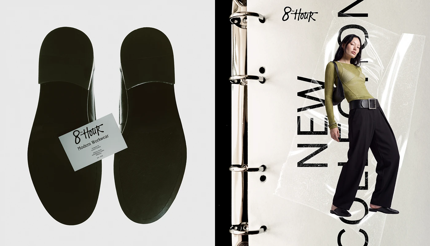
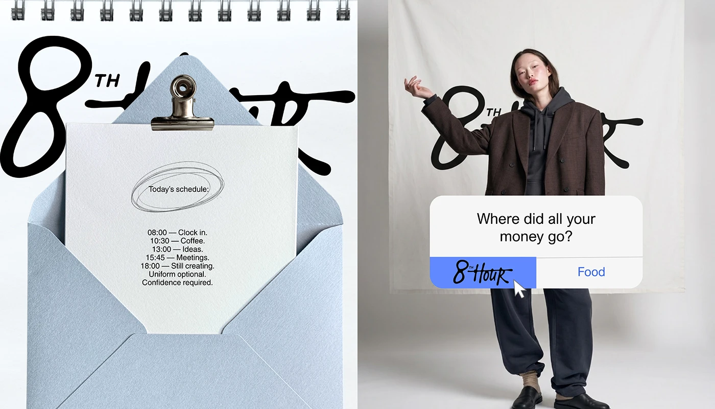
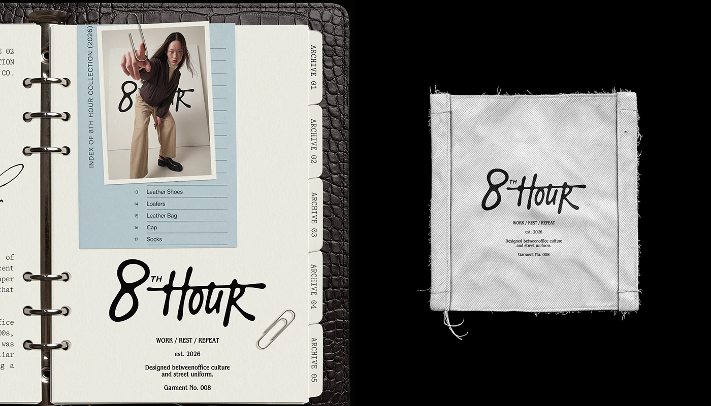
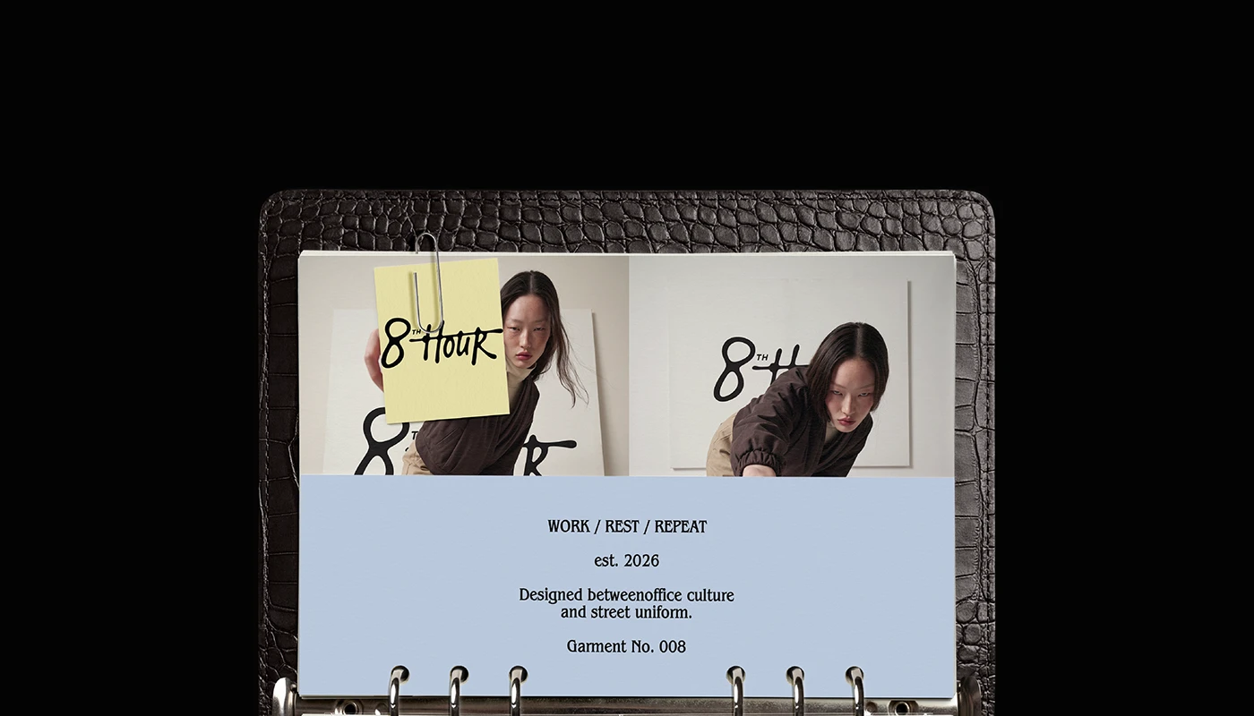
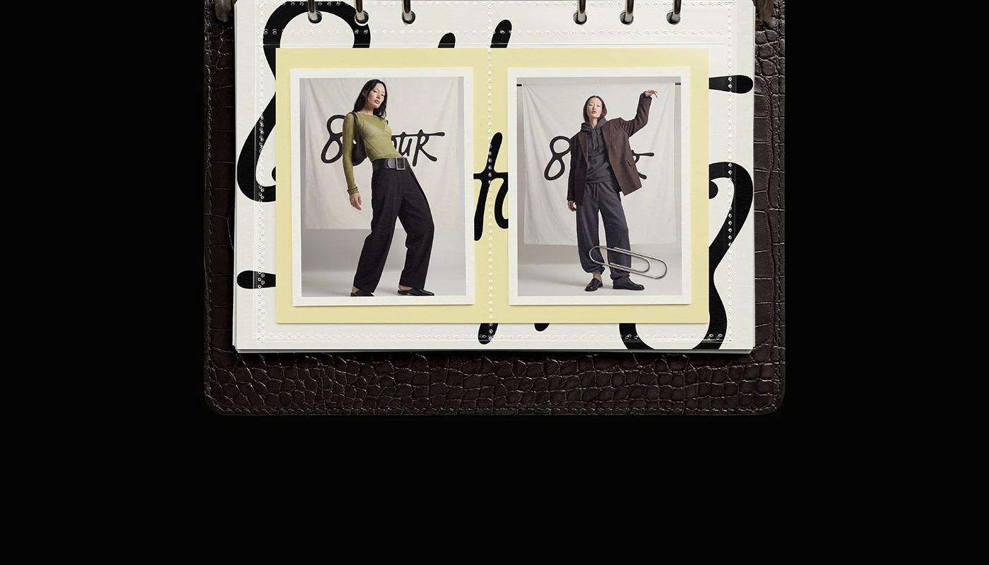
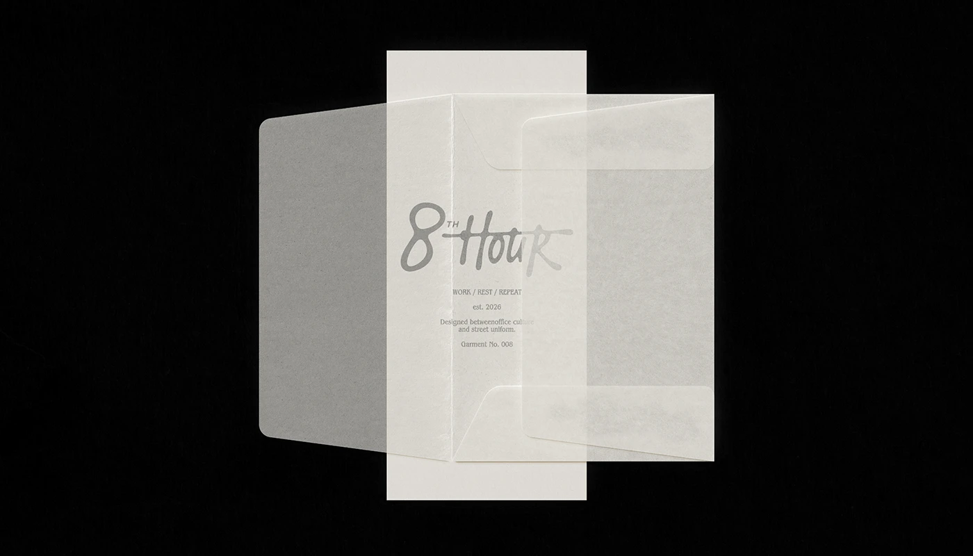
The visual system balances raw work clothes with clear office structure. At the core of the branding sits a bold script mark. The mark features a long stroke that runs across the letters. Designer Anastasiia S. sets this fluid mark against sharp grids and dark binders. The print layout pairs a tall serif font for main headers with a clean sans font for spec text. Small items like steel clips, notes, and index tabs anchor the identity in real office tasks. Black leather book spines and silver ring mechanisms create a strong archival feel. Every piece feels like a working tool for the studio desk.
Utilitarian Editorial Typography and Garment Branding
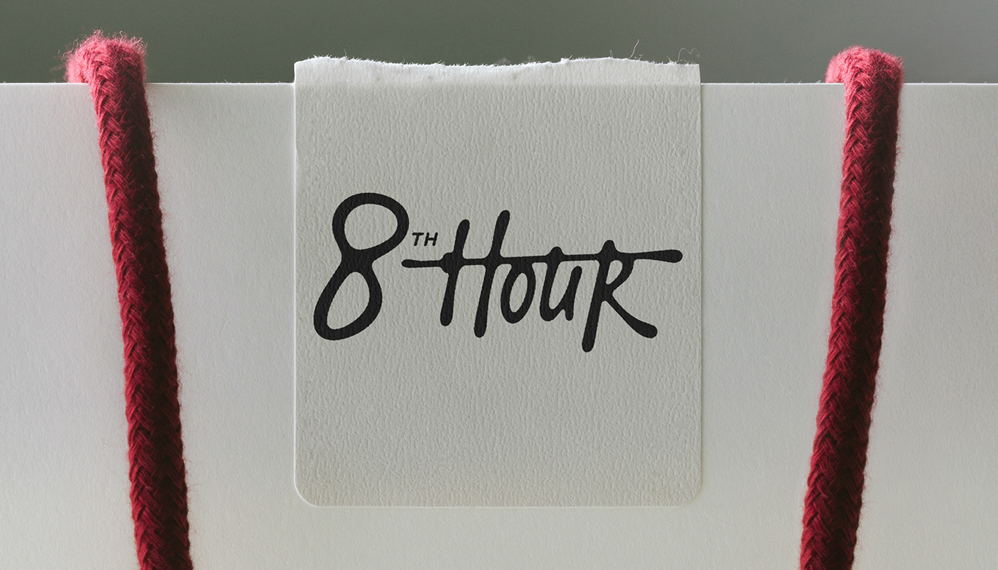
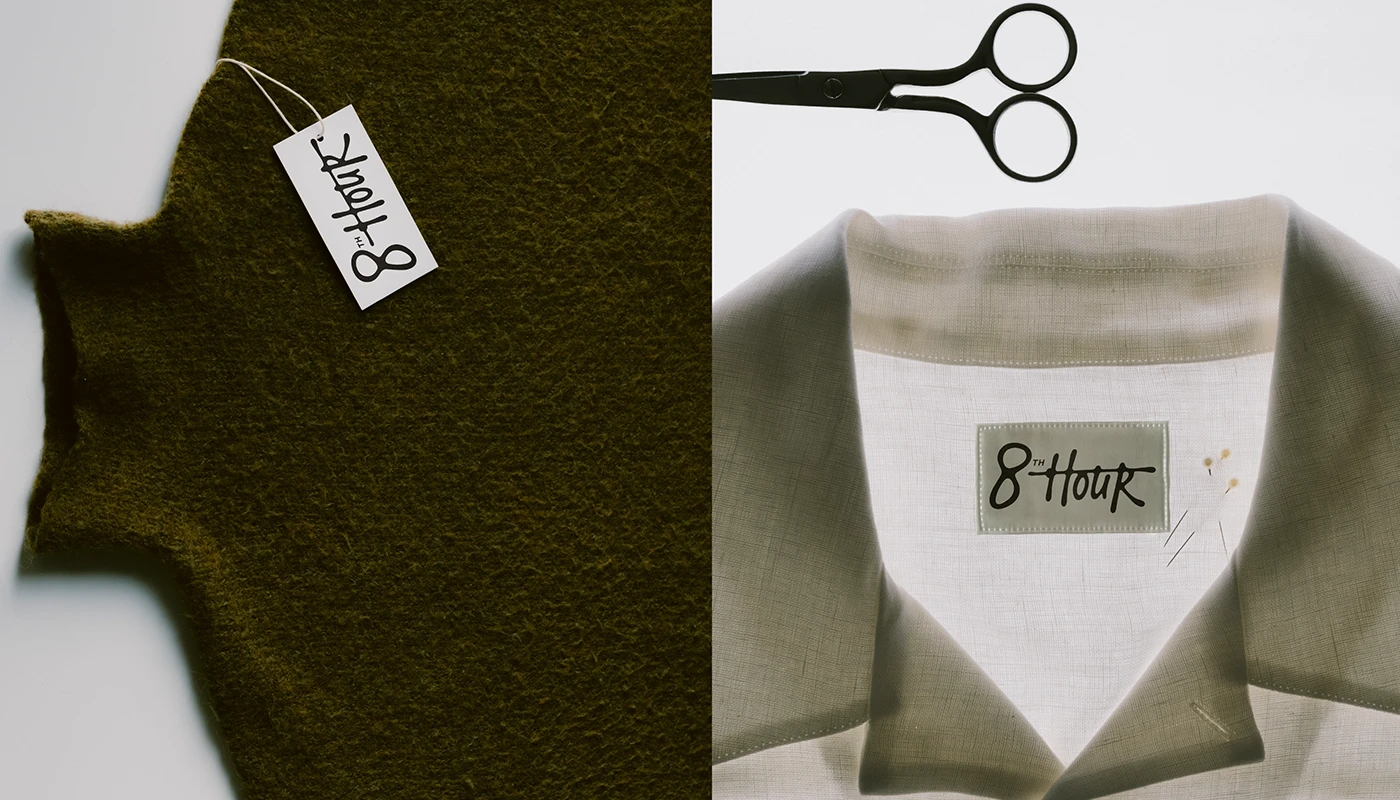
Physical goods turn the fashion branding into a tactile set of pieces. Thick white paper bags feature red rope handles and black wordmark labels. Garment tags use heavy card stock pinned with steel safety pins. Clear paper sleeves hold folded collection cards on dark desk surfaces. Woven cloth neck labels and care tags sit on boiled wool coats and crisp white linen shirts. The print choices highlight the clean feel of raw cloth, card, and metal. Each piece uses clear craft details to communicate quality and purpose.
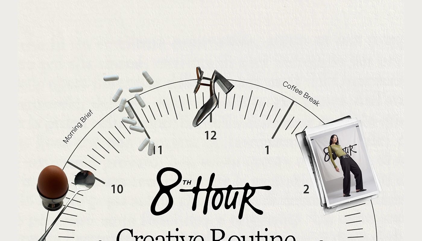
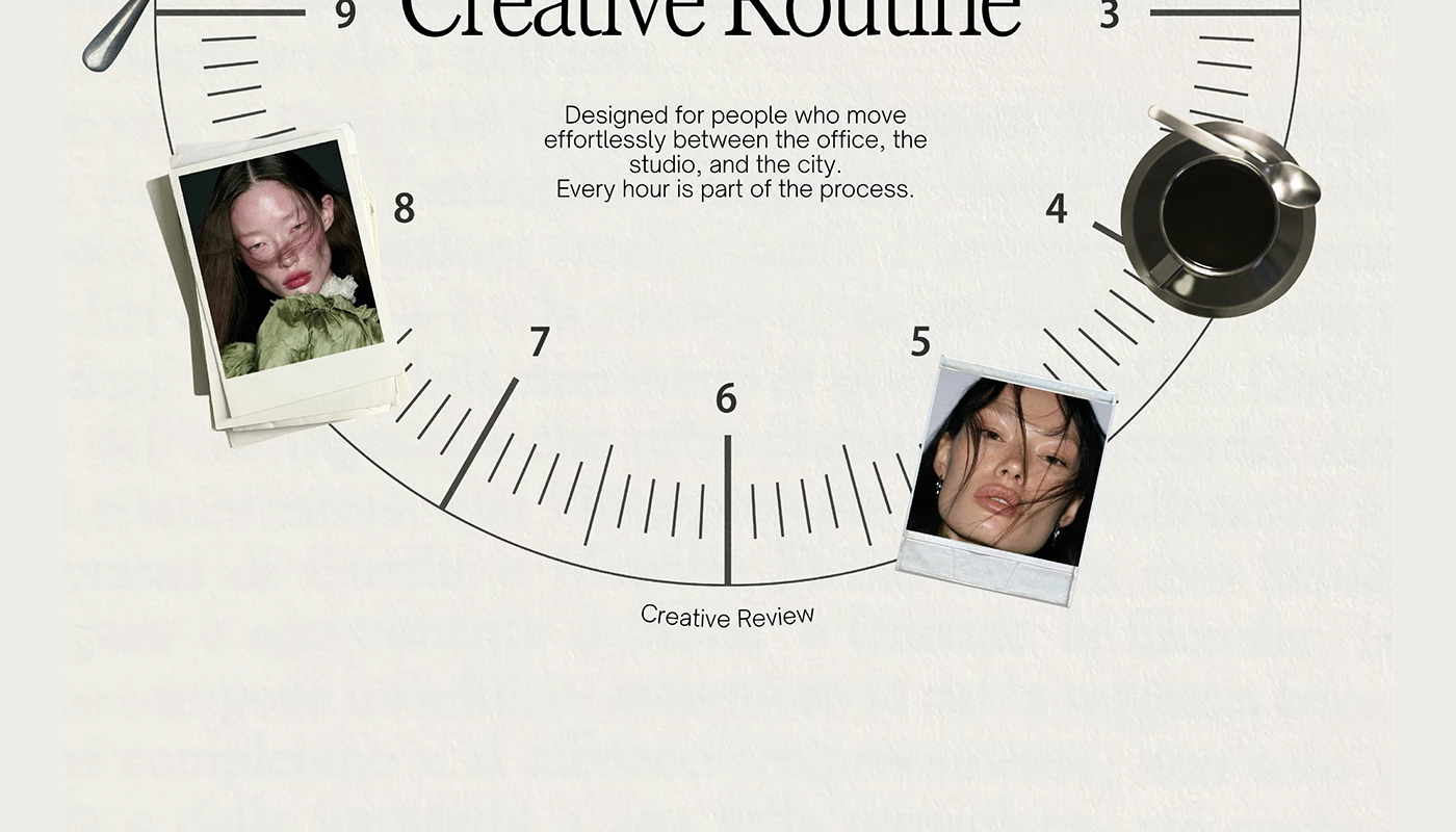
The project frames the daily eight hour work day as a creative act. Round time dials map out morning coffee, design reviews, and studio work. This neat branding method treats daily clothes as a functional uniform for deep focus. The full system relies on scale contrast, raw textures, and clear type grids. It bridges the gap between classic work wear and everyday street fashion. View the complete apparel branding case study on Behance by Anastasiia S.