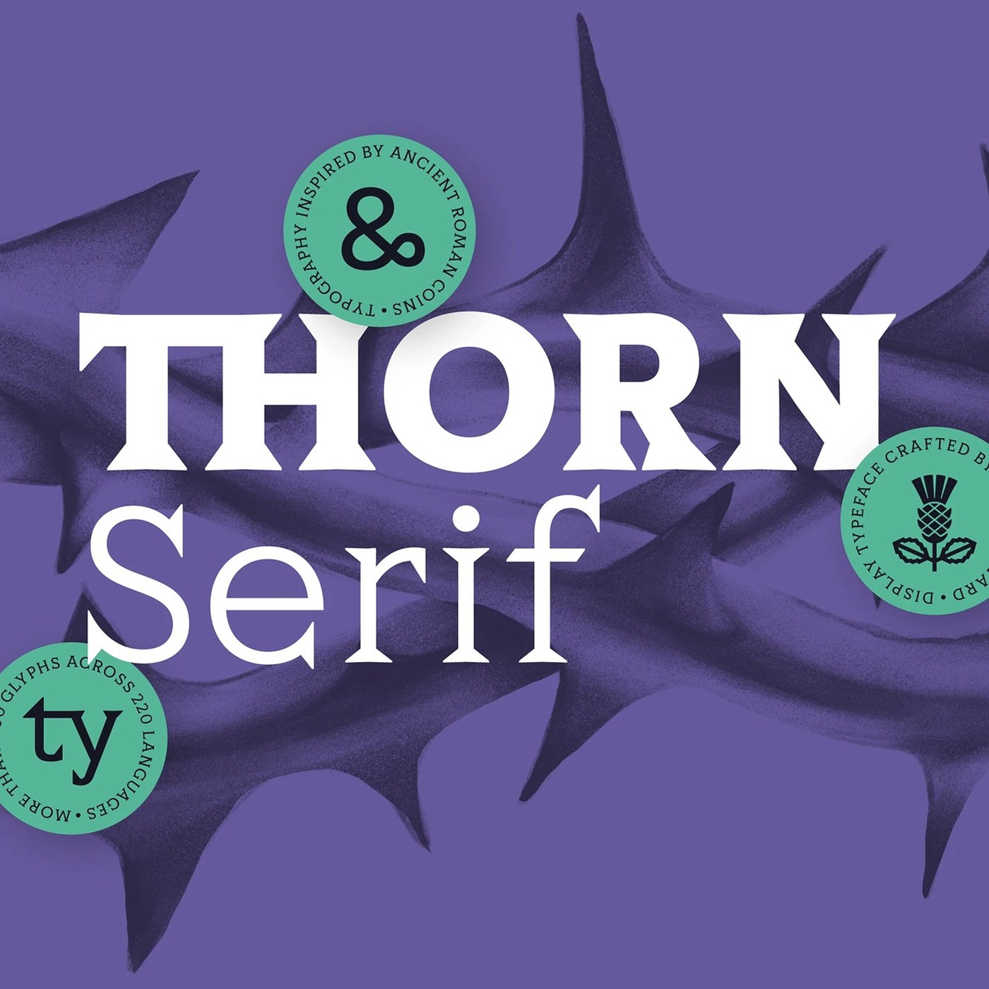
Thorn Serif Typography Design by Type Forward
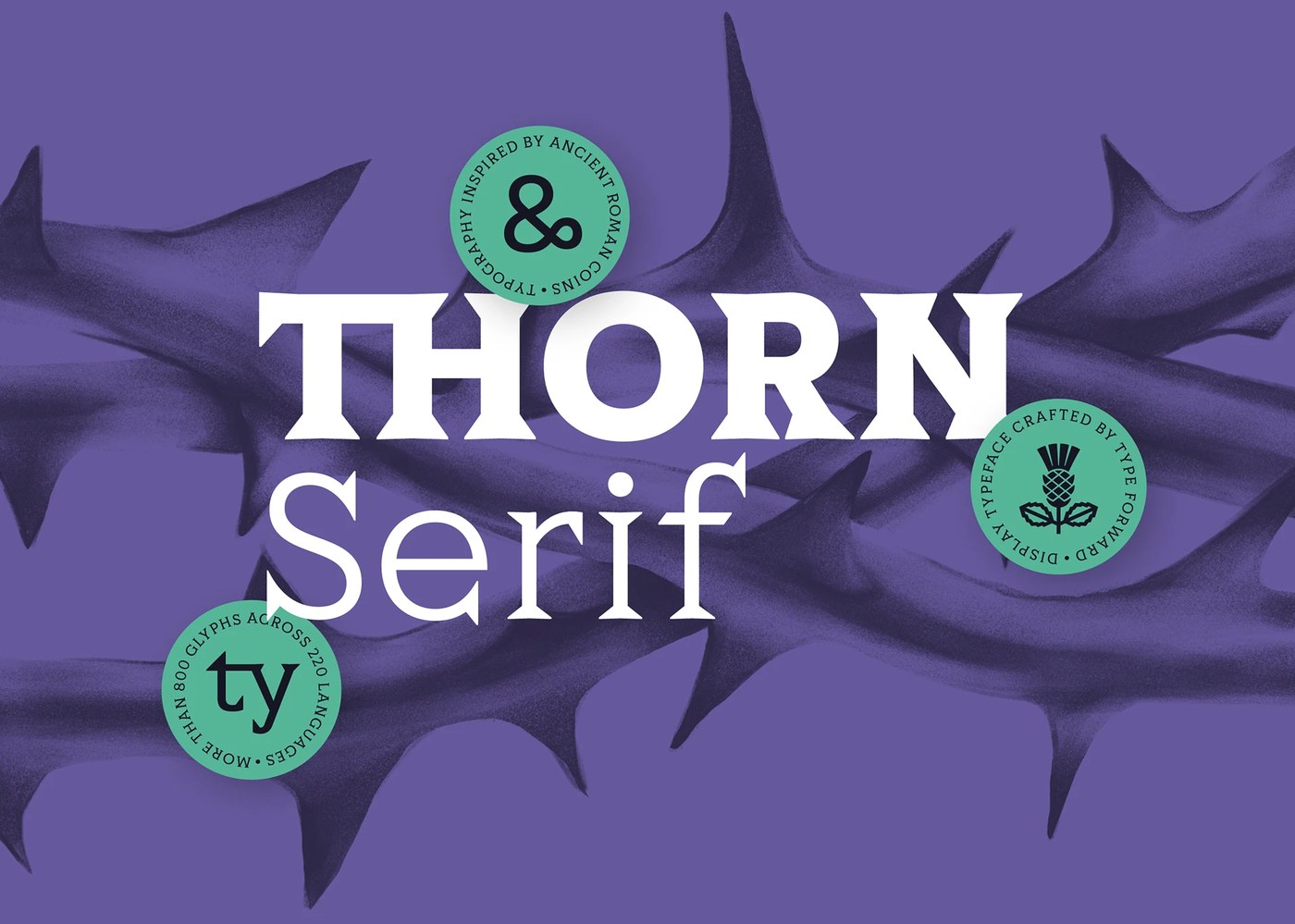
Type Forward explores classical Roman coinage with Thorn Serif, an eight-weight variable font family built for high-impact display typography.
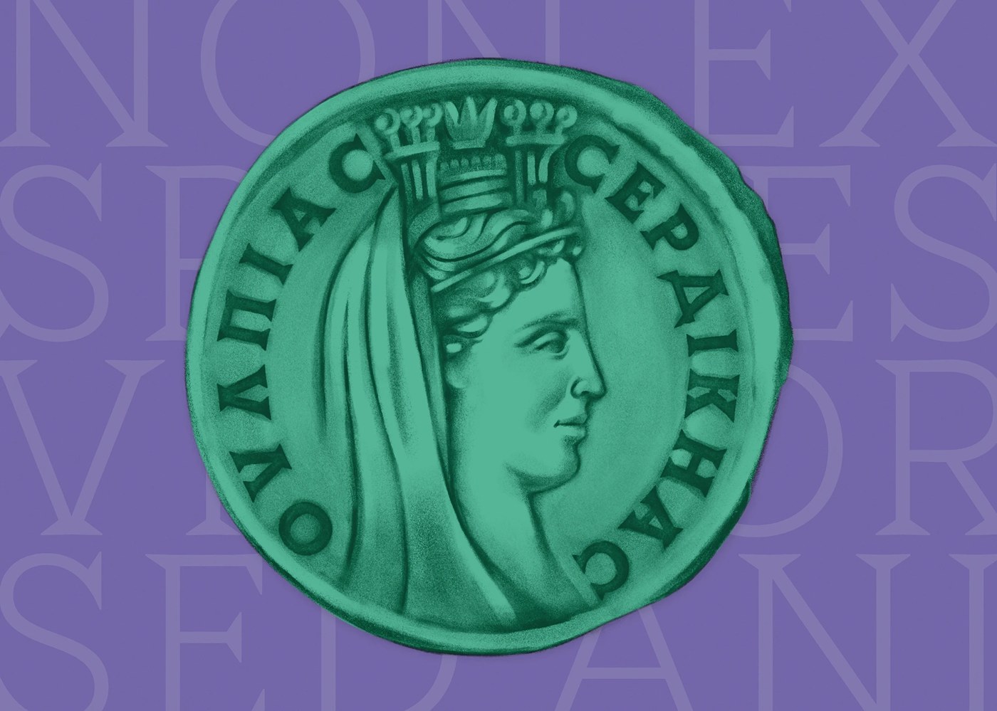
Designed by Type Forward with Stan Partalev and Mirela Belova, Thorn Serif draws its weight from ancient Roman coins. Deep purple backdrops meet bright mint green tones. Sharp thorn silhouettes frame the bold letterforms. The typeface drops delicate curves for rugged carved serifs. Each stroke feels struck by an iron punch. A high x-height pairs with compact ascenders. This grid choice locks words into tight display lines. Circular badges display thistle marks and Latin specimen notes. The glyphs hold immediate structural force. The resulting forms bring historical craft to modern editorial typography.
Ancient Numismatic Dies and Variable Typography
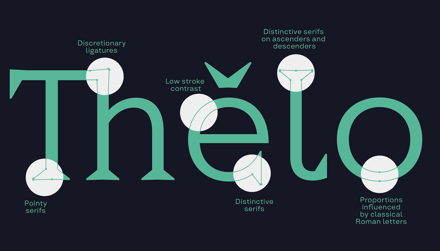
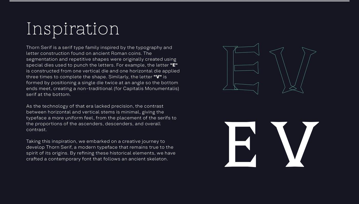
The letter construction reflects ancient coin minting. In early workshops, smiths hammered letterforms into metal blanks using iron dies. Letters like E were formed by striking one vertical bar and three horizontal punches. The letter V used two angled die hits that met at the base. This created a distinct triangular bottom serif. The letter l carries sharp terminals on both ascenders and descenders. Wide circular curves balance narrow stems. Thorn Serif translates these mechanical marks into digital typography. Minimal contrast between stems yields a solid stone-cut rhythm across the page.
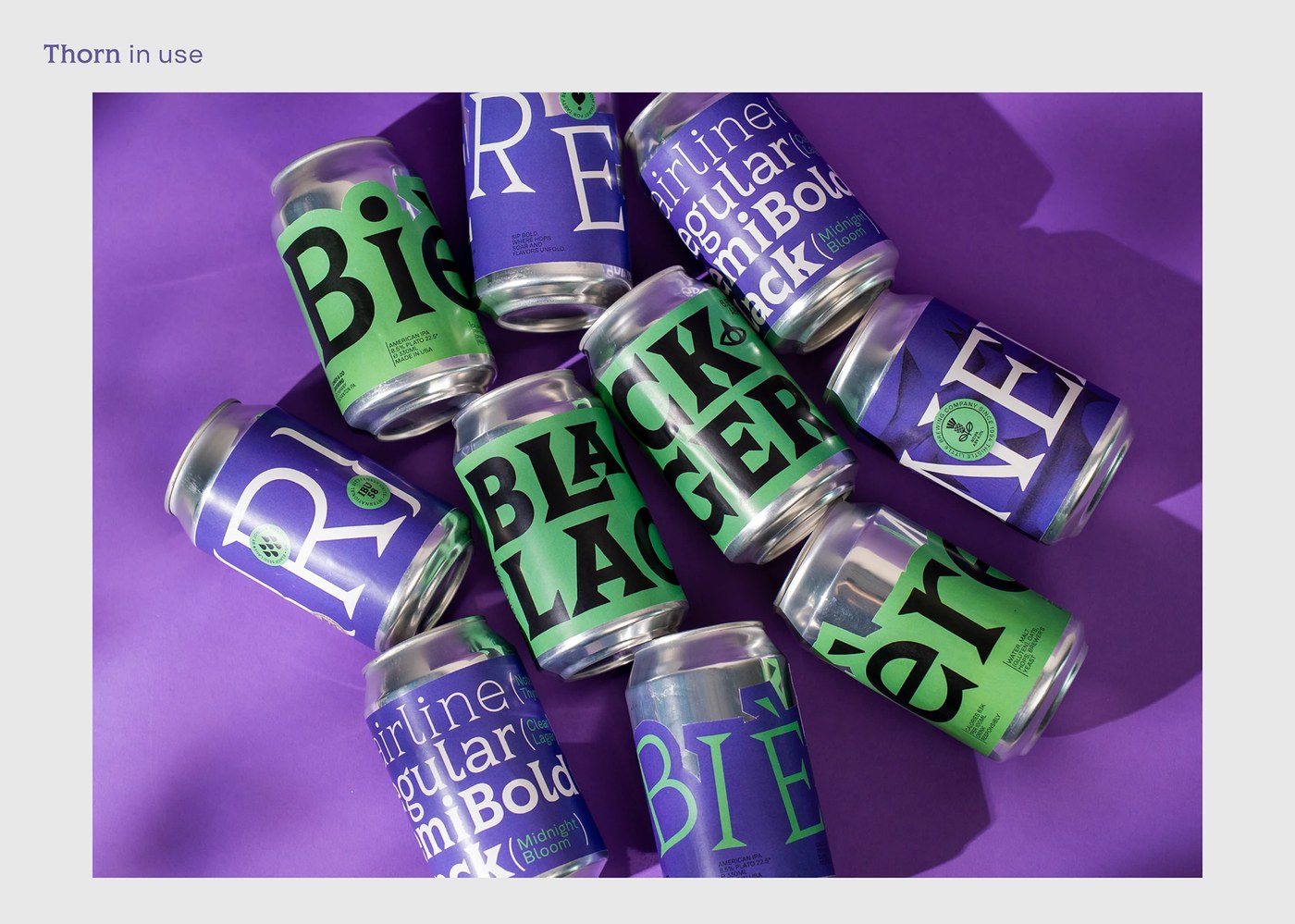
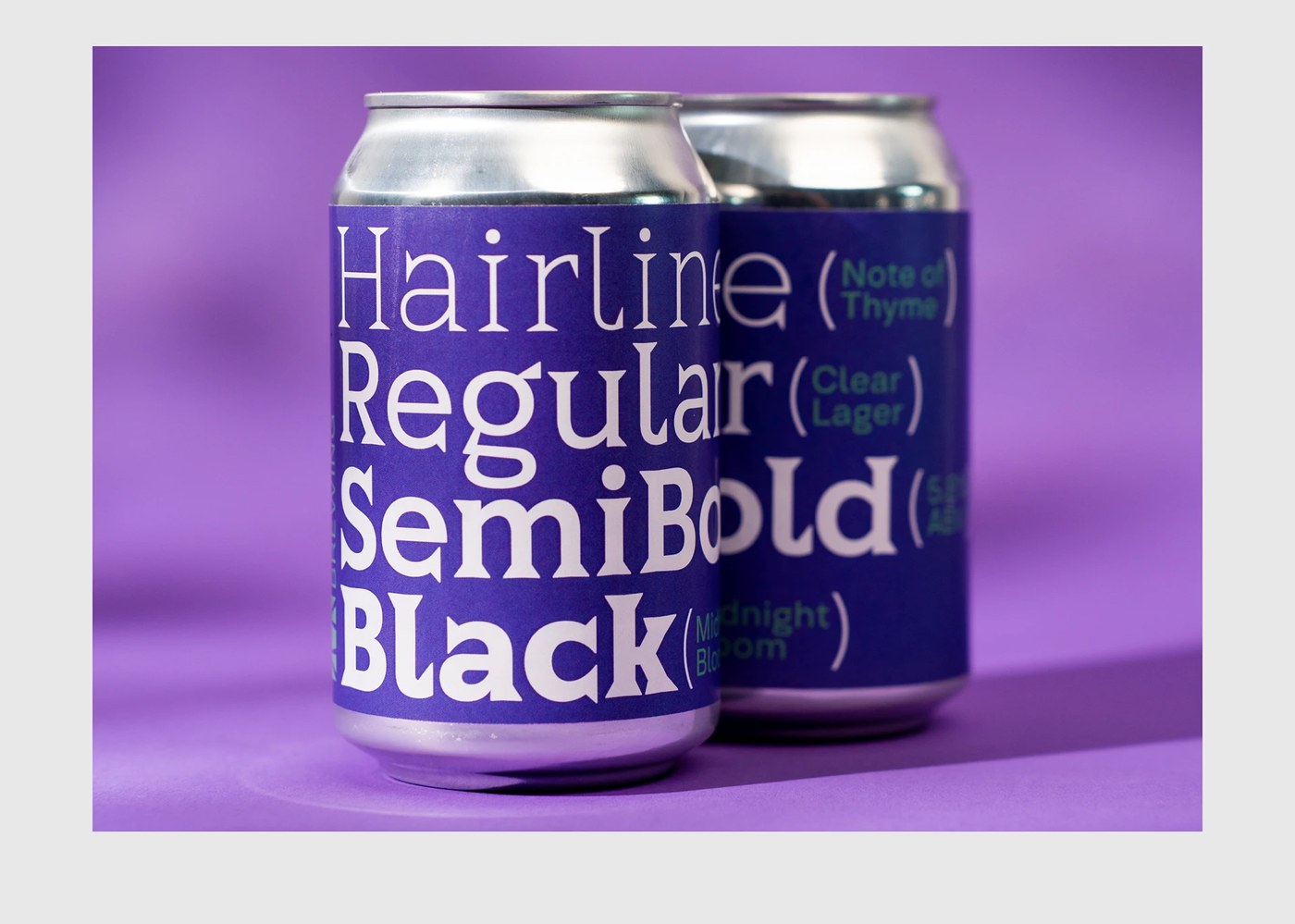
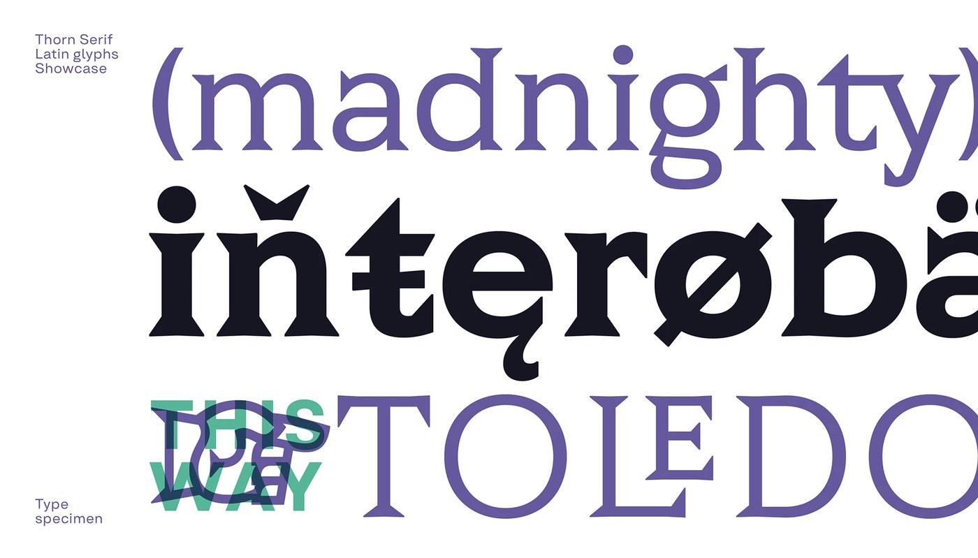
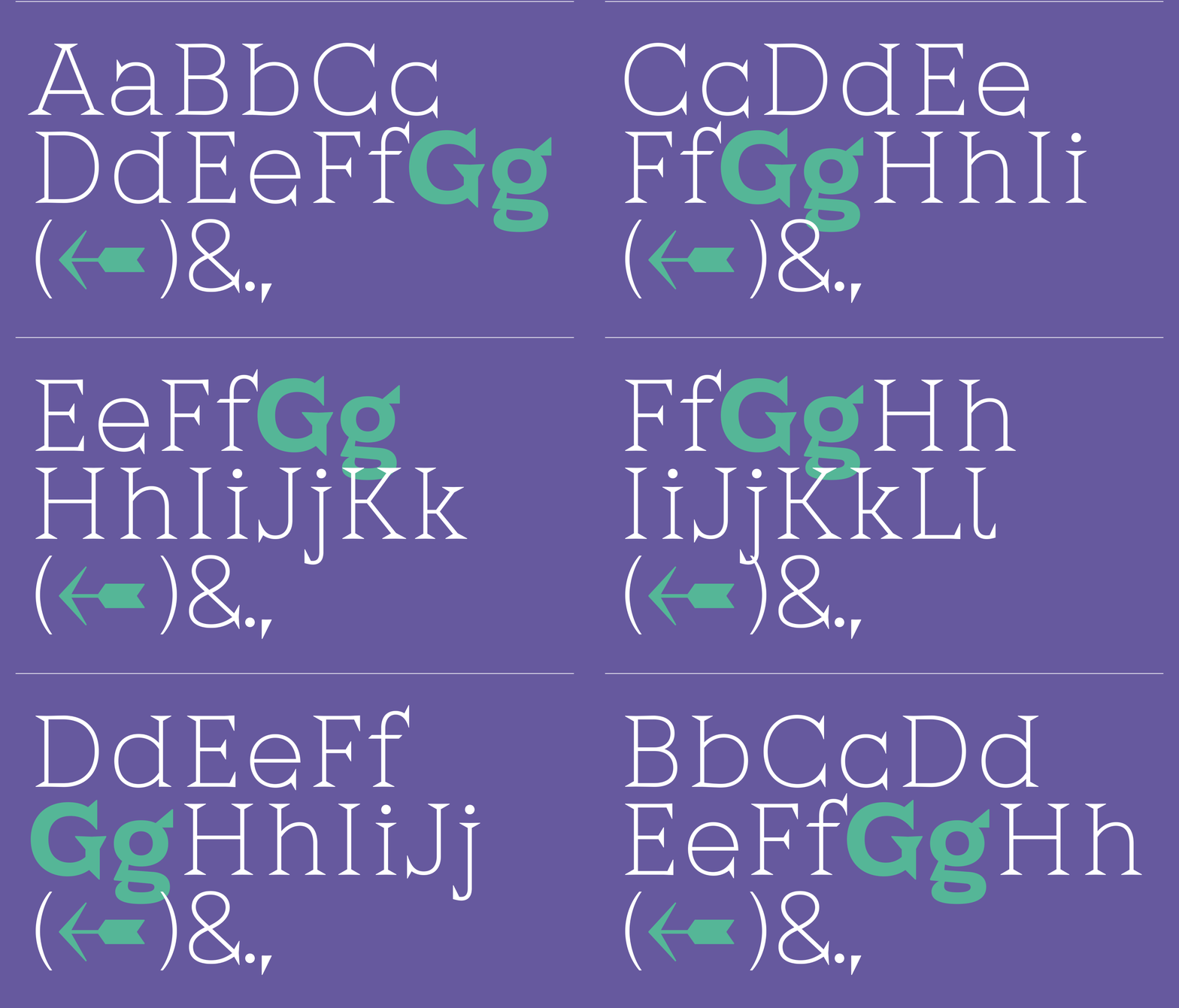
The family also works as a versatile production system. Eight calibrated weights range from sharp Hairline to monolithic Black. All weights live inside a single variable font file. The character set spans more than 800 glyphs across 220 languages. It includes discretionary ligatures, sharp accents, and tuned kerning pairs. Packaging specimens test this typographic flexibility on aluminum beverage cans. Condensed heavy styles anchor bold product titles on beer cans. Lighter cuts maintain crisp clarity on small labels. Type Forward proves that ancient material history can inform durable, functional typography across physical packaging and print media.
Explore the complete specimen and font weights on Type Forward.