Best of the Week: Structural Packaging and Swiss Grids
We gather the best of the week across packaging, branding, editorial design, and typography from ISO week 2026-W39, highlighting architectural forms and print craft.
This week’s editorial throughline investigates the tension between severe structural geometry and organic, tactile materiality. Across bespoke tinplate packaging, cold-set newsprint layouts, and predictive telemetry interfaces, designers rejected decorative excess in favor of modular discipline, physical depth, and deliberate craft.
Featured Design and Branding Picks
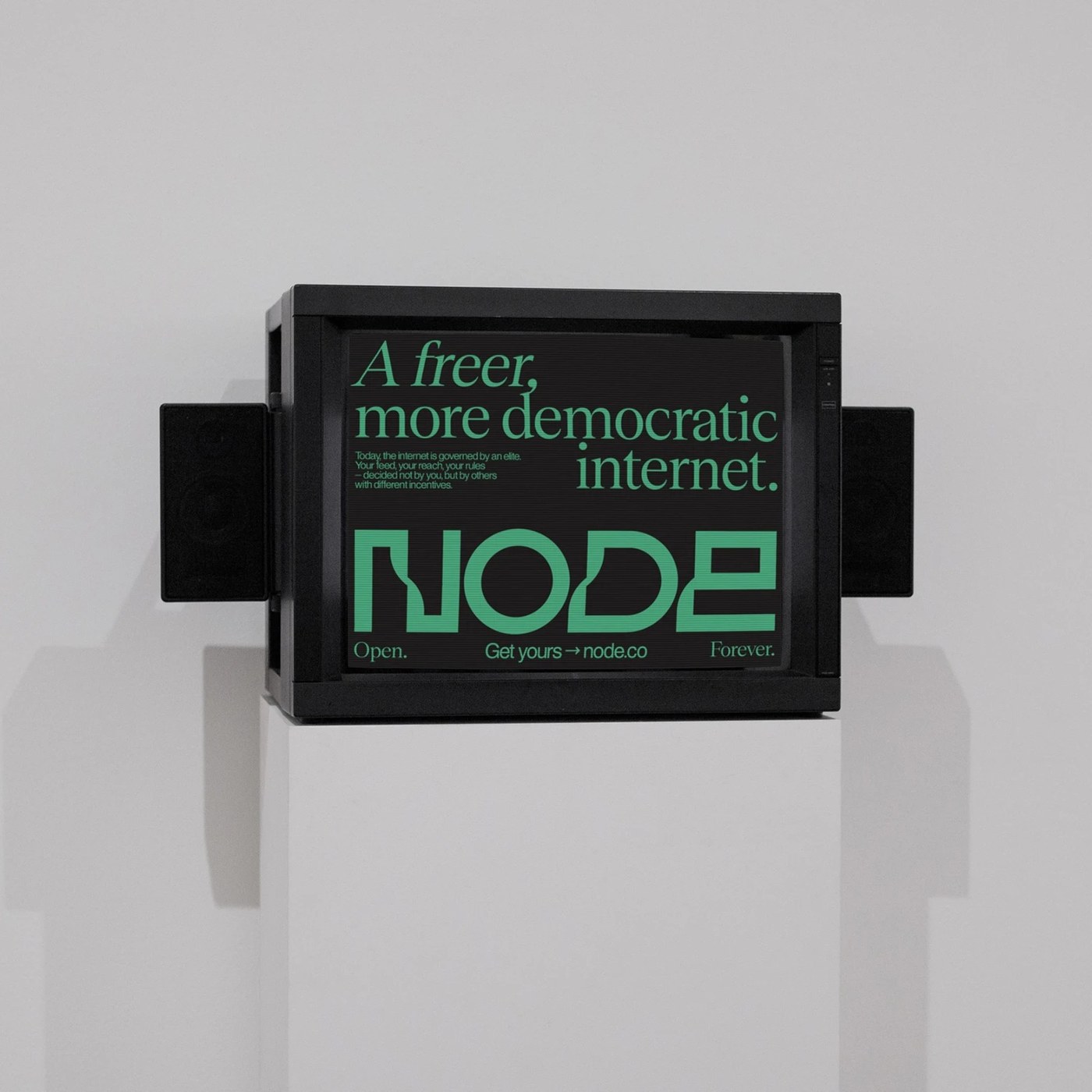
Node by Brand Brothers
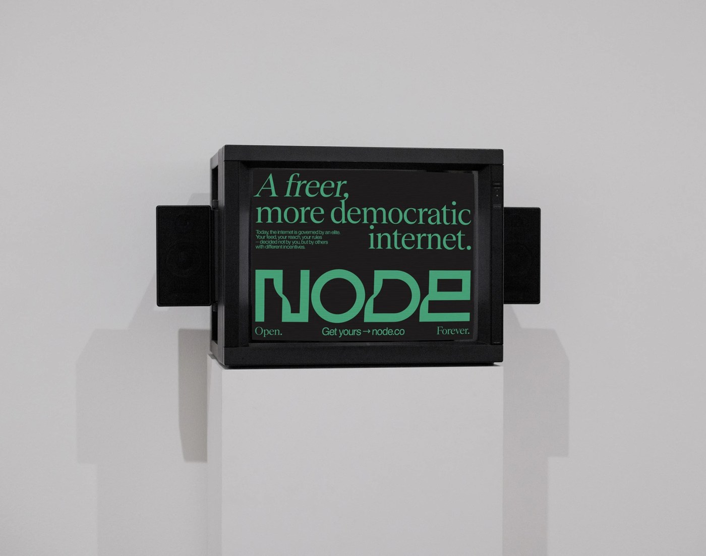
Parisian studio Brand Brothers engineered a modular visual identity for Node, a decentralized personal cloud and server infrastructure. The dynamic wordmark branches into an expandable typographic lattice that directly mirrors peer-to-peer data distribution across network nodes. Combined with stark monochrome restraint and tactile blind-embossed stationery, the system grounds complex digital sovereignty into an authoritative physical presence.
View Feature
Stereoscope Specialty Coffee Roaster by OlssønBarbieri
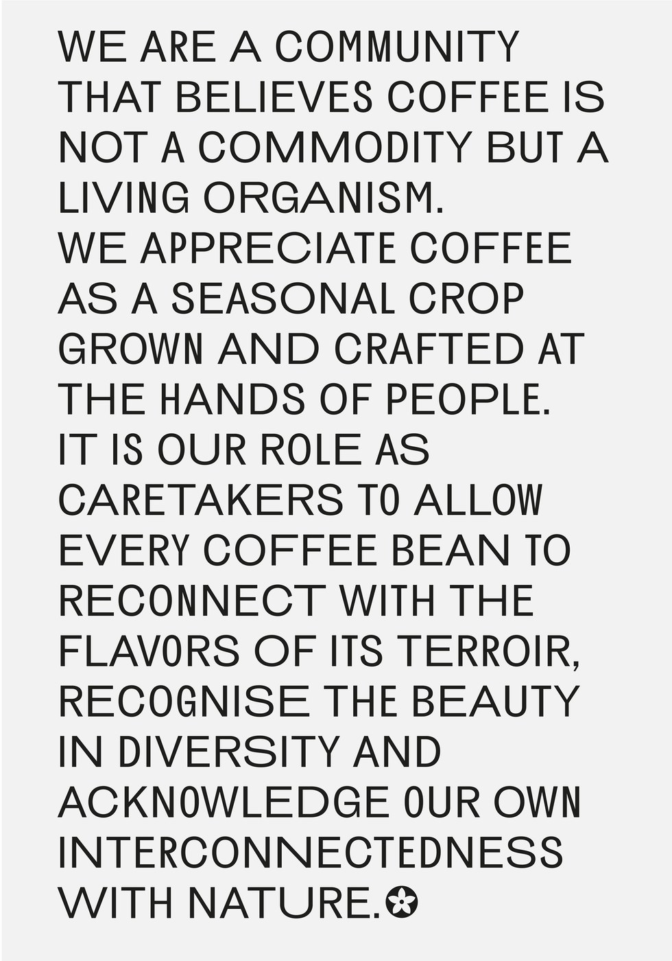
Oslo-based studio OlssønBarbieri developed a sculptural packaging architecture for Los Angeles roaster Stereoscope that translates Chinese cosmological philosophy into physical vessels. Custom cartons are die-cut and folded into angular topographies reminiscent of high-altitude mountain cultivation, accented by rounded hot foil stamping and Bagua trigram cutouts that frame origin details. The system pairs these tactile paperboard shells with five-width variable grotesque typography, treating specialty coffee packaging as an archival artifact.
View Feature
COMPAGNIE 3B (Presskit) by Florian Cornut
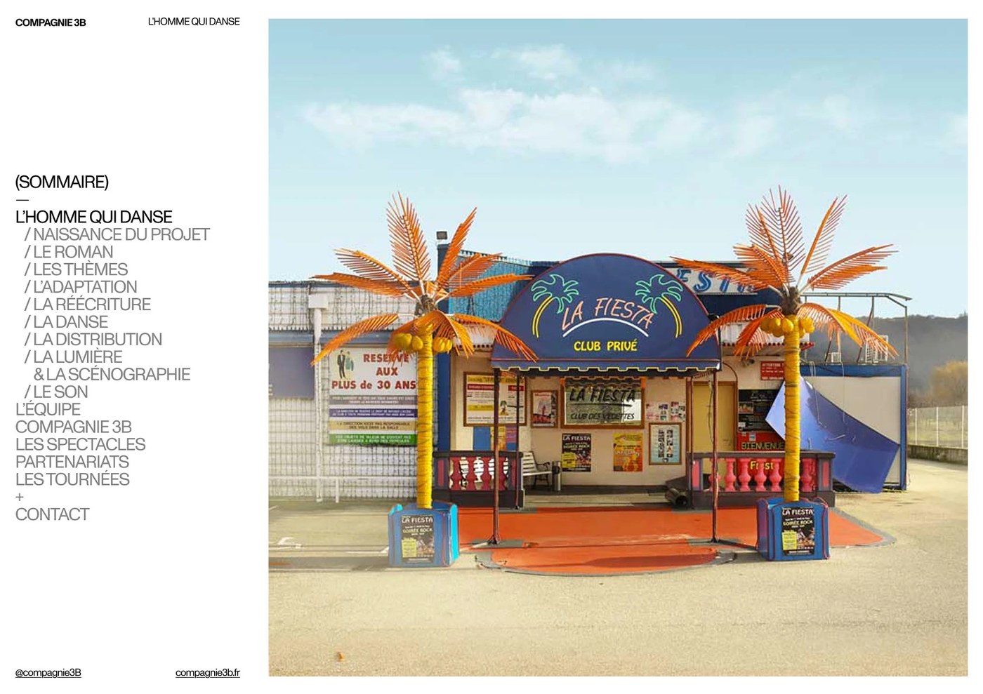
Florian Cornut applied uncompromising Swiss grid discipline to the performance dossier for French theatre collective Compagnie 3B. Setting Dinamo’s Monument Grotesk across strict asymmetrical column structures, the pagination balances dramatic live choreography photography against micro-scale technical production metadata. Printed on unvarnished heavy text stock, the publication demonstrates how rigorous editorial pacing shapes performing arts collateral.
View Feature
North of Normal by Molnár Péter
Austrian designer Molnár Péter crafted an alpine minimalist brand identity for creative collective North of Normal that balances extreme typographic restraint with tactile print finishes. An incised geometric logotype commands monumental negative space across blind-debossed letterheads, edge-painted duplex business cards, and custom workshop envelopes. The visual language extends into physical environments through frosted glass directional pylons and screenprinted studio broadsheets.
View Feature
QUARTER PAST NOON by SAVVY STUDIO
SAVVY STUDIO transformed culinary publishing into a collectible presentation suite enclosed within a bespoke linen-wrapped rigid box. The unboxing experience reveals three bound monographs, vellum overlays, custom envelopes, and forty-five loose recipe cards printed on heavy uncoated stock. Earthen culinary pigments and blind-debossed serif typography establish a quiet dialogue between gastronomic literature and collectible archival design.
View Feature
Formula Condensed Typeface by Pangram Pangram®
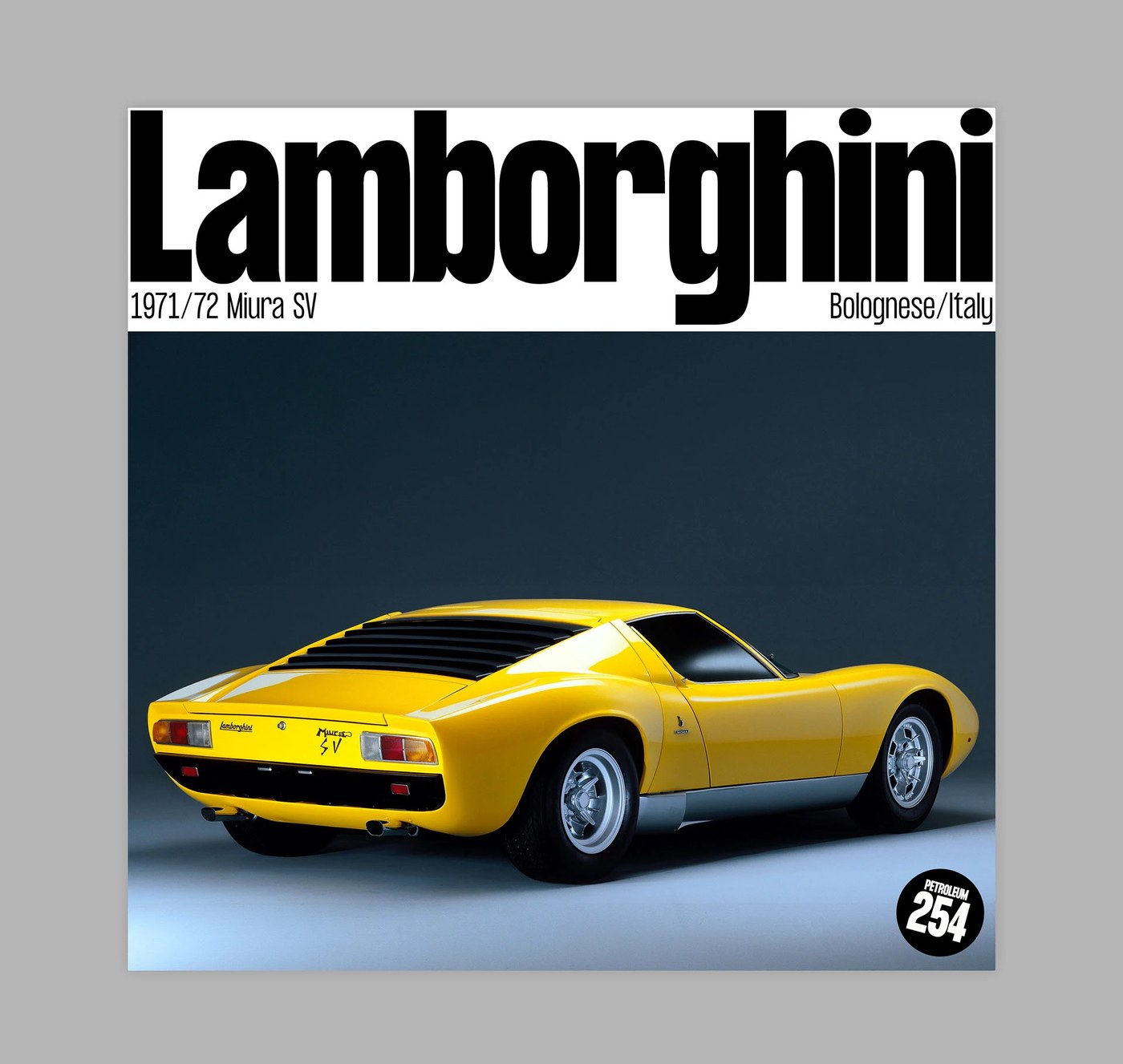
Pangram Pangram’s Formula Condensed explores the outer limits of horizontal letterform compression while preserving mechanical precision across large-scale display formats. The grotesque typeface introduces unexpected typographic tension by pairing ultra-dense condensed letterforms with dramatically extended alternate uppercase glyphs. Its aggressive proportions and deep ink-traps deliver immediate authority across automotive editorial posters and dense specimen sheets.
View Feature
dose by Sungsik Kim
Seoul-based designer Sungsik Kim conceived dose, an interface and digital companion ecosystem paired with an automated precision coffee maker. The digital experience centers on real-time pharmacokinetic caffeine curve telemetry, tracking metabolic decay through a refined dot-matrix visual language. Warm off-white canvases, deep charcoal type, and luminous electric orange accents establish an elevated aesthetic that bridges medical telemetry with domestic wellness.
View Feature
ADAM PENDLETON by SAVVY STUDIO
For contemporary artist Adam Pendleton’s studio monograph, SAVVY STUDIO engineered a layout framework inspired by Toshi Ichiyanagi’s 1960s IBM punch-card musical notations. The editorial grid breaks traditional margins to position body copy along the spine and outer edges, creating dynamic spatial tension around full-bleed monochrome artwork reproductions. Open lay-flat binding and stark monochrome contrast reinforce the artist’s inquiry into Fluxus poetry and conceptual abstraction.
View Feature
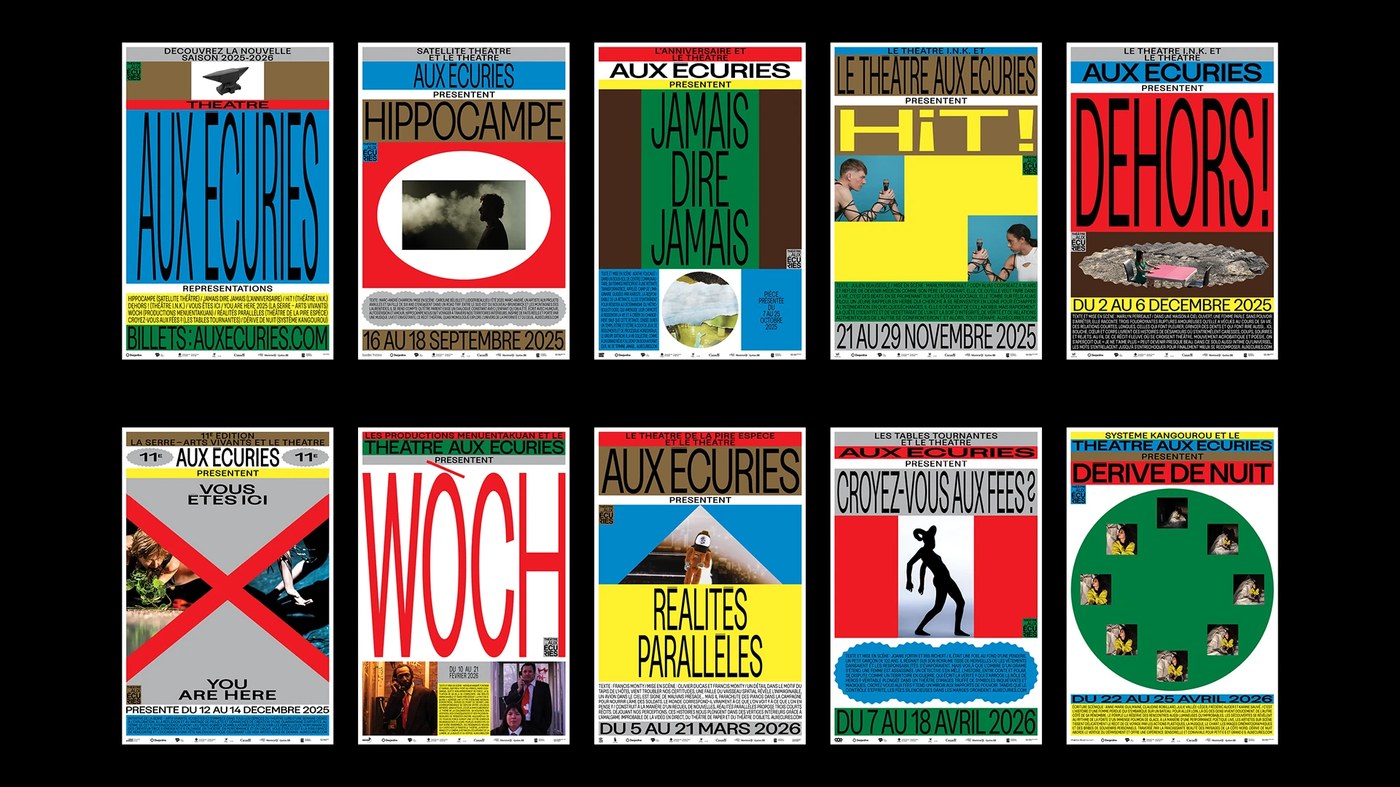
Théâtre Aux Écuries (2025–26 Season) by Paprika Design
Montreal design powerhouse Paprika Design developed an extensive, multidisciplinary campaign identity for creative hub Théâtre Aux Écuries. The identity anchors monumental typographic scale contrasts, expressive character framing, and modular grid layouts across street posters, transit displays, and educational print brochures. The work illustrates how municipal cultural institutions can command public attention through sophisticated color blocking and unapologetic typographic scale.
View Project
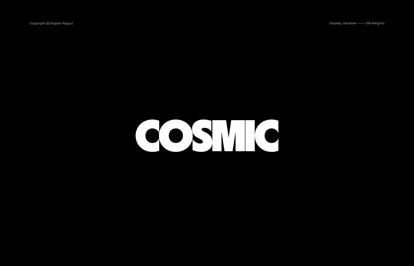
Cosmic Typeface by Rajesh Rajput
Rajesh Rajput introduced Cosmic, a display sans-serif engineered across nine distinct weights alongside a continuous variable font axis. Characterized by crisp geometry, open counter spaces, and subtly flared terminals, the typeface balances technical precision with editorial warmth. The accompanying specimen compositions demonstrate its range from delicate hairline weights in luxury branding to ultra-dense black display settings in brutalist print posters.
View Project
Halo Brewery by Underline Studio
Toronto studio Underline created an adventurous visual identity and packaging system for craft beer pioneer Halo Brewery. Departing from standard craft beverage conventions, the studio deployed geometric patterns in unconventional chromatic pairings across labels, secondary packs, and taproom collateral. The system pairs tactile uncoated can wraps with crisp sans-serif typography, establishing an energetic visual rhythm that matches the brewery’s experimental recipes.
View Project
Next week, we turn our attention to experimental digital design systems and tactile spatial wayfinding, exploring how reactive typographic engines and physical environments converse across modern brand experiences.
For more inspiration check out our curated selections on Abduzeedo.