Aira: Inside Kurppa Hosk's Clean Energy Visual Identity
Kurppa Hosk crafts a warm Nordic visual identity, naming strategy, and hardware design system for European clean energy-tech challenger Aira.
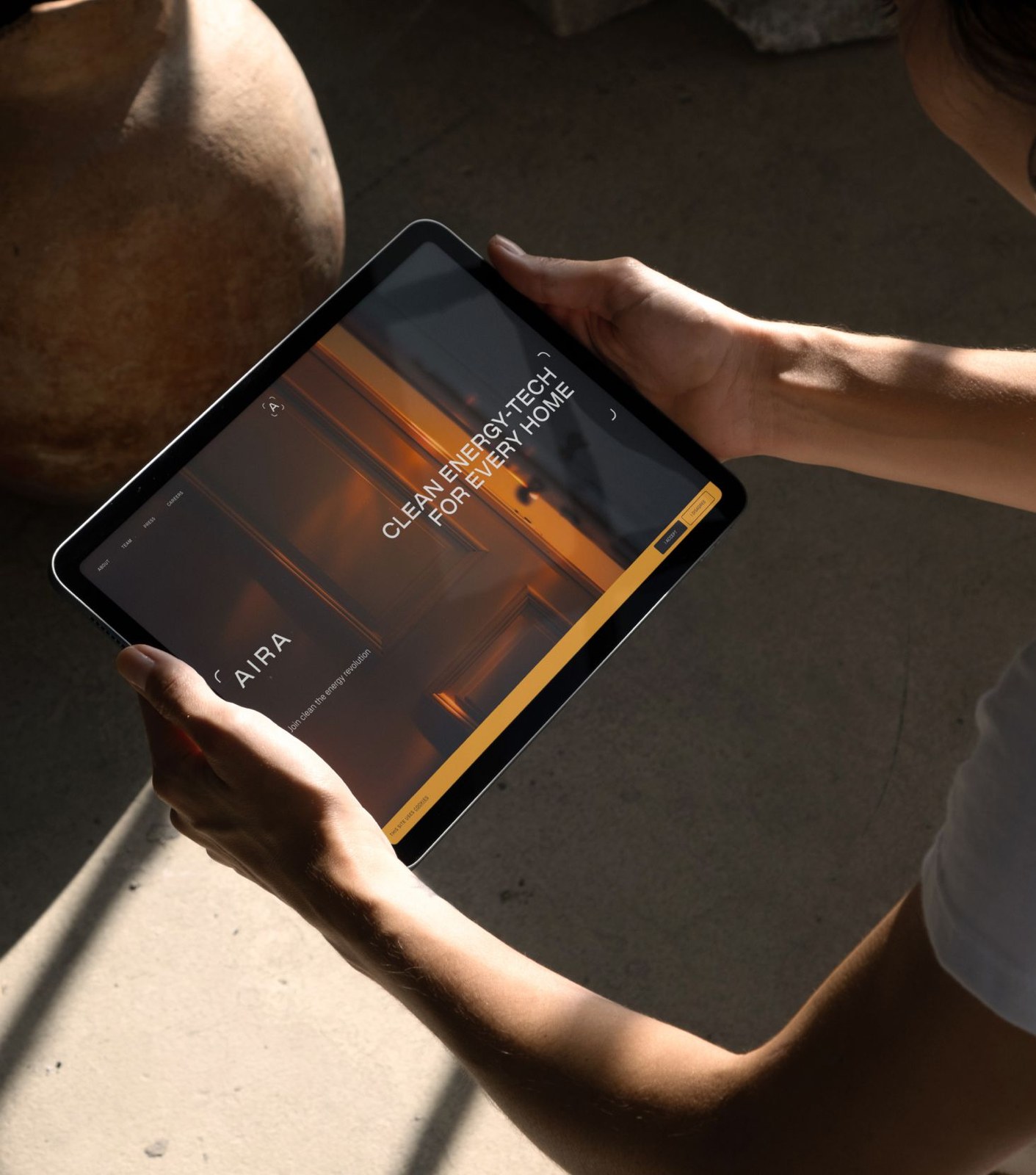
Residential heating accounts for fifteen percent of all carbon emissions across Europe. The heat pump technology needed to fix that problem already exists, yet household adoption outside Scandinavia lags behind because the category looks and talks like cold plumbing engineering. Stockholm agency Kurppa Hosk built Aira from the ground up to change that perception, handling brand strategy, naming, tone of voice, and the complete visual identity. It's a sharp strategic pivot. Heat pumps aren't pitched as basement utility boxes here. Kurppa Hosk frames Aira as an approachable home comfort brand rooted in Nordic simplicity, helping the company launch across three European markets and secure $195 million in impact investor funding.
Nordic Warmth in Clean Energy Visual Identity
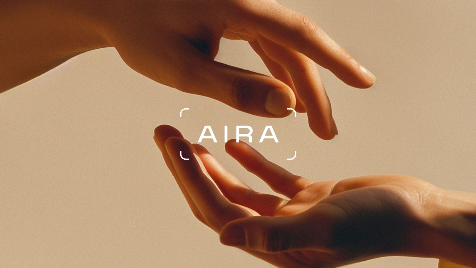
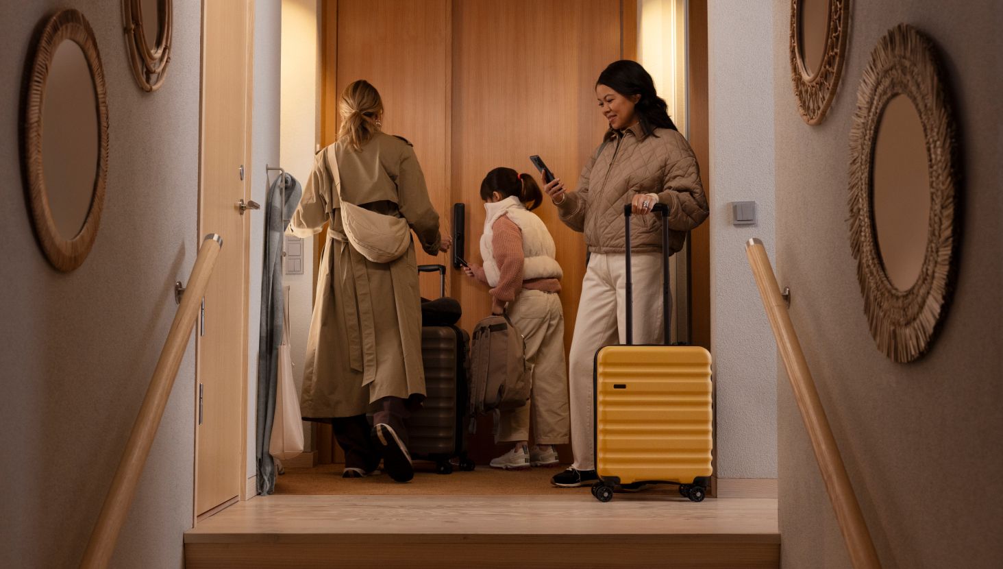
Most green-tech startups default to clinical leaf icons or harsh neon gradients. Aira goes for domestic warmth instead. The typographic system pairs a custom-crafted wordmark with clean sans-serif headlines that hold generous margins across digital layouts in Figma and printed homeowner guides set in InDesign. Soft thermal color transitions and warm natural daylight in AndFriends' lifestyle photography make the brand feel like part of a living room. The type does the heavy lifting. Every layout locks into a disciplined Scandinavian grid that strips away technical jargon so homeowners can understand energy savings at a glance.
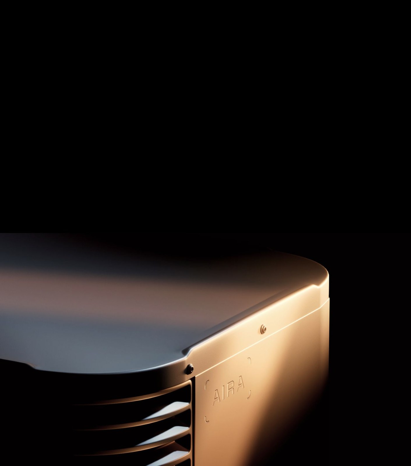
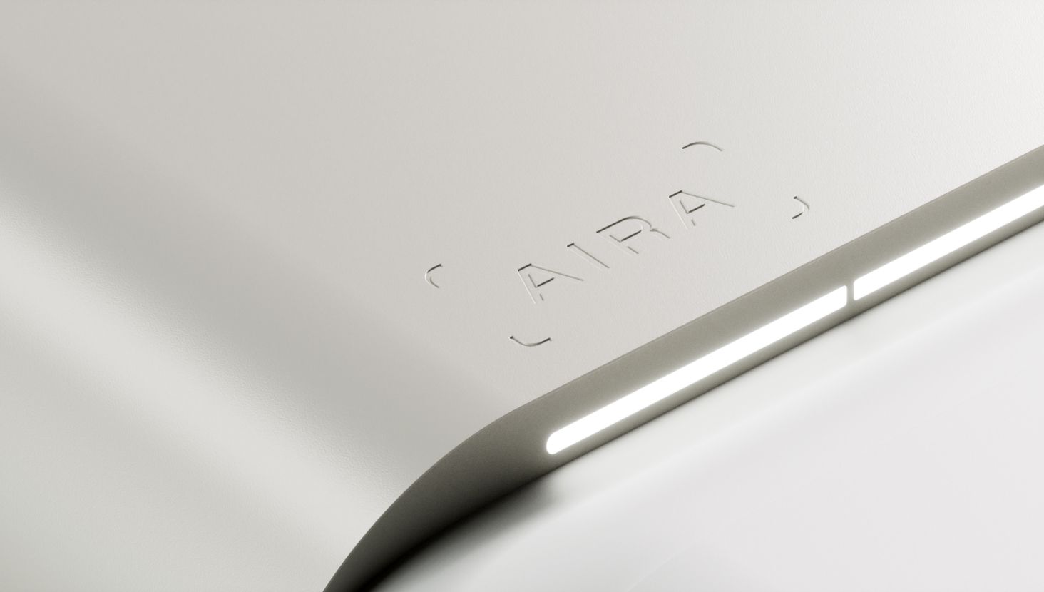
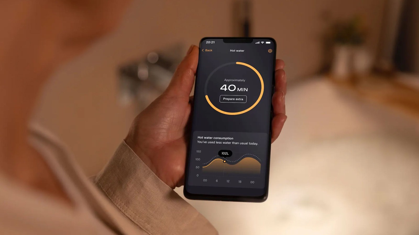
Hardware is where a clean energy visual identity usually falls apart. When an outdoor heat pump unit sits bolted to a brick facade, bad industrial styling ruins the brand promise immediately. Working alongside CGI studio Found, the team carried the same understated geometric restraint onto the physical outdoor casing, service vans, installer workwear, and mobile app telemetry. Nothing in the grid feels forced. By connecting industrial product surfaces with calm editorial typography, Kurppa Hosk turns a misunderstood Scandinavian heating technology into a confident European challenger brand.
See the full project by Kurppa Hosk on Kurppa Hosk.