Brand Identity: Setenet by Estúdio Reven
Estúdio Reven developed the brand identity for Setenet, translating mission-critical enterprise internet infrastructure into a disciplined graphic language.
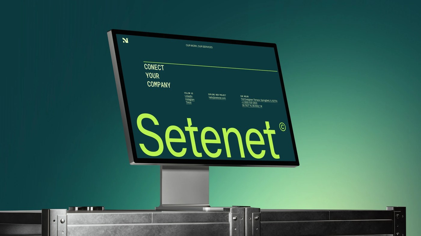
Most telecom companies lean on tired industry clichés: ethereal globe lines, glowing blue fiber swooshes, and smiling call center stock photography. Brazilian design practice Estúdio Reven discarded these tropes entirely when shaping the visual system for Setenet. Operating in the invisible realm of high-capacity data transport, Setenet provides dedicated internet infrastructure, 24/7 technical monitoring, and 99.97% uptime guarantees to enterprise IT directors and CTOs. At this scale, every minute of unexpected downtime carries real financial consequences. The brand required an identity that projected absolute structural stability, precision engineering, and utilitarian authority from client pitch decks to field technicians gear.
Chromatic Tension and Optical Precision
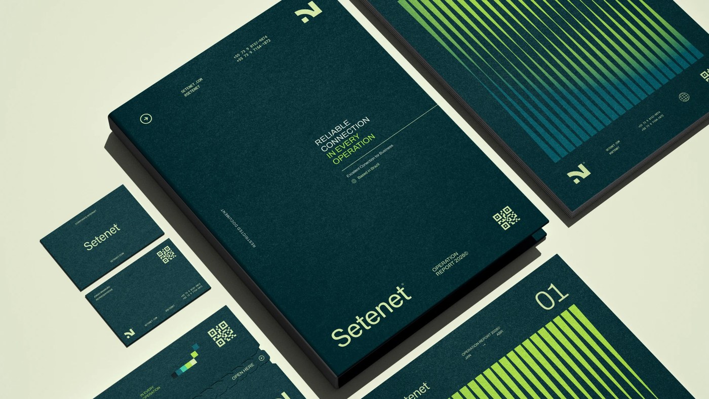
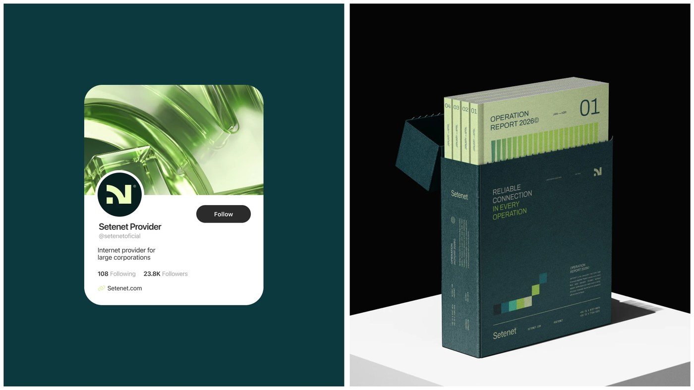
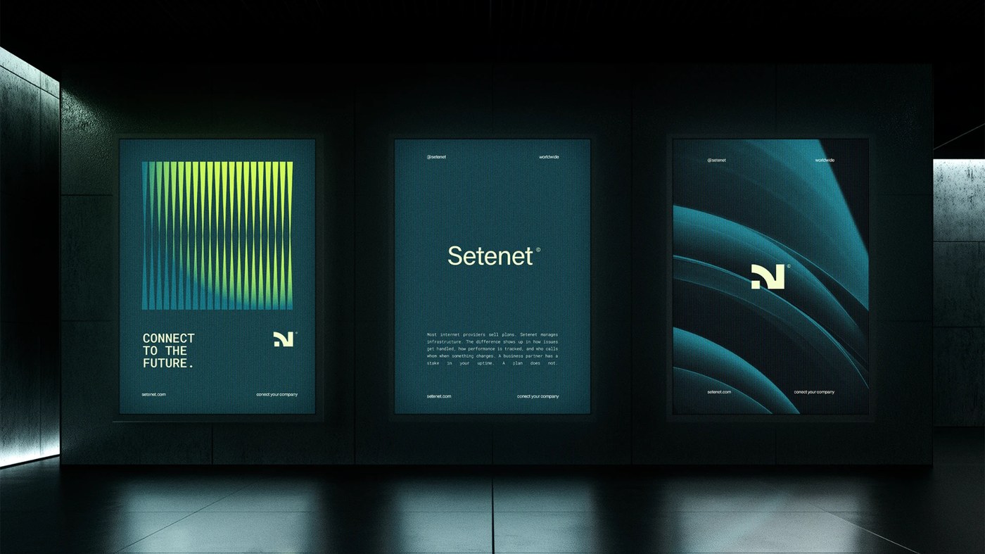
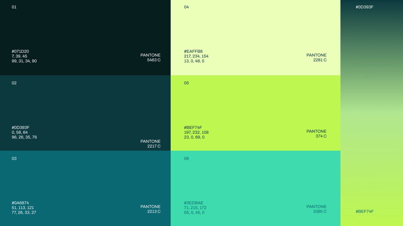
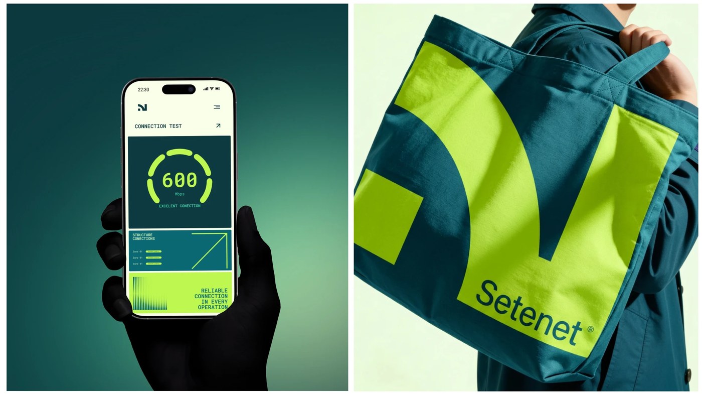
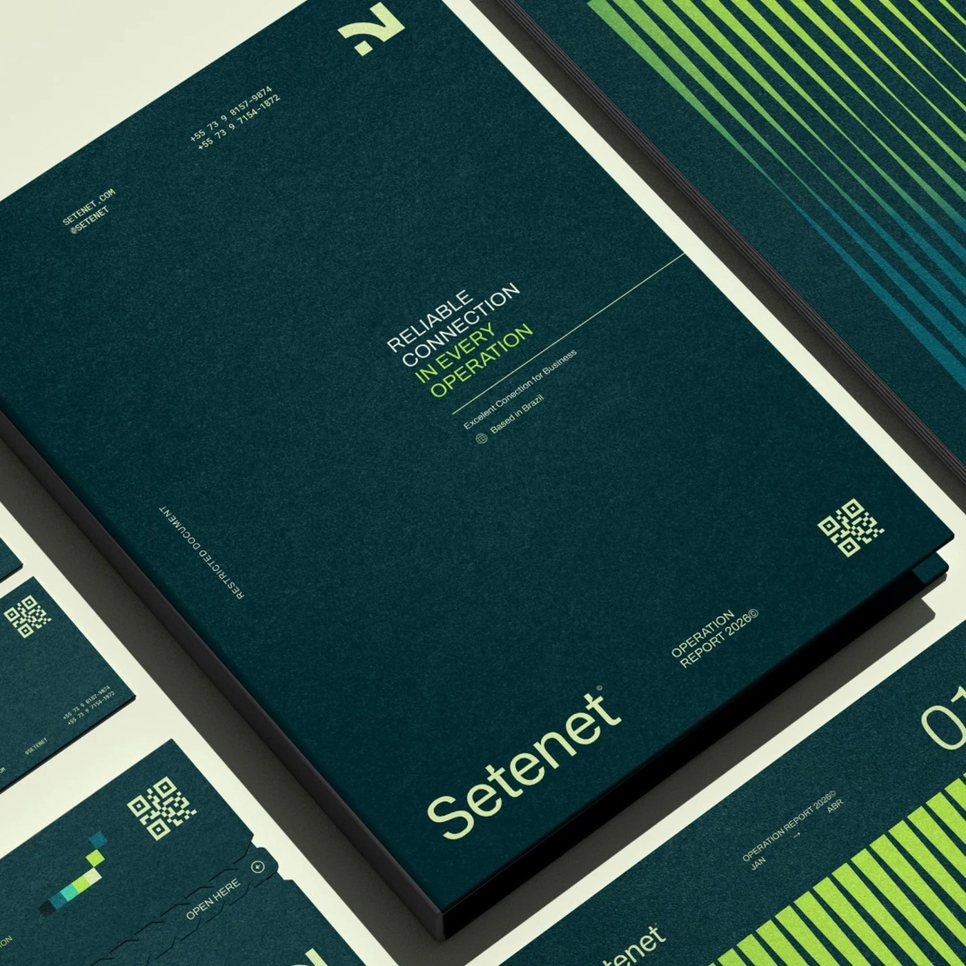
The visual foundation relies on deliberate chromatic tension. Estúdio Reven anchored the corporate palette in deep spruce and petrol teals (Pantone 5463 C and 2217 C), evoking subterranean server vaults and shielded cable conduits. Against this dense ground, electric lime and chartreuse accents (Pantone 374 C and 2281 C) ignite as high-visibility signaling markers. The custom monogram fuses an angled geometric N and numeral 7, constructing a kinetic emblem of routing pathways. Complementing the logomark, a family of vertical optical frequency bars expands across printed and digital surfaces, visualizing unbroken data throughput without signal degradation.
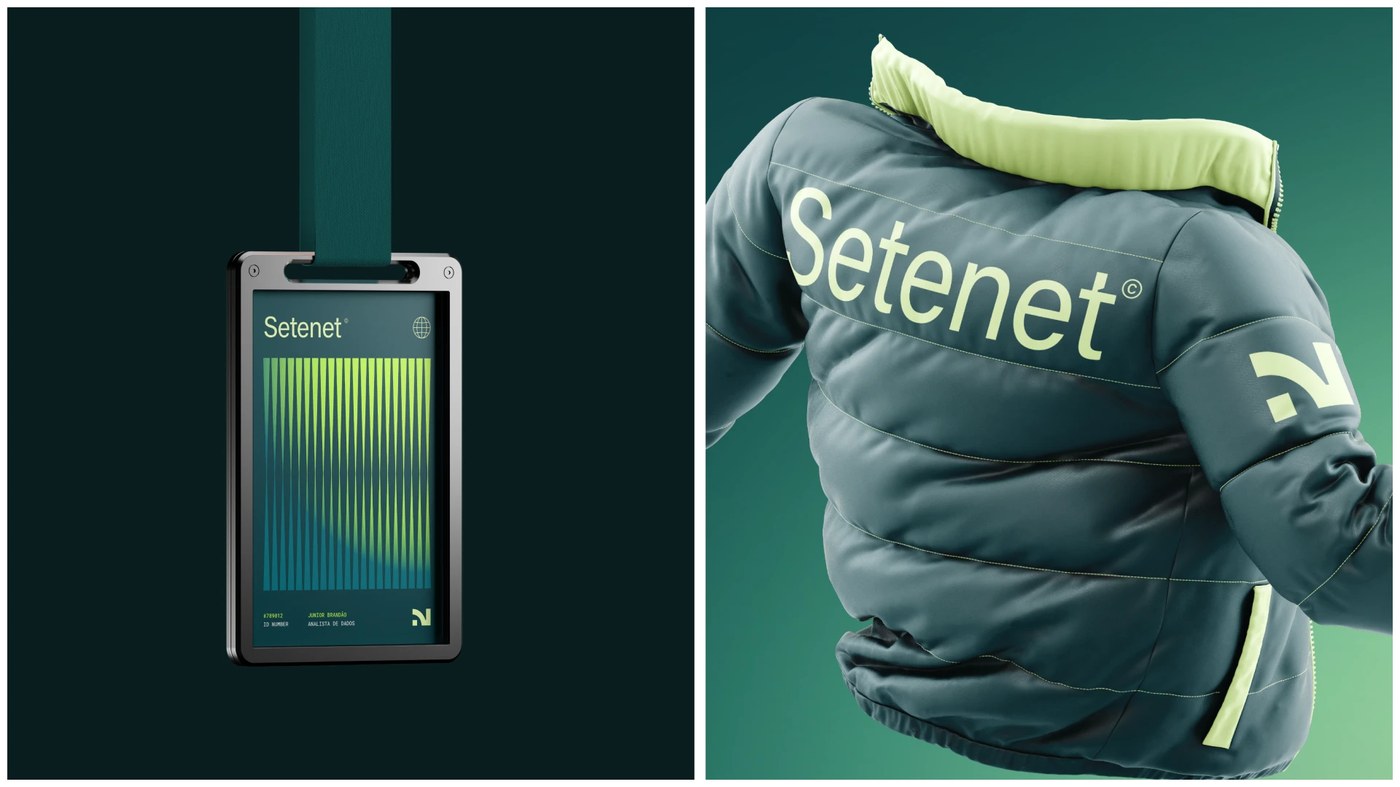
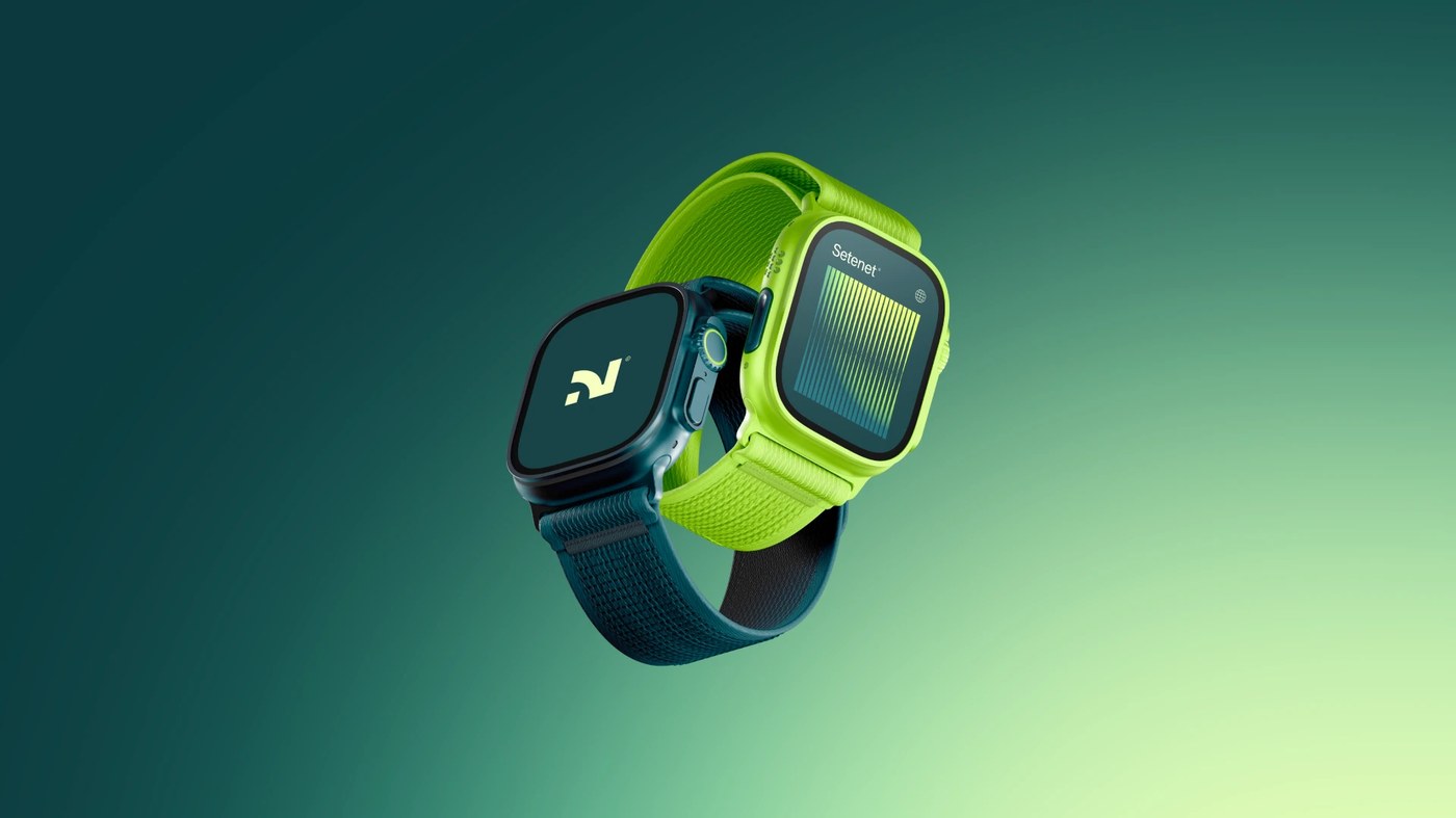
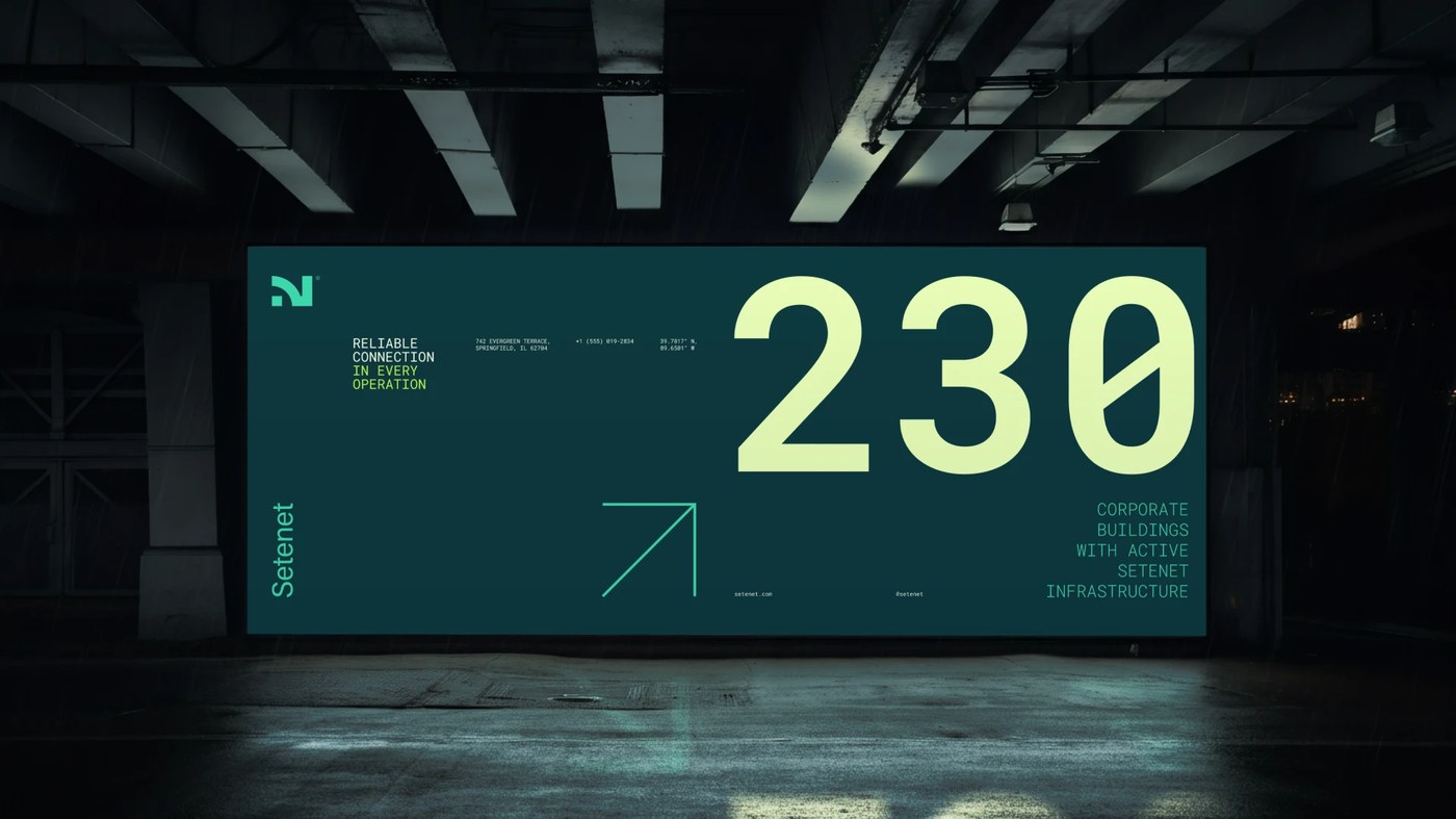
This systematic rigor carries across tactile physical collateral and everyday operational touchpoints. Hardcover operations binders, quarterly documentation boxes, and edge-printed business cards feature blind debossing and precision micro-typography. Each document folder uses dense unvarnished paper stock that feels substantial in hand during high-stakes executive negotiations. Utilitarian field gear—from heavy-duty puffer jackets with contrast neon collars to laser-etched metal security lanyards—gives network technicians a distinct, professional presence on site. Digital speed telemetry on Apple Watch Ultra displays and large-scale subterranean transit billboards prove how the identity scales across every corporate tier.
See the full project by Estúdio Reven on Behance.