Typography Design: Bob's Display Typeface by Plau Design
Plau Design shaped the typography design for Bob's Display. The bold retail font turns classic fast-food curves into five weights.
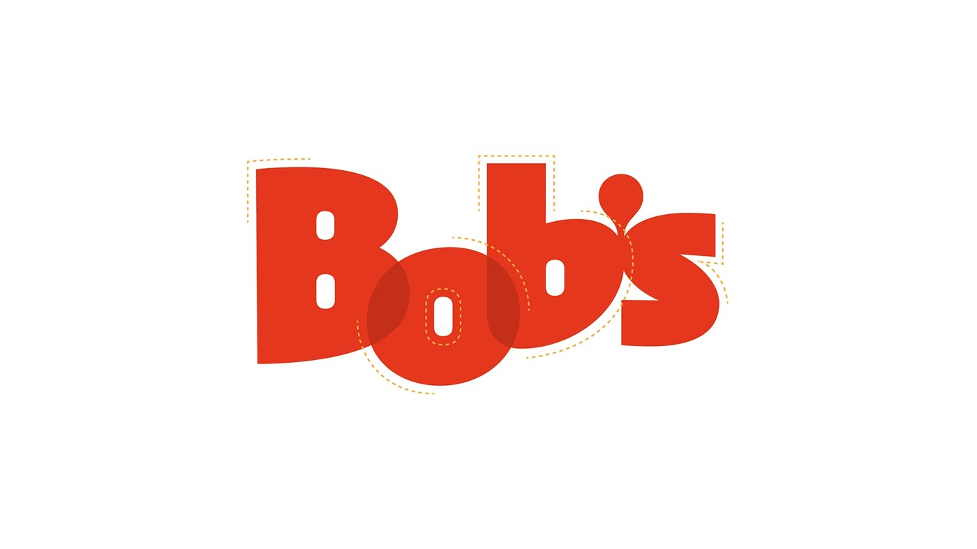
Bob's opened in 1952 as Brazil's first fast-food chain. The brand has more than one thousand stores across the country. Its curved logo and milkshakes shaped Brazilian food culture. Ad agency Artplan invited Rio studio Plau Design to craft a new font. Carlos Mignot, Lu Leitenperger, and Rodrigo Saiani led the type team. They turned the friendly spirit of the diner into a custom display family. The letters carry the warm mood of classic roadside signs. This fresh typography design brings rich fast-food history to modern life. Every letter shares the fun energy of the iconic burger chain.
Bob's Display Typography Design and Details
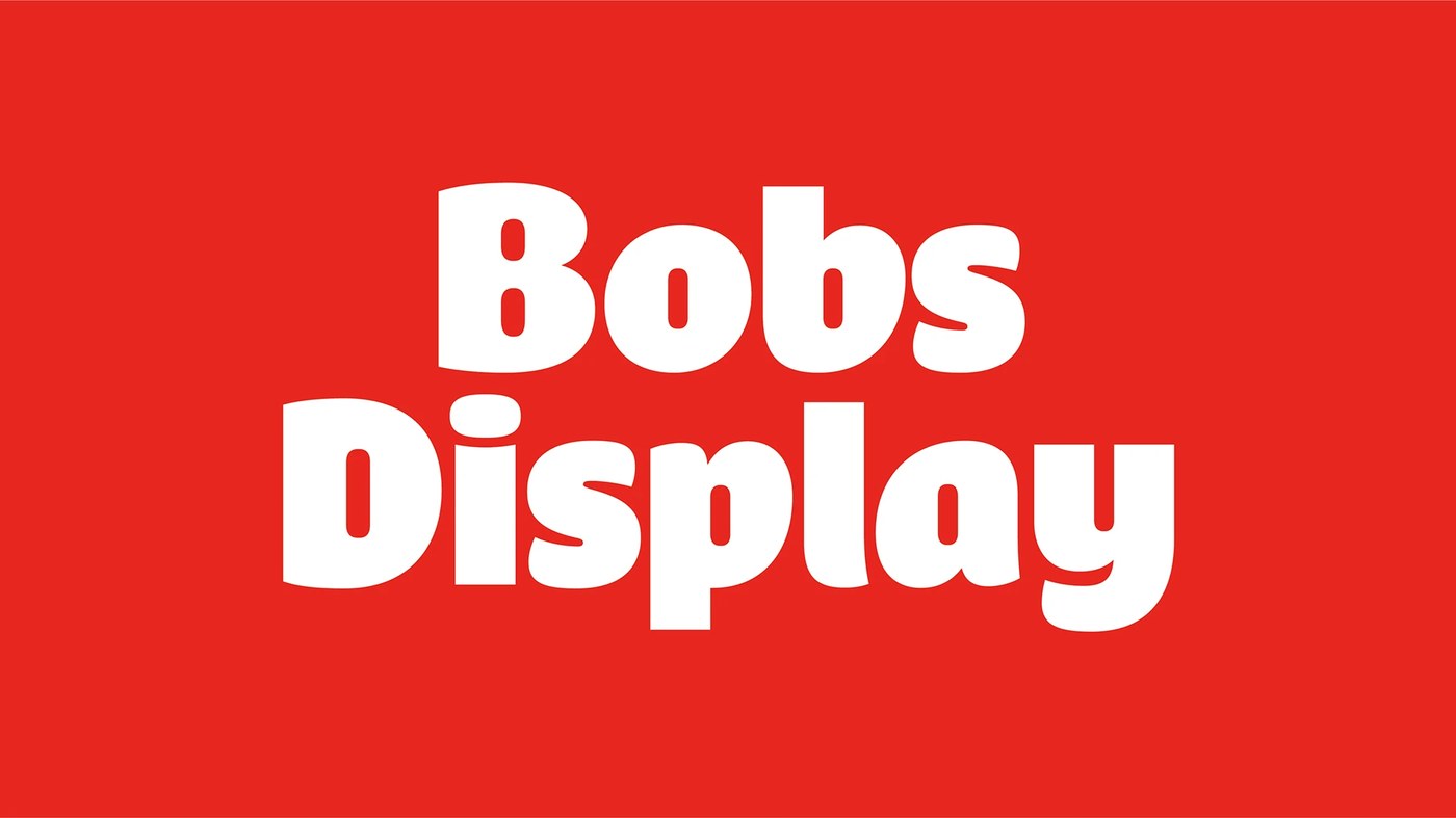
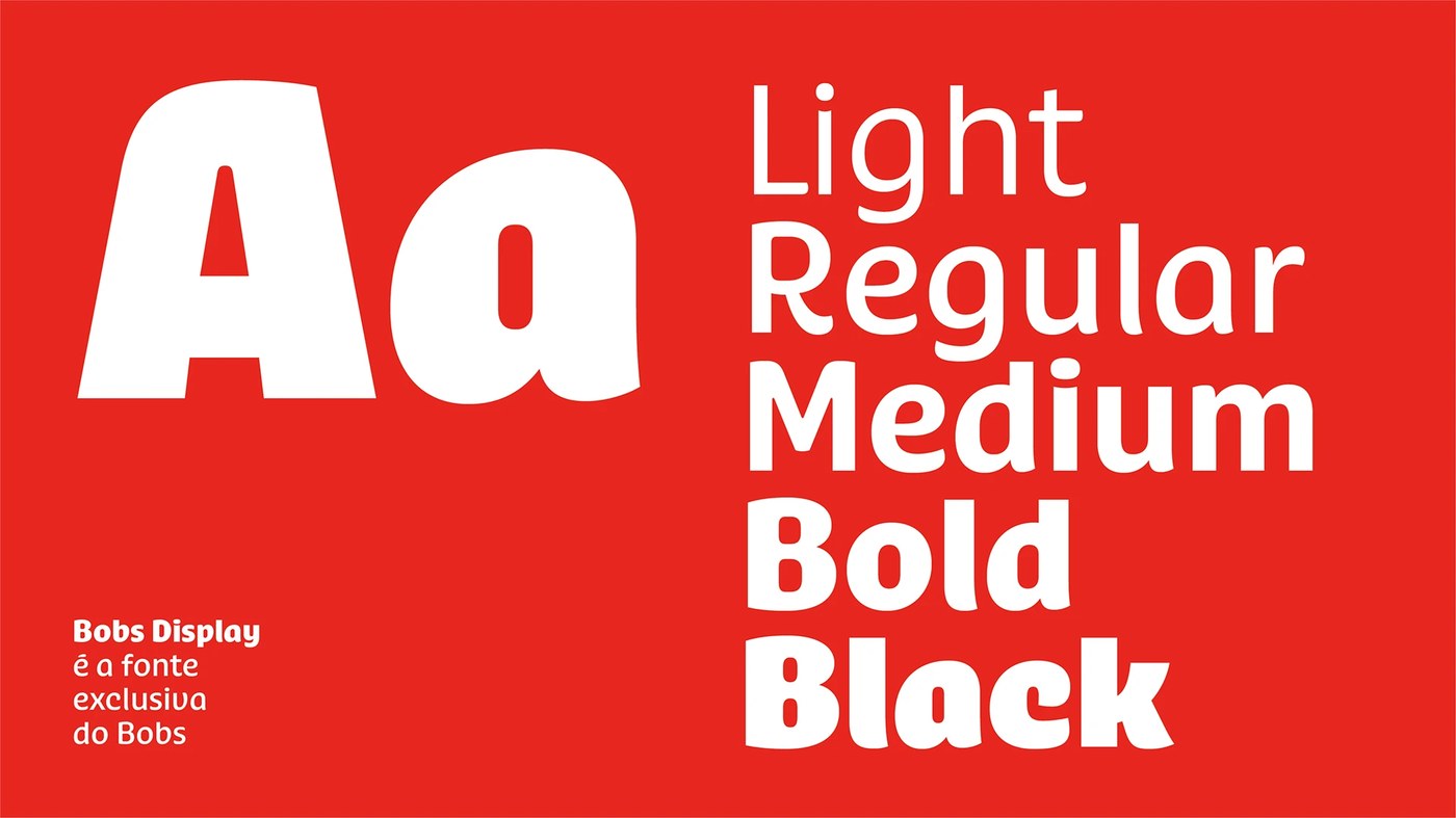
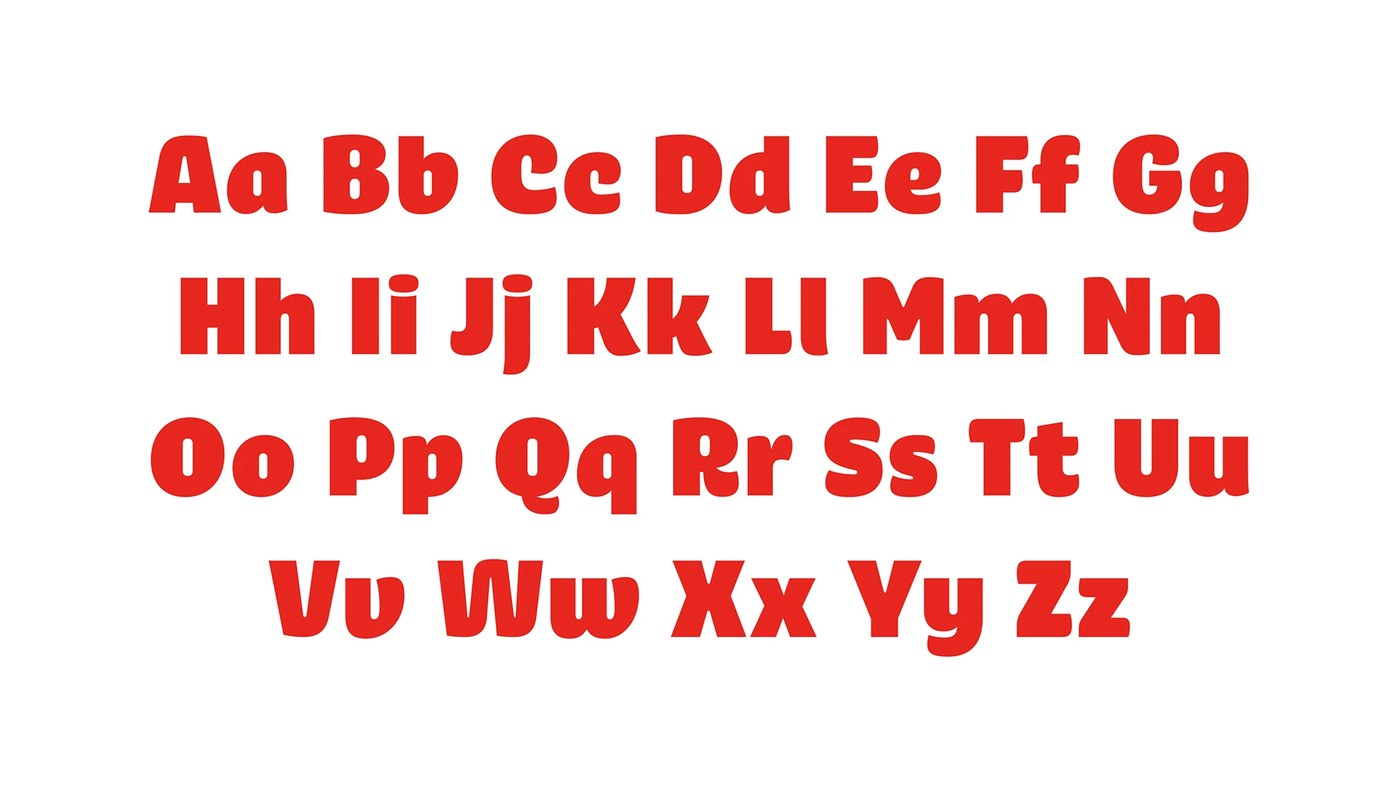
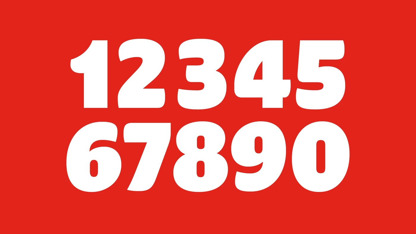
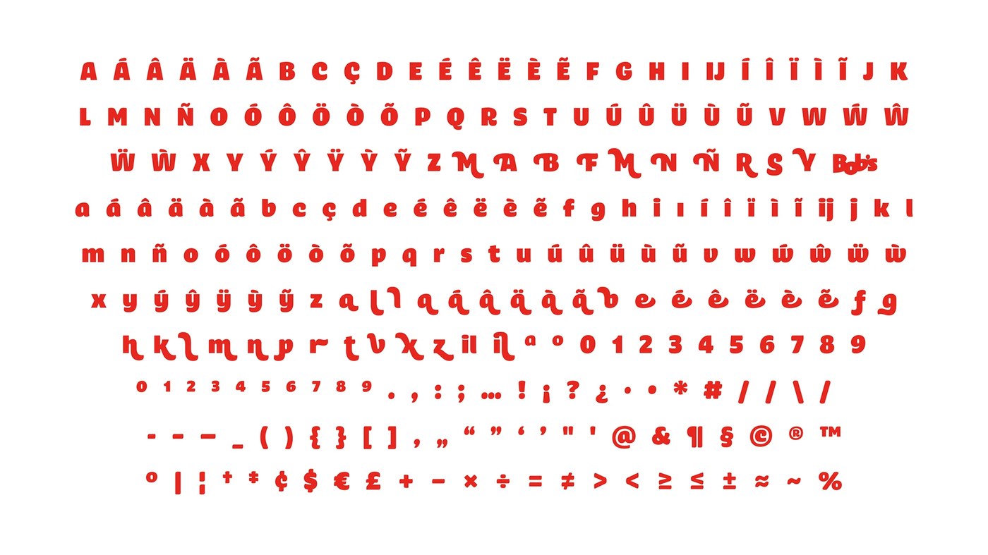
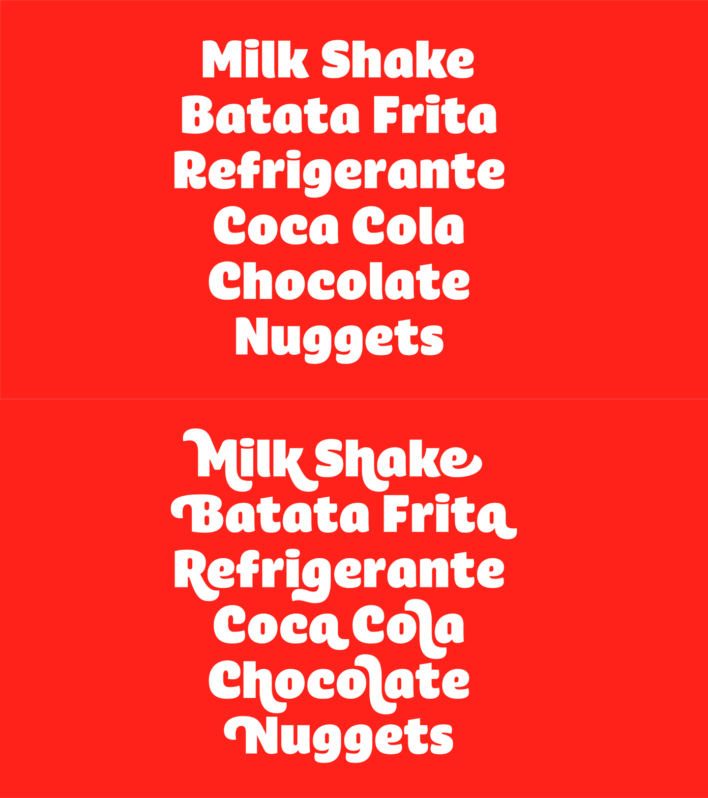
The font family offers five weights from Light to Black. Heavy weights feature thick stems, tight counters, and rounded curves. Soft shapes mimic the smooth flow of milkshakes and sauces. Plau Design added playful swashes and alternates for large headlines. Designers can build bold titles with easy visual rhythm. Smart glyph features help with store prices and small cents. This neat tool adds quick utility to menus and digital signs. Solid baselines keep text blocks straight across all store touchpoints. Large letter heights make signs easy to read from far away. The careful typography design turns retail needs into clean visual form.
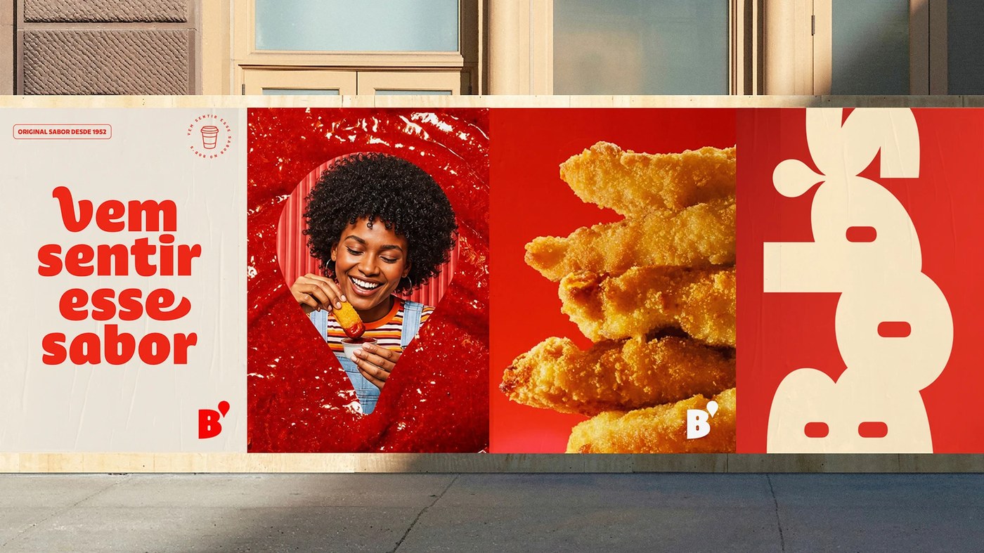
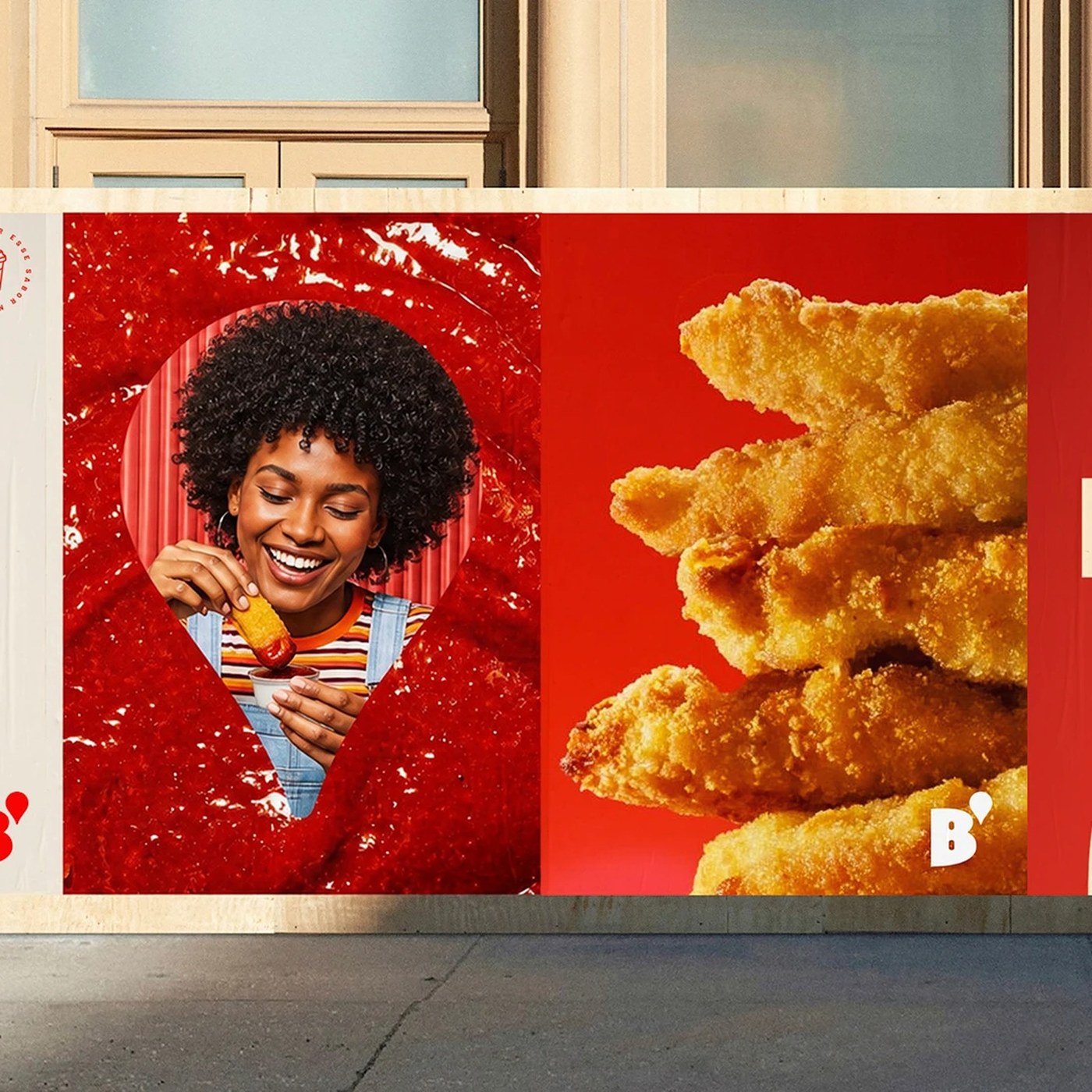
Street posters pair the thick letters with food photography. Big titles look bright and crisp against warm red backgrounds. Clean cream fields make menus easy to read at the counter. The full glyph set covers all accents for Portuguese text. Plau Design blends vintage sign charm with modern digital craft. The letters look great on store walls, paper cups, and phone screens. Thick strokes help words pop on busy city streets. This retail typography design gives the classic brand a strong voice. Simple craft and honest lines make the food chain feel fresh today.
See the full project by Plau Design on Behance.