Mojo PMM SaaS Mascot Branding by The Unicorn Agency
The Unicorn Agency creates the Mojo PMM SaaS mascot branding identity using fluffy character art and bold B2B visual assets.
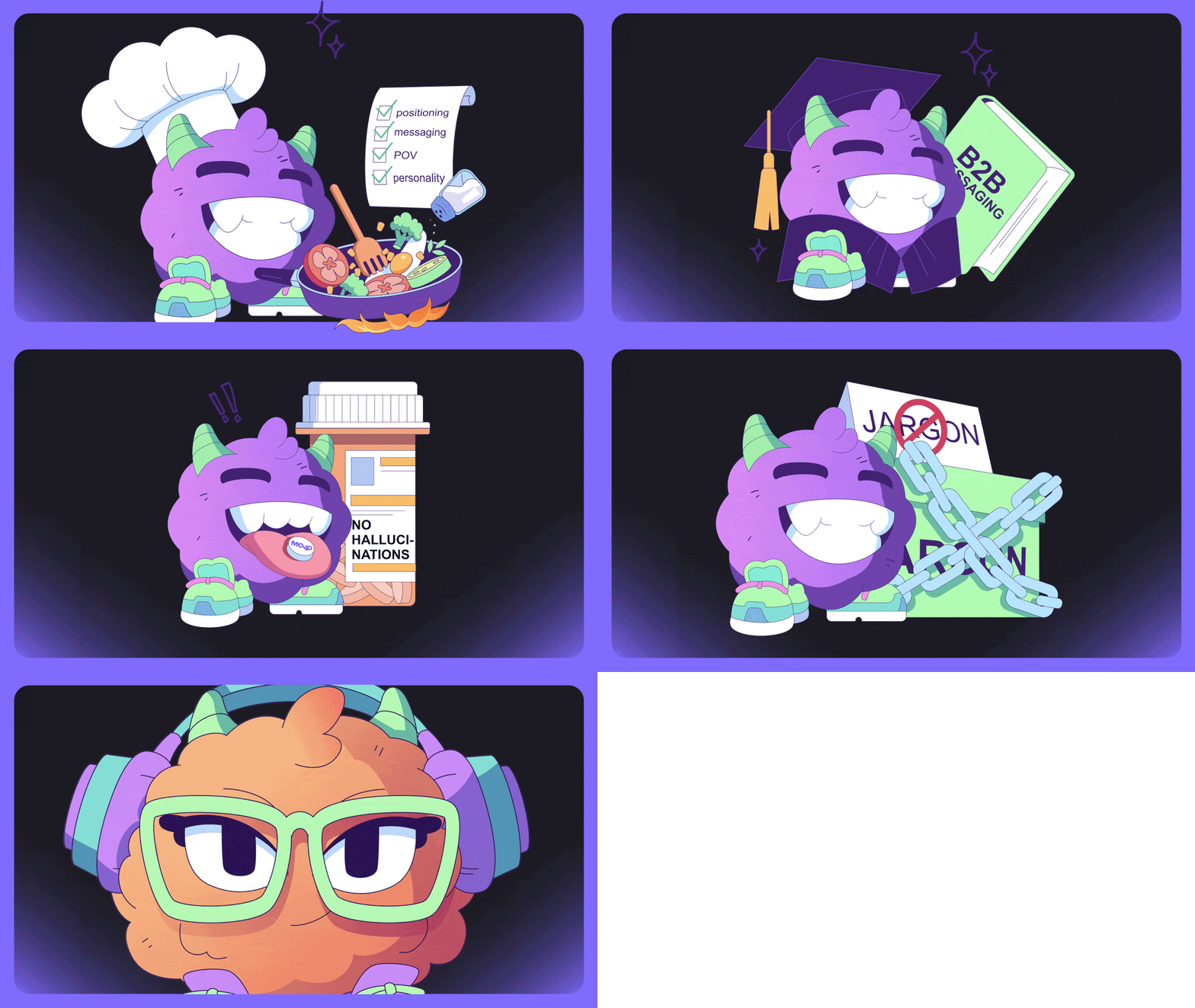
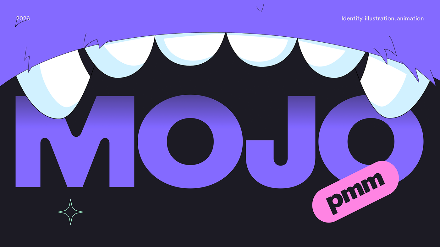
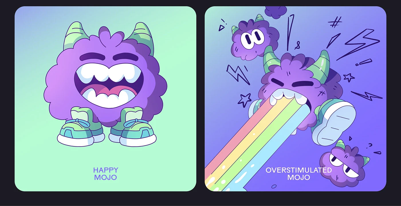
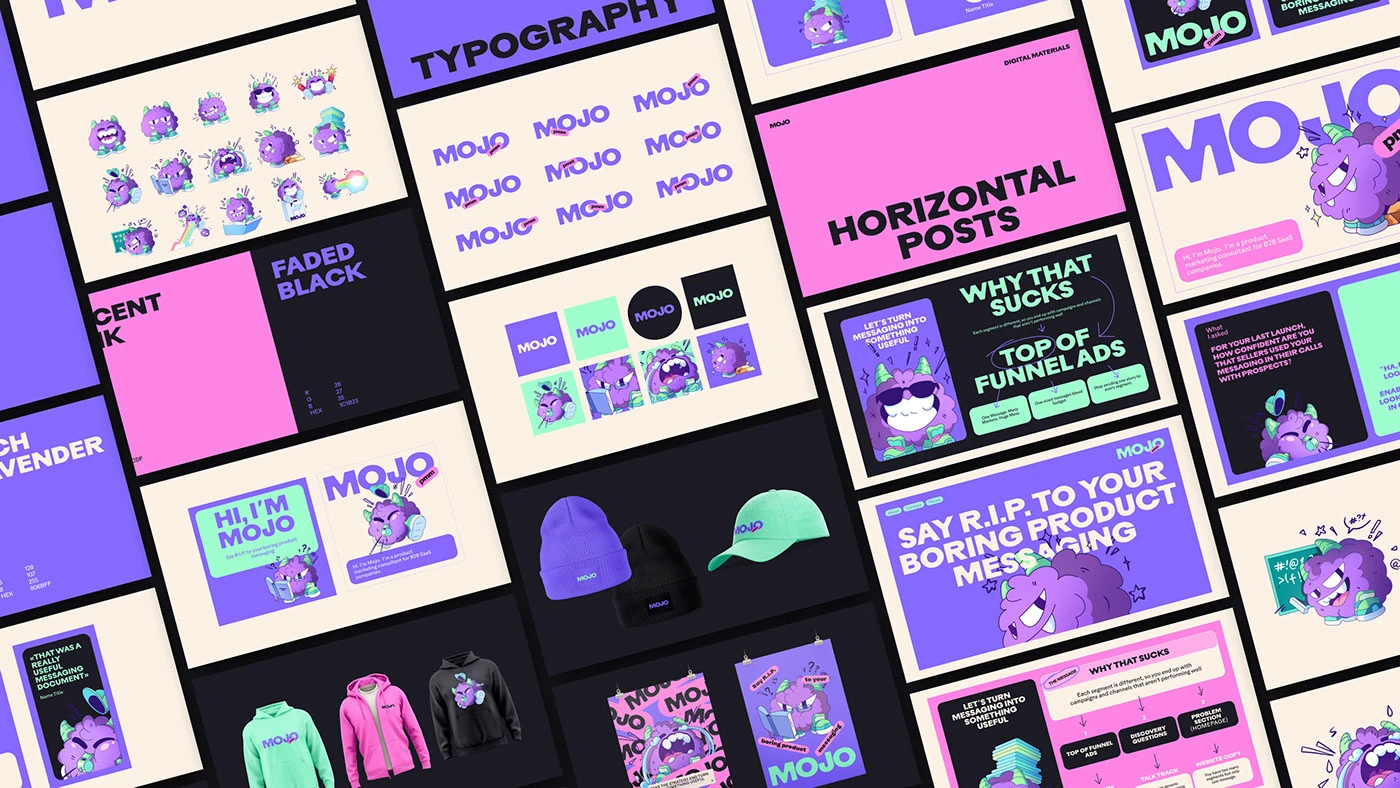
The Unicorn Agency created a clear visual identity for product tech app Mojo PMM. Standard tech branding often relies on cold diagrams or plain blue web layouts. Here, the team builds a clean branding language centered on a fluffy mascot character named Mojo. Thick bold letters pair with bright orange color blocks and dark contrast backgrounds. The full branding system turns simple software text into playful visual stories. High-contrast ink density keeps each printed poster looking sharp on office walls. Clear line spacing gives header text a clear stance on entry doors.
Character Art and B2B SaaS Branding System
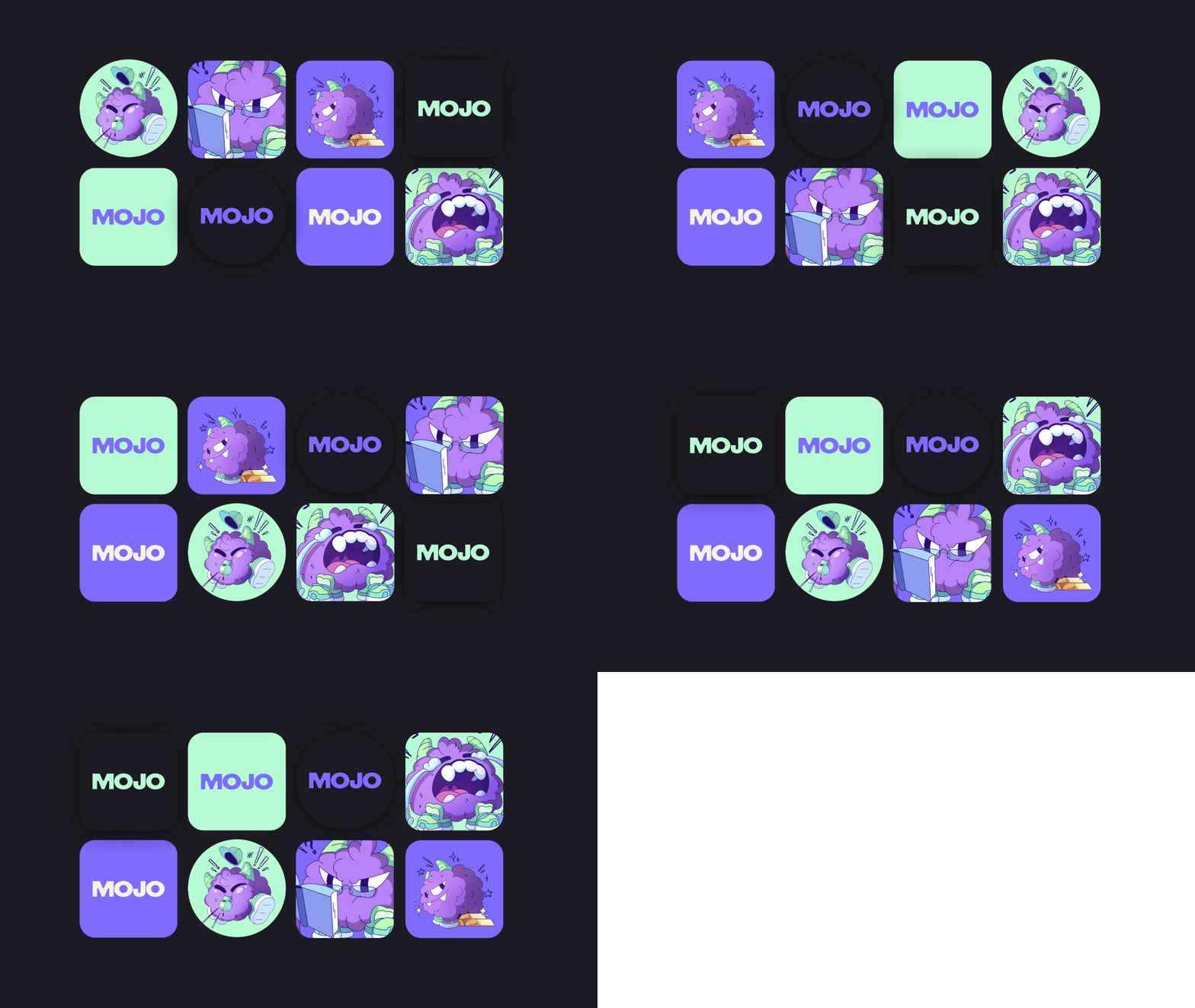
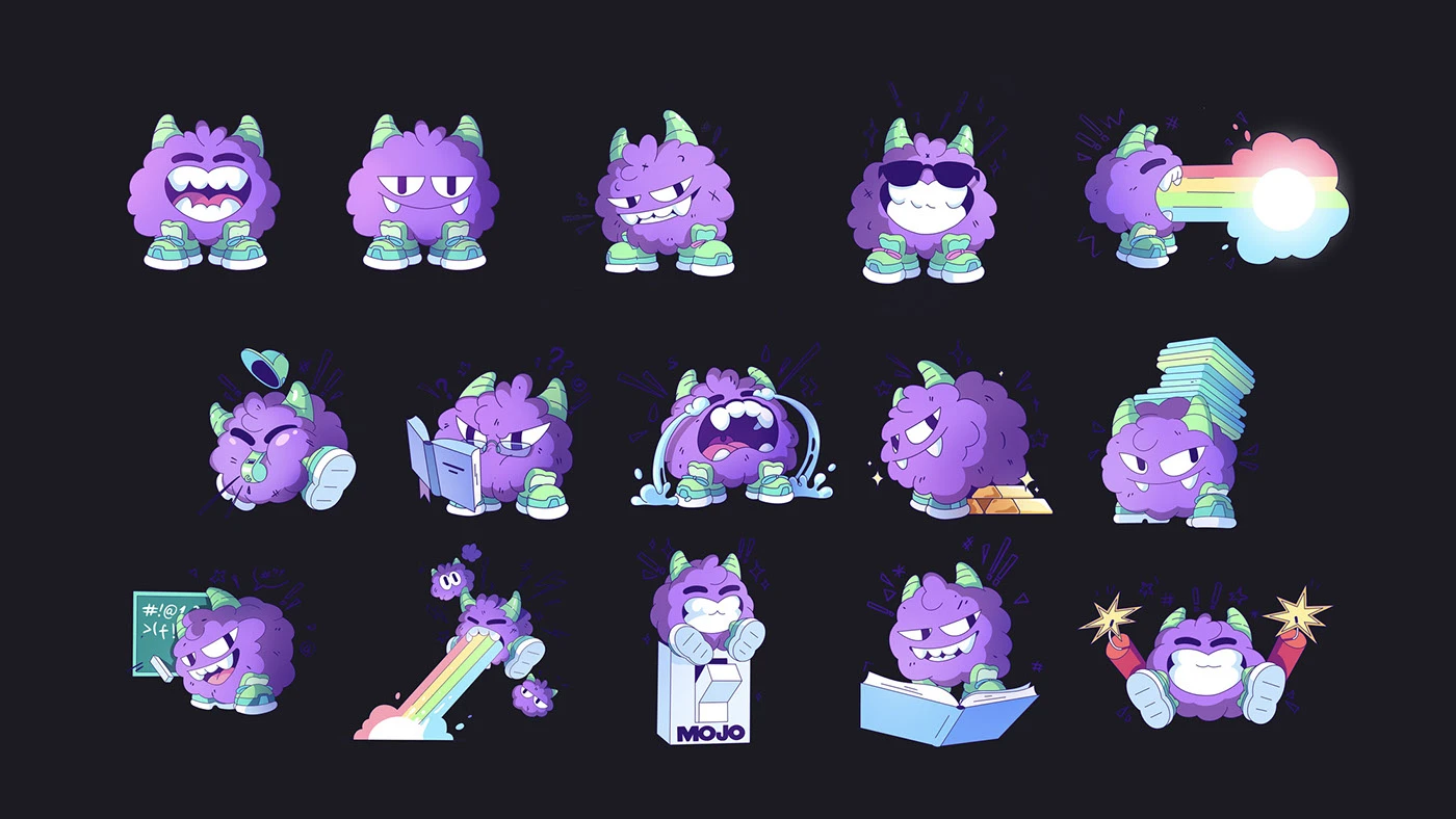
The visual system extends across web banners, app stickers, social posts, and product user guides. Each digital card uses heavy line weight with character poses that stand out on screen displays. The Mojo character acts as a repeated guide across web headers and email templates. By making character art a core part of the branding language, the designers create a friendly bond. Deep dark fields and white space keep software feature details easy to scan. Simple grid lines guide text for clear reading. Soft sticker shapes feel good in hand on laptops.
The project balances playful character art with clear product copy. Neat layout grids organize features, pricing tiers, and user notes without clutter. The mascot stickers give the software line a solid stance. The work shows how targeted brand branding builds tech identity without extra art. Simple type choices make feature cards easy to read on screen. To explore full identity specs and mascot art, explore The Unicorn Agency's project portfolio.