Design That Stirs – BP&O
Of course, not every cocktail is quite so easy to remember. There are thousands of the things, many with names that give absolutely no clue what you’re about to drink. “Mint to Be” or “Kitten Punch.” A dainty sip wrapped in a rugged name, or a classic twisted just far enough to make you laugh. Half the fun lives in the pun. The other half is remembering what actually goes in the glass.
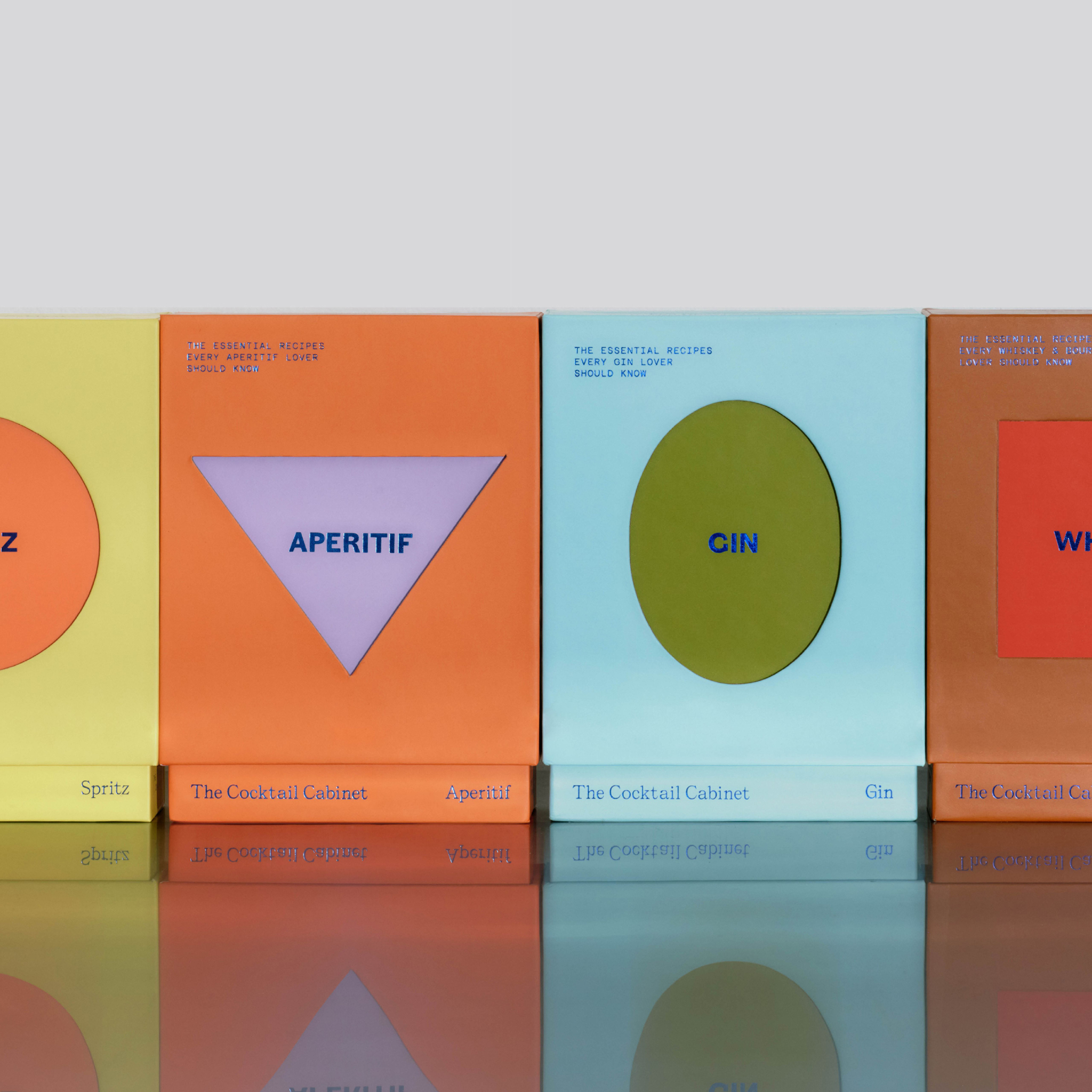
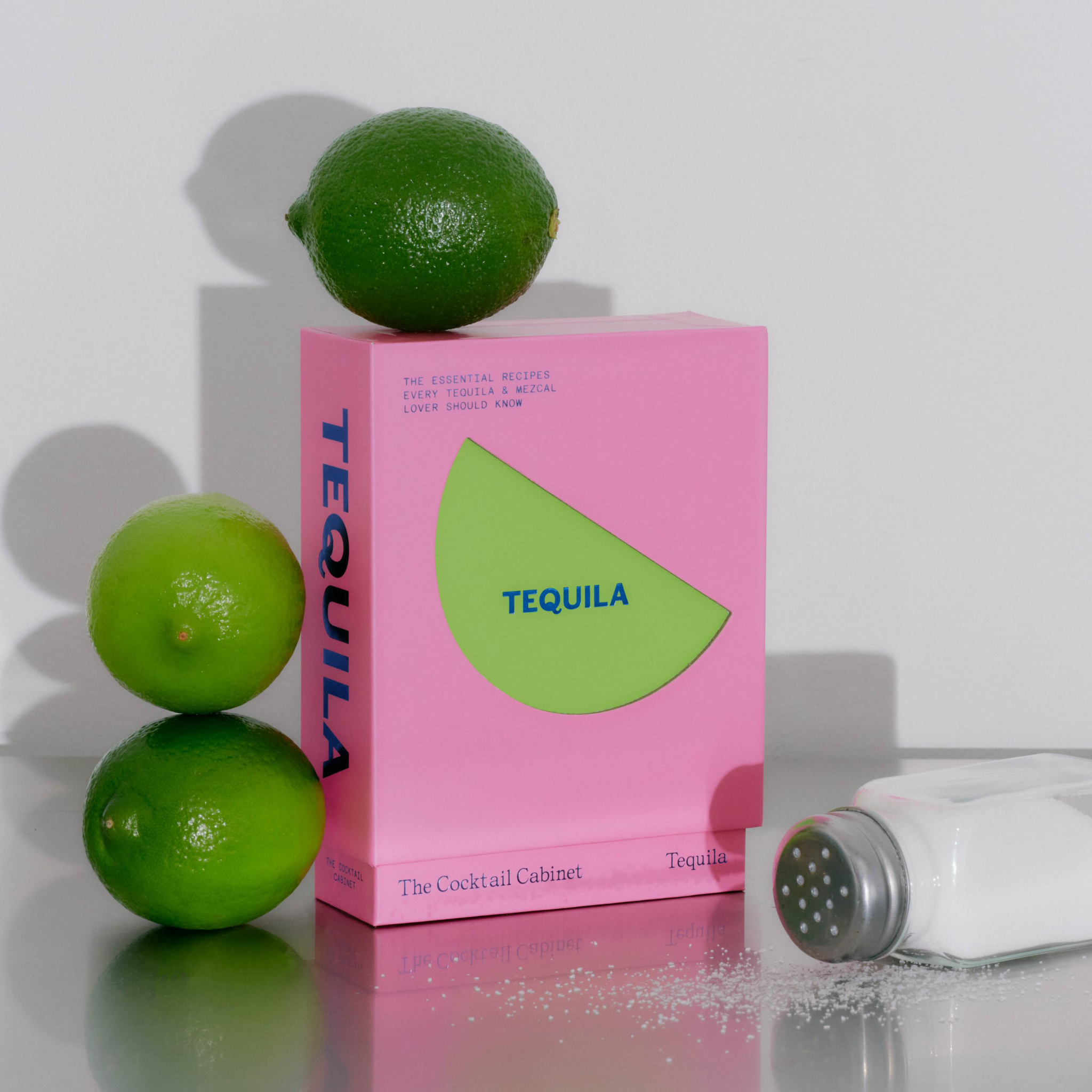
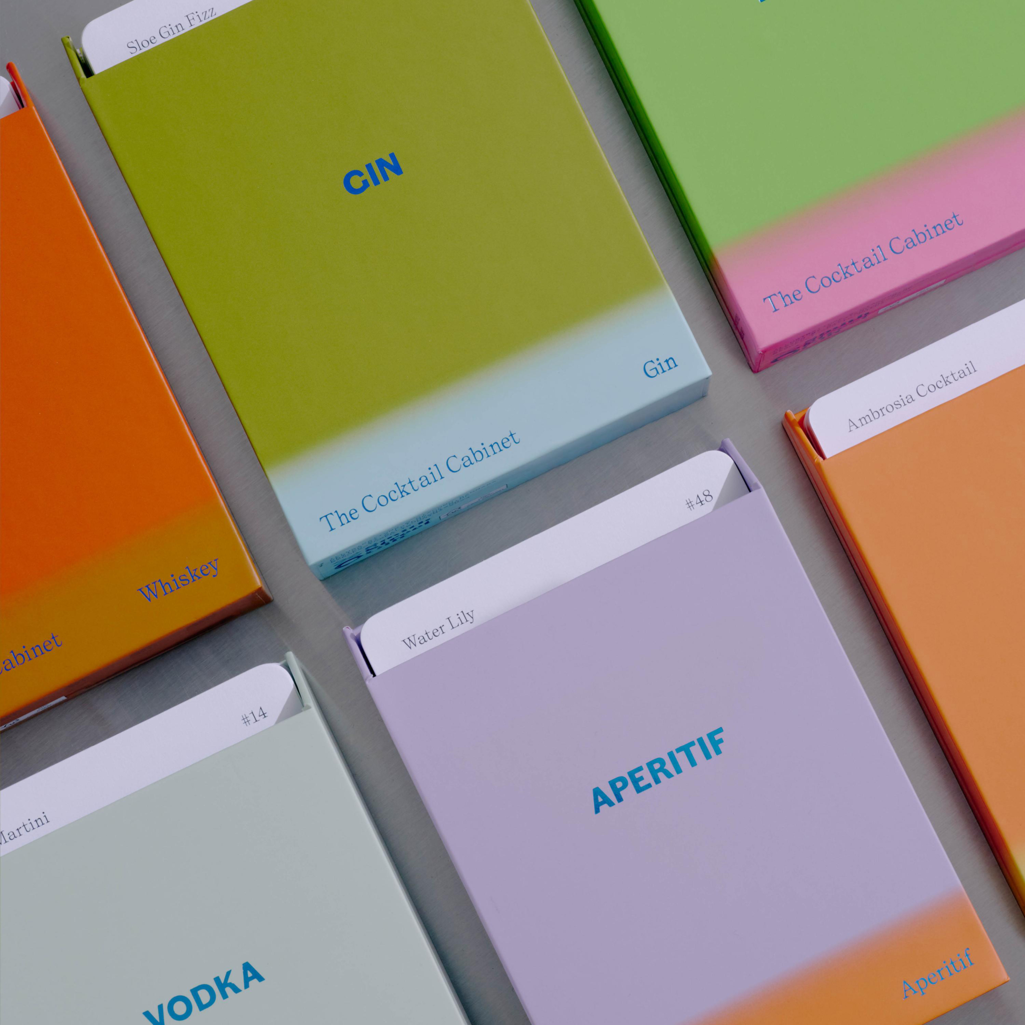
That’s usually when The Cocktail Cabinet gets pulled out. Designed by Aussie studio A Friend of Mine, it turns cocktail recipes into a deck of cards, ready for the moment someone casually orders a Boulevardier and your brain completely blue-screens.
Ingredients, ratios and methods are laid out clearly enough to flick through while pretending you knew all along. It looks the part too, essentially your bartender brain translated into cardstock. Cooler than a laminated bar mat and far more reliable than your mate Dave, who’s absolutely convinced tonic works in everything.
The Negroni is probably one of the easier cards in the deck. Three ingredients, equal measures, but each is doing something very different. The gin brings the backbone, vermouth brings sweetness and depth, Campari brings bitterness. Even the ice is doing more than keeping it cold. As it melts, dilution changes the drink.