Type mirrors music in Phion Symphony Orchestra’s new identity
Thonik has revitalised the Dutch instrumental ensemble with a versatile visual system based on sound and movement
The Phion Symphony Orchestra has partnered with Dutch design studio Thonik on a new visual identity for the group. Founded in 2019 as a travelling instrumental ensemble, it has no permanent physical home, meaning that it needed a distinctive brand to feel grounded and recognisable.
Frequently touring to other countries to perform, and requiring new campaigns for each destination, a key aspect of the brief for Thonik was a cohesive yet adaptable identity that could live across these communications.
Falco van Burg, design lead at Thonik, explains: “Phion needed a visual system that they could expand with every campaign, so they would remain recognisable to their audiences while still giving every campaign a unique image. To make that a reality, we chose to make music the foundation for the overall identity.”
Drawing on the sonic qualities of the orchestra, as well as the movement of the composer, Thonik devised a brand system that is rooted in the music itself. Most notably, this plays out through a thoughtful use of typography, in which Thonik looked to Swiss type foundry Grilli Type for inspiration.
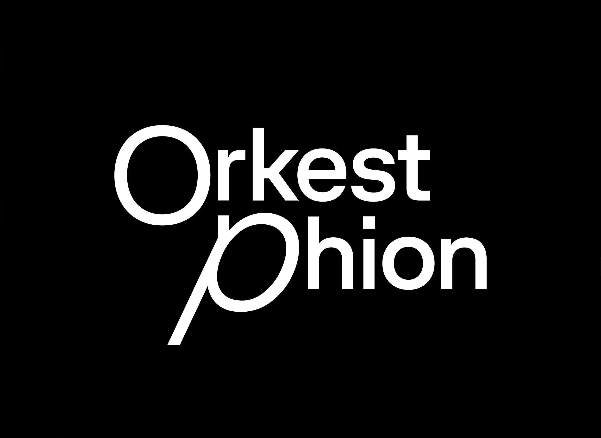
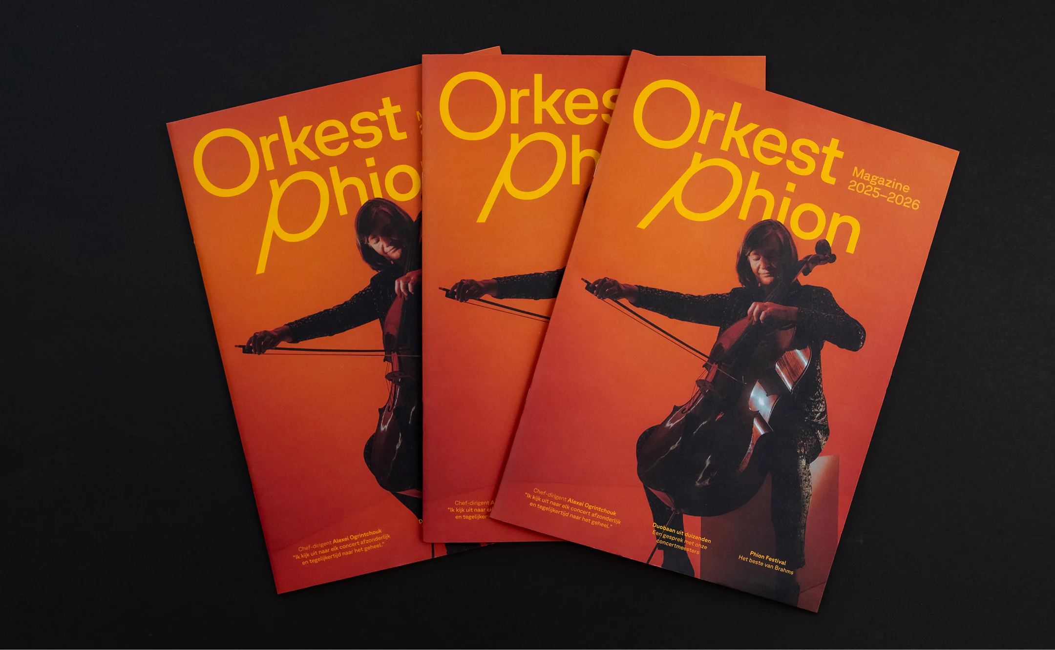
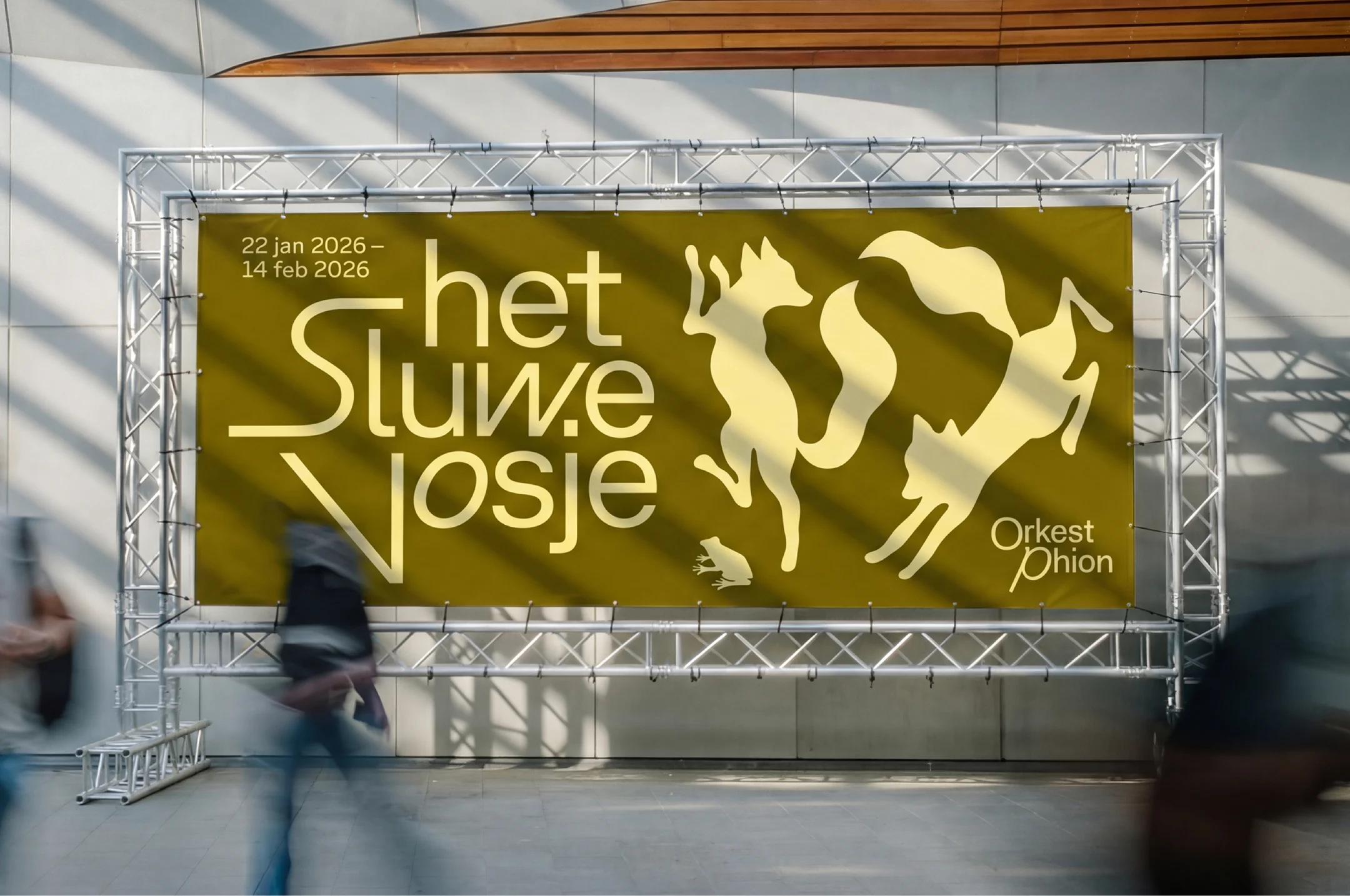
The team landed on GT Planar as the core typeface for the identity, drawn to its capacity for movement that reflects the vibrancy of the orchestra’s sound, and the mesmerising patterns of the conductor’s baton. “GT Planar has details that only appear when you slant it,” notes van Burg. “The moment the type tilts, extra forms come out that emphasise its character, and you can feel the typographer knew exactly how it should move.”
Used in static compositions, as well as dynamic animations, the type drives the rest of the branding. It sets the tone for an identity that is distinctive yet truly adaptable. Applied over the top of concert imagery and videos, it moves with the composer and responds to shifts in the piece being played. In doing so, it forms a symbiotic relationship with the orchestra’s energy and sound.
“Before we design anything, we ask what the piece feels like,” says van Burg. “Calm or restless? Does it build slowly or hit you right away? That feeling is what we translate, not the information. A restless piece bends the letters hard and breaks the word apart. A calm piece stays open and quiet. There is no master template waiting for the next programme. However energetic a title gets, it still has to feel composed, not improvised. That was our limit.”
Alongside the new visual identity for the group, the Orchestra now has two separate names, which Thonik helped to devise: Orkest Phion for use at home in the Netherlands, and Phion Symphony Orchestra, for use abroad.