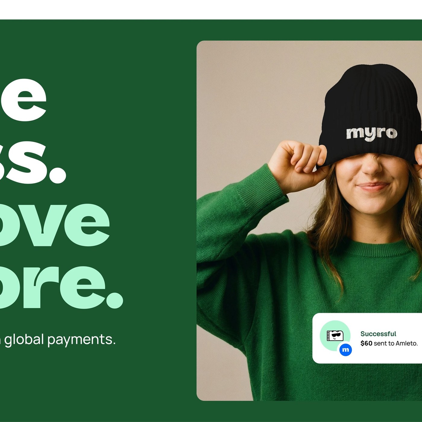
Branding Design: MYRO Identity by Joseph Omas
Explore the bold branding design for fintech platform MYRO by Joseph Omas. The dynamic identity pairs vivid typography with tactile debit cards.
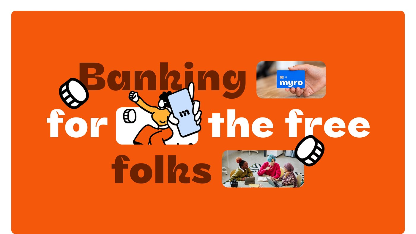
Joseph Omas built a visual system for international transactions. The project reimagines banking for modern creators and independent founders. Remote professionals often struggle with complex cross-border payment systems. Traditional financial institutions enforce rigid boundaries and costly transfer fees. Myro addresses these challenges by simplifying international money movement. The overarching strategy positions the platform as the bank of the free. Freedom becomes the central metaphor guiding every creative choice. Omas translated this philosophy into energetic layouts and optimistic color palettes. The resulting branding design eliminates visual clutter across user touchpoints. Instead of showing cash, the artwork celebrates unrestricted personal momentum.
The MYRO Branding Design and Graphic System
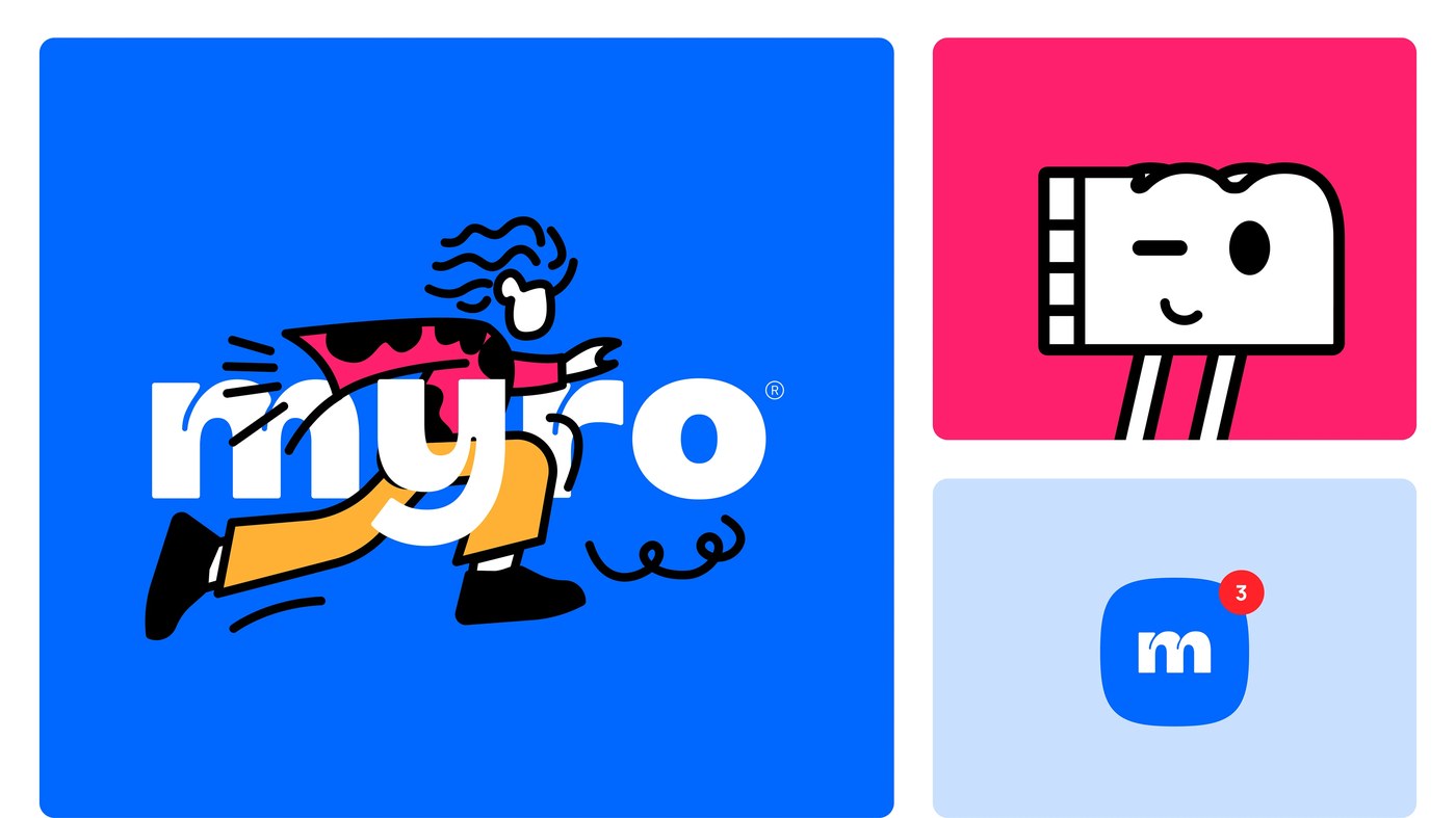
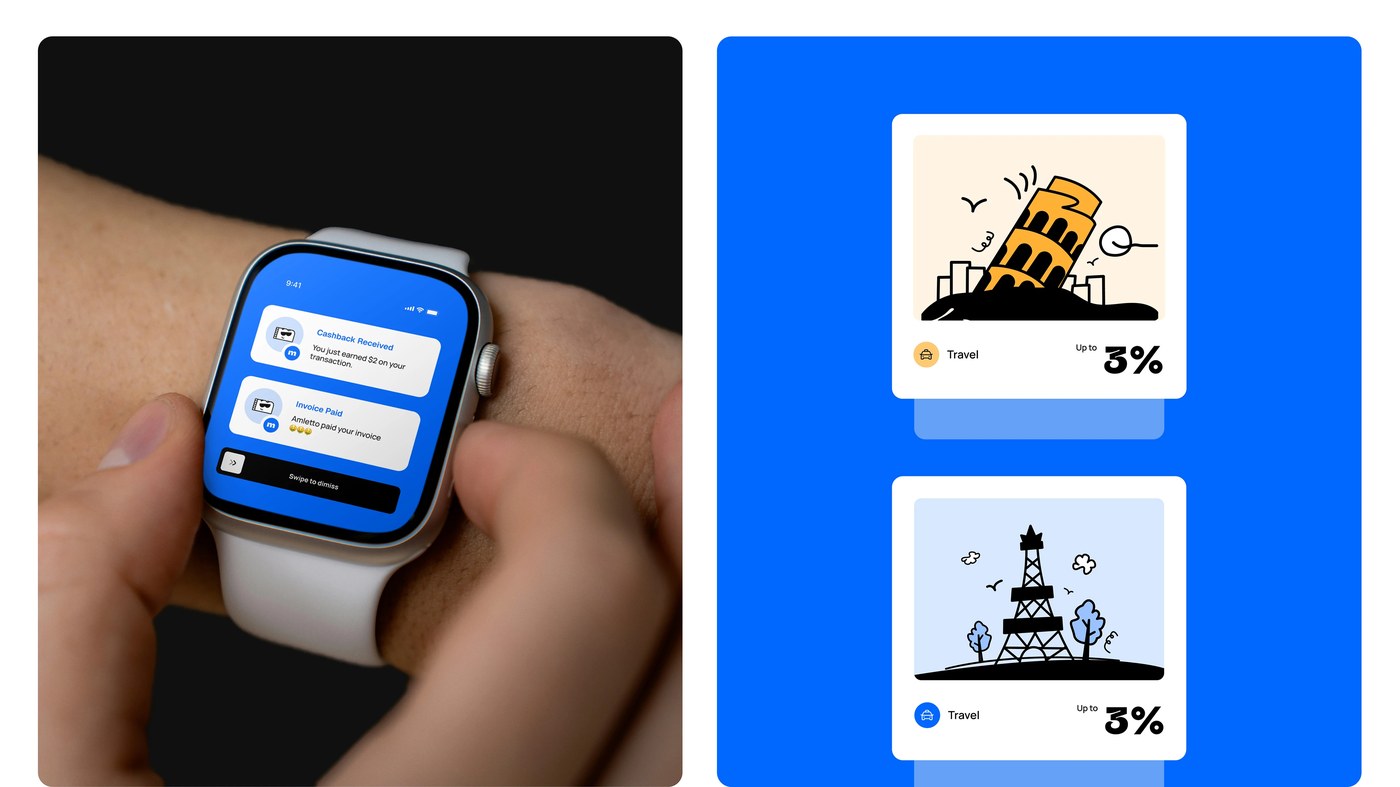
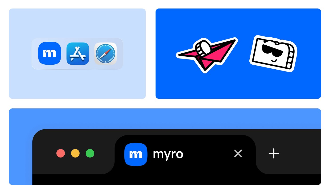
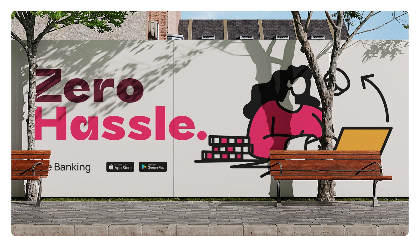
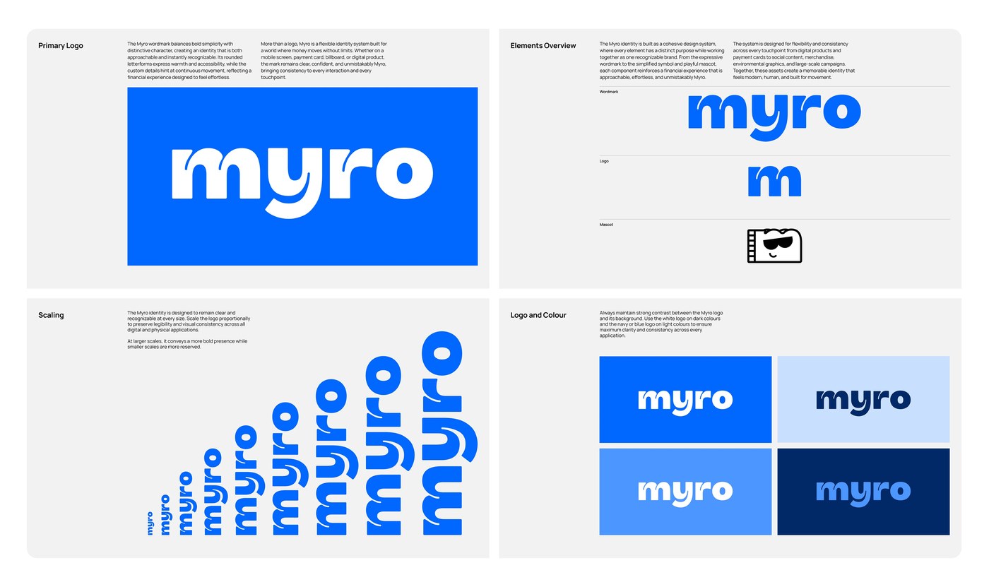
A geometric lowercase symbol anchors the dynamic branding design. The rounded letterform communicates immediate warmth and approachable personality. Substantial stroke weights preserve legibility on compact digital screens. Generous spacing reinforces visual stability across complex mobile interfaces. Bold display typography dominates large format outdoor campaign posters. High-contrast color pairings match rich purple surfaces with vivid yellow accents. Electric cobalt tones and warm coral hues energize promotional graphics. Short promotional phrases emphasize financial sovereignty for global workers. Graphic containers frame headlines with purposeful editorial discipline. Every typographic scale balances structural authority with expressive charm.
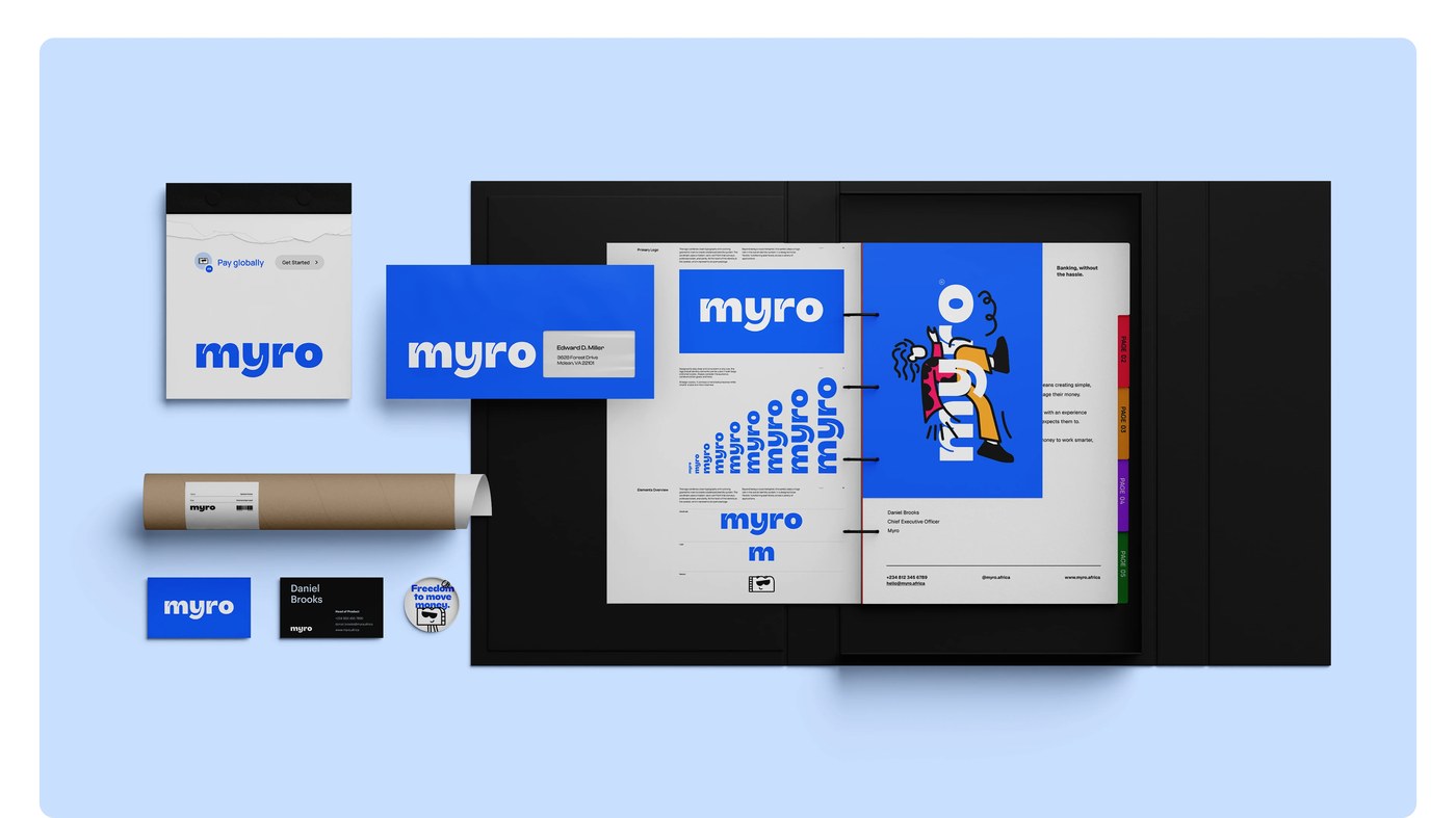
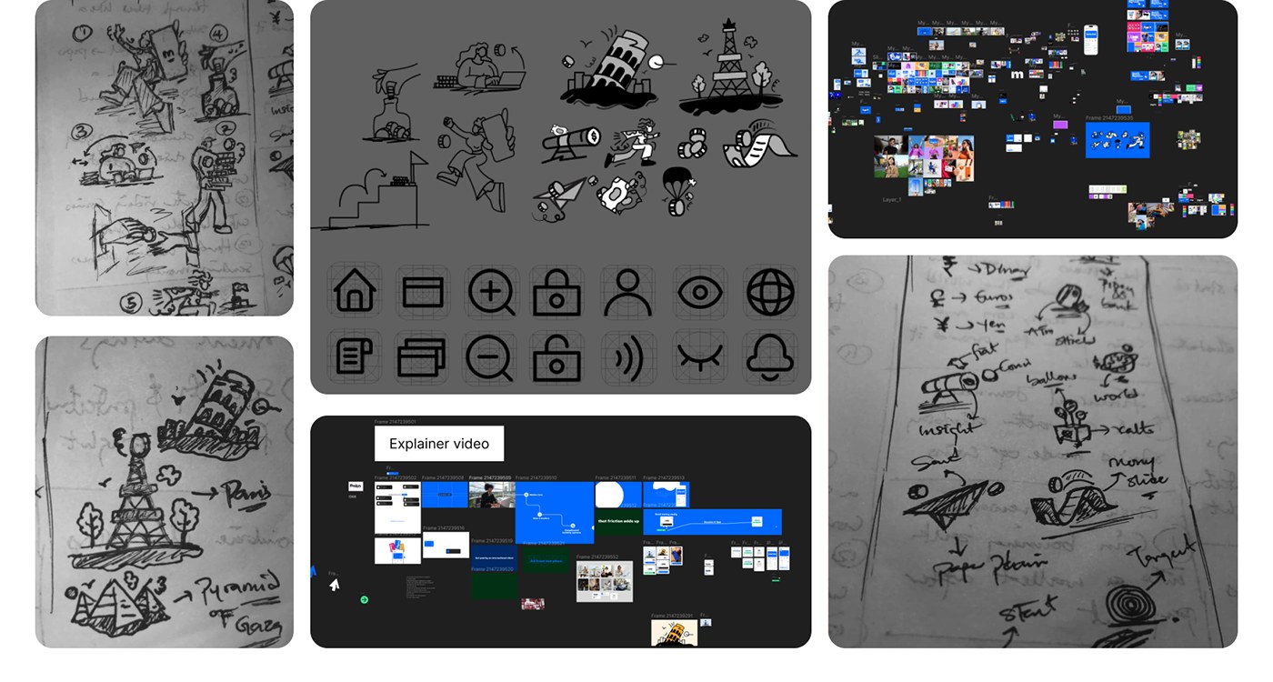
The branding design translates into physical banking artifacts. Matte payment cards feature striking vertical orientation and minimal typography. Users can choose between cobalt blue, pastel pink, and golden yellow. Custom card carriers deliver a tactile and memorable unboxing experience. Printed paper envelopes house comprehensive welcome guides and corporate stationery. The system also includes embossed leather lanyards and tactile business cards. Early concept iterations in Figma explored diverse geometric layouts and icons. Collaborator Adediji Zaccheaus helped refine the cohesive graphic architecture. This cohesive visual execution bridges digital software and physical print. The final identity brings clarity to borderless financial technology.
See the full project by Joseph Omas on Behance.