Thissaway refreshes historic golf resort The Belfry following major expansion
The Belfry Hotel & Resort in Sutton Coldfield, Warwickshire, has revealed a comprehensive rebrand created by specialist hospitality design studio Thissaway.
Timed alongside a multi-million-pound development of the resort, which includes the new 8,852-square-metre Masters Suite for conferences and an upgraded wellness hub, the updated identity aligns the venue’s visual presentation with its enlarged physical footprint.
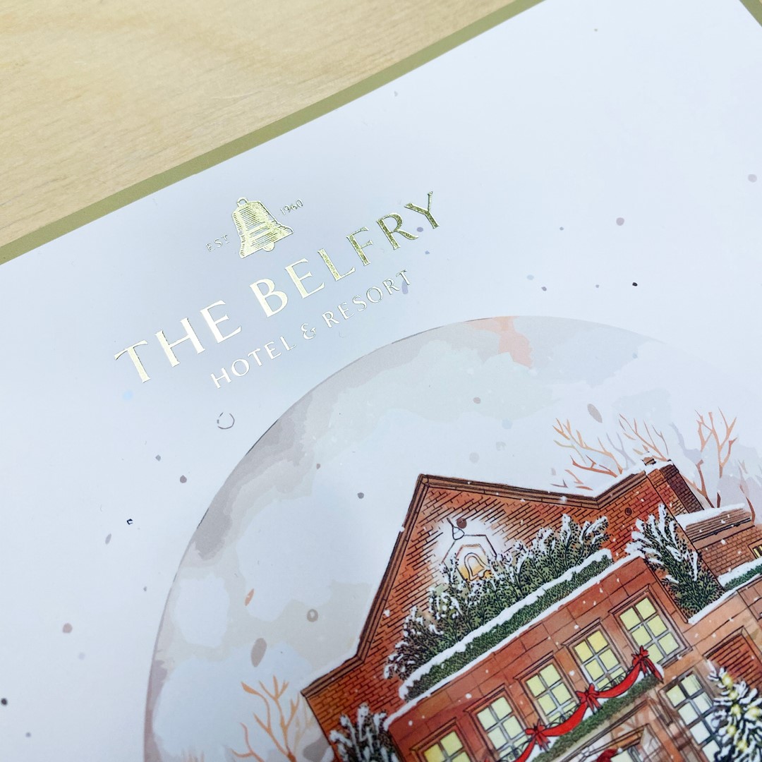
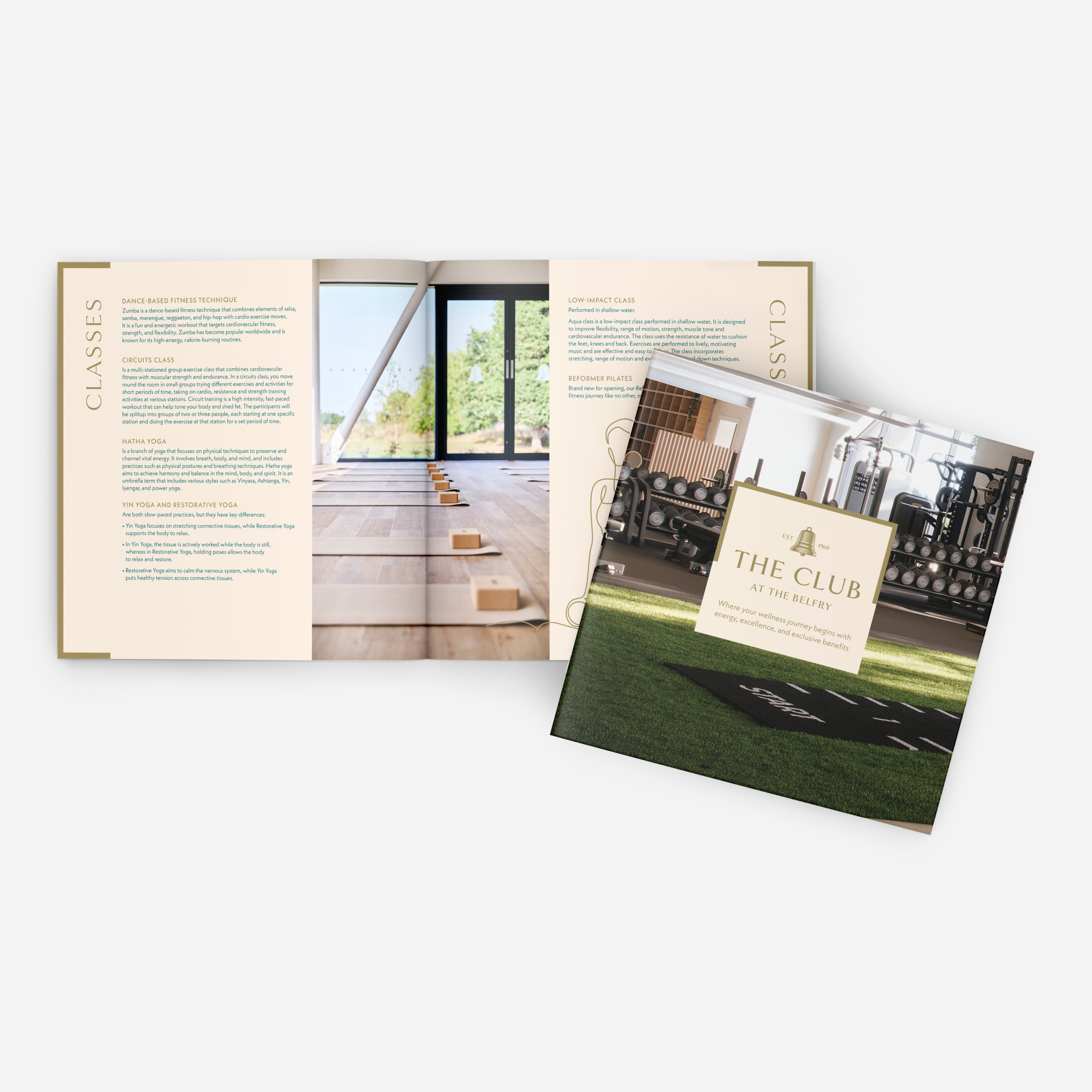
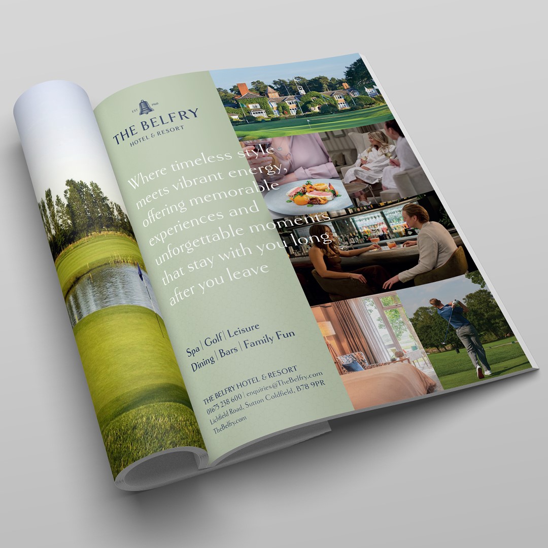
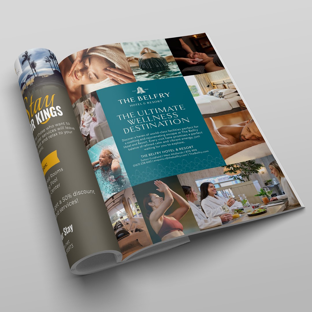
Thissaway initiated the project with an extensive discovery phase comprising brand workshops, stakeholder sessions, and guest research. The insights revealed that visitors predominantly view the resort as a backdrop for marking major milestones, ranging from weddings and corporate events to championship golf tournaments on its famous Ryder Cup courses.
This strategic finding prompted the design team to return to the root meaning of the word belfry. Historically housing bells used to signal civic celebrations, announce news, and bring communities together, the bell structure provided the central conceptual framework for the updated brand.

Bean said, “The bell gave us a single, powerful idea that was authentic to The Belfry from the very beginning. The most impactful brand work rarely invents something new from scratch, but instead uncovers what was already there to begin with and gives it an opportunity to shine.”
The updated identity rebuilds the iconic bell mark, replacing the former simplified graphic enclosure. It’s paired with contemporary serif lettering and an updated colour palette crafted for application across both high-end hospitality collateral and everyday leisure touchpoints. Visual direction focuses on guest experience and movement through the premises.
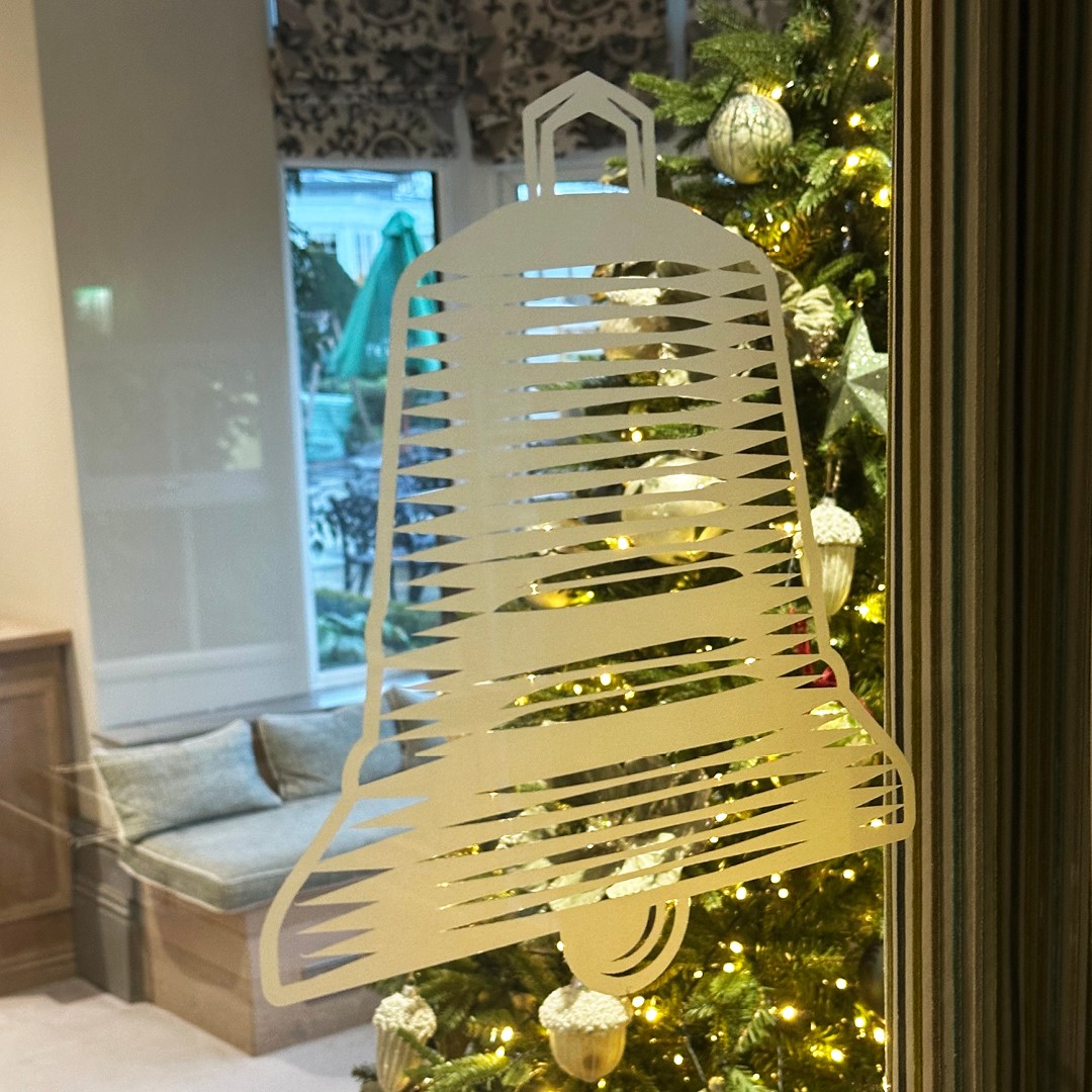
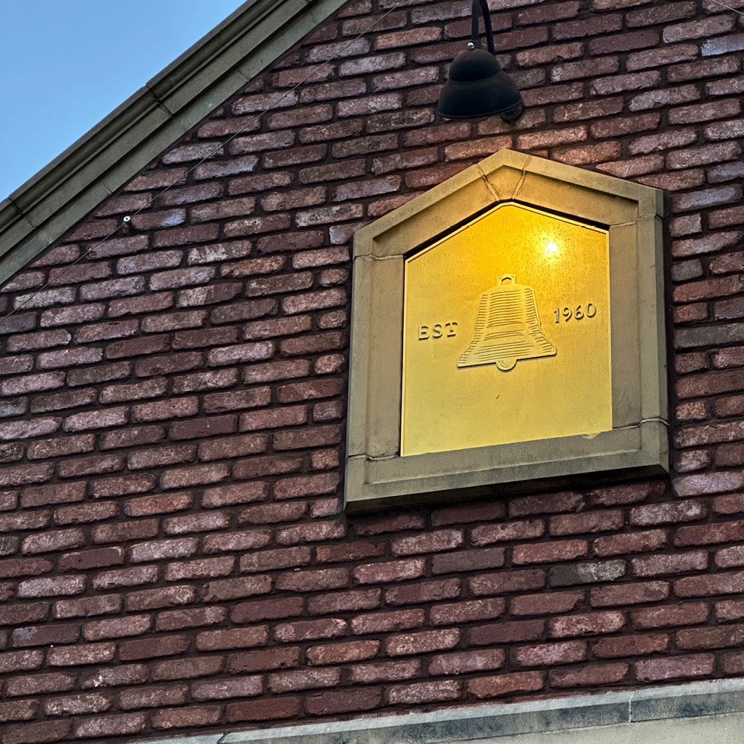
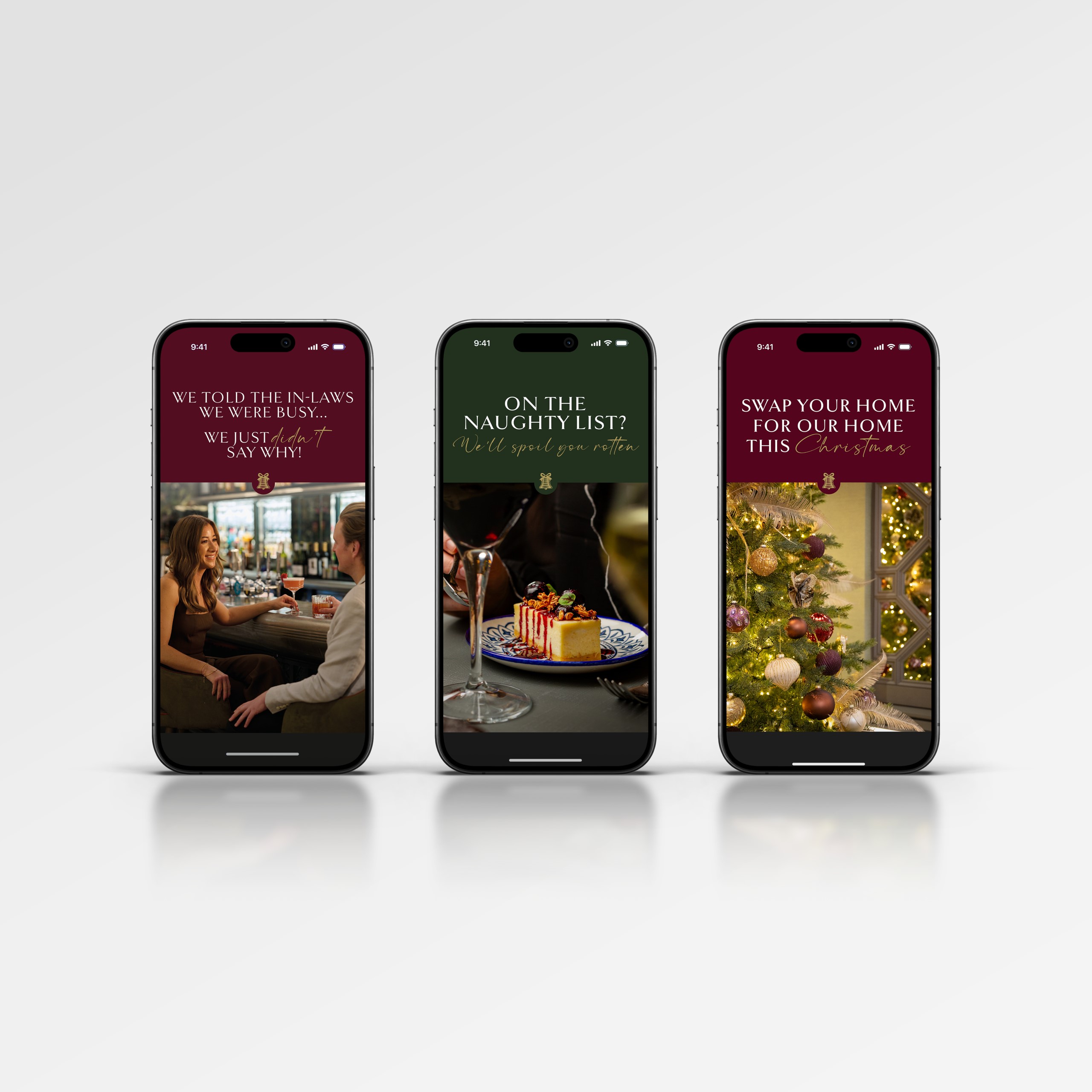
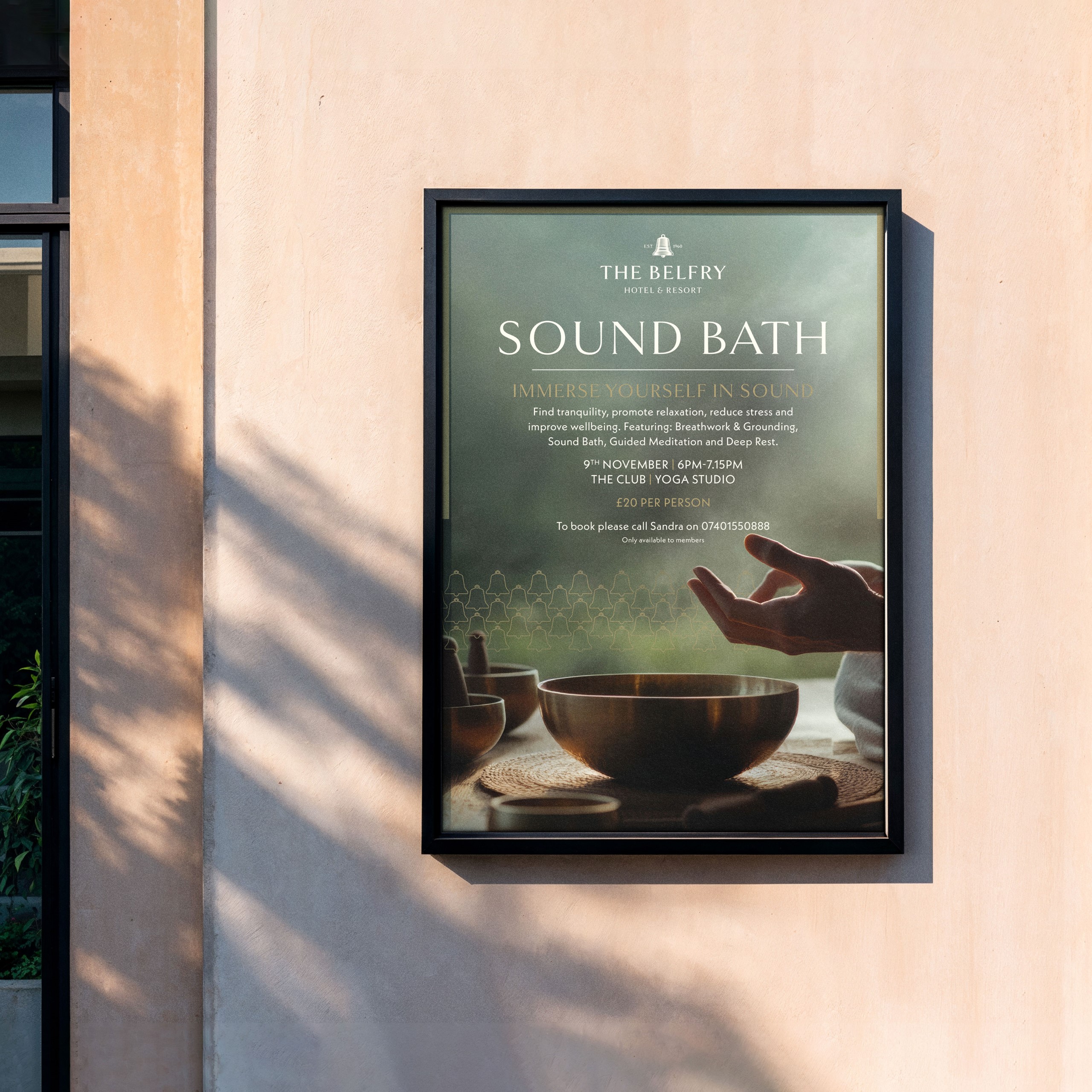
Beyond the main resort marque, Thissaway devised a flexible sub-brand architecture encompassing distinct identity systems for the Spa, the Club, and various dining venues on site. The comprehensive rollout extends across wayfinding signage, digital channel assets, print collateral, event touchpoints, and brand usage guidelines.
Aldridge said, “Working with the Thissaway team on The Belfry’s rebrand has been an incredible experience. They immersed themselves in our heritage, audience, and future ambitions, delivering an identity that feels both elevated and authentically us.”