Typography: Gregory Grotesk by Jakob Runge & TypeMates
Jakob Runge and German foundry TypeMates craft Gregory Grotesk, a 24-style typography family shaped by wood-type soft anti-ink traps.
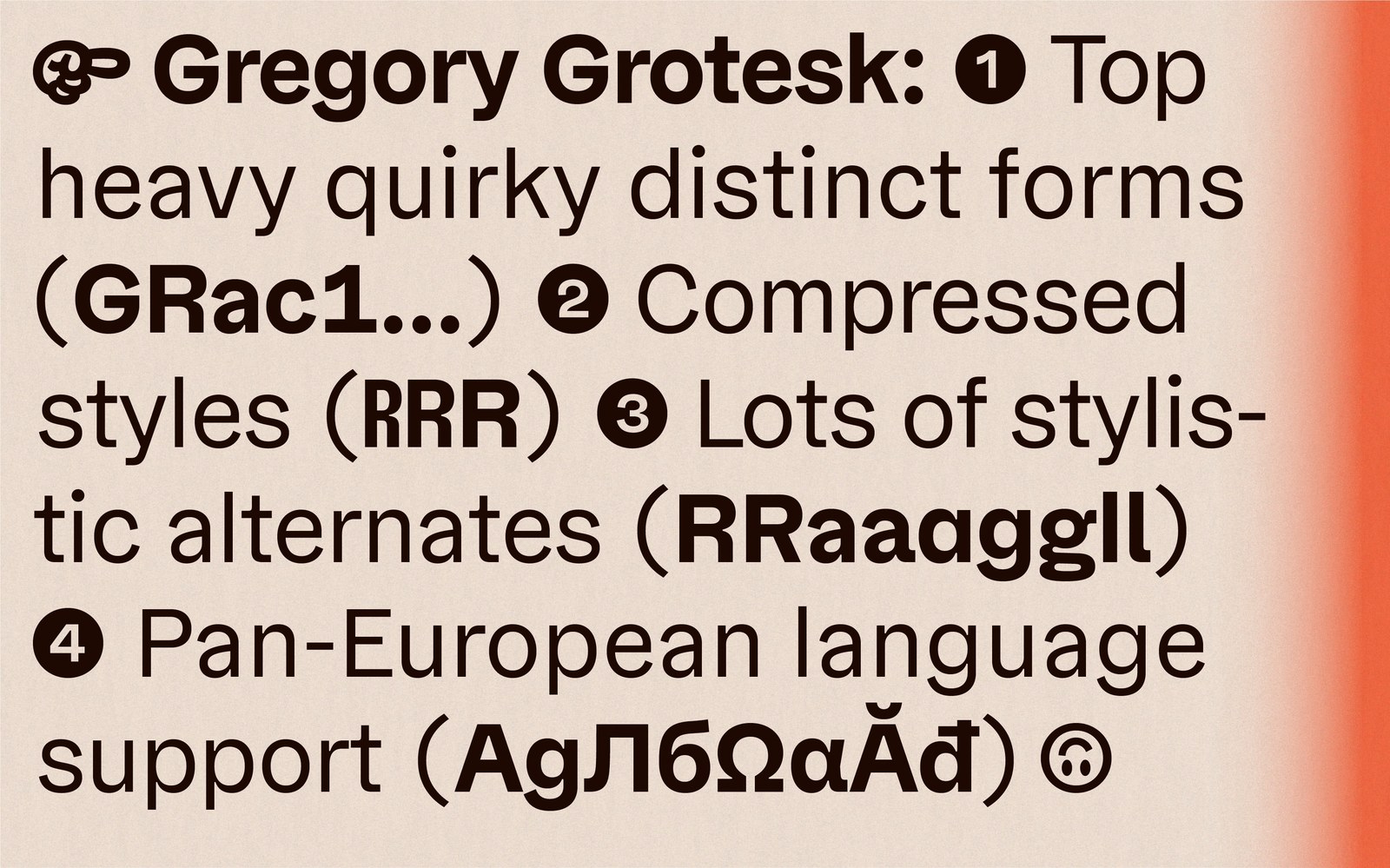
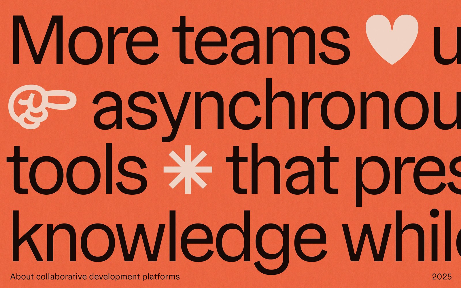
Work paralysis sparked this whole family. Staring down the massive workload of finishing the Gregory serif cuts at German foundry TypeMates, designer Jakob Runge felt like a rabbit caught in headlights, so he dodged the pressure by sketching how those quirky proportions might behave without serifs. That creative detour turned into Gregory Grotesk, a 24-style geometric grotesque spanning eight weights across Normal, Condensed, and Compressed widths. It doesn't chase cold Swiss perfection. Top-heavy capitals like G and R bring immediate poster presence, while pan-European Latin, Greek, and Cyrillic support makes the family a serious workhorse for daily editorial and interface typography.
Wood-Type Warmth in Modern Typography
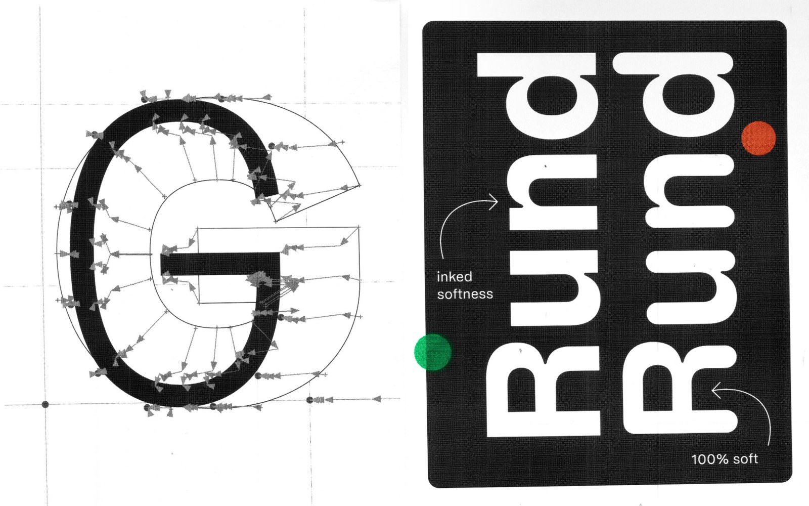
Sharp ink traps have become a visual cliché in contemporary digital type. Runge went the opposite way, looking to large-scale nineteenth-century wood-type printing to warm up sterile screen environments. Where diagonal and orthogonal strokes meet, rounded inner corners create what he calls soft anti-ink traps. Those pooled junctions force the strokes to thin and taper right at the joint — a subtle nod to early grotesque cuts built for small lead type blown up to poster scale. It's easy to trace those mechanics in the making-of specimen sheets, where raw bezier handle grids on an uppercase G sit beside a black Rund card comparing inked softness at the stem joints against fully rounded terminals.
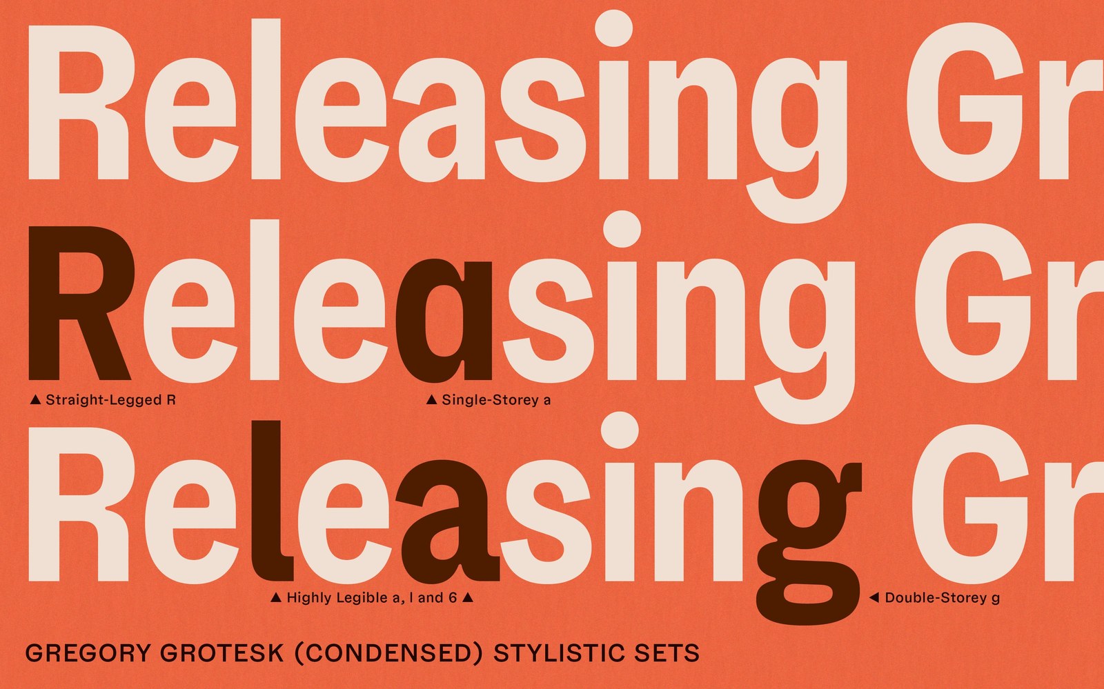
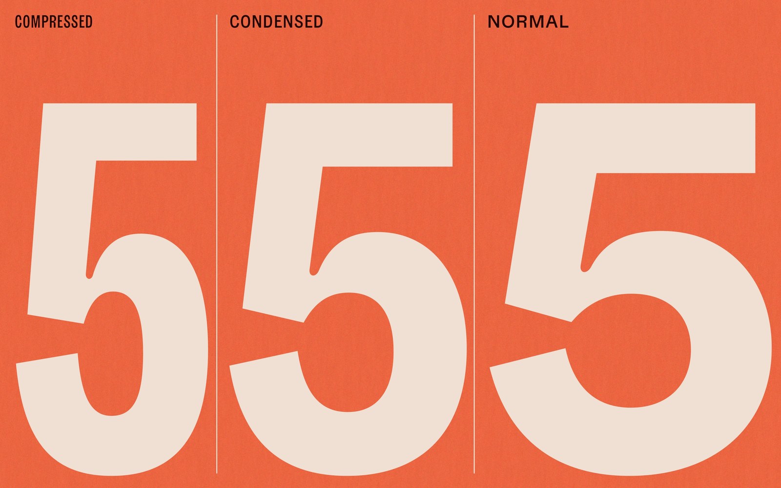
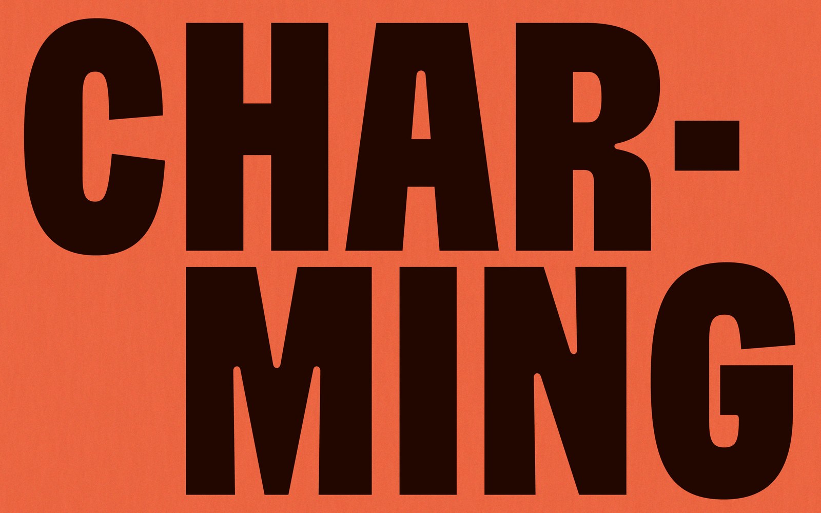
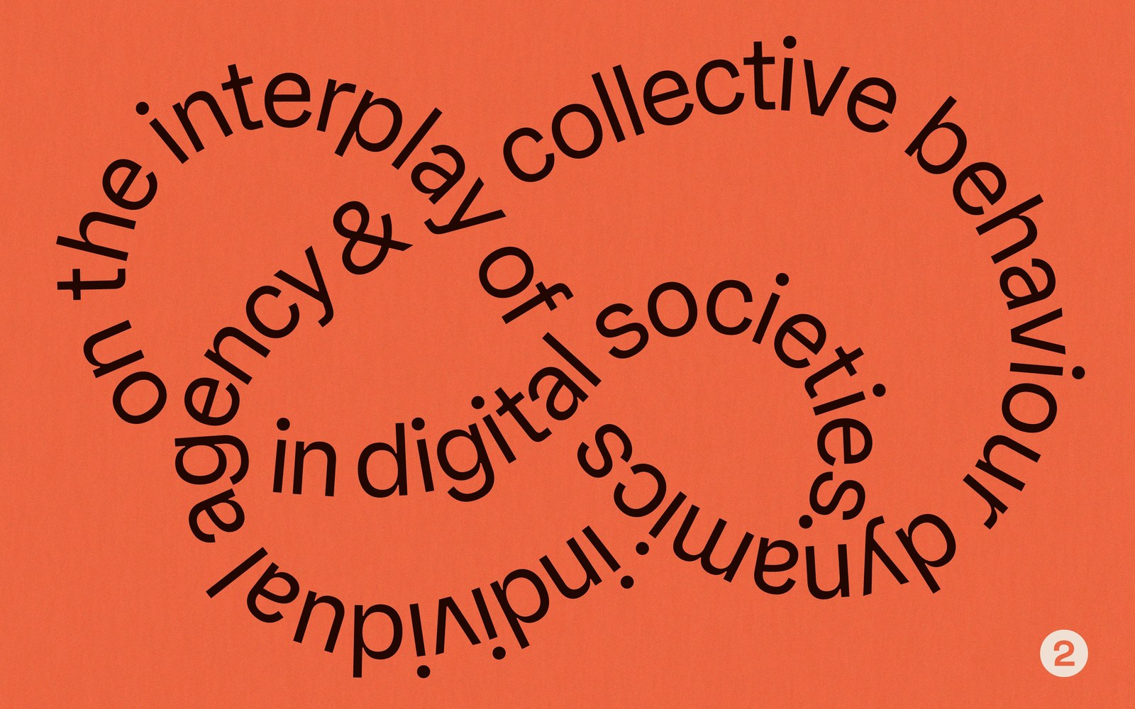
Narrow sans-serifs usually lose their personality once counterforms tighten up. Here, that inked junction softness keeps the Compressed and Condensed cuts unmistakable, whether stacked in heavy espresso-black display blocks or lined up in giant side-by-side numeral 5 width comparisons over warm terracotta stock. Stylistic sets add plenty of range too. Designers can swap in a straight-legged R, a single-storey a, disambiguated l and 6 forms, a classic double-storey g, or playful pointing manicules. Coming full circle from his clean geometric Cera days back to expressive character, Runge built a flexible typography system that pairs naturally with Marc's Weymann Serif in subheads or sits cleanly in body text beneath Philipp Neumeyer's headline-heavy Nobert.
Read the full interview with Jakob Runge and TypeMates on TYPE01.