· Fonts In Use· Richard Sheaff
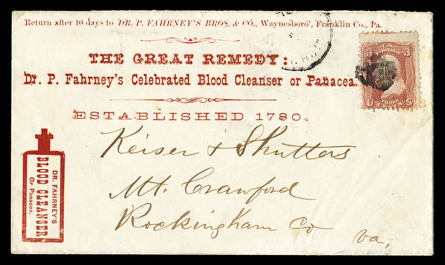
Fahrney’s Blood Cleanser trade card and envelope
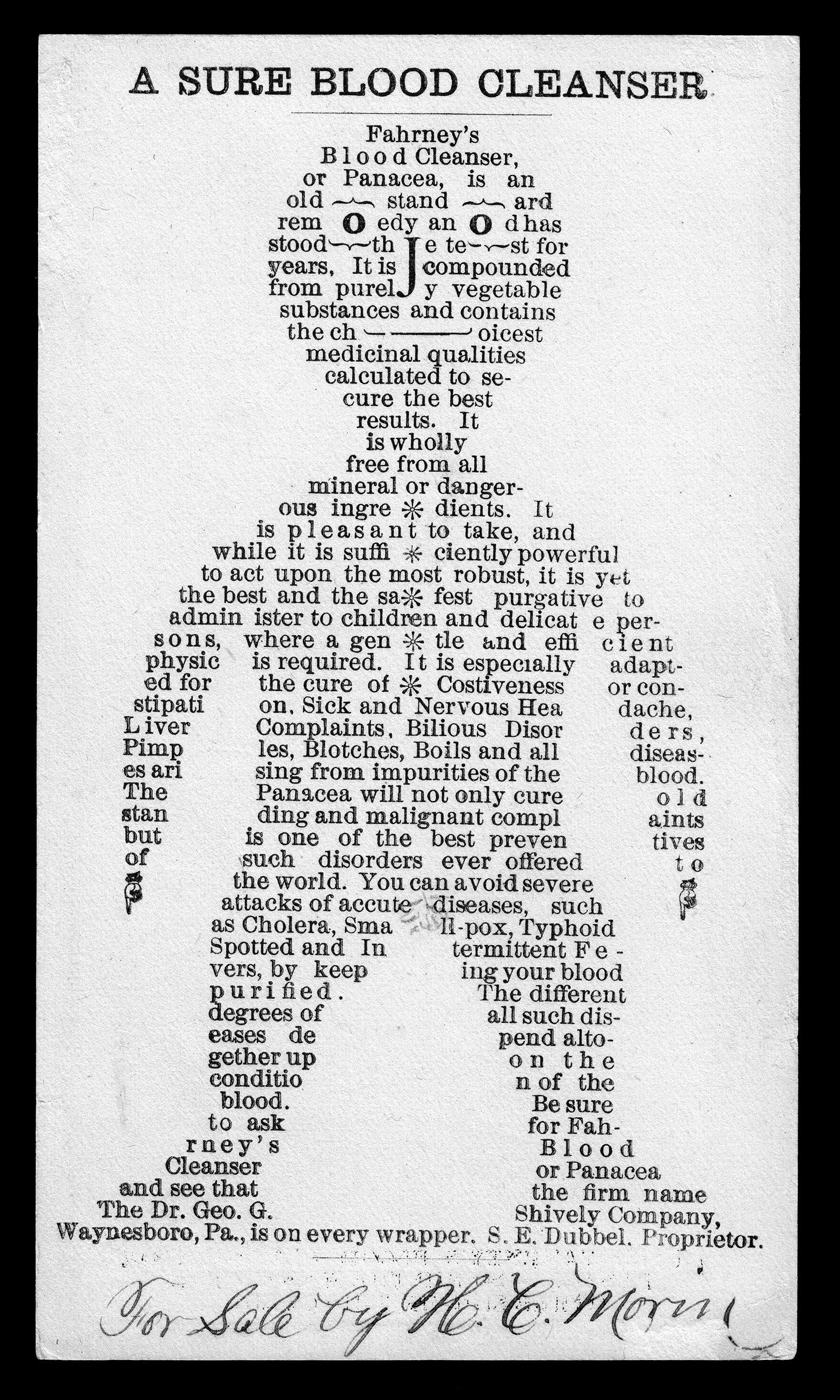
“A Sure Blood Cleanser” uses an Antique for the title and a Modern/Scotch for most of the “body text”. Note the asterisks used as buttons, as well as the manicules as (tiny) hands.
A ca.1875–1885 trade card, which is a wonderful example of the use of type as illustration. Possibly the typesetter was inspired by an 1844 example found in the Mormon newspaper The Nauvoo Neighbor, see below.
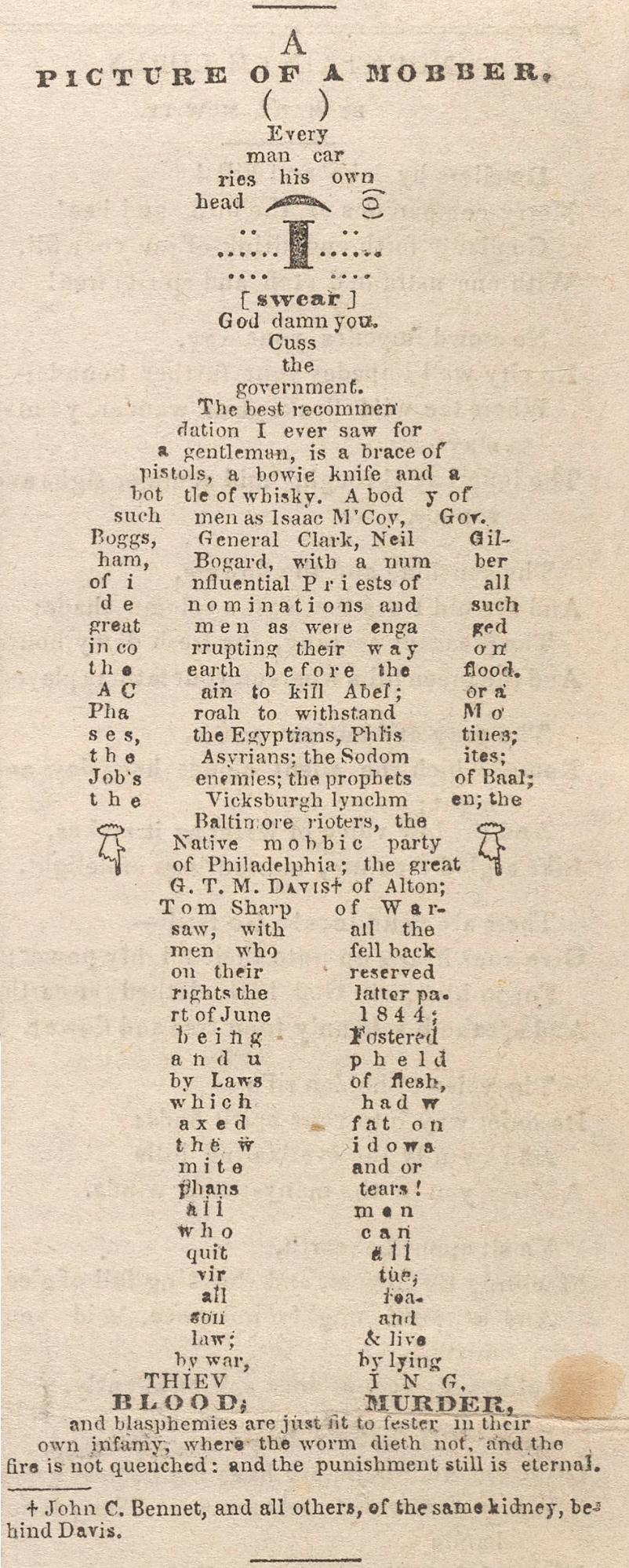
For reference: “A Picture of a Mobber” in the Mormon newspaper The Nauvoo Neighbor (1844). The typefaces in this work have not been identified.