Cinéma Cinéma — Editorial Design by Deux Huit Huit
Deux Huit Huit crafted a modular editorial design system for Cinéma Cinéma, uniting three independent Montreal movie theatres.
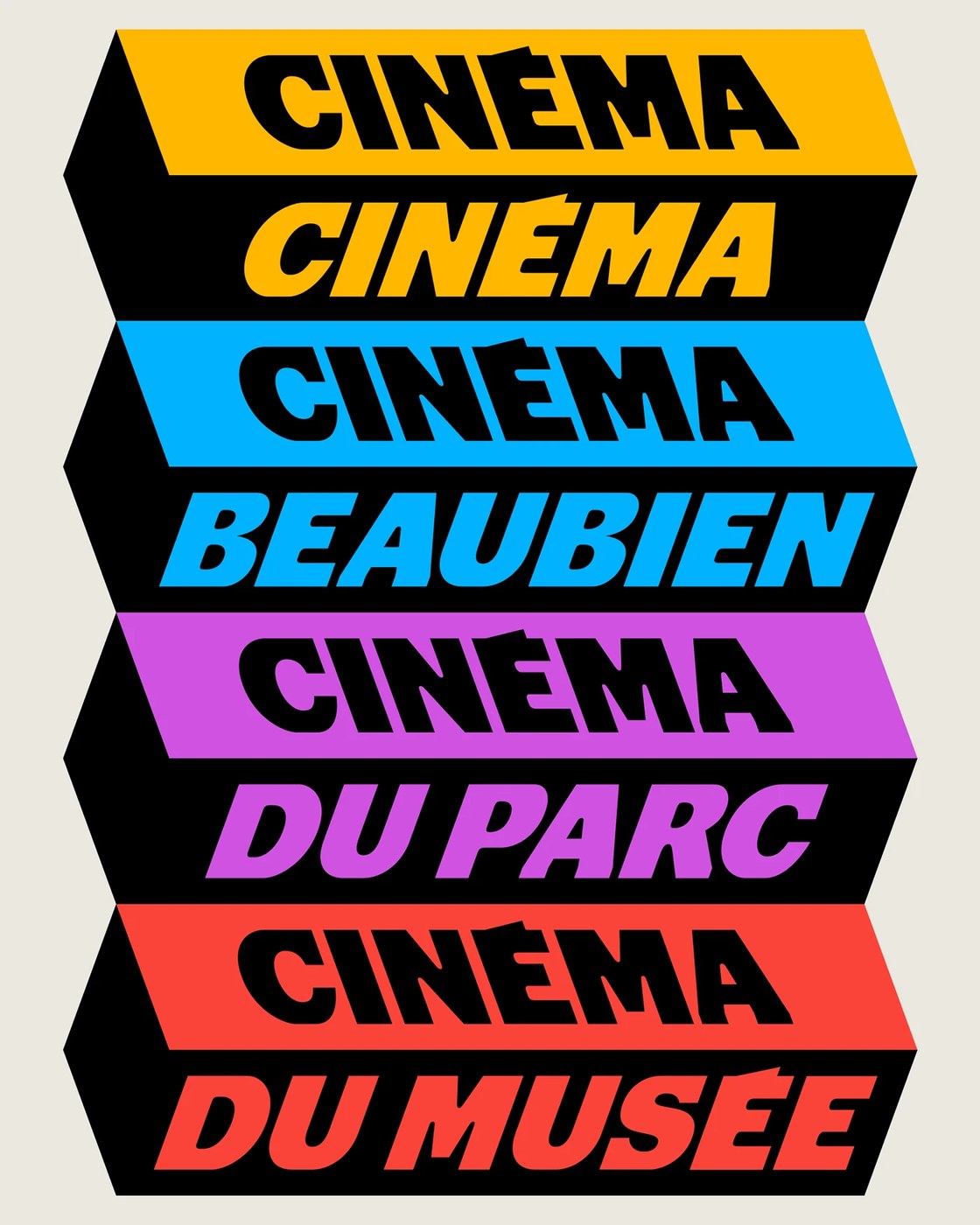
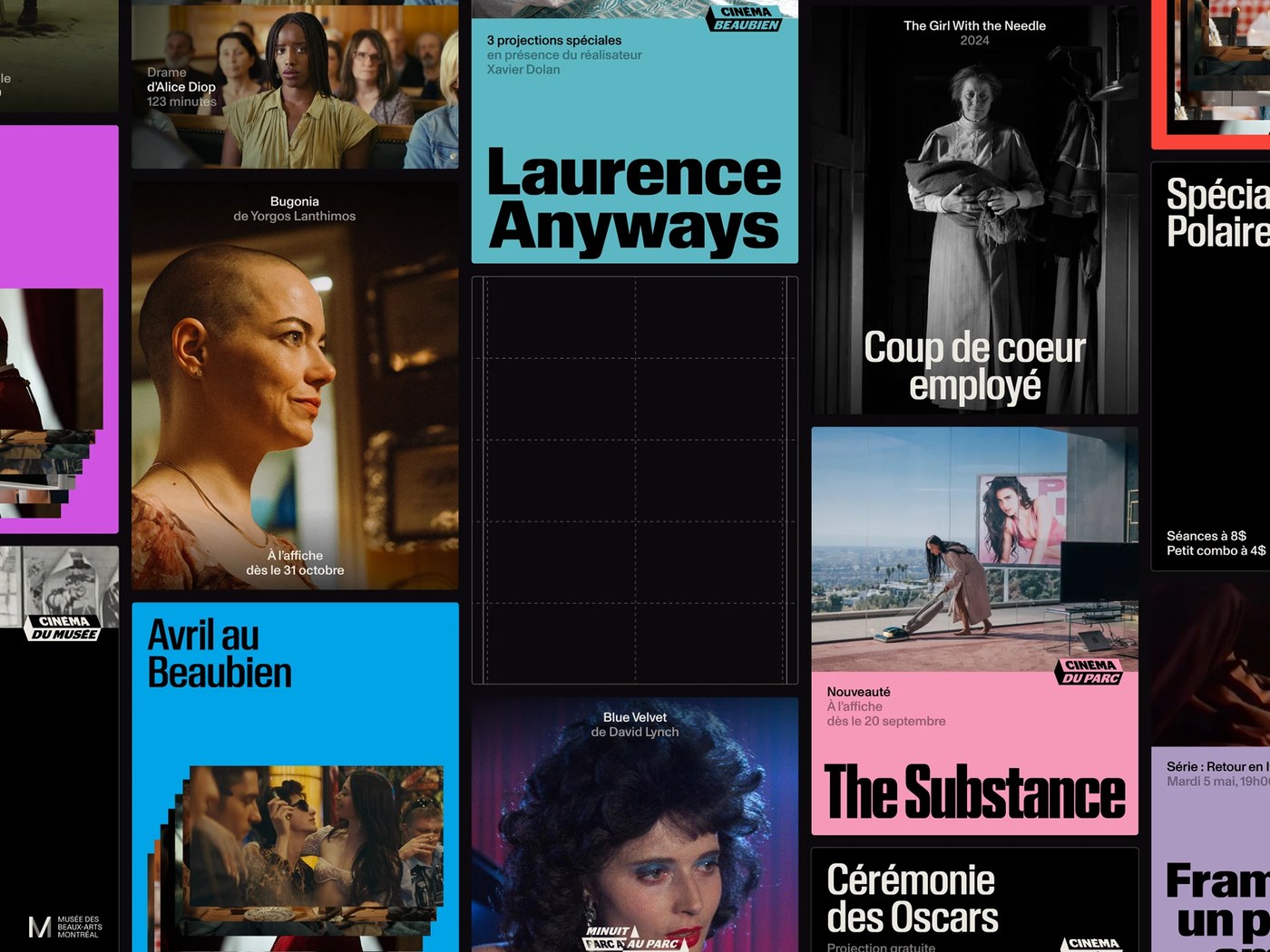
Montreal studio Deux Huit Huit faced an intricate cultural challenge: bringing three storied neighborhood cinemas—Cinéma Beaubien, Cinéma du Parc, and Cinéma du Musée—under a unified entity without flattening their distinct local personalities. Rather than smoothing over their differences, the studio constructed a shared visual framework rooted in classic cinema graphic codes. The core brand functions as a chameleon marquee that adapts to each venue’s programming and architectural legacy. A disciplined monochrome baseline allows each theater’s signature color to emerge—cyan for Beaubien, magenta for du Parc, and warm vermilion for du Musée. The resulting editorial design establishes an adaptable graphic grammar that accommodates eclectic festival programming, repertory screenings, and director retrospectives.
Condensed Marquee Typography and Grid Structure in Editorial Design
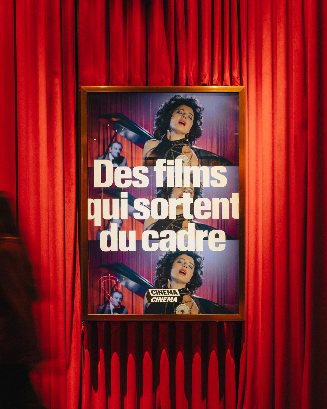
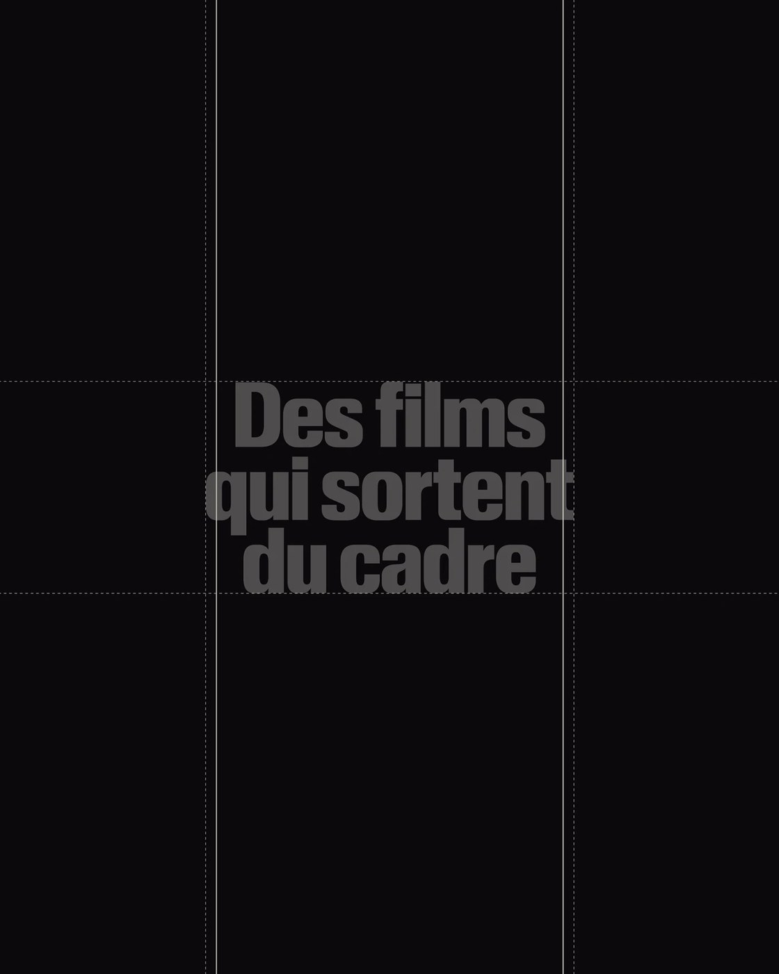
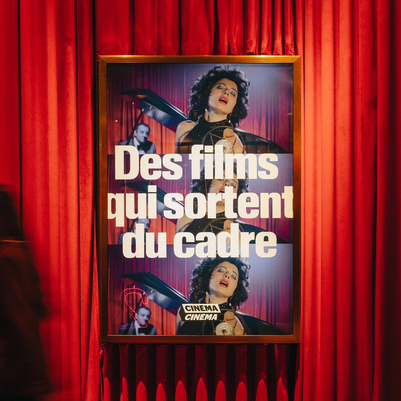
The typographic architecture centers on monumental, condensed sans-serif letterforms reminiscent of mid-century cinema marquees and French New Wave title sequences. Heavy, tightly tracked vertical headlines command festival posters and broadsheet programs, utilizing the phrase “Des films qui sortent du cadre” to celebrate cinema that breaks the conventional frame. Geometric guidelines and an isometric construction grid govern the faceted polygon container, locking the double “C” monogram into a bold three-dimensional perspective. Across digital screening calendars and printed schedules, modular grid divisions compartmentalize showtimes, director credits, and film stills from Xavier Dolan, Yorgos Lanthimos, and David Lynch with rhythmic typographic clarity.
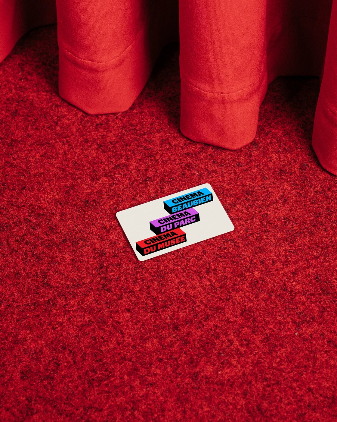
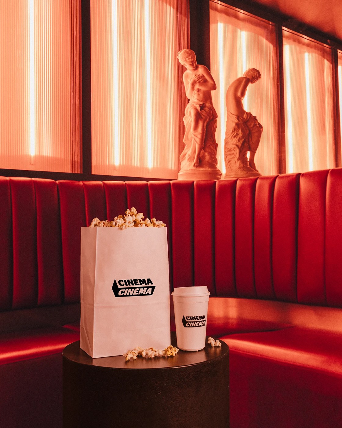
Physical touchpoints translate this editorial design into tangible cinema artifacts. Backlit brass poster lightboxes mount against deep crimson pleated velvet drapery, framing film stills within the bold brand container. Clean white concession packaging—including popcorn bags and paper coffee cups—carries the black angled logotype in sharp relief against the warm theater interior. Membership cards printed on durable white substrates display the three cinema blocks stacked in cyan, magenta, and red. In kinetic environments and broadcast titles, the faceted three-dimensional marquees rotate dynamically, demonstrating how the structural editorial design shifts effortlessly from tactile print ephemera to fluid screen motion.
See more from Deux Huit Huit on Behance.