Boldtype Management Visual Identity and Typography Branding
Boldtype Management is a dynamic visual identity and branding project by Aptum Studio featuring ultra-bold geometric block typography.
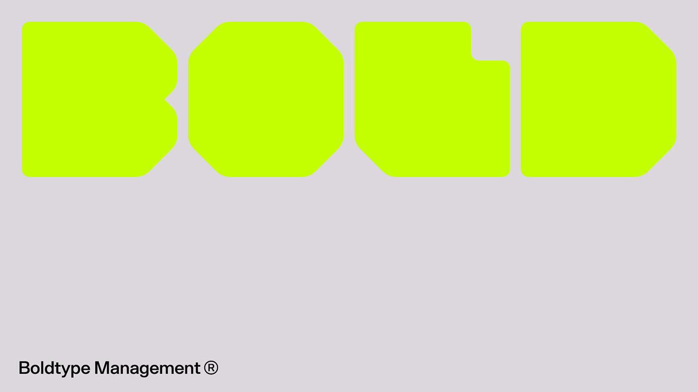
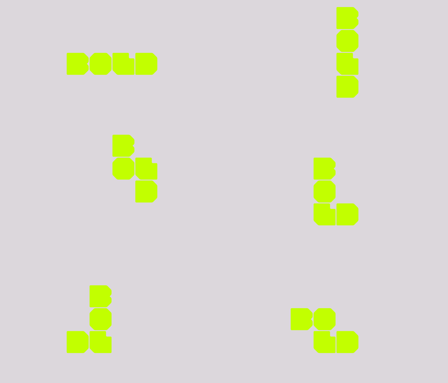
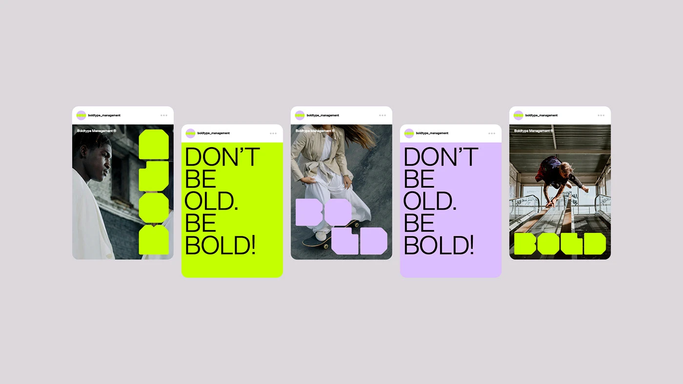
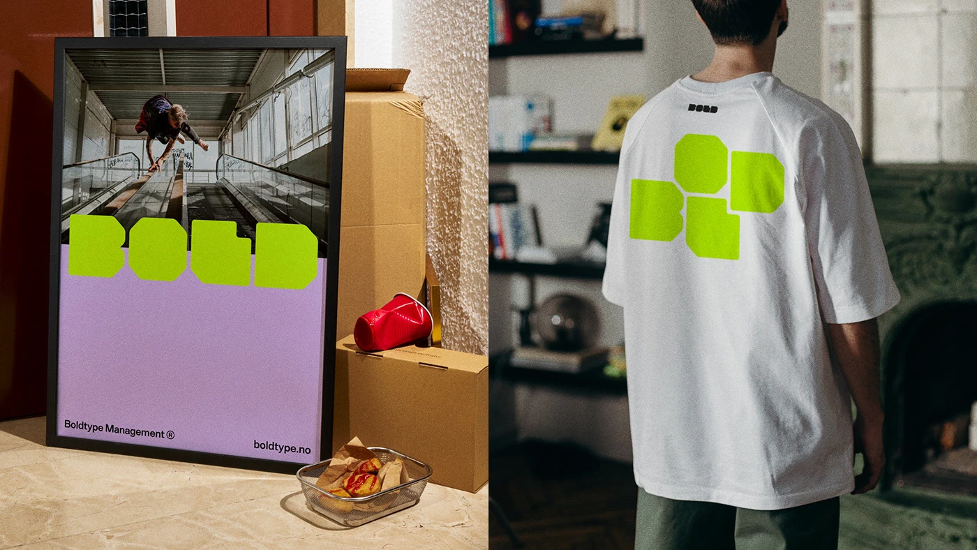
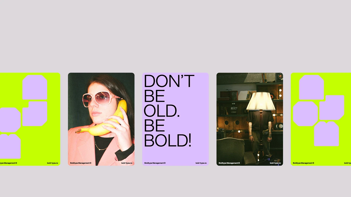
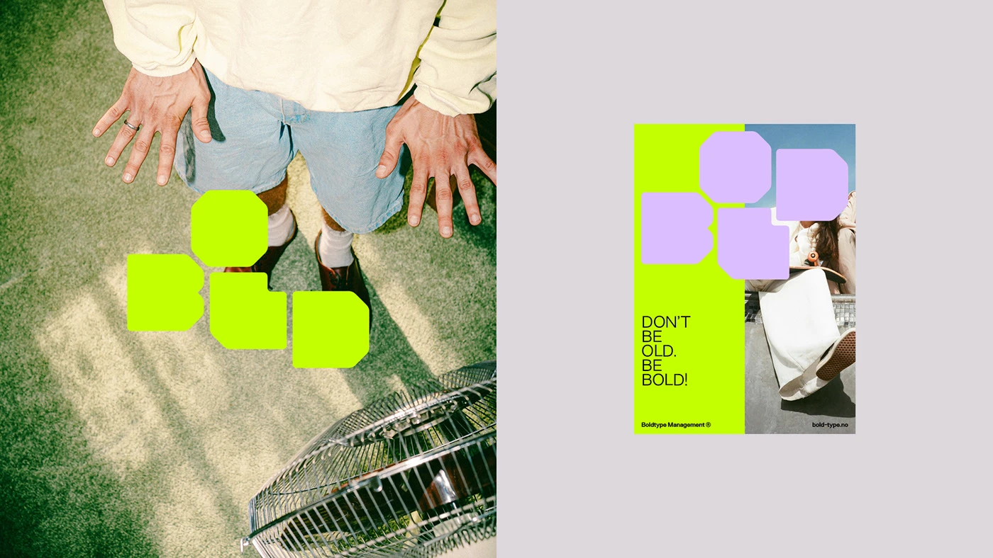
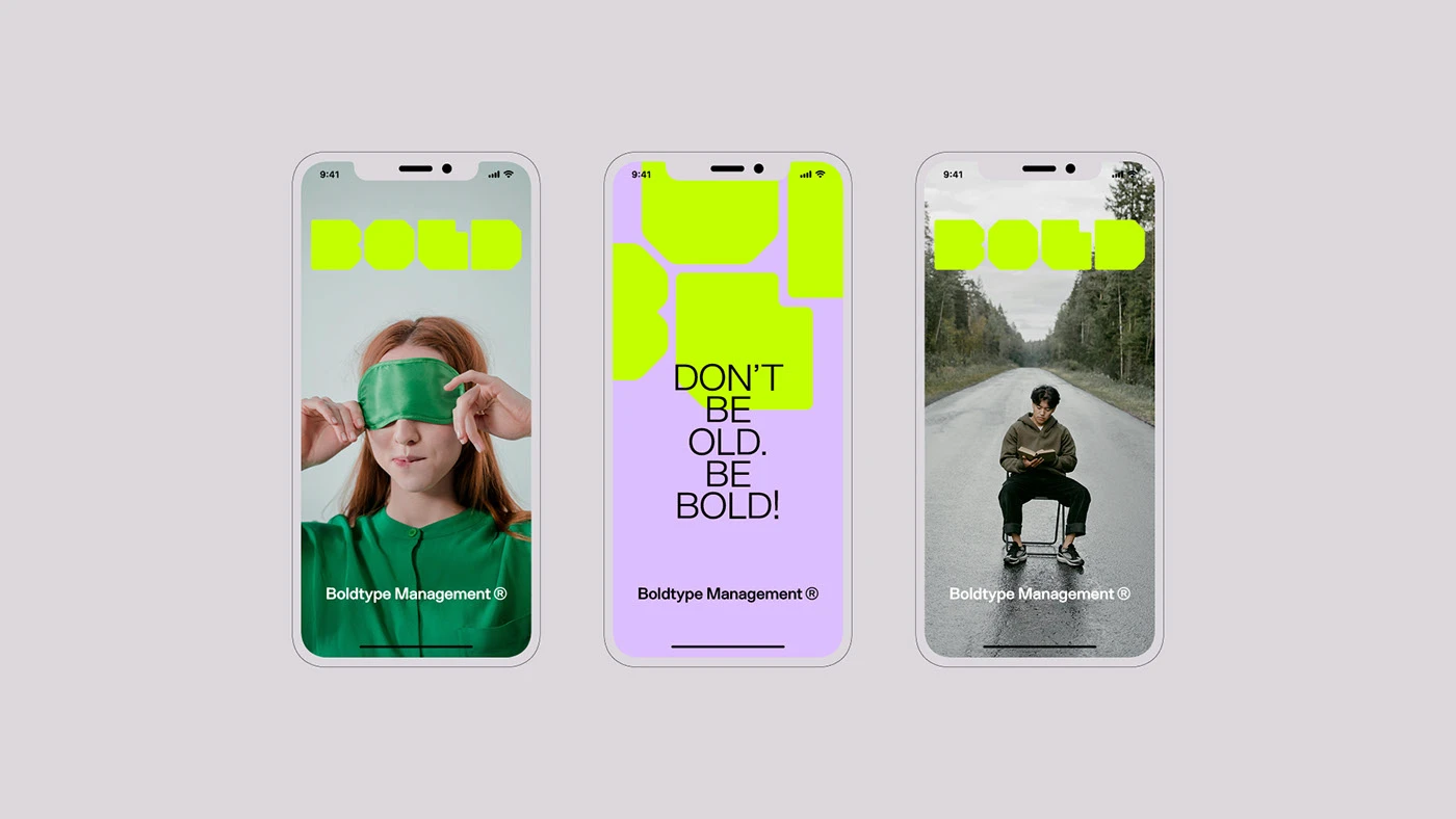
The visual system relies on a big custom font that acts as the main hero graphic. At the core of the branding sits the word BOLD drawn with thick octagonal block shapes. Designers Aptum Studio, Luca Guerci, Matteo Polla, and Thomas Garaventa pair this heavy font with an electric acid yellow and soft lavender tone. Thin sans serif text adds a sharp look next to the heavy block letters. The layout pairs raw city photos with clean color fields and bold type marks. Every layout gives the letters heavy visual weight on the page. The full branding system relies on high contrast and simple shapes.
Ultra-Bold Geometric Typography and Event Branding
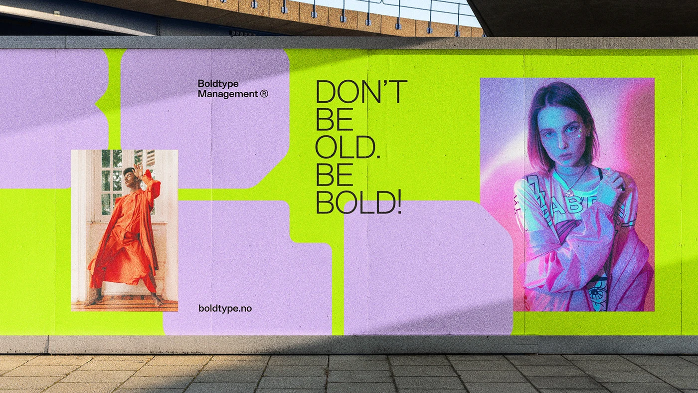
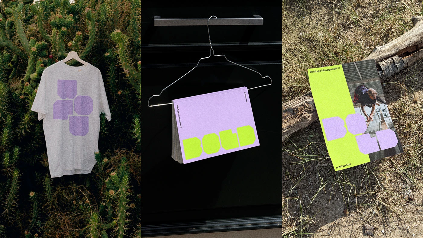
Print and web items extend the brand language to city walls and phone screens. Large street posters use bright color blocks with the line Don't Be Old, Be Bold. Book covers, hanging art prints, and cotton shirts place the block letters on light and dark cotton fields. Social media post frames display event news with clean image borders. The print choices focus on deep color ink and crisp line edges on every surface. Each piece treats the bold font like a real building block for event promo.
The identity gives event management a new voice that speaks to young crowds. By pairing heavy type with active street photos, the branding creates a clear mood. The full visual strategy links raw energy with clean event layouts. It gives great inspiration for design teams who build brand marks for young groups. The design choices stay fresh on every poster layout. Explore the complete brand identity case study on Behance by Aptum Studio.