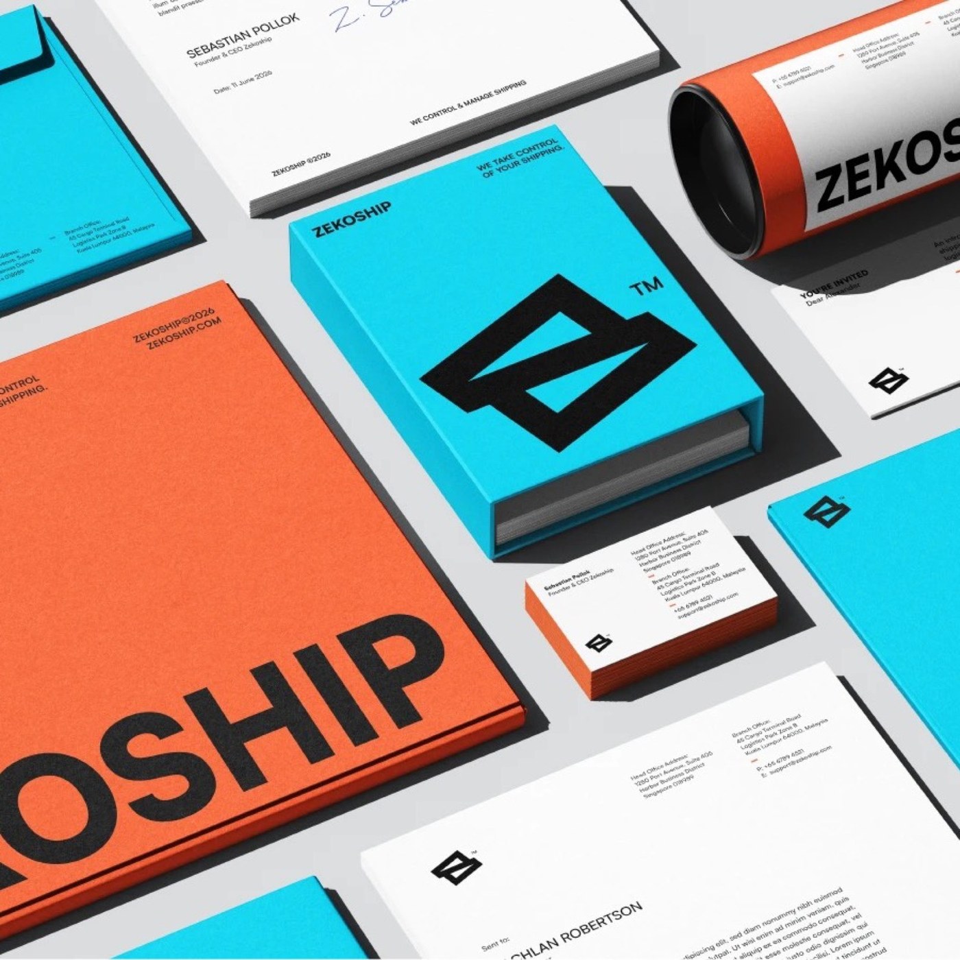
Brand Identity: ZEKOSHIP by Rokeya Akter
Rokeya Akter crafts a high-impact brand identity for ZEKOSHIP, pairing utilitarian logistics telemetry with high-contrast chromatic restraint.
Modern global logistics demands immediate visual authority and operational clarity. For ZEKOSHIP, a freight forwarding and transportation management provider operating across international supply chains, designer Rokeya Akter developed a comprehensive brand identity grounded in speed, structure, and systematic control. Built around the core ethos “Take Control. Manage Shipping,” the visual framework translates complex intermodal freight coordination into an agile, geometric design language designed to command attention from warehouse floors to corporate shipping manifests.
Utilitarian Telemetry and High-Tension Contrast in Brand Identity
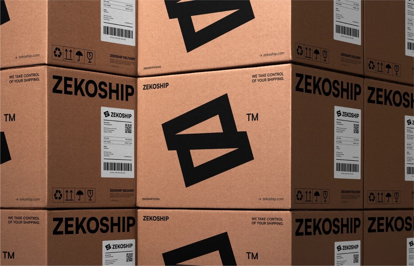
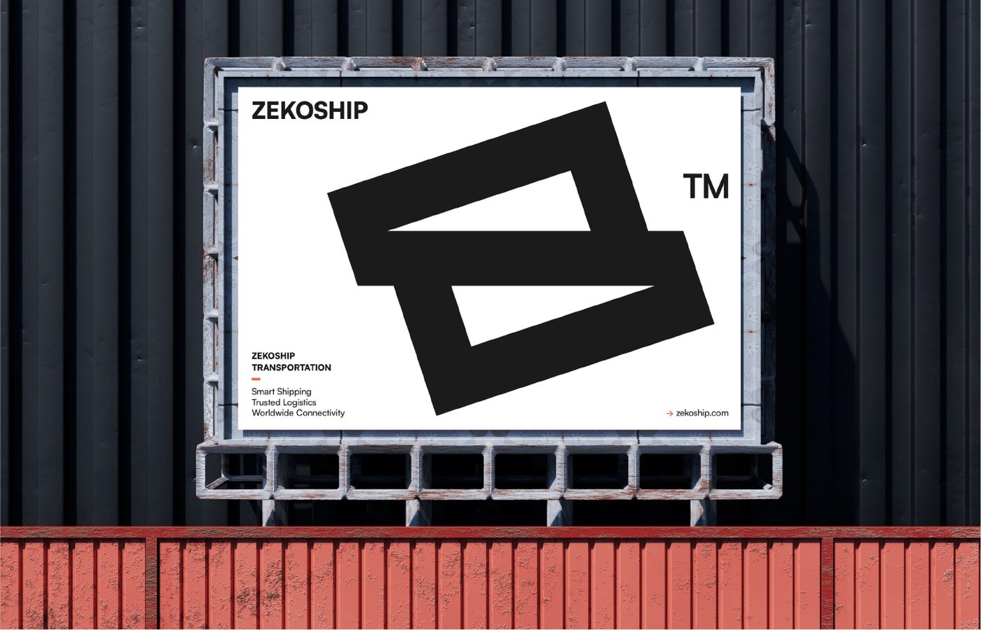
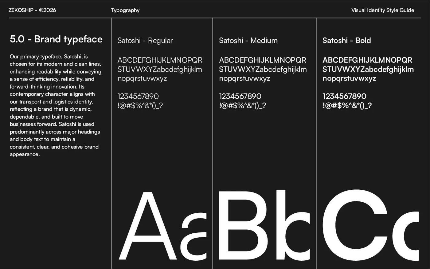
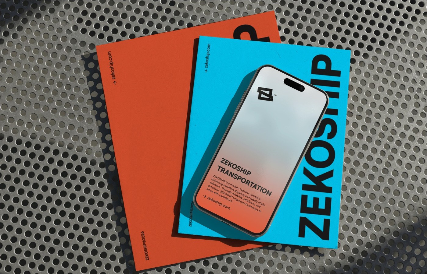
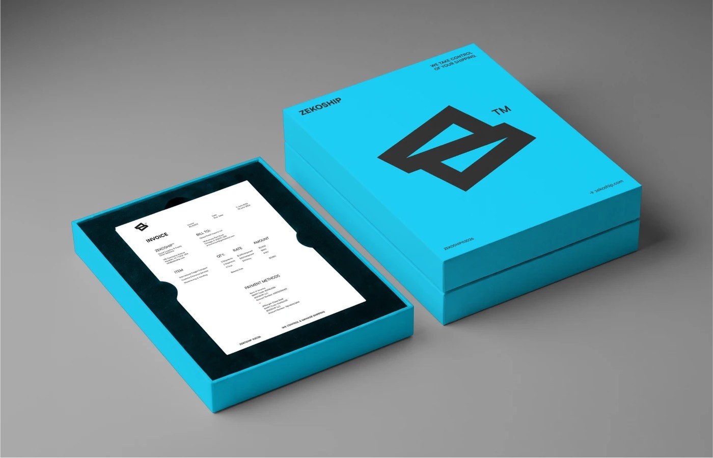
At the center of the visual identity sits a geometric monogram combining the initial letterform Z with dynamic diagonal transport trajectories. The mark functions both as an authoritative corporate signifier and as an expansive graphic device, cropping and scaling across layouts to define directional framing angles. Akter anchored the typographic hierarchy in Satoshi, a modernist neo-grotesque designed by Indian Type Foundry. Across Regular, Medium, and Bold weights, Satoshi delivers crisp mechanical proportions and generous apertures that maintain immediate legibility across physical package labeling, architectural signage, and digital tracking interfaces.
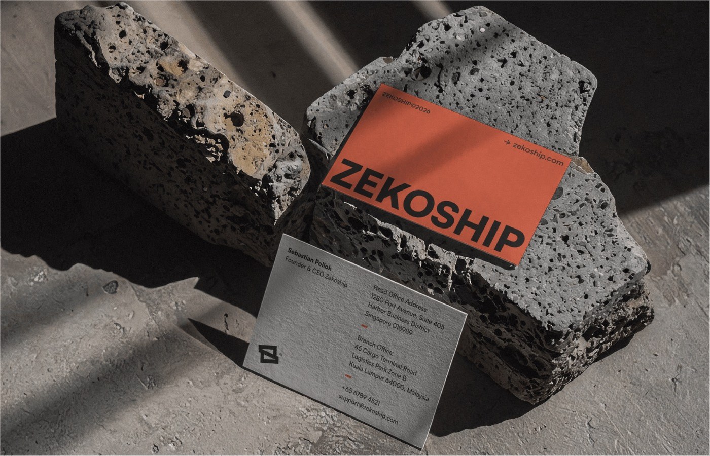
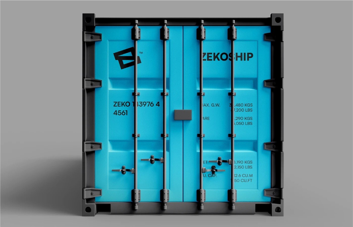
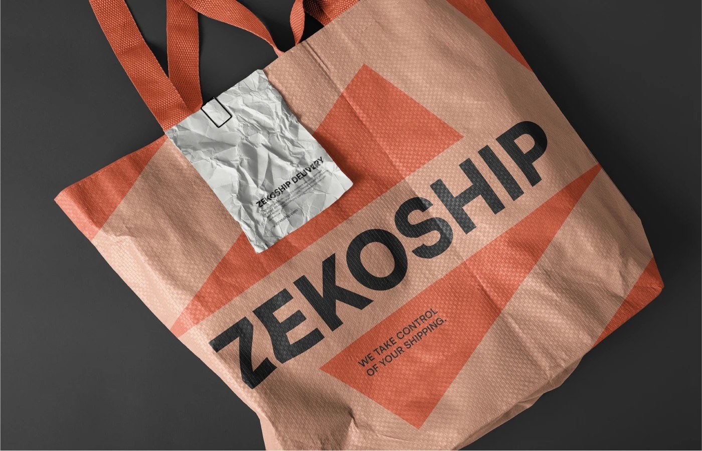
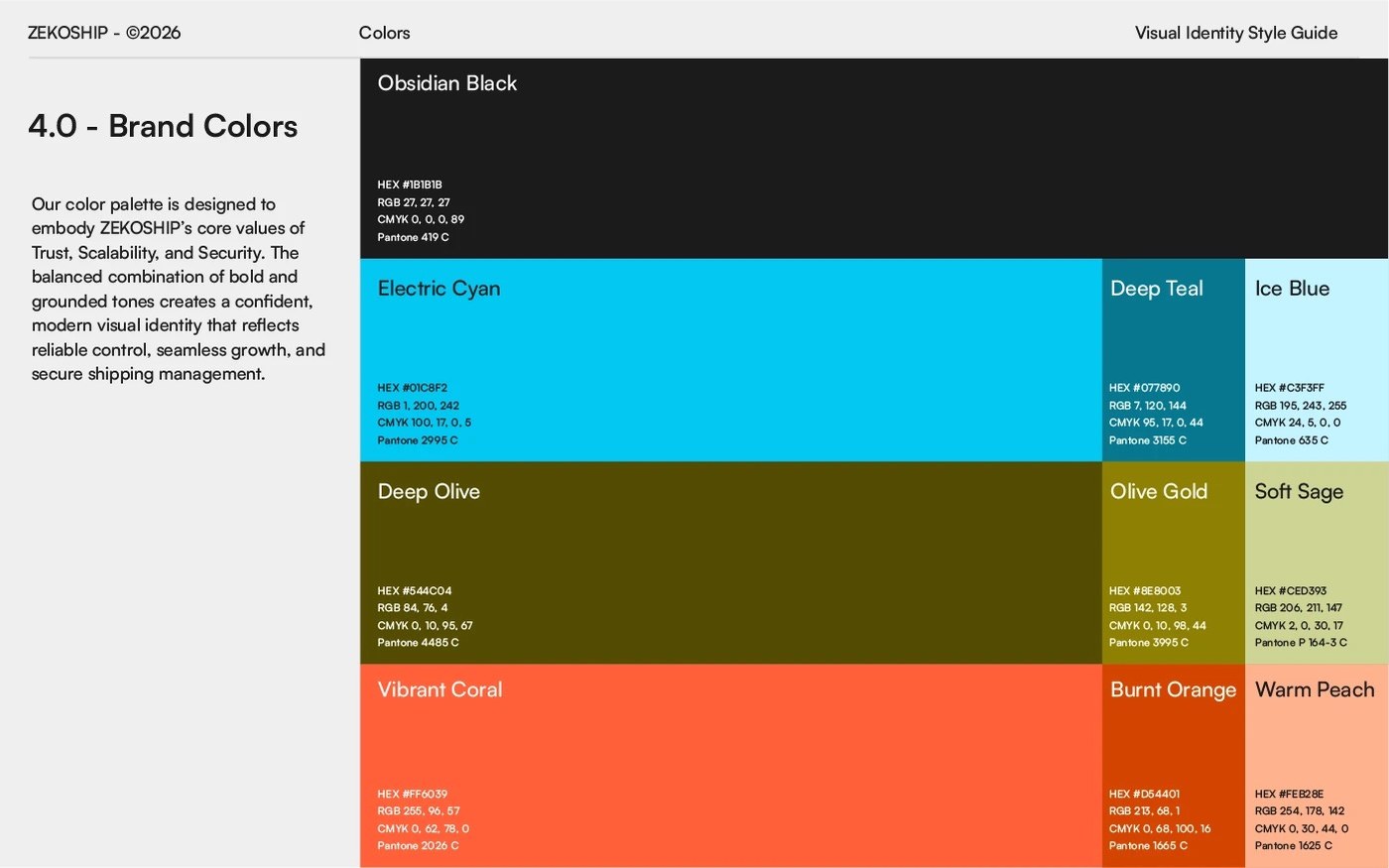
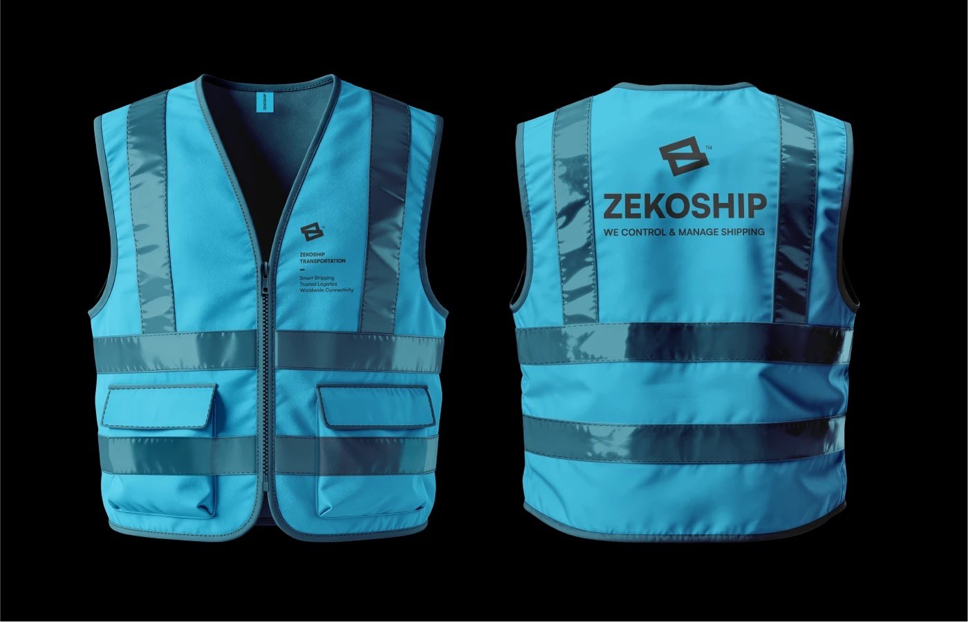
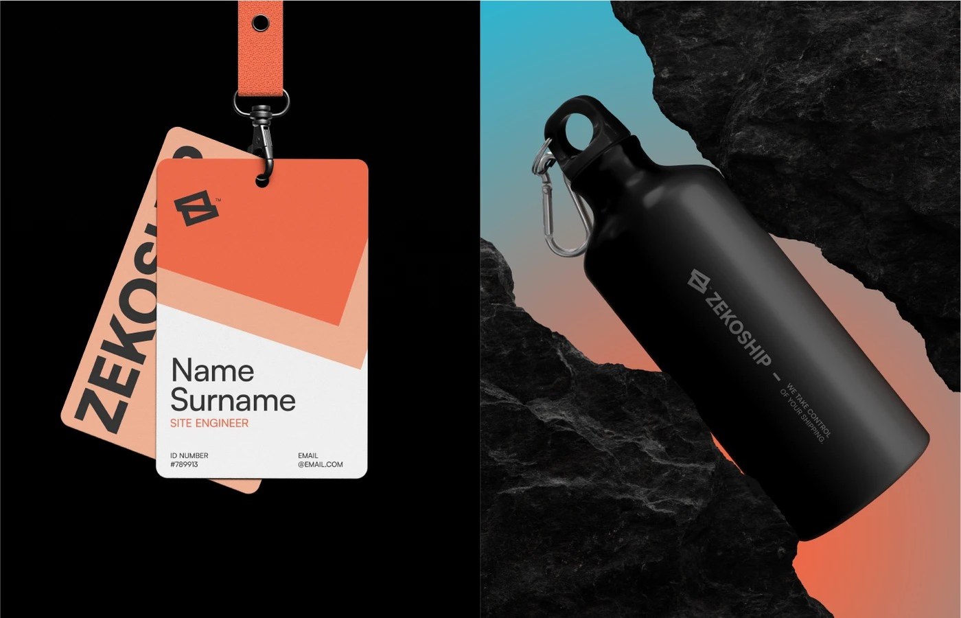
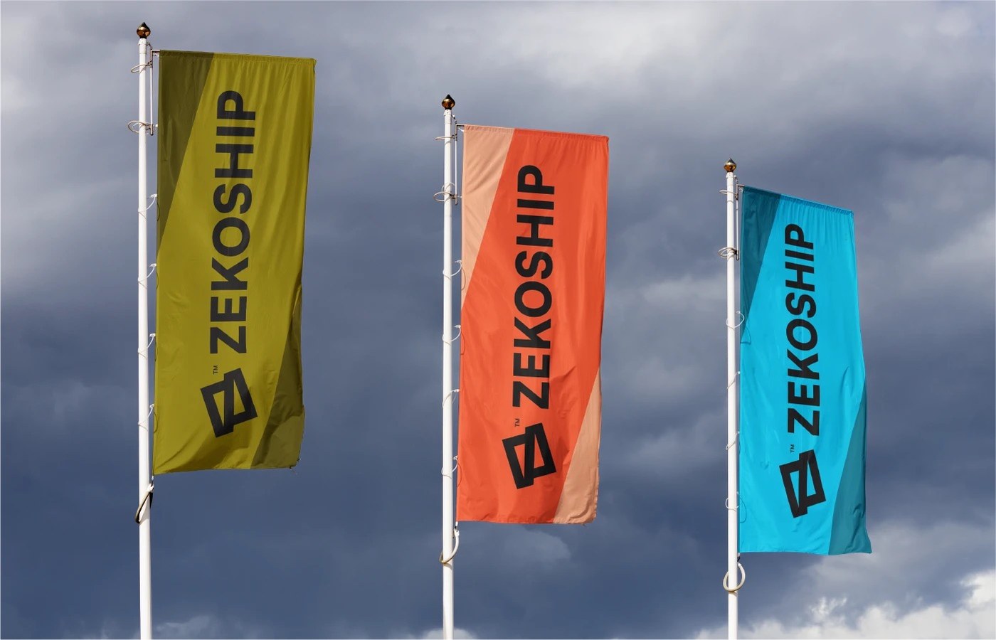
The brand identity distinguishes itself through tactile substrate collisions and rigorous color discipline. Moving beyond conventional logistics blues, the chromatic system pairs deep Obsidian Black (Pantone 419 C) with high-visibility Electric Cyan (Pantone 2995 C), Coral (Pantone 2026 C), and Deep Olive (Pantone 4485 C). Physical touchpoints highlight this material tension: heavy corrugated shipping cartons feature silkscreened marks and barcode telemetry labels; full-scale intermodal steel shipping containers display stenciled freight specifications; and textured cotton business cards rest against rough concrete and volcanic stone. Complemented by woven polypropylene delivery totes, high-visibility field safety vests, and custom presentation boxes, the identity establishes a cohesive, industrial presence across every stage of the global supply chain.
See the complete project by Rokeya Akter on Behance.