SALAD&RIA Fresh Food Branding Identity
Explore Mateus Araújo's SALAD&RIA branding system featuring bold tall typography, lime green accents, and rich macro food photos.
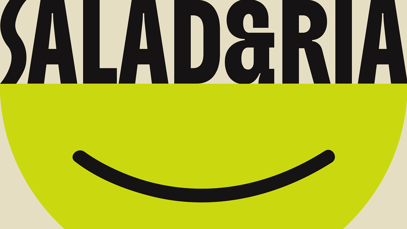
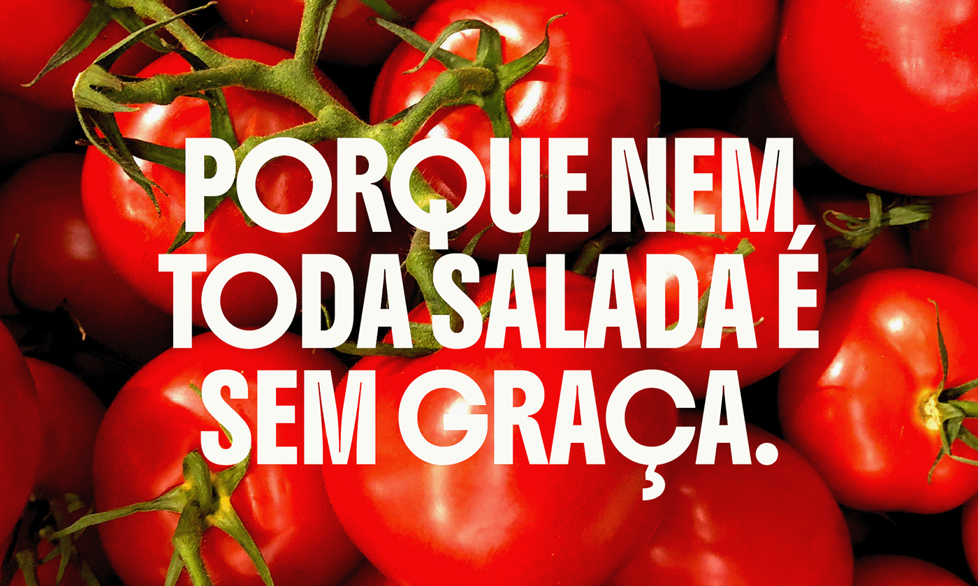
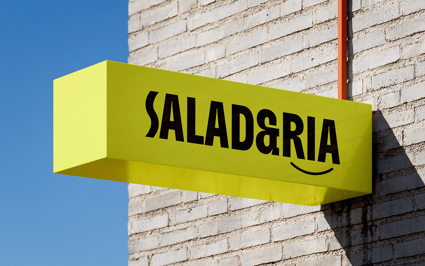
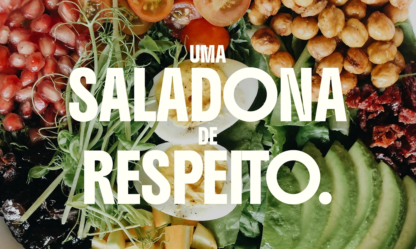
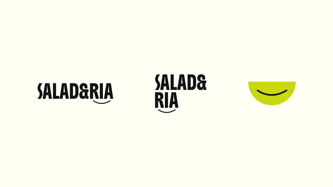
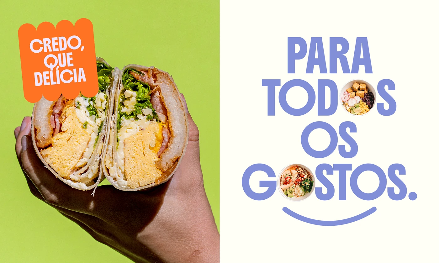
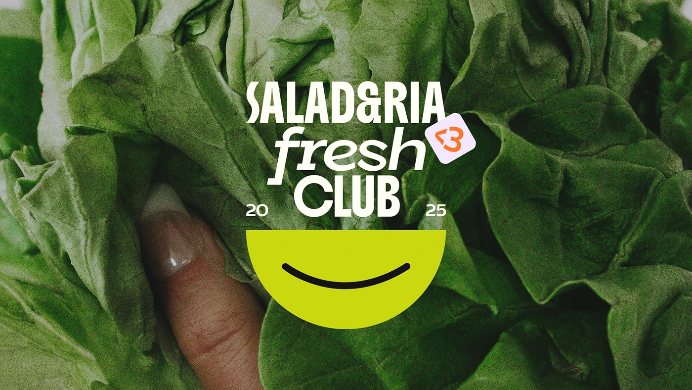
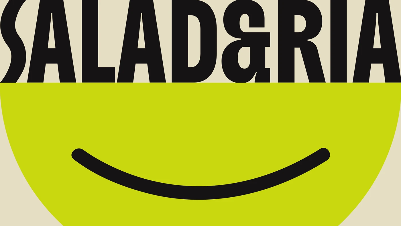
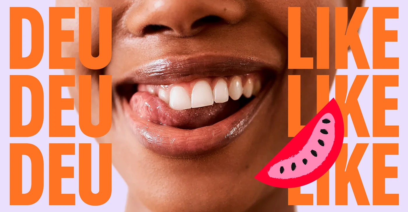
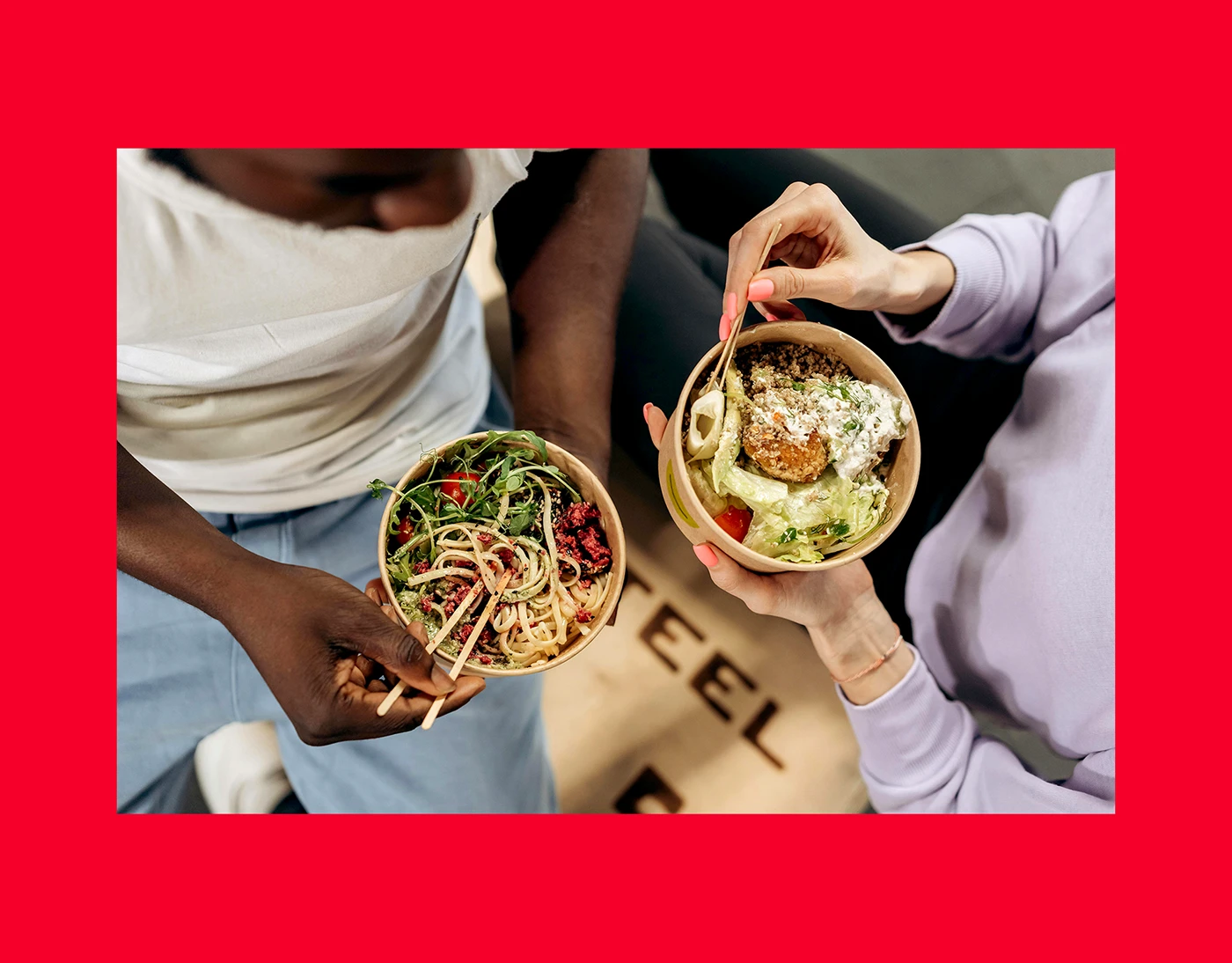
Mateus Araújo made the SALAD&RIA branding set for a fresh food delivery brand. The design relies on a tall sans font paired with a smile curve. A bright color set pairs lime green, ripe red, soft white, and dark tone. High contrast type sits right on top of close food shots. Big letters fill print posters and phone screens with clear food notes. On shop walls, bright yellow box signs display the brand mark with strong visual style. Small stickers seal each food box with care. Every bowl label brings a fresh look. Food boxes look clean and bright.
Condensed Typography and Fresh Branding Identity
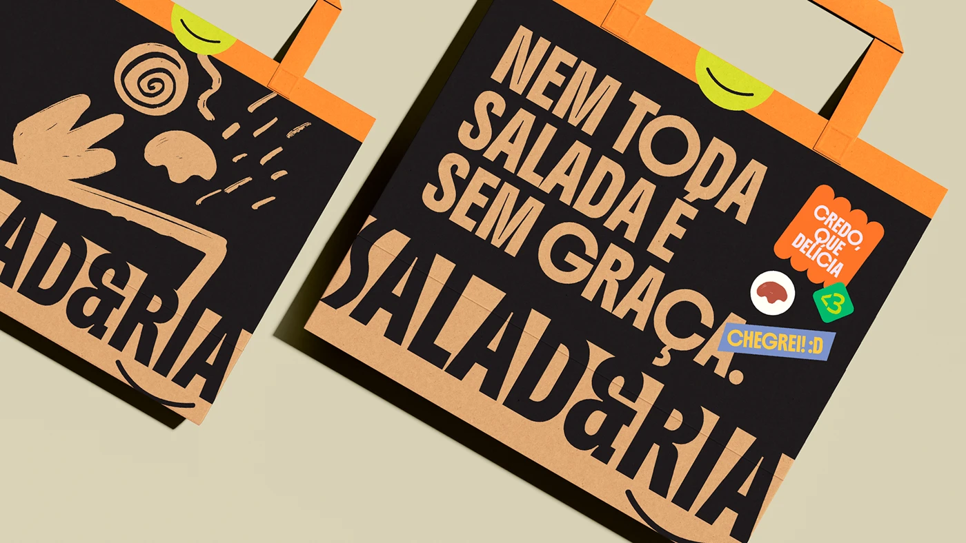
The spatial branding plan links fun food to neat graphic grids. Custom letter shapes act as toy building blocks inside the layout grid. Each letter shifts width to fit tight spaces on print cards and web pages. Dark outlines add contrast and clarity to complex art on food wraps and bags. Bold color blocks mark different menu sets, guiding buyers as they pick meals. The type uses soft edges to keep shapes friendly to guests. Bright green tags make picking items fast. Every bag tag stays clean and crisp. This neat grid keeps brand work clear on boxes, cups, and paper sacks.
The flexible branding layout works well on social web posts, day menus, and store sign boards. Simple shape frames hold food pics, text notes, and price tags. Treating brand parts as toy building blocks keeps the system ready for new shops and new menus. The team made a rich set of brand assets. The brand visual system feels complete. The project shows how fresh food places profit from smart visual design systems. View the full graphic set on Mateus Araújo's Behance portfolio.