Collective Actions Digital Exhibition Web Design
Collective Actions is an editorial web design and digital exhibition platform by Paprika Design featuring warm typography and fluid cards.
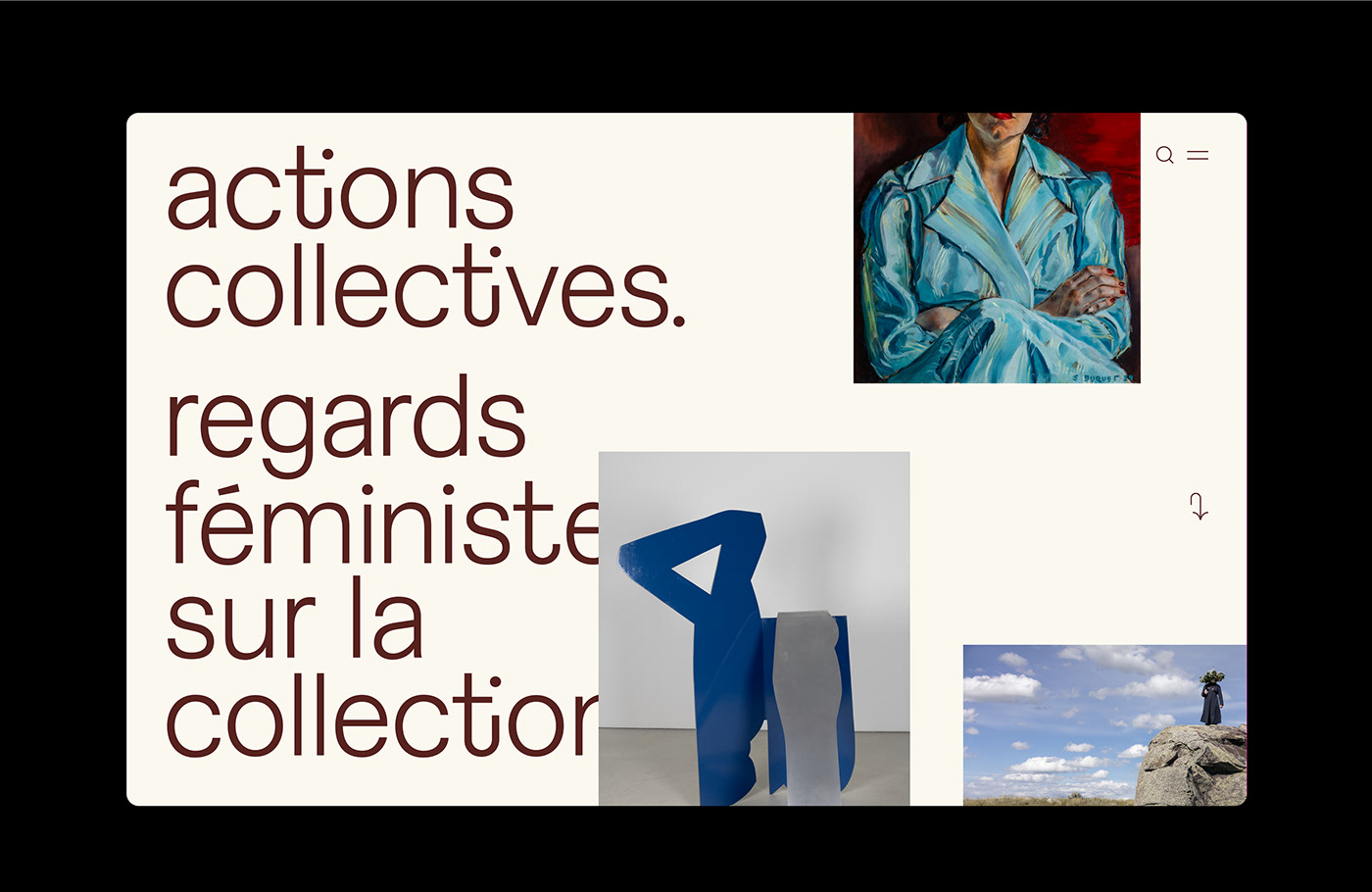
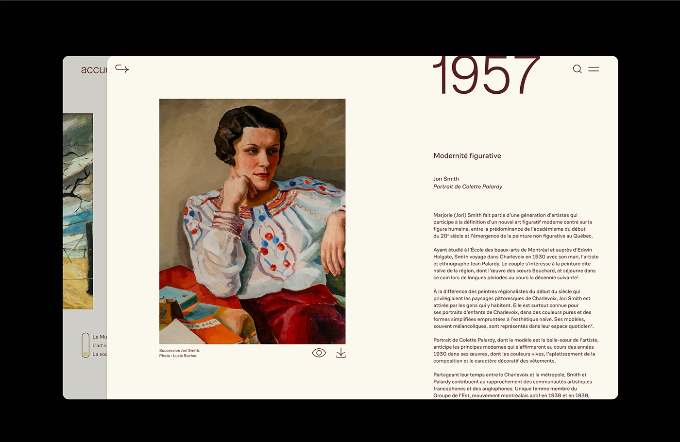
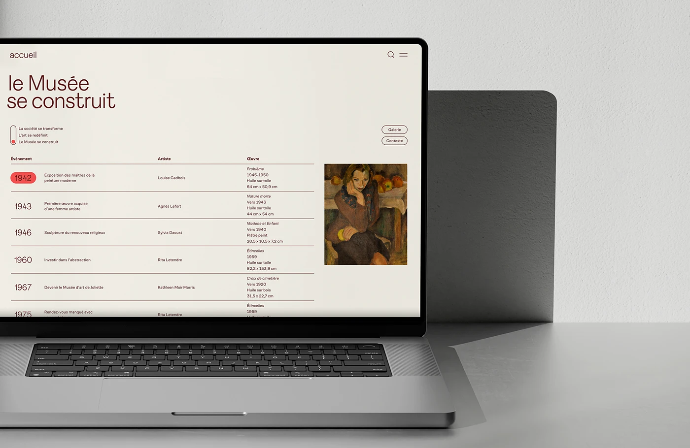
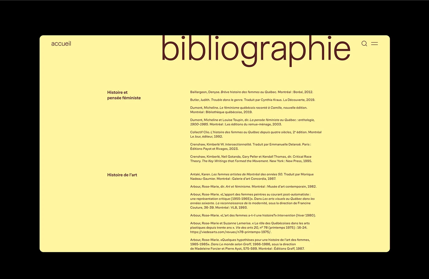
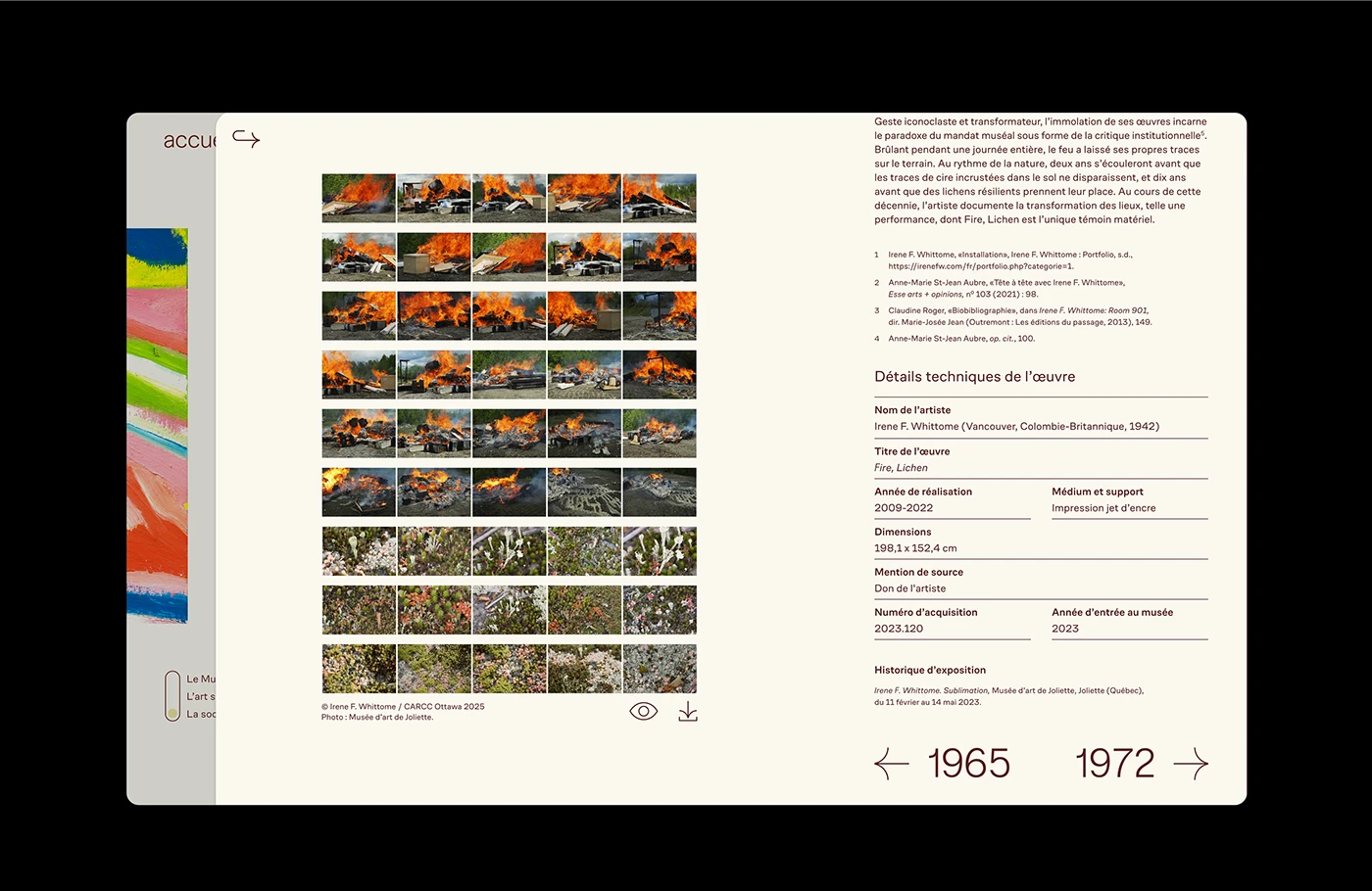
The digital site pairs editorial rules with clean web design structure. At the core of the page sits dark burgundy text on a warm cream ground. Studio Paprika Design sets big title text next to art photos and date years. Clean card shapes hold art notes, artist names, and record dates. The page layout lets text blocks breathe next to rich oil painting images. Every view uses simple spacing to guide the reader through the online art set. The clean web design keeps the user focus sharp on each art piece. Broad margin space adds breathing room to every text column.
Editorial Typography and Fluid Container Web Design
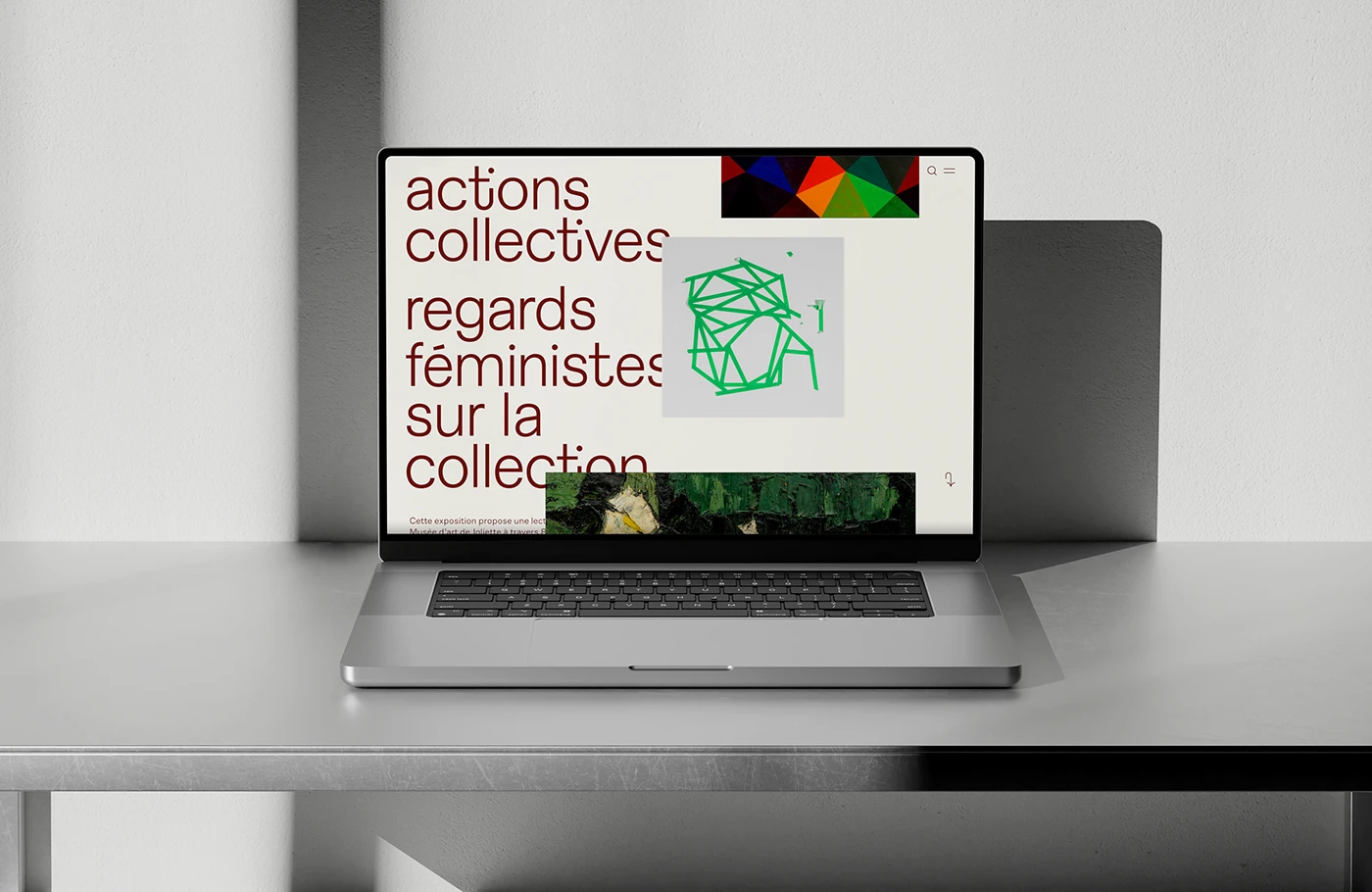
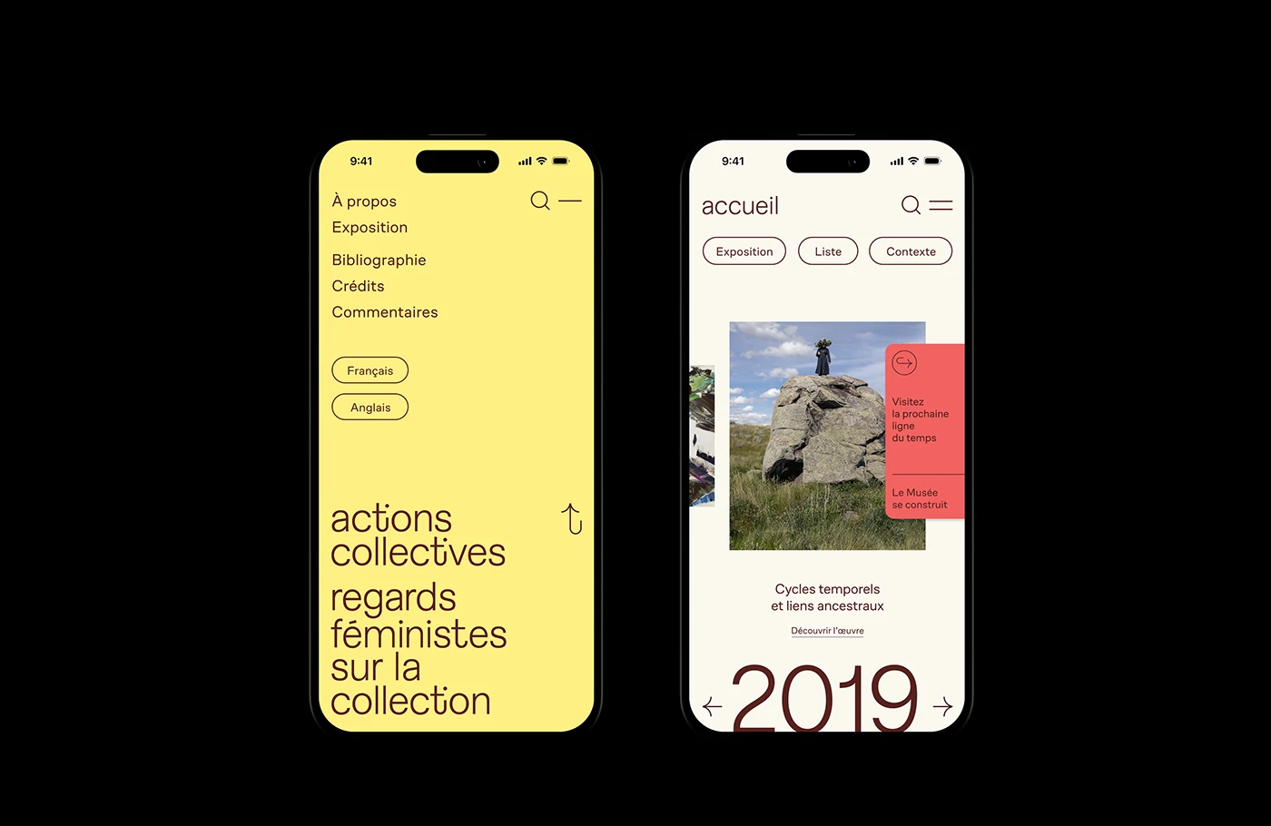
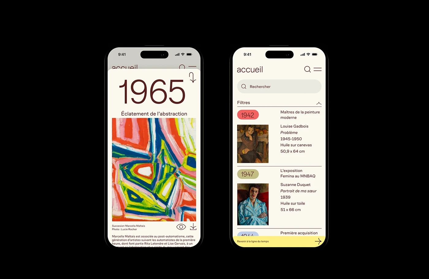
Mobile views adapt the web design system to small phone screens. A soft yellow side menu opens to show quick page links and language choices. Coral red cards float over art photos to prompt quick taps. On laptop screens, wide displays show multi column timeline lists with light line rules. The layout uses soft pastel tone fields to group main content blocks without hard borders. The typography stays clear on every screen size and phone view. Smooth container cards keep every layout clean. Responsive layouts adapt well across all devices.
The site shows how smart web design makes art archives easy to read. By focusing on clean reading flow and clear cards, the design turns an online exhibit into an engaging story. The full layout links art history with modern user experience patterns. It gives great inspiration for design teams building web design projects and digital art archives. Each view proves how simple grid details build strong reading value. Explore the complete digital case study on Behance by Paprika Design.