Editorial Design: Flexible Visual Systems by TwoPoints.Net
Flexible Visual Systems by TwoPoints.Net is an editorial design project codifying systematic visual grammar across a 320-page design manual.
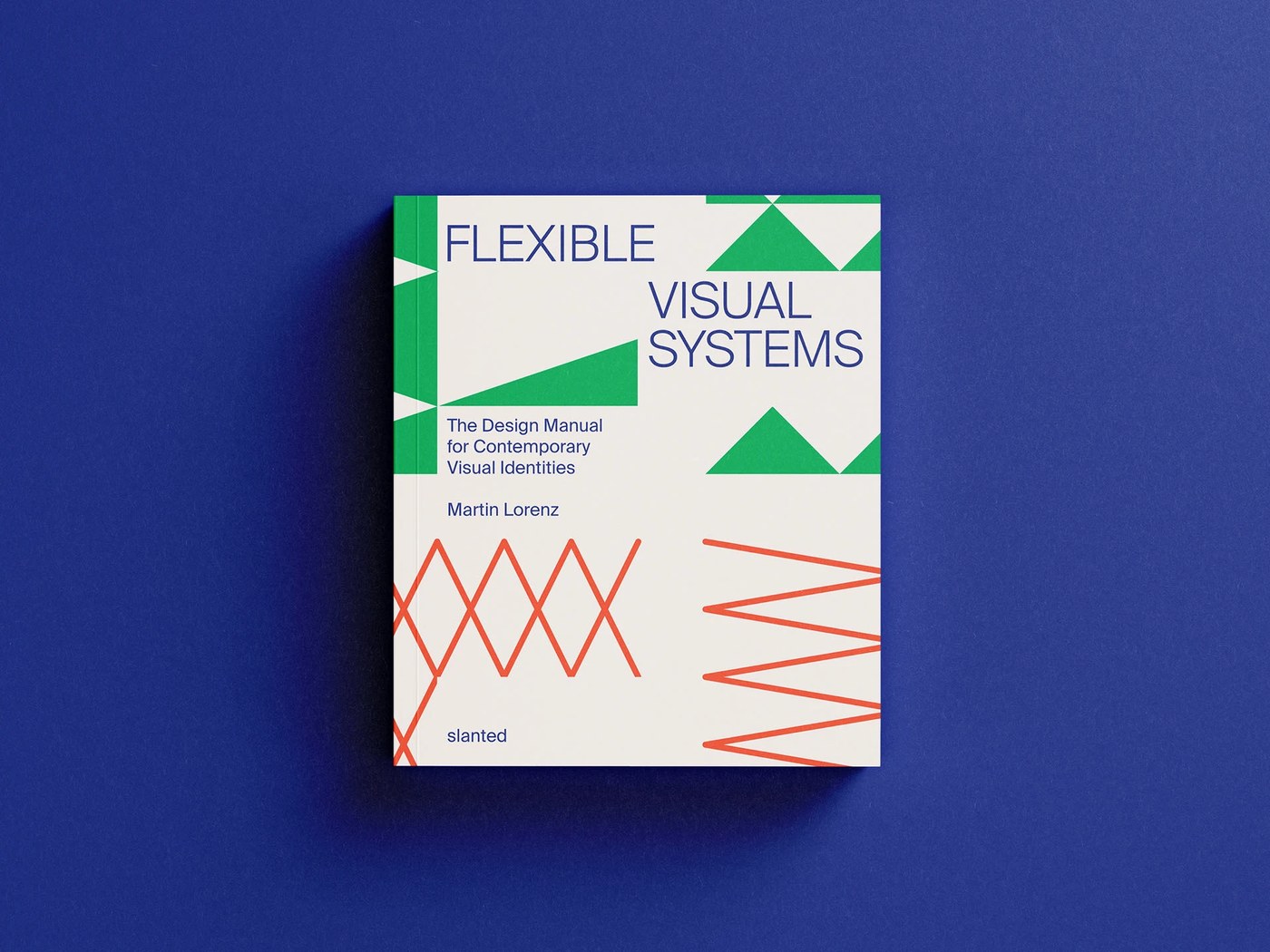
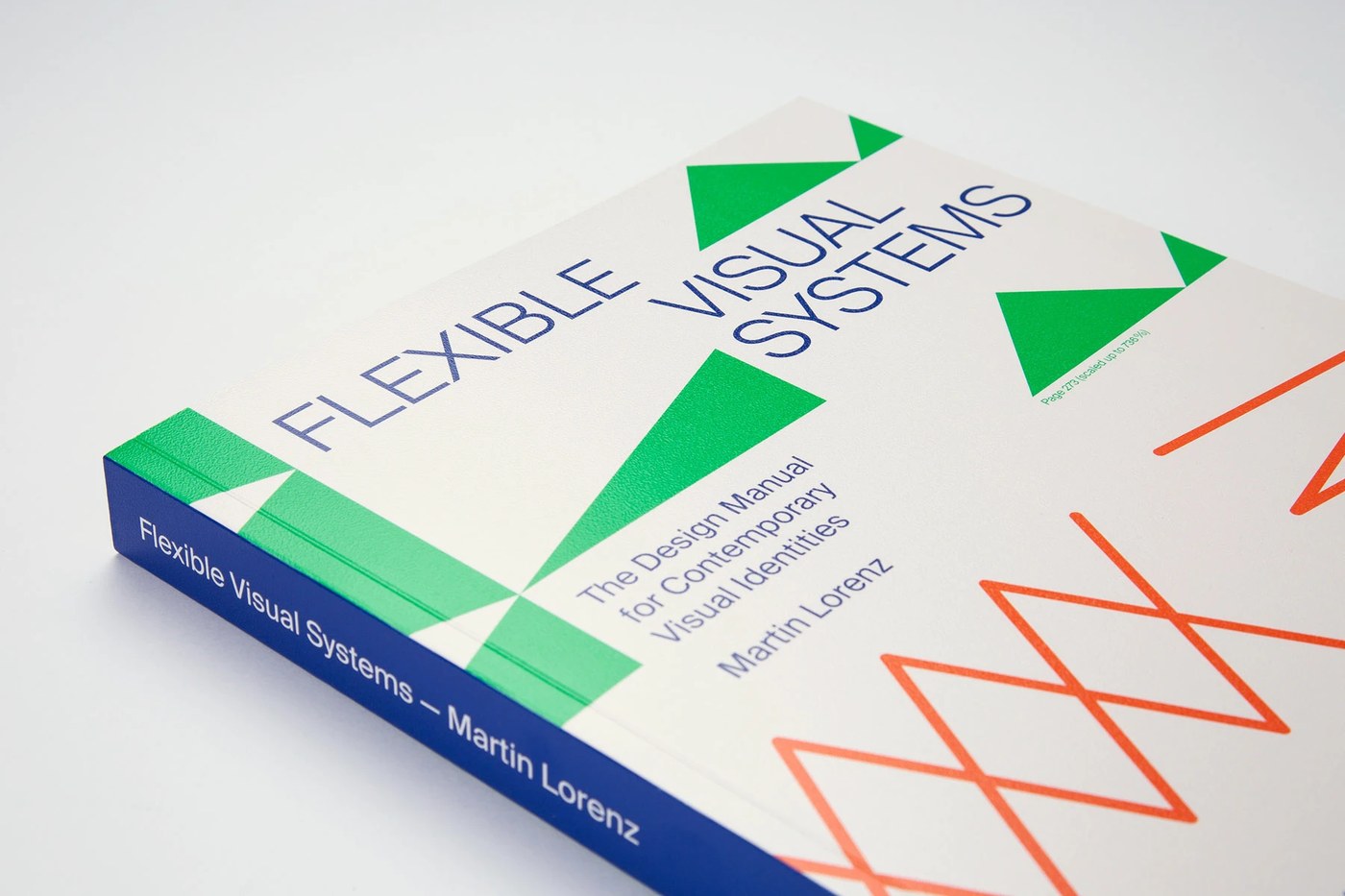
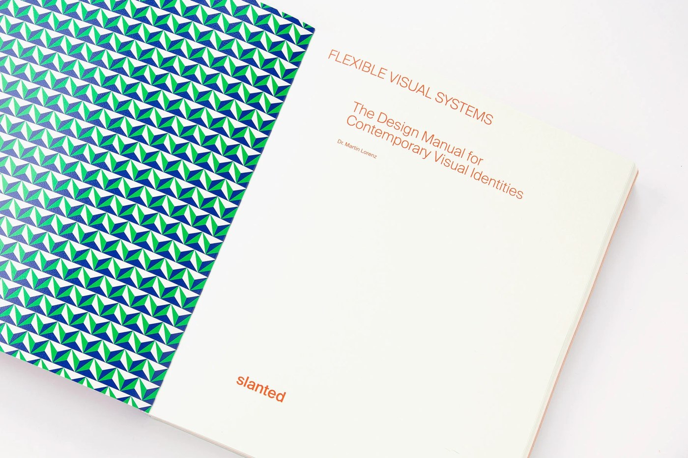
Designed by Dr. Martin Lorenz of TwoPoints.Net, the volume synthesizes two decades of studio practice into a comprehensive design manual. Slanted Publishers released the 320-page work to document flexible systems for brand identities. Printer Agpograf in Barcelona produced the book using three bright Pantone spot colors on a 210 by 250 mm trim size. The softcover exterior pairs Creator Sand 300 gsm stock with matte varnishing, setting high chromatic tension between emerald green, neon vermilion, and cobalt blue. Inside, Coral Natural 120 gsm paper carries dense geometric diagrams, modular grids, and programmatic typography with crisp line definition. Rather than relying on generic case studies, this editorial design directly instructs designers on constructing identities from elemental forms.
Systematic visual grammar and editorial design hierarchy
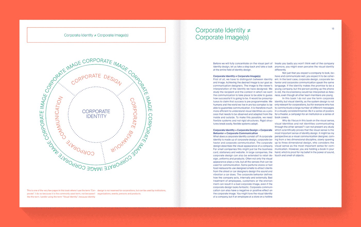
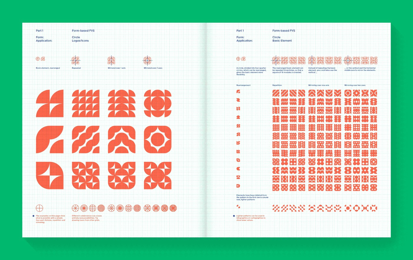
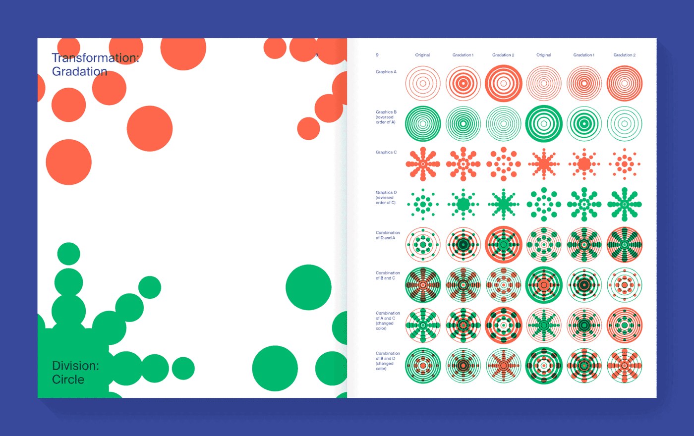
The interior architecture of the book follows a tripartite editorial division. An 82-page theoretic introduction opens the volume, establishing historical precedents and contextual theory for flexible systems. The second section spans 148 visual pages, organizing practical instruction manuals around five core geometries: circle, triangle, square, pentagon, and hexagon. TwoPoints.Net applies strict typographic columns alongside modular coordinate grids. Glyphs and diagrams mirror, rotate, and subdivide across baseline grids without losing optical coherence. Blue sans-serif instructional copy anchors running headers and margin coordinates, leaving ample space for expansive shape taxonomies. In the final transformation section, dynamic gradation formulas and motion frameworks demonstrate generative design behavior. This methodical editorial design hierarchy allows complex algorithmic concepts to read with textbook clarity.
Material execution reinforces the instructional rigor of the book. Agpograf printed both cover and interior blocks using only three spot inks, stripping out four-color process halftones in favor of pure flat ink laydown. The uncoated tooth of Coral Natural stock absorbs the saturated spot pigments while maintaining absolute edge sharpness across technical vector matrices. The lay-flat binding allows wide analytical spreads to open completely without pinching diagrams in the gutter. By codifying computational branding methodologies into a durable print artifact, TwoPoints.Net bridges academic design theory with tactile production reality. The volume proves how disciplined editorial design can transform complex systematic thinking into an accessible manual for contemporary practitioners.
See the full editorial design project by TwoPoints.Net on Behance.