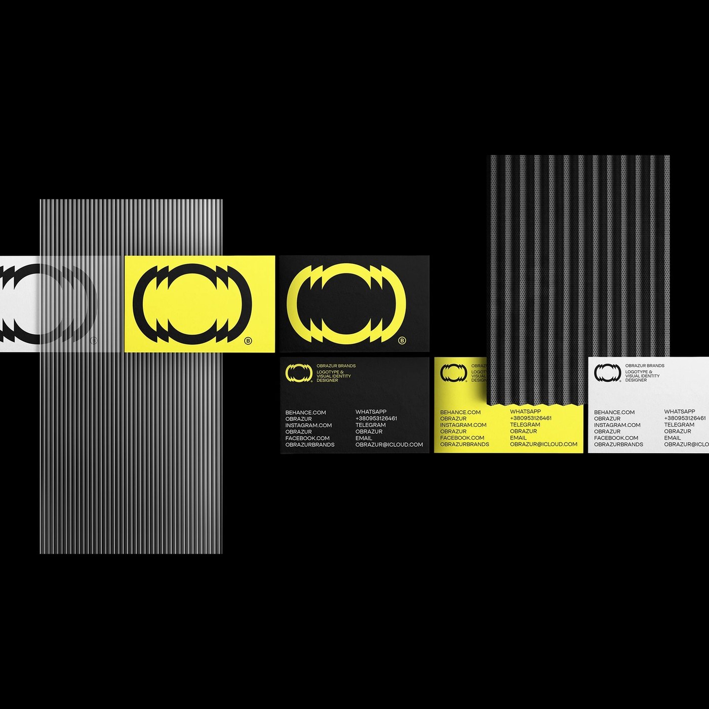
Visual Identity: Obrazur Concept by Obrazur Brands
Discover the kinetic visual identity for Obrazur Brands, featuring serrated circular geometry, acid yellow hues, and tactile print finishes.
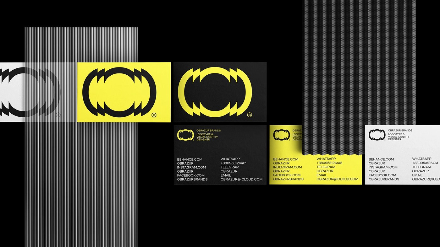
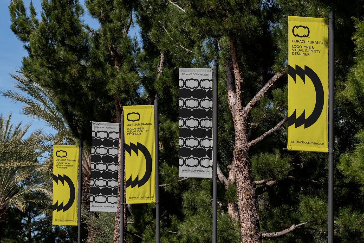
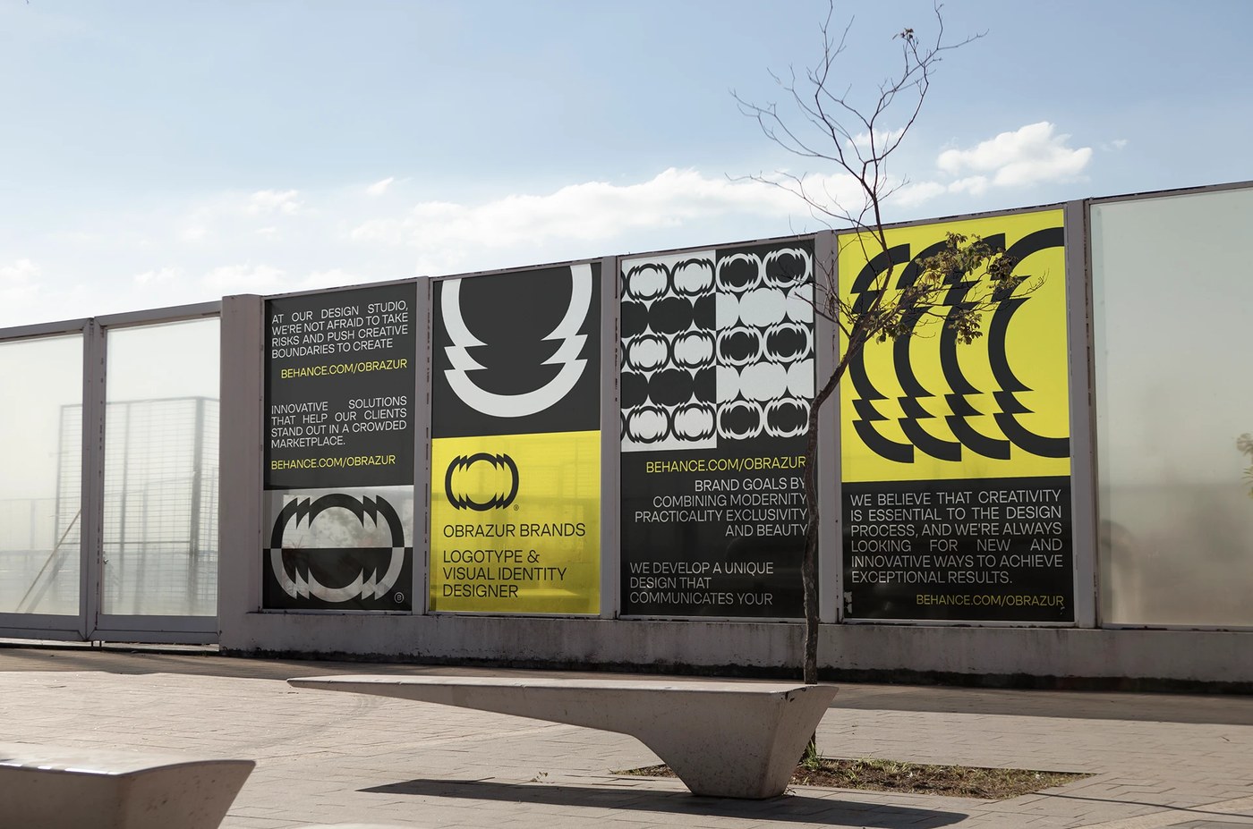
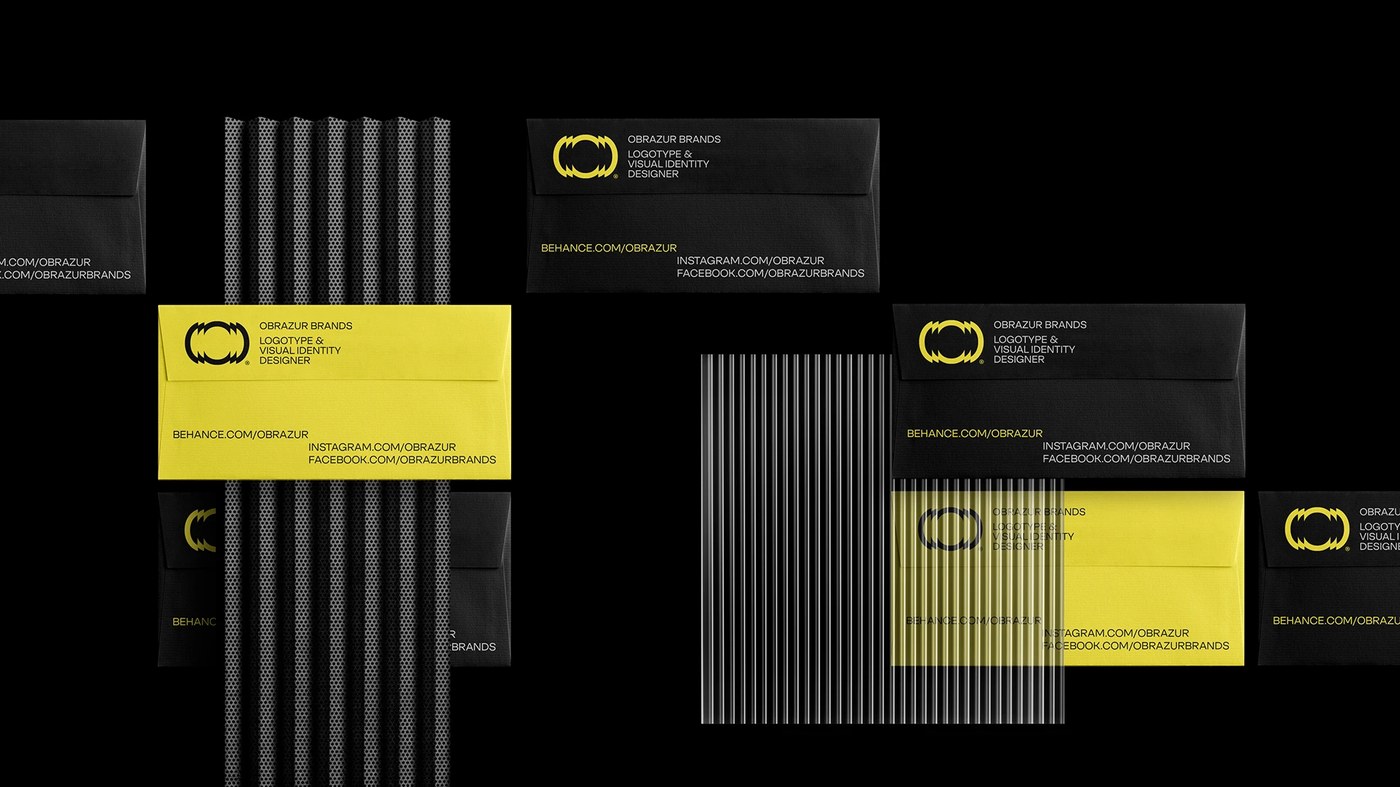
Ukrainian design studio Obrazur Brands unveiled its studio visual identity concept, establishing a bold graphic framework centered on optical kineticism, mechanical geometry, and industrial precision. Rejecting passive, minimalist monograms, the self-initiated rebrand creates an aggressive, high-energy design system engineered to scale across architectural wayfinding, physical tactile stationery, digital hardware showcases, and screenprinted workwear.
Kinetic Geometry and Serrated Symbol Architecture
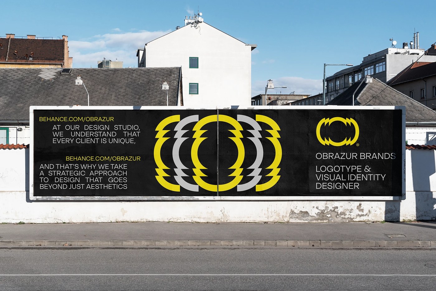
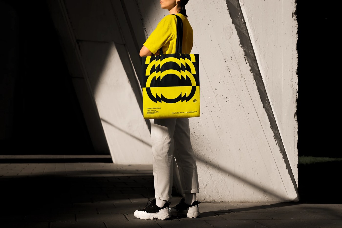
The core of the visual identity is an energetic circular mark composed of stepped, saw-toothed outer arcs. The glyph generates immediate visual vibration and spatial tension, suggesting mechanical gears, optical lens distortion, and continuous kinetic rotation. When deployed across environmental posters, exhibition banners, and social collateral, the symbol duplicates in stepped horizontal echos and repeating op-art grid patterns, transforming from an isolated logo into an active architectural texture.
The typography balances the dynamic mark with absolute Swiss typographic discipline. Crisp grotesque sans-serif letterforms set in structured uppercase captions organize contact details, studio manifestos, and technical metadata. This strict grid alignment ensures maximum legibility against bold graphic surfaces, corrugated metal backdrops, and high-contrast color fields across all touchpoints.
Acid Chromatic Tension and Industrial Materiality
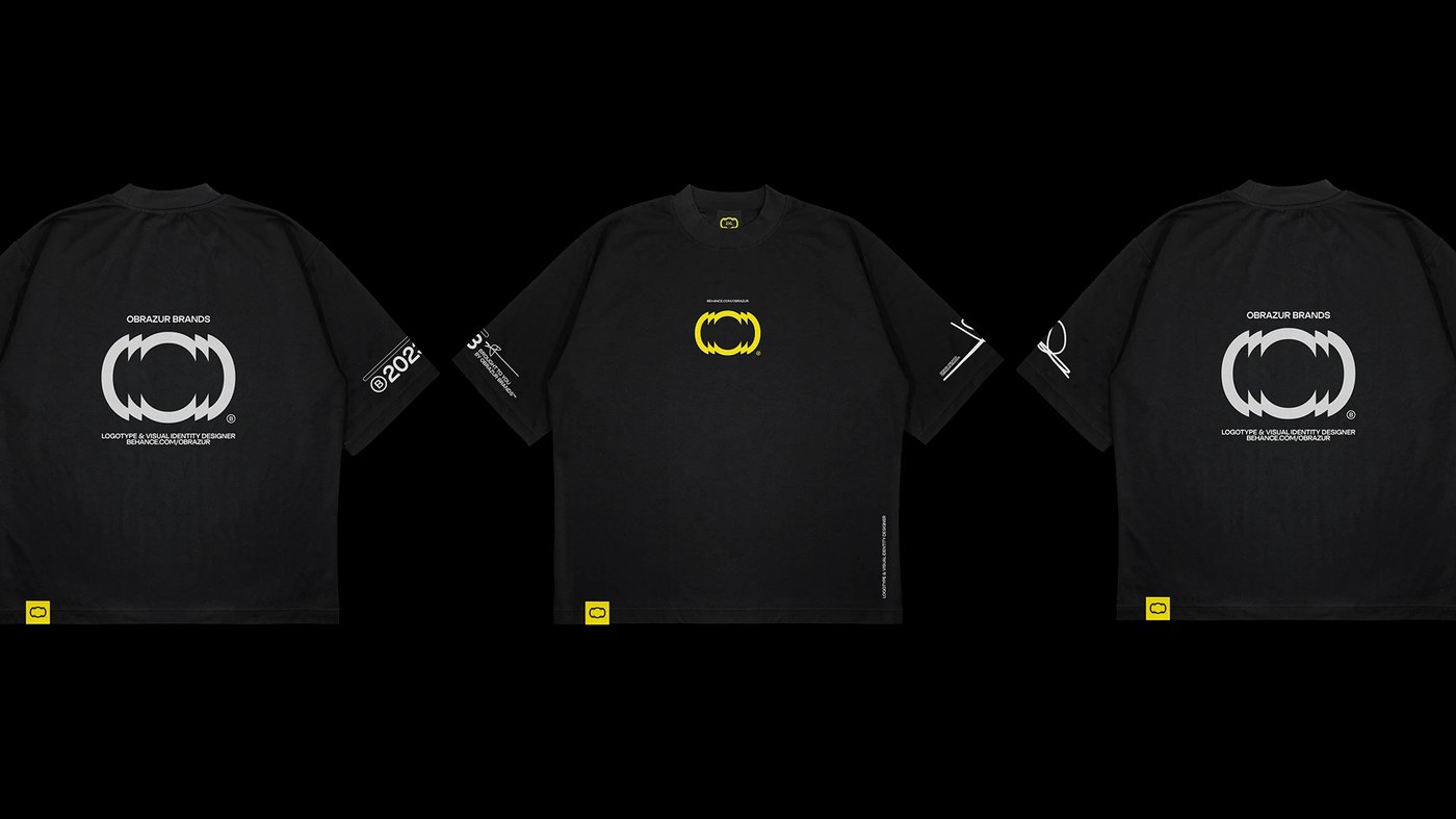
The color palette relies on high-voltage chromatic tension, pairing intense acid yellow with deep matte charcoal, stark white, and concrete grey. In physical applications, this palette is complemented by industrial materials: fluted ribbed glass, perforated corrugated metal plates, and thick paper stock with blind embossed details. From large outdoor billboard installations and street-level banners to heavyweight black cotton apparel with woven yellow hem tags, the system demonstrates how a cohesive visual identity thrives across diverse physical substrates.
Through its rigorous combination of kinetic iconography, strict typography, and tactile material finishes, the project offers a compelling case study in contemporary studio branding.
Explore more visual identity systems and graphic design projects on the Obrazur Brands Behance project page.