The i Paper Digital Experience Finally Feels Like Its Journalism
ustwo rebuilt the i Paper Digital Experience around impartial news and intelligent debate, made to feel active, premium and energising.
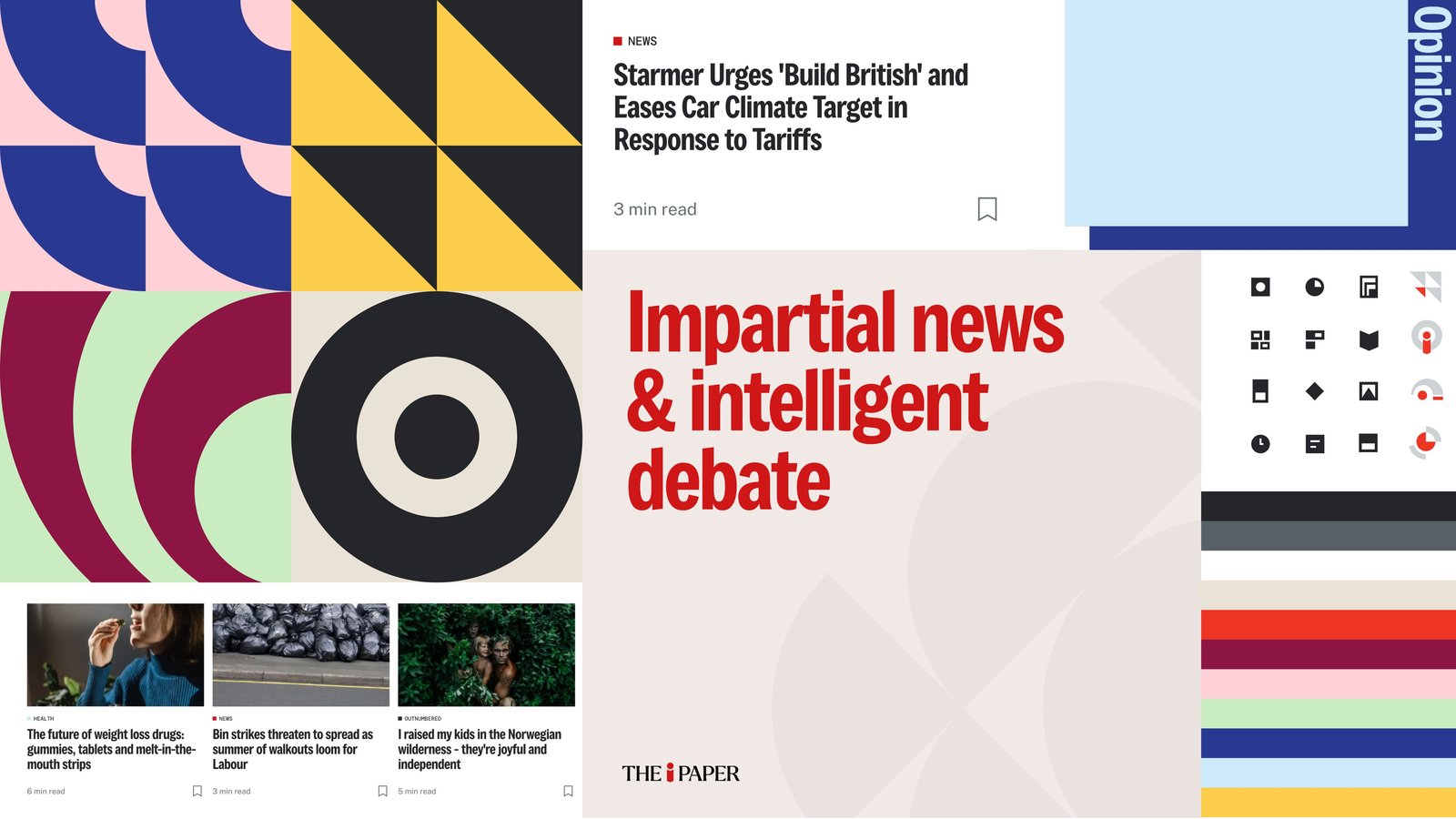
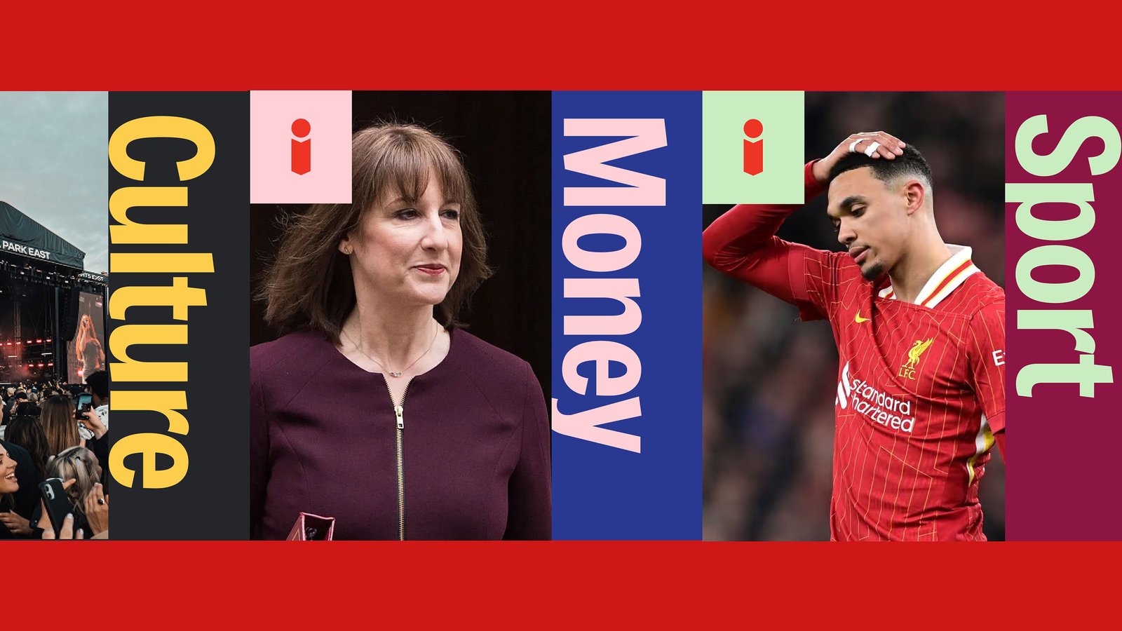
Most news apps look the same: a grey feed, a blue link, a red breaking banner. ustwo's redesign of The i Paper goes the other way, building the visual system straight from the paper's editorial promise, "impartial news and intelligent debate," set huge in a red grotesque that doubles as the brand's voice. Color does the organizing work. Culture gets yellow on ink, Money gets pink on cobalt, Sport gets mint on burgundy, and every section announces itself with its name set sideways at poster scale. The red i mark anchors everything, from the masthead to the app icon. Calm reading surfaces sit beside loud blocks of color. The brand board shows the full kit behind it: geometric pattern tiles, a working icon set, color bars, and article cards carrying read-time tags.
The i Paper Digital Experience is built for skimmers and subscribers alike
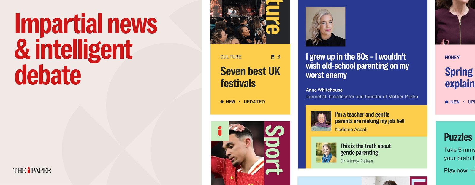
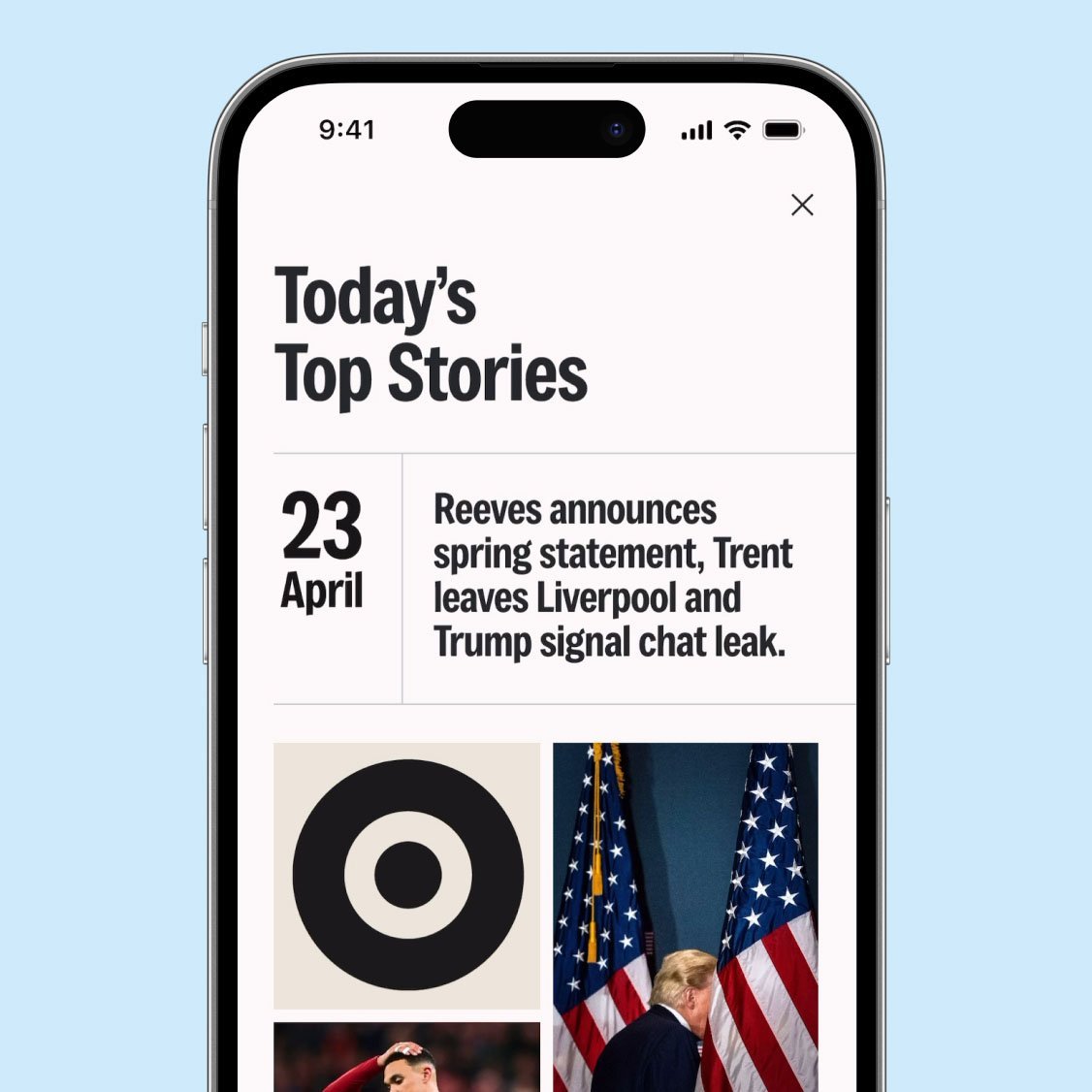
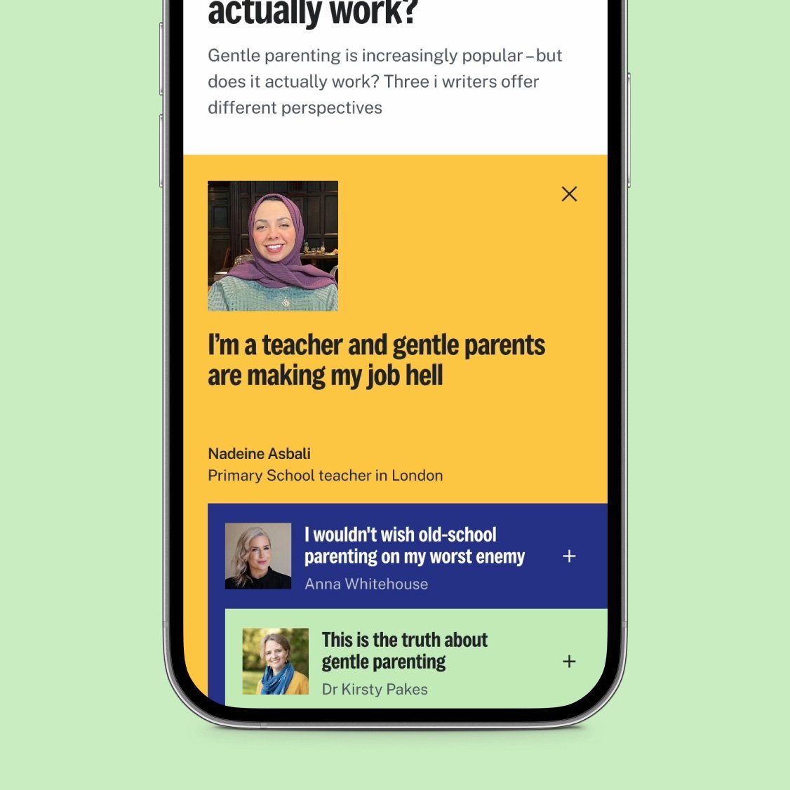
The type is doing serious work here. Headlines run in a sturdy grotesque with real weight behind them, "Today's Top Stories" lands like a print front page. Against that sits the serif masthead, THE i PAPER with its red i, a small classical counterpoint that keeps the whole thing feeling like a newspaper rather than a feed. Section labels turn vertical and go enormous: Culture, Money, Sport and Opinion become wayfinding, not decoration. Small functional type stays disciplined, kickers like CULTURE and MONEY, status flags like NEW and UPDATED, read times in quiet grey. The grid is mobile-first. Story cards stack in a single confident column, the "Today's Top Stories" screen pairs a giant numbered date with its headline, and the Opinion page runs a vertical spine beside portrait-led columns. Editorial design thinking applied to a phone screen, with the print logic intact.
ustwo shipped the thinking as a working toolkit, not a concept deck: a brand snapshot and playbook, a tone of voice framework with practical scenarios, a digital-first design language with a Figma design kit, key experience journeys and prototypes ready for delivery and experimentation, plus email and social templates, a phased brand and experience roadmap, and personas with newsroom engagement artefacts to help the newsroom adopt it at pace. The work was built with the paper's product and editorial teams in fifteen weeks. Per the case study, the refreshed brand is live on the website homepage and main reader experience, the first iteration of Shorts is launched and promoted, and Perspectives is in active live-use testing. The i Paper was shortlisted for seven Press Awards, with Shorts nominated for Best Audience Engagement Initiative of the Year. As Head of Product Remy Becher puts it, ustwo created the conditions for product and editorial teams to work in genuine alignment, "something we'd struggled to establish before."
Read the full case study on ustwo's site.