How Two Times Elliott Reimagined Branding Design for Paist
Two Times Elliott delivers an energetic branding design system for Paist, pairing clinical oral care precision with spirited daily ritual.
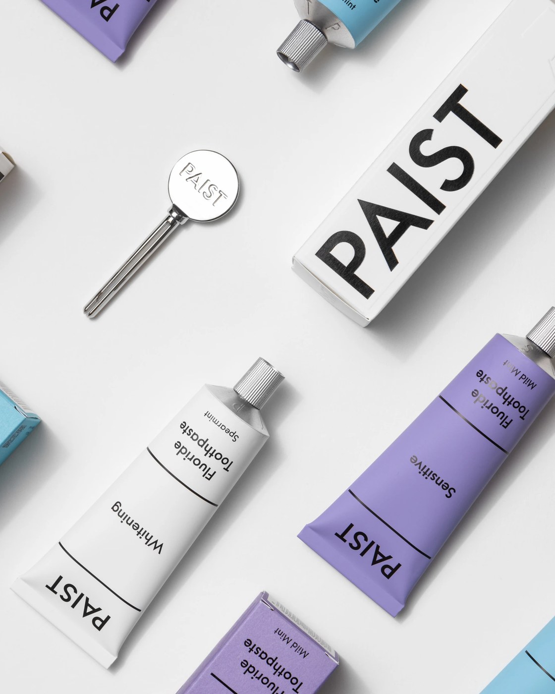
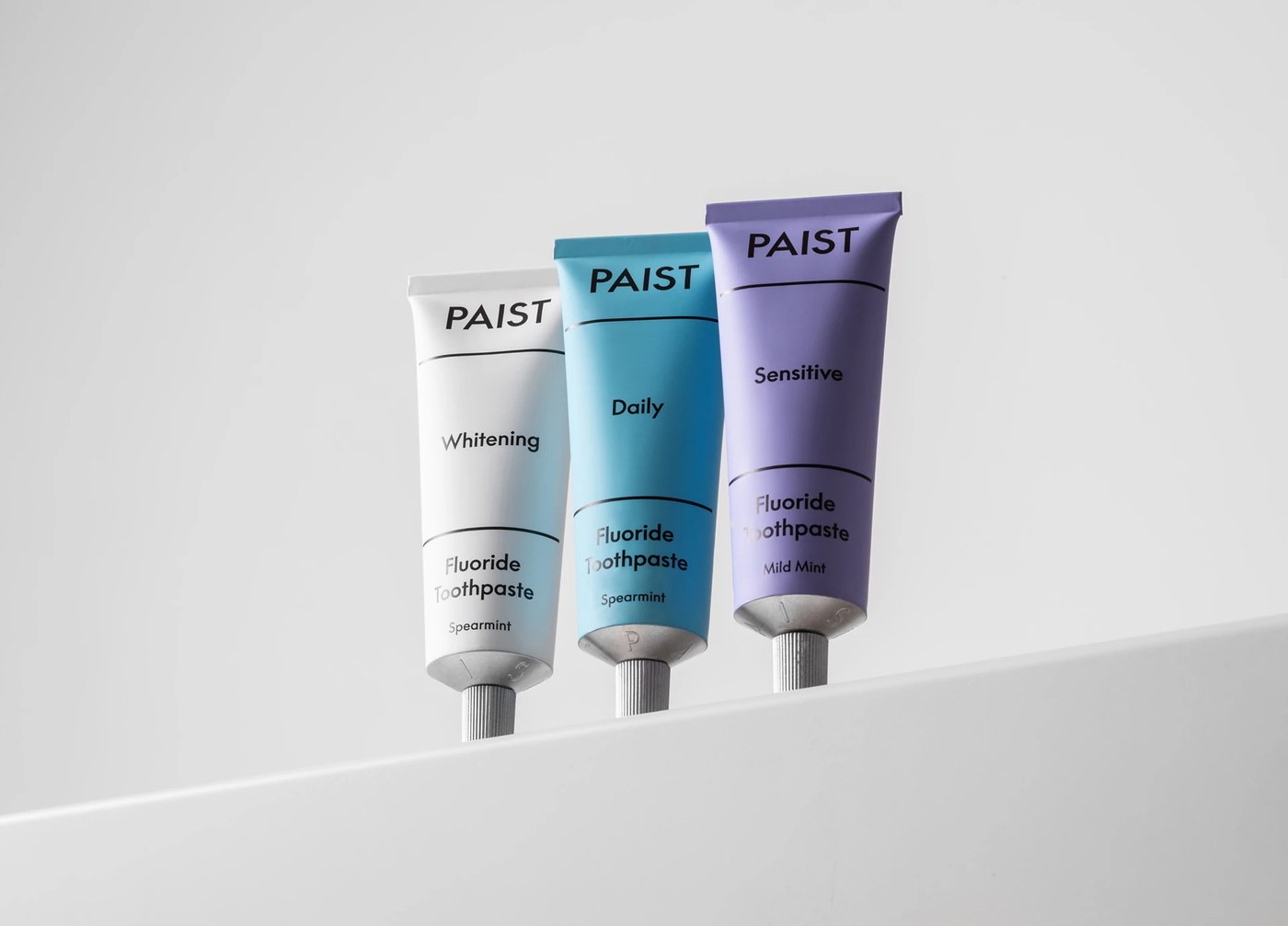
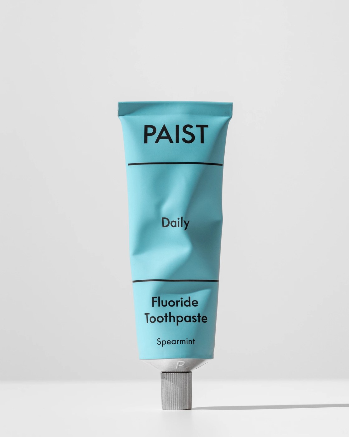
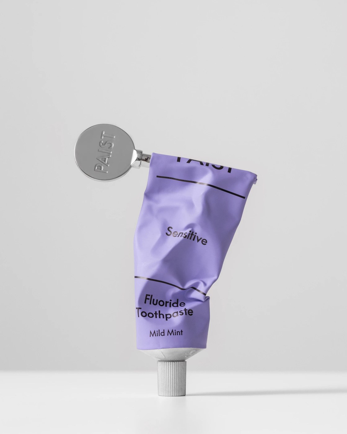
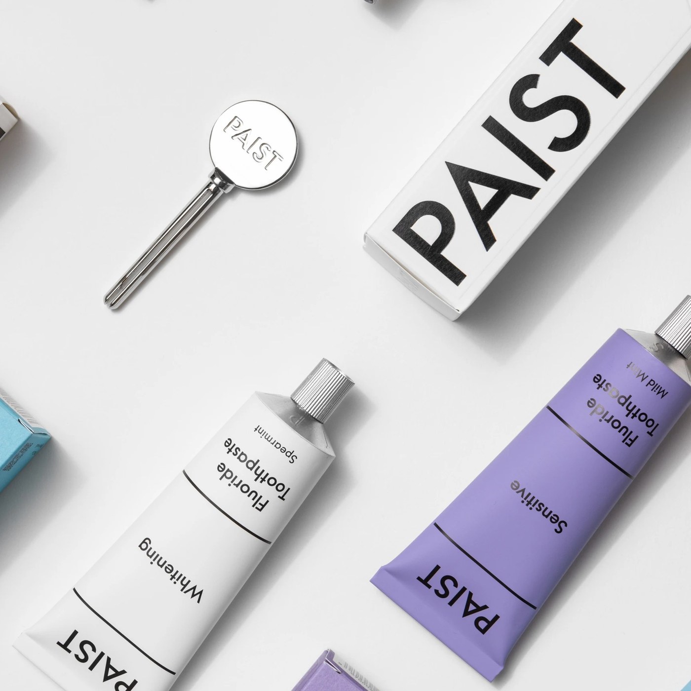
The oral care category has long been bogged down by clinical uniformity, dominated by a sea of generic red, white, and blue pharmaceutical tropes. London-based studio Two Times Elliott challenges this predictable landscape with Paist, reframing oral care around the daily ritual of brushing as a comforting, grounding anchor amidst everyday life chaos. To establish a reliable yet charismatic brand presence, the studio executed a multidimensional branding design strategy that balances scientific authority with offbeat personality. The visual direction rejects sterile supermarket aesthetics, establishing a chromatic palette of pure clinical white, refreshing sky blue for the Daily formula, and gentle lilac for the Sensitive variant, all bounded by clean black structural banding.
Clinical Authority and Ritual in Branding Design
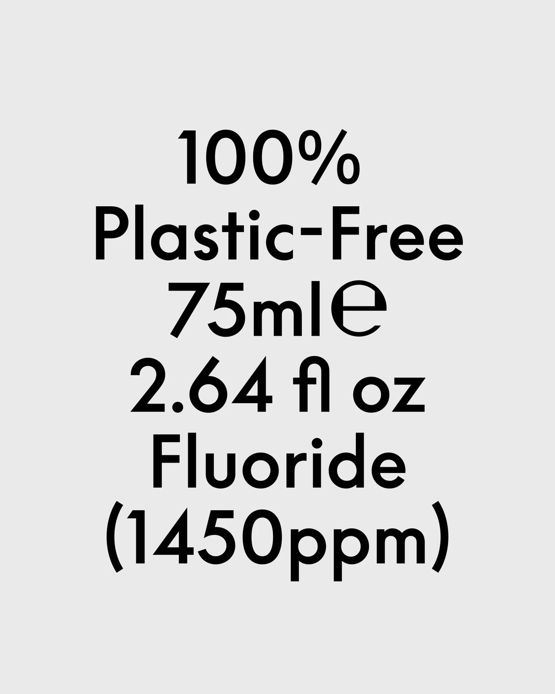
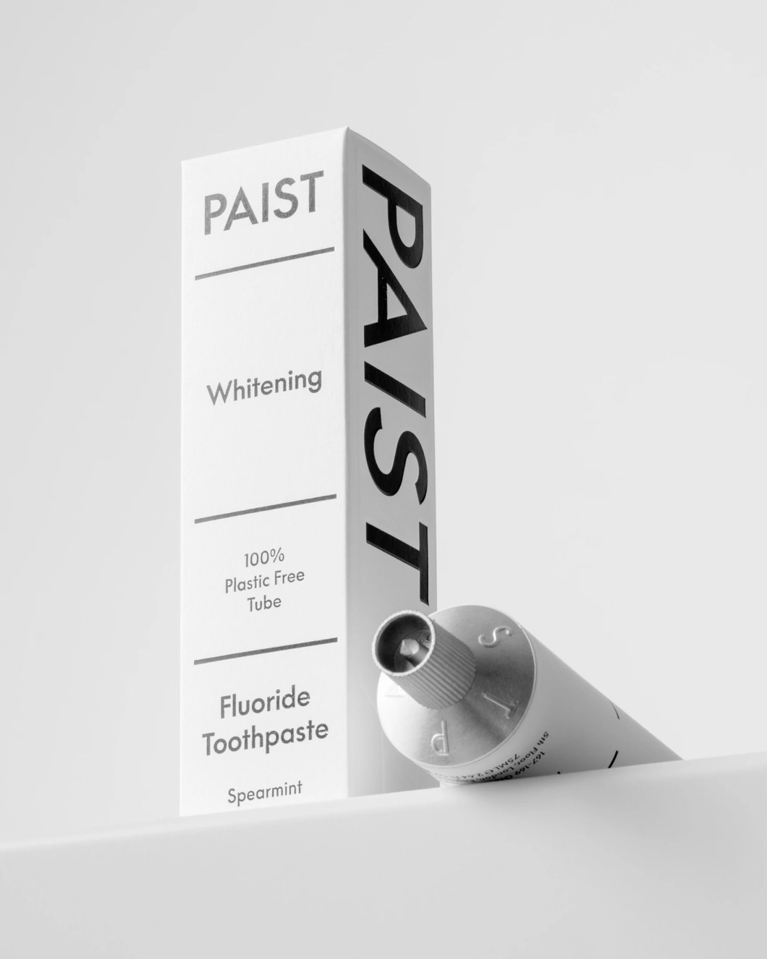
At the foundation of this modern branding design lies a disciplined typographic architecture built upon robust, high-contrast grotesque letterforms. The solid uppercase Paist logotype anchors each container, while crisp horizontal hairline rules partition product information into clean visual bands. Front-of-pack hierarchies move systematically from brand header to formula purpose and technical specifications, clearly presenting 100% plastic-free claims alongside fluoride metrics (1450ppm). This rational segmentation brings laboratory efficacy into direct conversation with playful graphic charm, maintaining absolute legibility across curved aluminum packaging substrates.
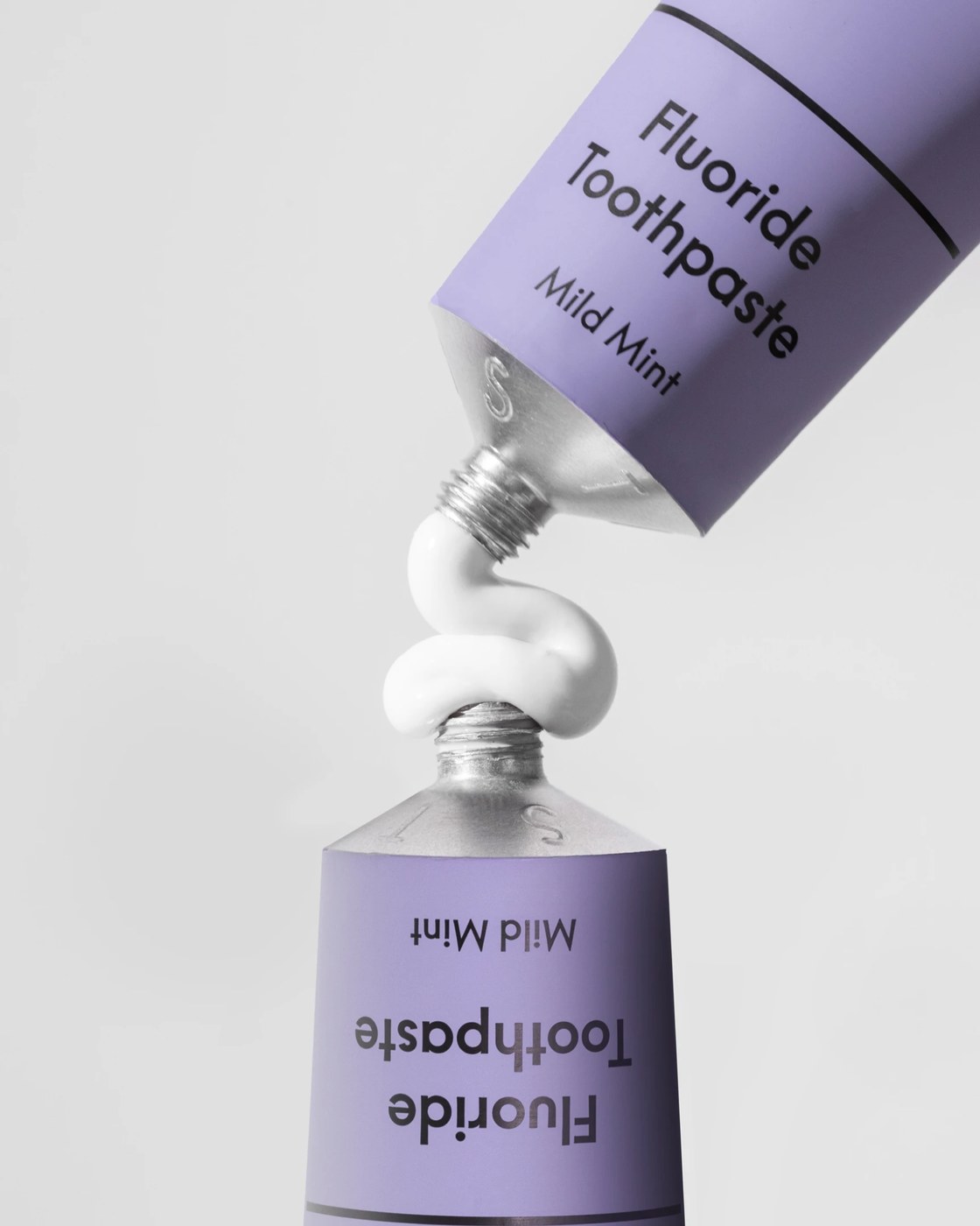
Materiality is central to the physical experience of this packaging and branding design. Eliminating conventional plastic laminates, Paist uses infinitely recyclable aluminum tubes with tactile ridged screw caps and custom embossed letterforms stamped across the metal shoulders. An accompanying solid metal key winder, engraved with the circular Paist monogram, transforms the everyday task of squeezing toothpaste into a satisfying physical ritual. Monolithic paperboard cartons utilize towering vertical wordmarks along their side panels to create a striking architectural presence on retail shelves. Through meticulous production craft and kinetic video assets, Two Times Elliott reframes daily hygiene into an engaging domestic artifact.
See more from Two Times Elliott on Behance.