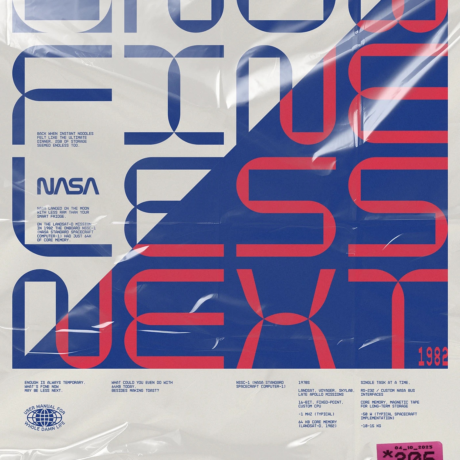
Molnár Péter’s Poster Design for PLAY 2 WIN Vol. 2
Hungarian graphic designer Molnár Péter returns with PLAY 2 WIN Vol. 2, a 17-piece poster design series mixing 1980s tech and print grit.
The house always writes the rules. As Hungarian graphic designer Molnár Péter moves through the final stretch of his forties, he treats his accumulated memories and false starts as what he calls little mood preserves. PLAY 2 WIN Vol. 2 (expanded to 12 + 5 days with its October 2025 bonus track) twists the familiar "pay to win" cliché into a raw daily diary about surviving inside rigged systems. There's no rigid brief holding these pieces together. Instead, every sheet carries a recurring oval globe stamp reading "USER MANUAL FOR WHOLE DAMN LIFE," a custom P2W katakana mark, and fluorescent supermarket price stickers counting down the days left in the year.
1980s Tech Archaeology and Gritty Poster Design
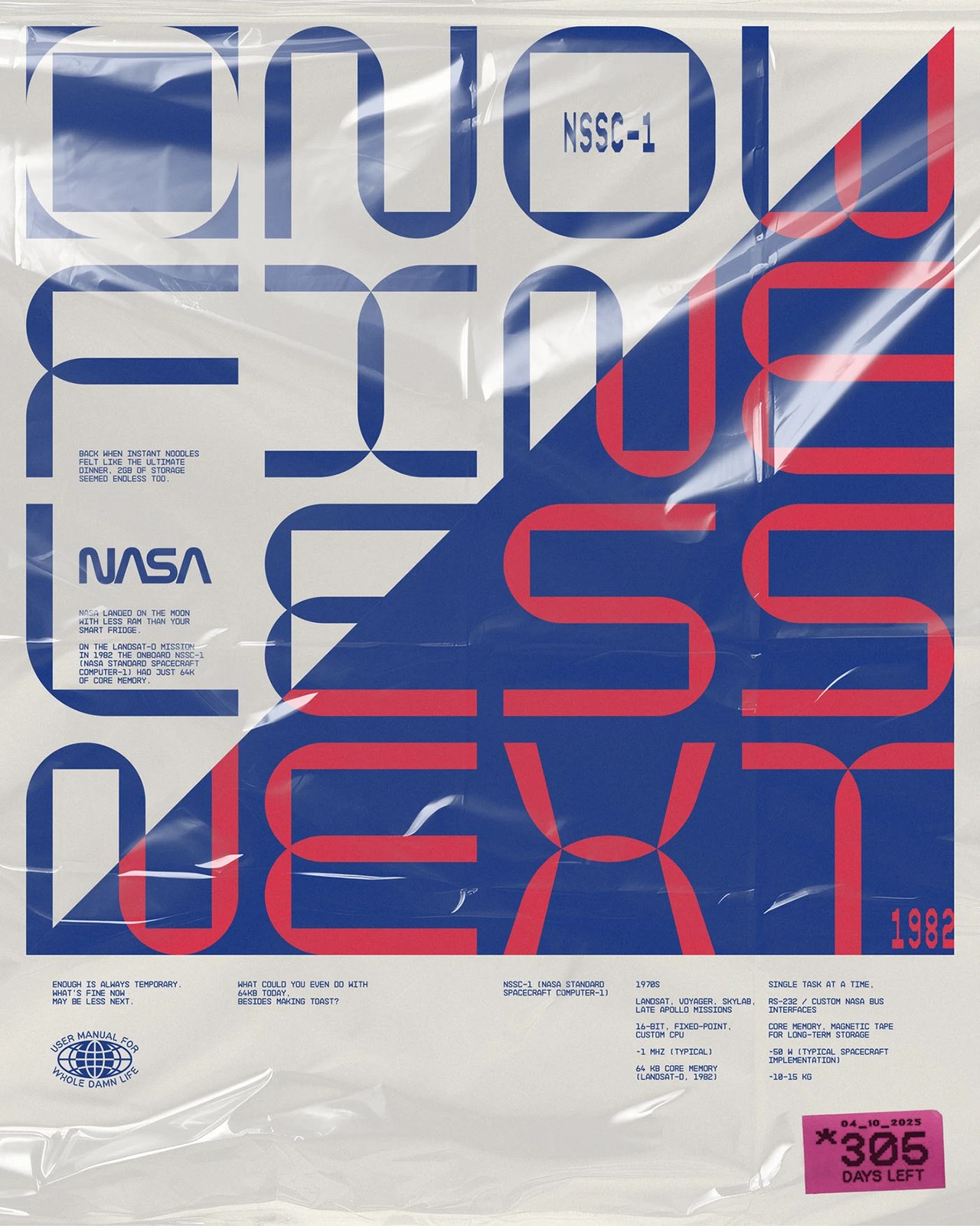
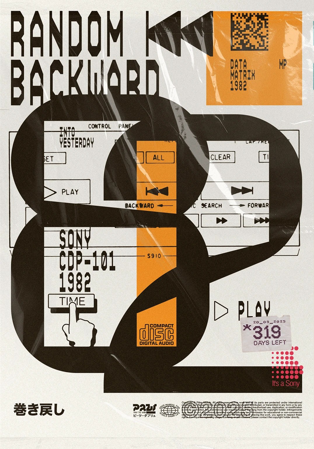
Every sheet feels lived-in. Molnár wraps several compositions under glossy, crinkled polyethylene film so the ink looks like a forgotten record sleeve pulled from a discount bin. In "NOW FINE LESS NEXT," a four-by-four modular stencil grid splits diagonally between cobalt blue and crimson to honor the 1982 Landsat-D mission and NASA's NSSC-1 onboard computer — reminding us that NASA landed on the moon with less RAM than a modern smart fridge. That same fondness for 1980s hardware drives "RANDOM BACKWARD," where a massive black "82" and an orange data-matrix strip frame the button layout of Sony's 1982 CDP-101 Compact Disc player beneath a weathered "*319 DAYS LEFT" tag.
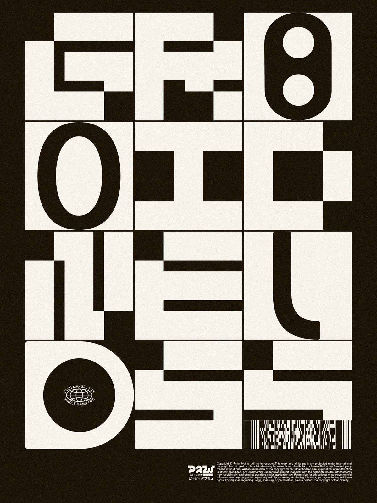
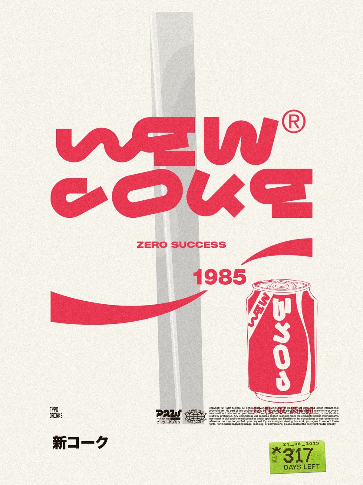
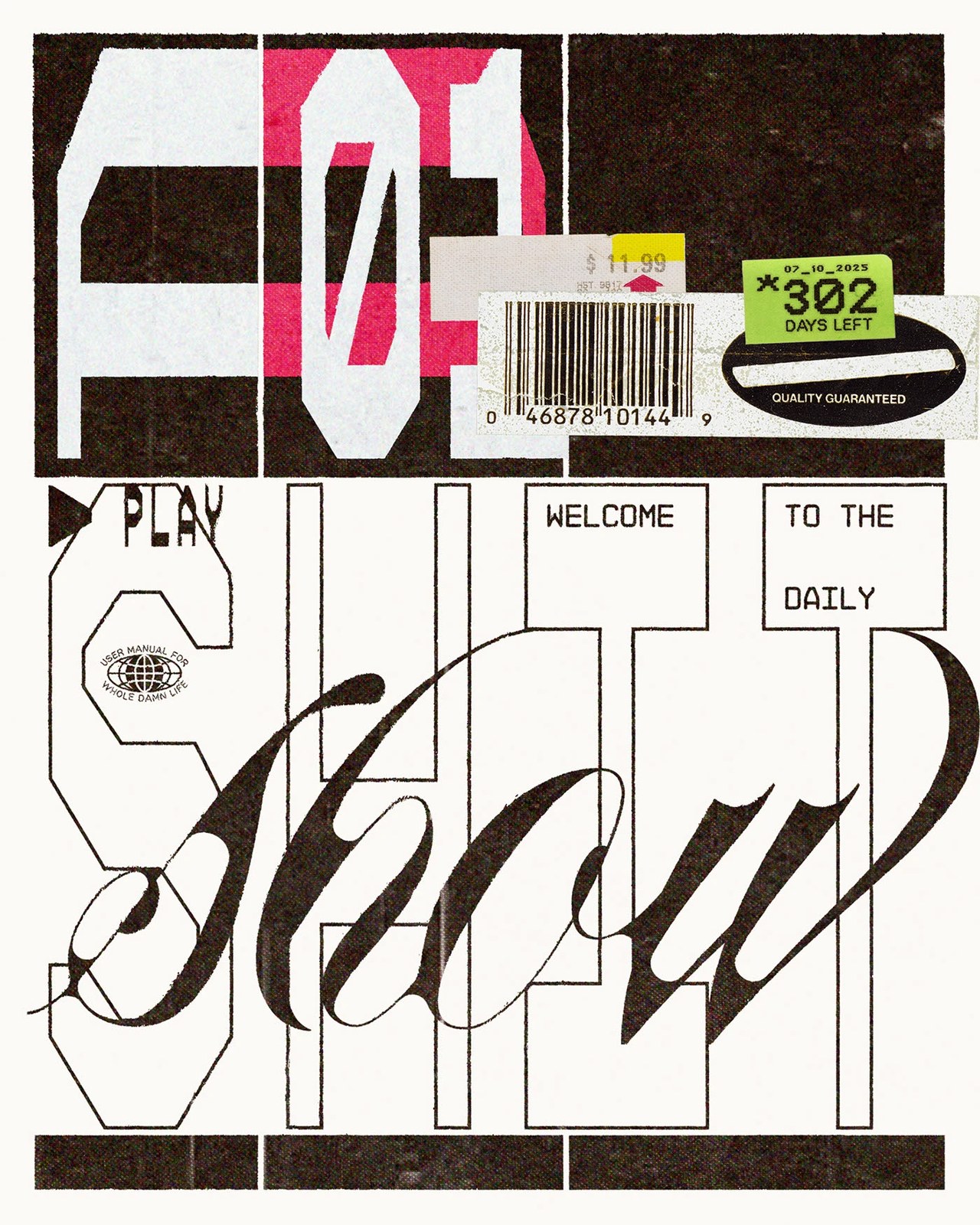
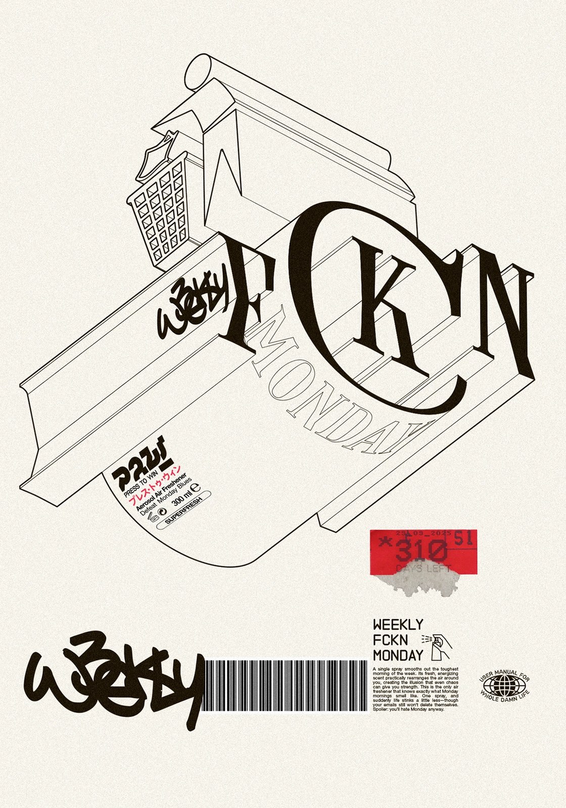
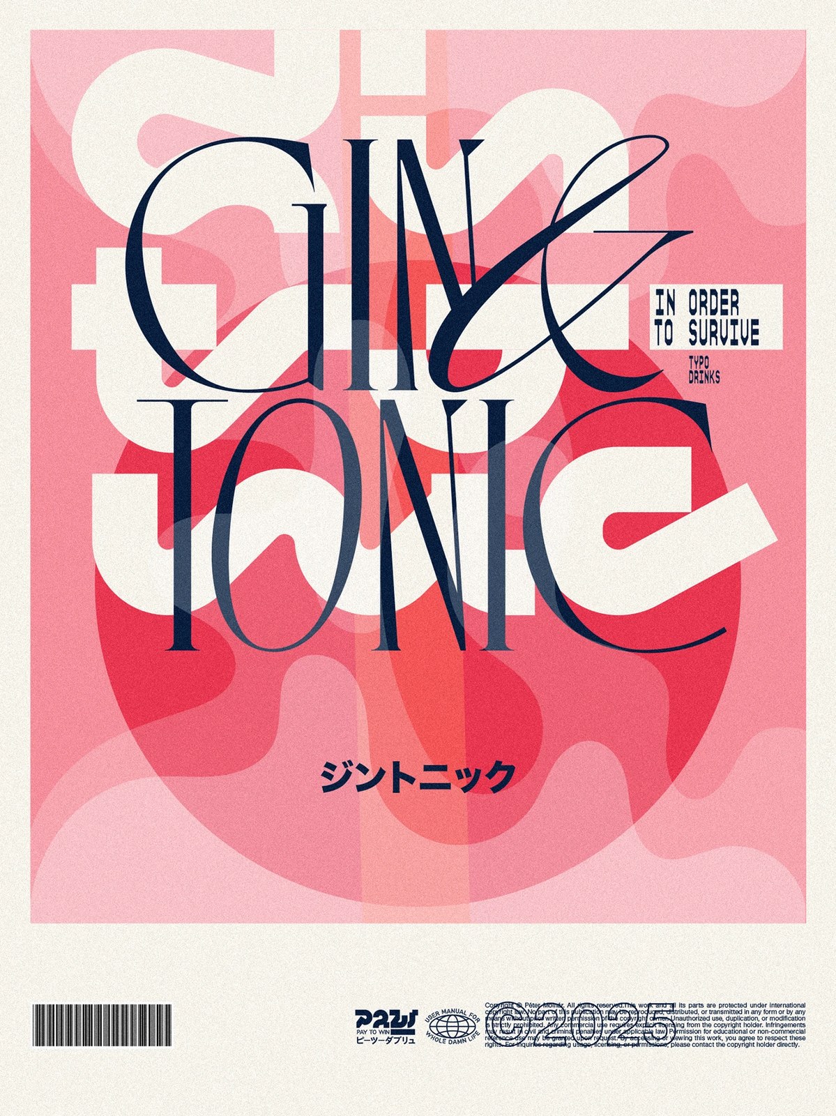
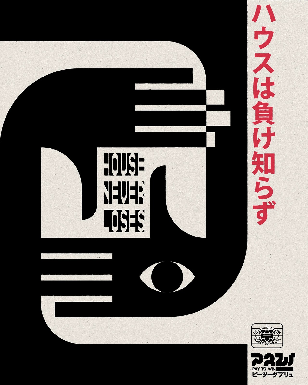
The contrast hits right away. Molnár doesn't lock himself into one typographic style across the run. "GROUNDLESS" stacks chunky cream-and-black block letters into a tight three-by-four grid with pixelated stair-step cuts, while "GIN & TONIC" layers razor-thin navy serif capitals and a looping ampersand over a coral-pink wavy circle. Turn to "NEW COKE" and warped red tubular lettering sits above an illustrated 1985 soda can and the deadpan verdict "ZERO SUCCESS." Between the isometric 3D line art of "USED-LIKE NEW AGE," the interlocking black-and-cream hands of "HOUSE NEVER LOSES," and the "$11.99" barcode sticker slapped across "WELCOME TO THE DAILY SHIT SHOW," it's a sharp, unfiltered run of print work.
See the full project by Molnár Péter on Behance.