Branding Design: North of Normal by Molnár Péter
Molnár Péter crafted a kinetic branding design for North of Normal Studio, using Carlo Vivarelli grid logic and geometric sports typography.
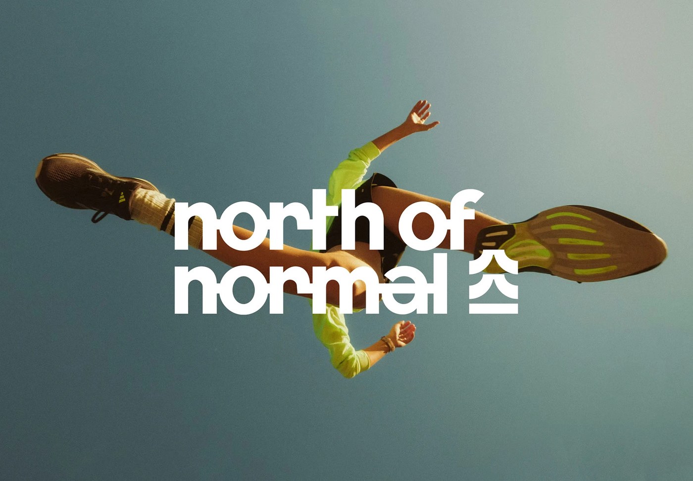
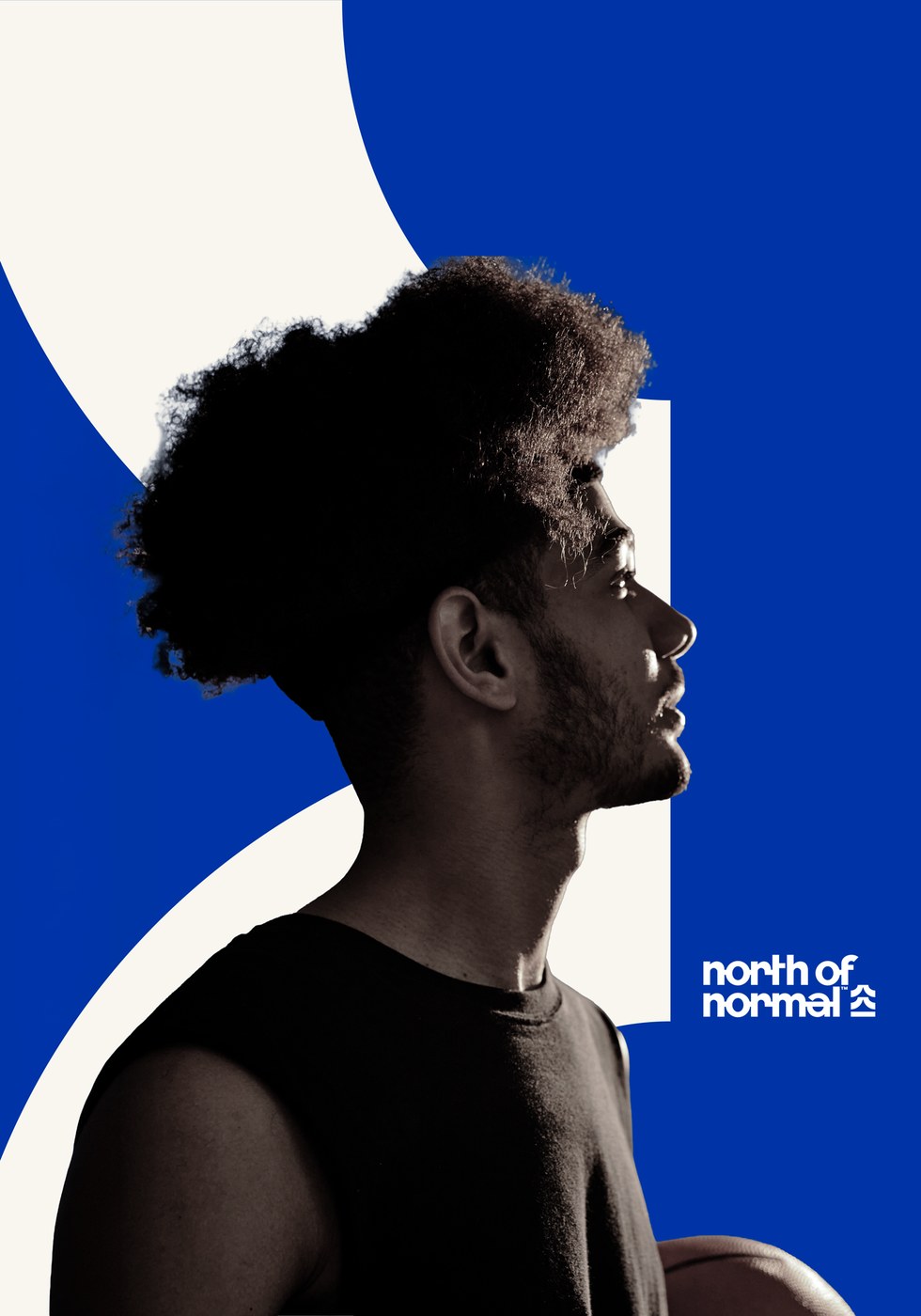
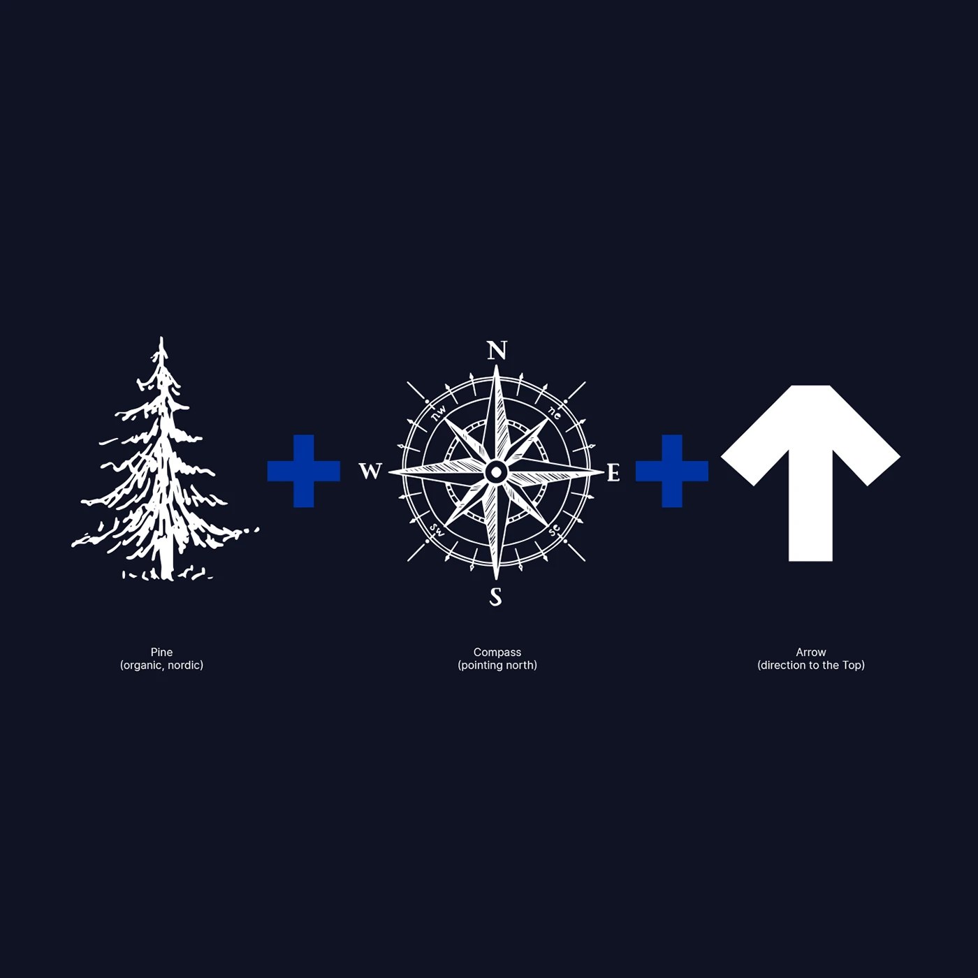
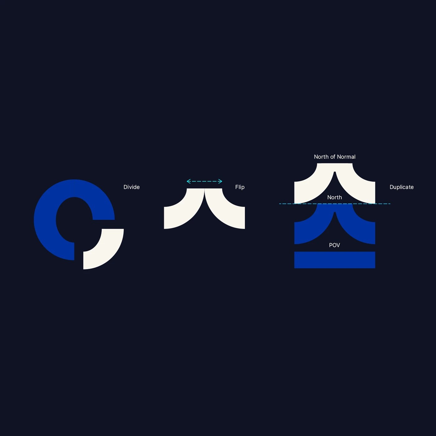
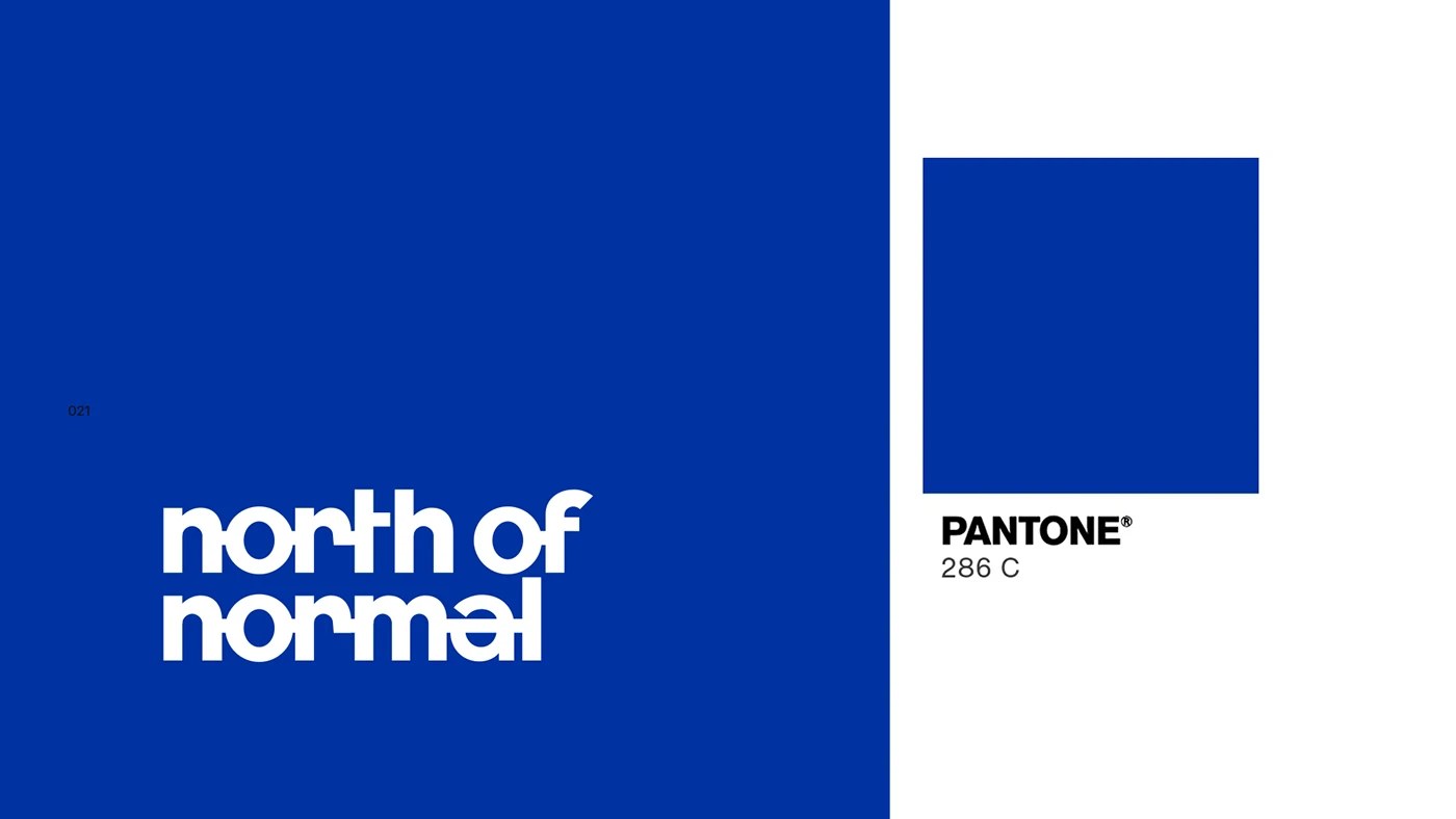
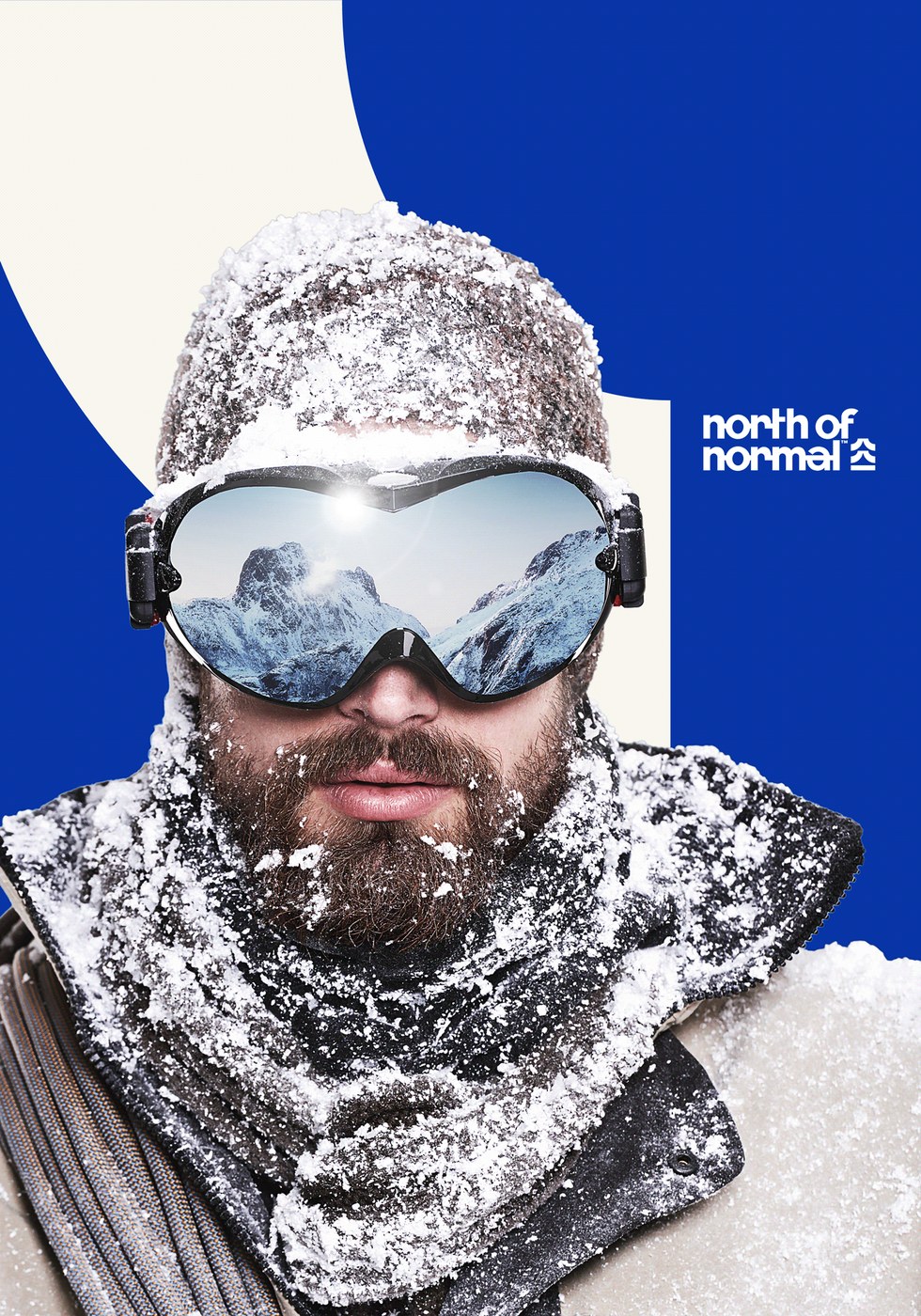
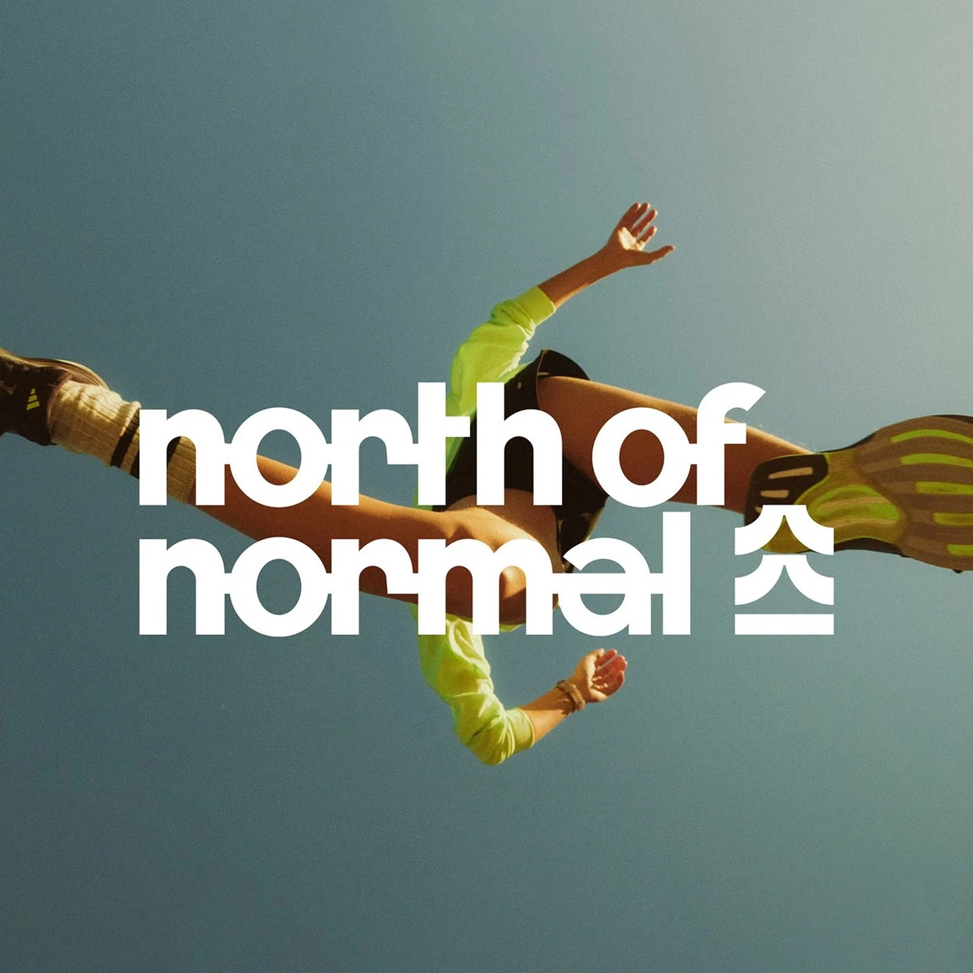
North of Normal Studio produces sports-themed video content, requiring an identity built around tempo, physical motion, and clear screen recognition. Molnár Péter responded with a bold system anchored in PANTONE 286 C cobalt blue, deep obsidian, and clean off-white. The central symbol condenses Nordic pine needles, compass bearings, and directional vectors into a modular glyph. Its baseline sets the point of view, while stacked chevrons rise above the reference plane to signify peak athletic performance. High-contrast athletic portraits, from leaping sprinters to snowbound alpine mountaineers, ground the graphic system in raw human effort. This approach gives the branding design an immediate physical presence across high-speed video timelines.
Constructing the North of Normal Branding Design System
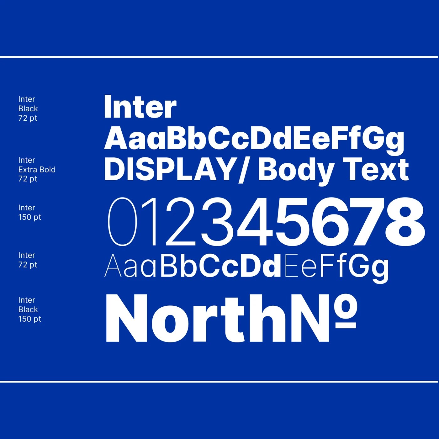
The grid structure draws direct inspiration from Carlo Vivarelli’s mid-century systems approach, translating strict Swiss geometry into digital video layouts. Molnár Péter selected Inter as the core typeface, deploying it across stark weight contrasts ranging from thin numerals to dense Inter Black display titles. Geometric circular segments were divided and flipped to construct the mark, allowing the vector icon to lock directly into the lowercase wordmark. Micro-scale type specimens at 72 pt sit against monumental 150 pt numerical counters, creating tension across screen margins. This deliberate structural discipline ensures the branding design remains sharp when animating across digital broadcasts.
Digital sports media often defaults to noisy motion graphics, but North of Normal relies on disciplined negative space and clear optical weight. The system scales across social cutdowns, motion title cards, and extreme sports documentaries without losing coherence. By pairing rigid typographic hierarchies with kinetic video pace, Molnár Péter proves that systematic Swiss design principles thrive in dynamic video environments. The identity avoids generic athletic clichés, focusing instead on structural vector balance and saturated cobalt fields. This rigorous branding design provides the studio with a flexible toolkit engineered for digital broadcast applications.
See the full project by Molnár Péter on Behance.