Typography: Server Mono by Blaze Type for INTDEV
Blaze Type and INTDEV team up on Server Mono, an open-source monospaced font built for terminal legibility and crisp web typography.
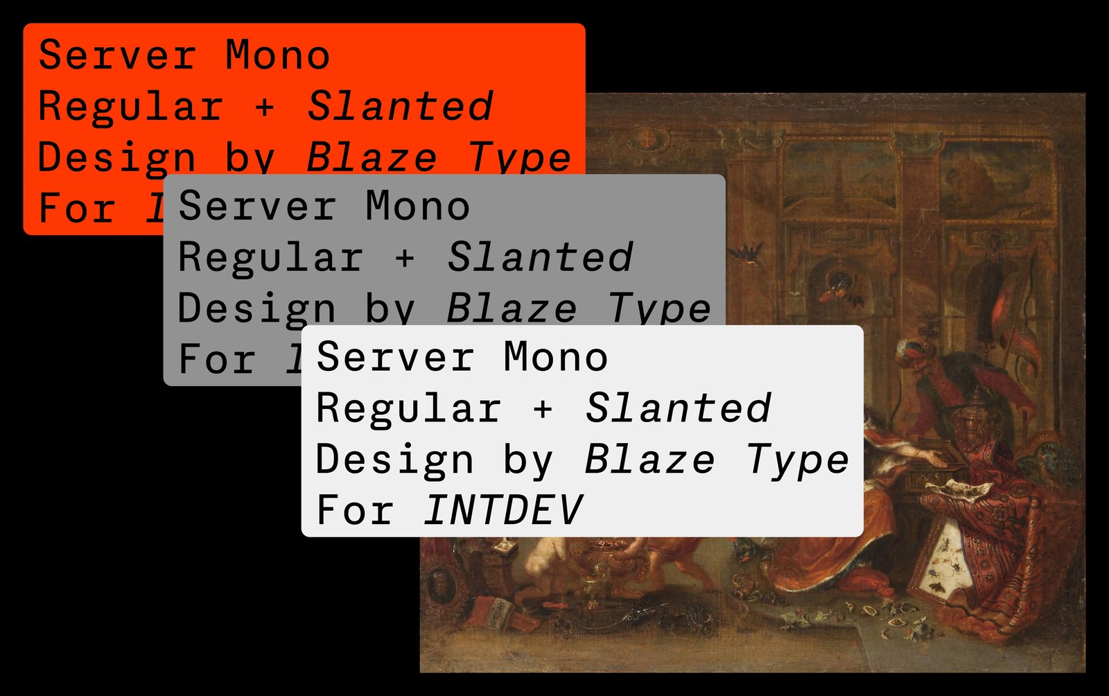
Developers stare at terminal windows all day. If a zero looks too much like an uppercase O, you're going to waste twenty minutes hunting down a broken variable. When Jimmy Lee at Seattle's Internet Development Studio Company (INTDEV) reached out to French foundry Blaze Type, the goal was straightforward: build the foundry's first commissioned open-source font under the SIL license, free for anyone to download, modify, or ship in production code. Type designers Matthieu Salvaggio and Tim Vanhille looked back at Apple's San Francisco Mono and classic ASCII art, drawing a two-style family in Regular and Slanted that holds its edge across low-res command lines and wide web layouts.
Open-Source Monospaced Typography for the Terminal
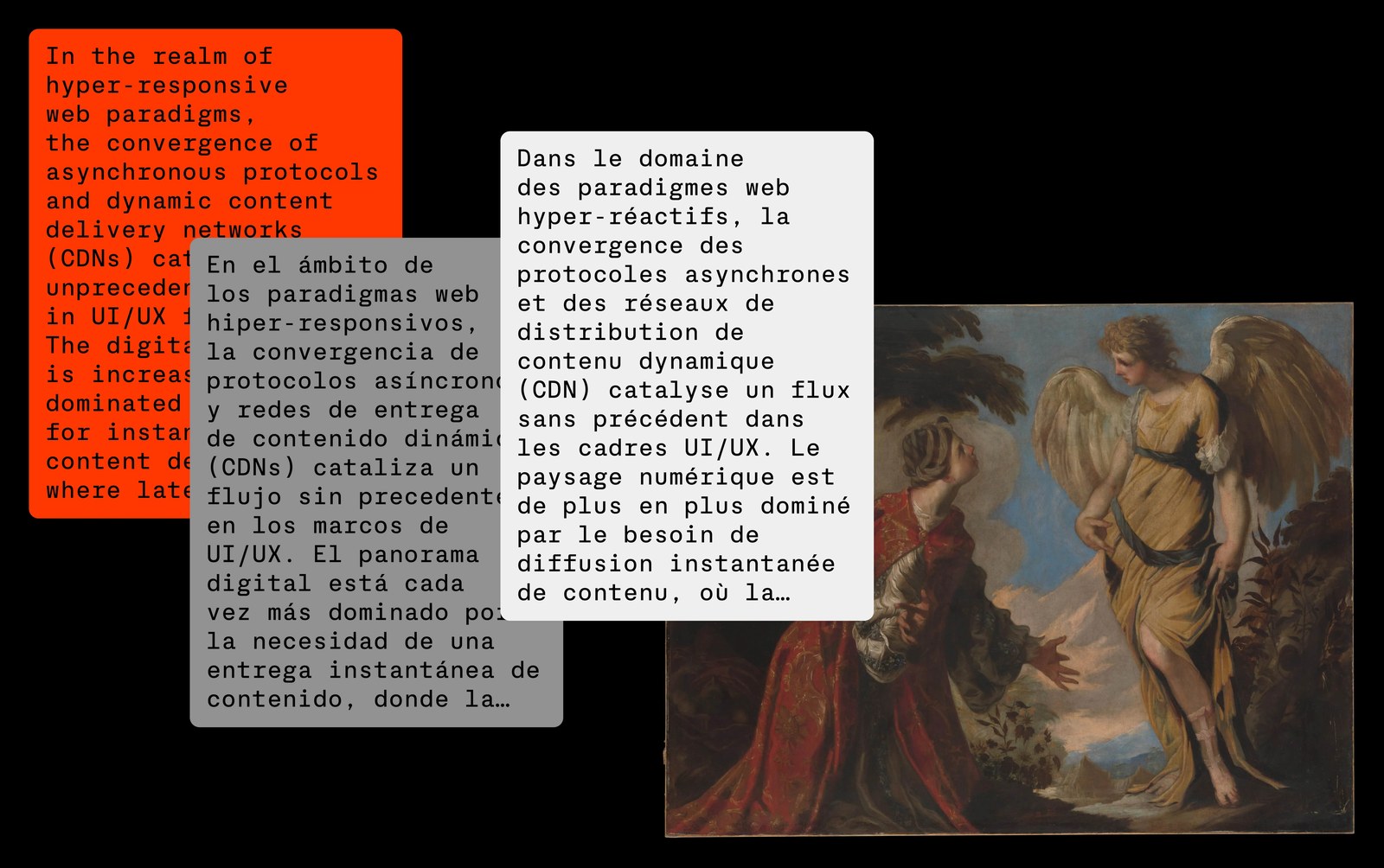
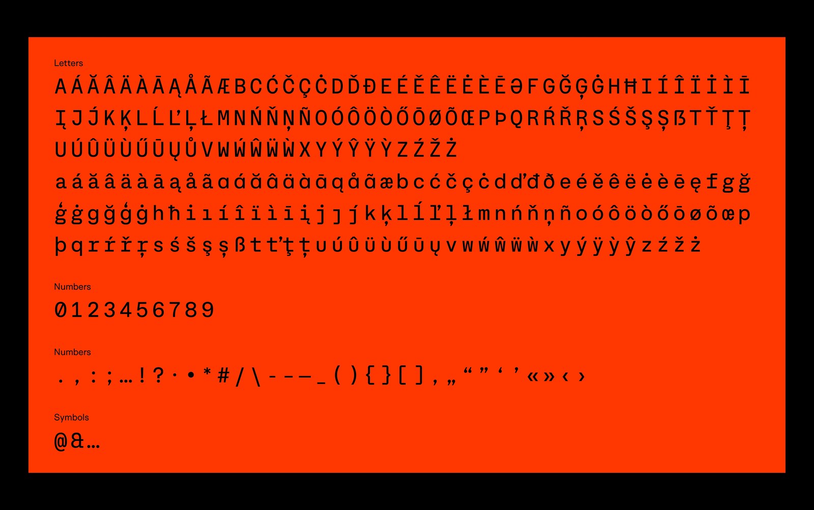
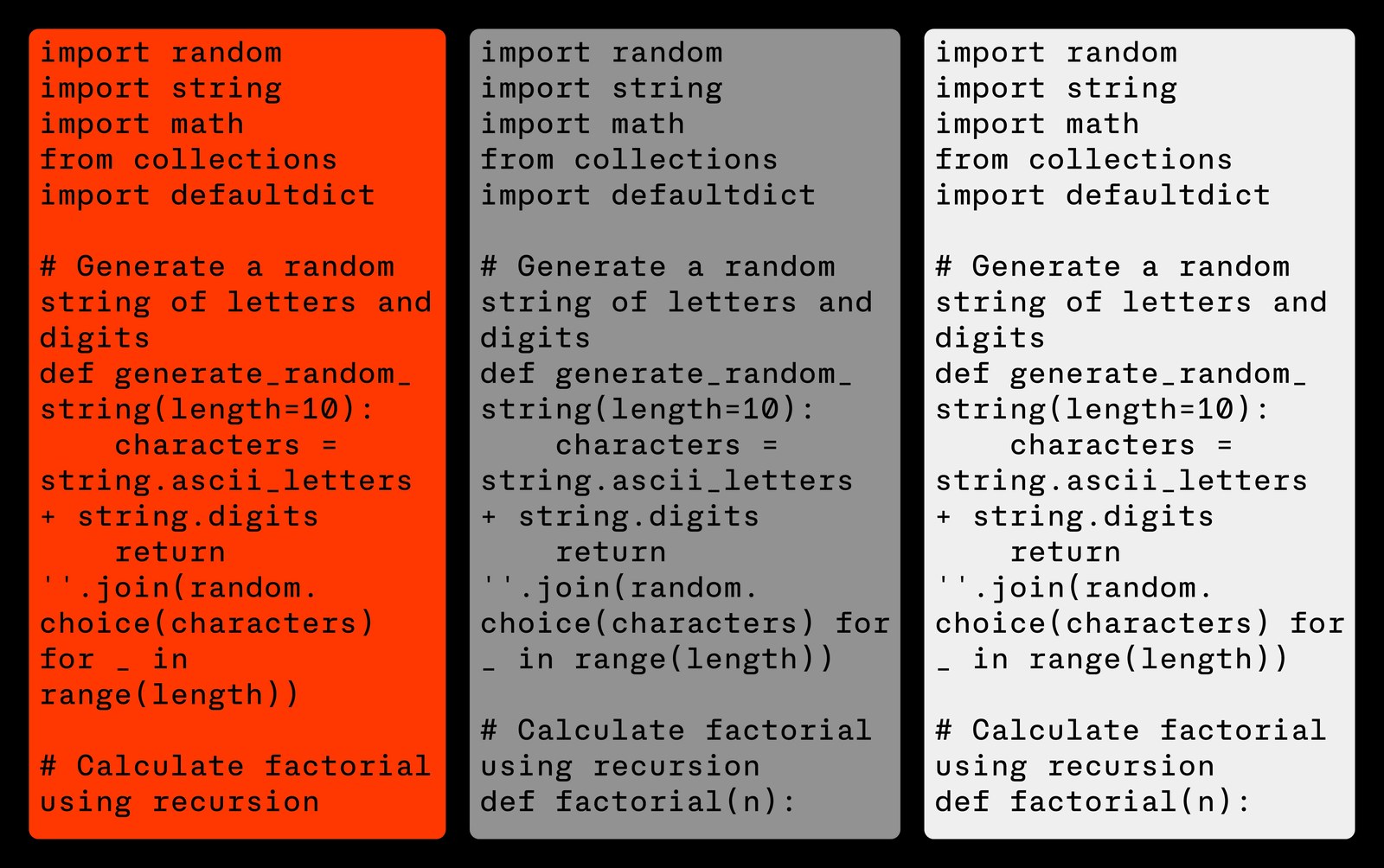
Every glyph sits inside the exact same horizontal box. That fixed width is what keeps code indentation honest. Look closely at the vermilion-orange character sheet and you'll spot how Salvaggio and Vanhille solved the classic disambiguation traps in monospaced typography: the numeral 0 carries a crisp diagonal slash, the figure 1 plants a flat base serif against a hooked top flag, and the character set packs both double-story and single-story lowercase a alternates alongside tall curly braces and brackets. Nothing in the spacing feels cramped. Even in the three-column Python specimen running generate_random_string and recursive factorial functions across vermilion, slate-grey, and off-white cards, the vertical rhythm stays locked to the pixel.
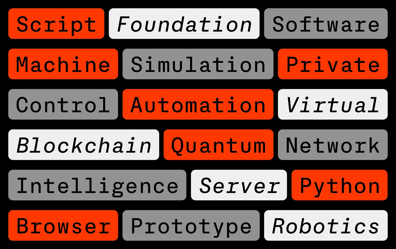
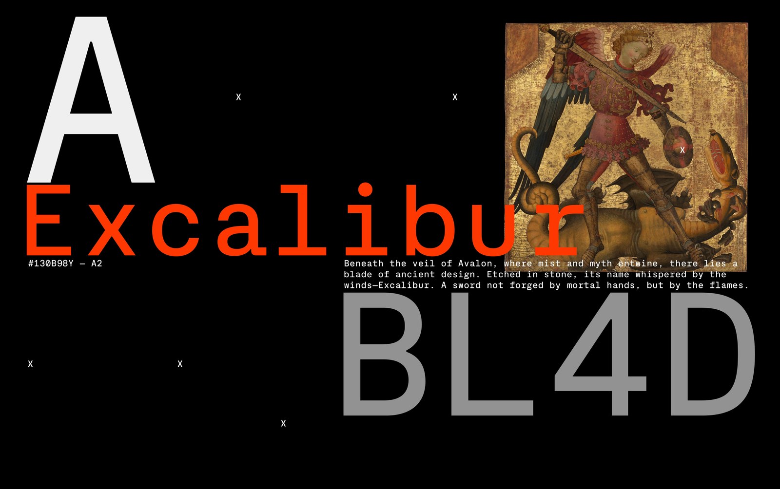
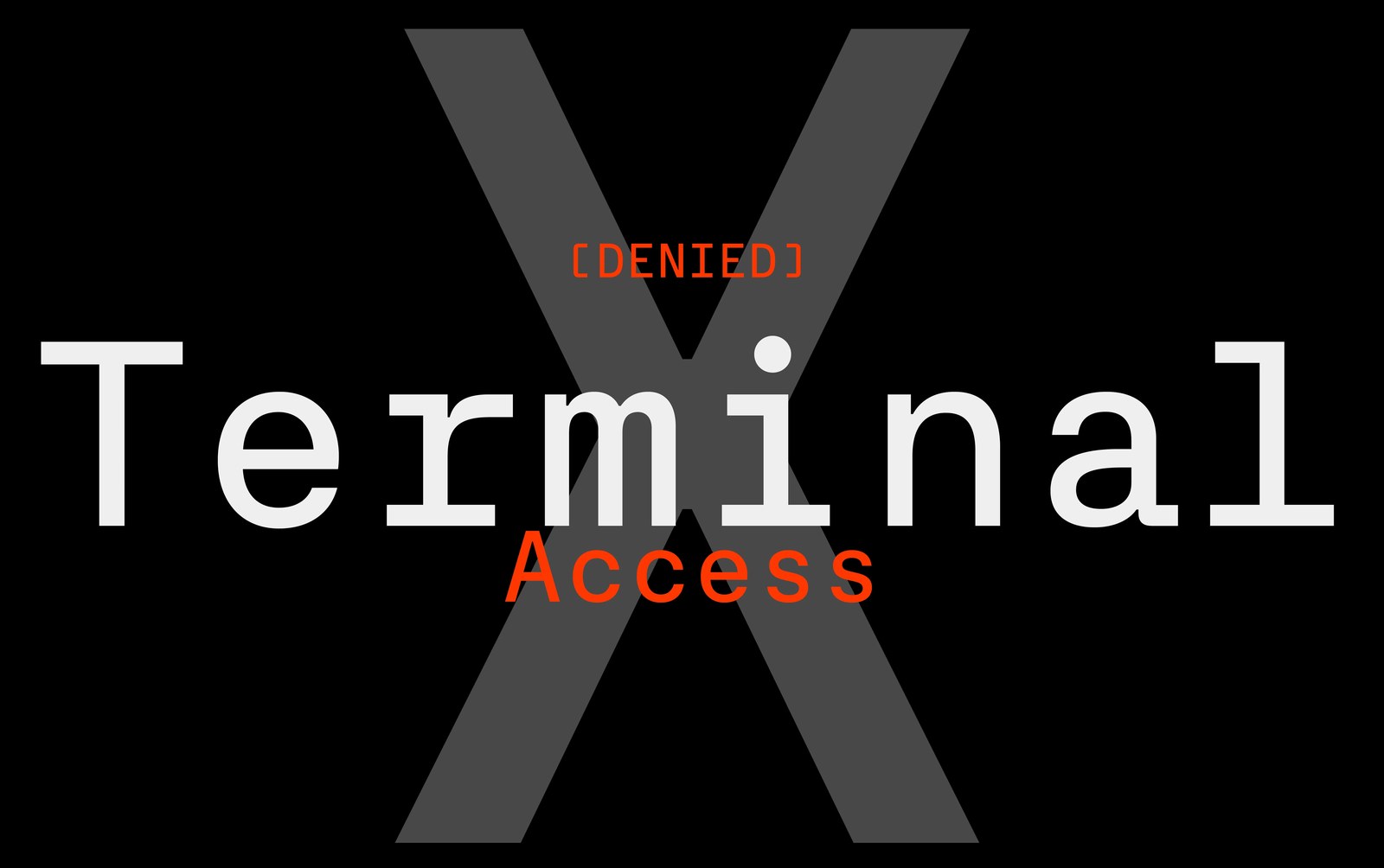
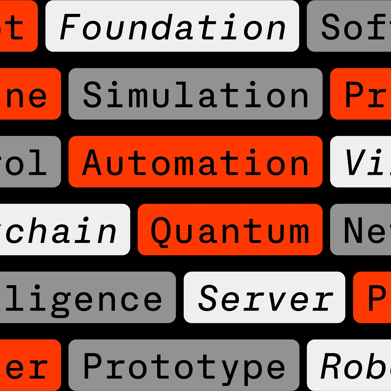
The specimen art direction refuses to play it safe. Instead of showing dark IDE screenshots, the layouts drop rounded vermilion, grey, and off-white pill badges — reading Script, Foundation, Blockchain, Quantum, and Robotics, against pitch-black canvases and classical oil paintings, including a gold-leaf panel of St. Michael slaying a dragon behind red Excalibur and grey BL4D display type. Another frame parks white Terminal lettering and red [DENIED] Access warnings right over a giant charcoal X. It's a sharp reminder that technical typography doesn't have to look clinical when the letterforms have real bones.
See the full project by Blaze Type on Blaze Type.