Typography Design: TT Nooks Serif by TypeType Foundry
TypeType Foundry presents TT Nooks Serif in bold typography design. The display family pairs sharp slipper serifs with wide proportions.
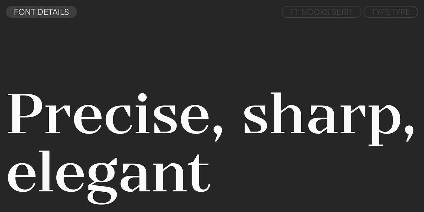
TypeType Foundry reworked the letter forms for version 2.000 of the family. The modern serif carries a sharp and stately posture. High stroke contrast creates clear visual tension across all glyph outlines. Wide proportions give the letter shapes a bold presence on the page. Flat squarish curves add geometric order to the rounded bowls. The foundry shaped the asymmetrical serifs to look like small slippers. These distinct terminals anchor each baseline with firm physical balance. The sharp brackets balance black stroke weight against open white counters. This strict typography design stands out among modern editorial serifs. Each letterform holds the eye without losing its classic poise.
Asymmetrical slipper serifs and modern typography design
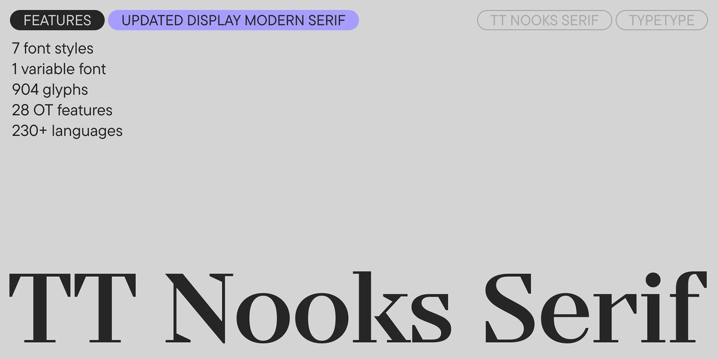
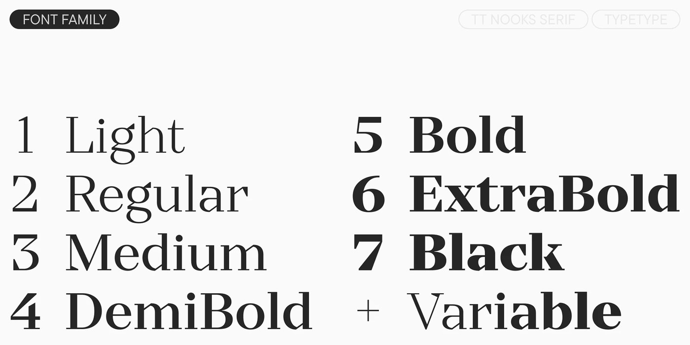
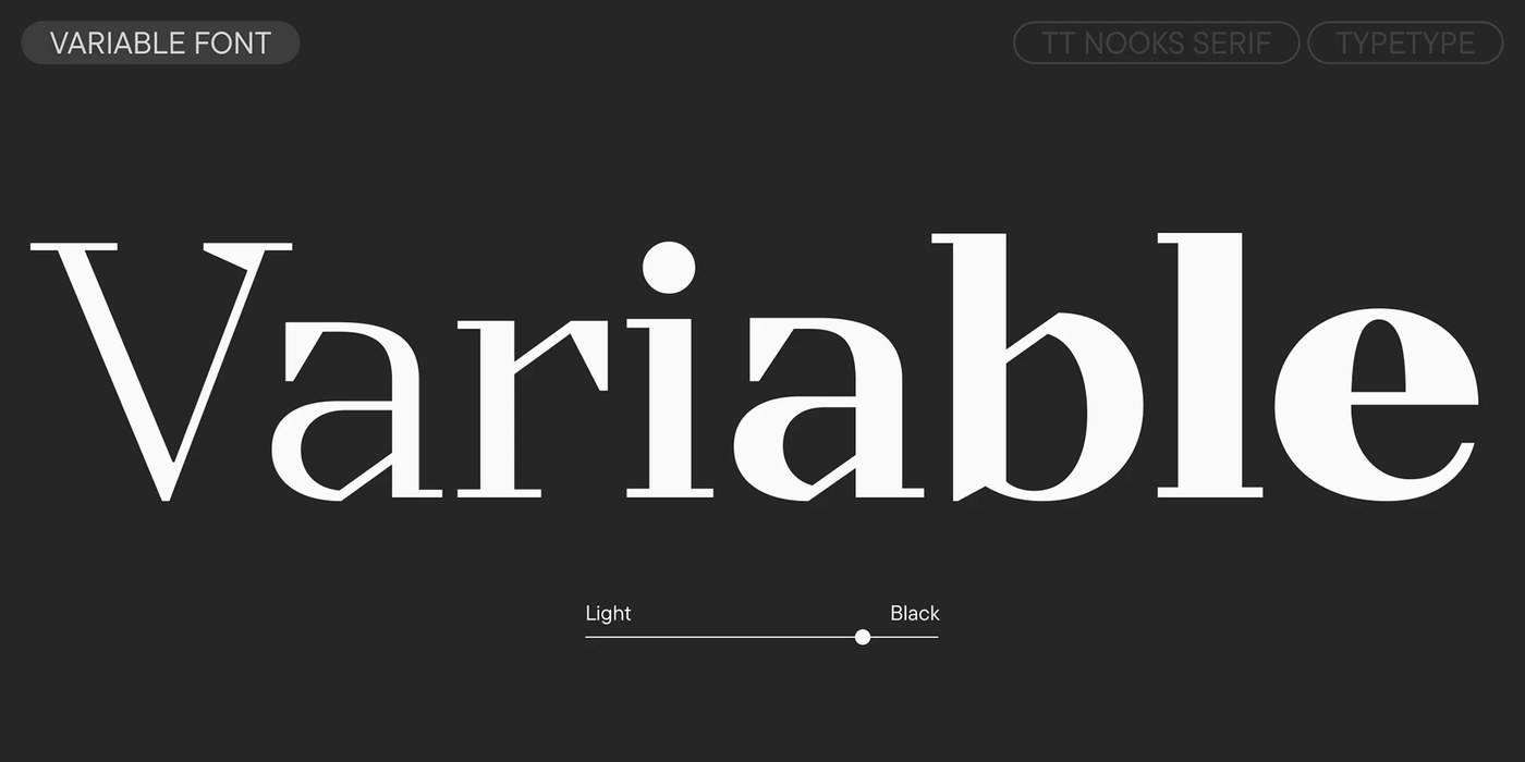
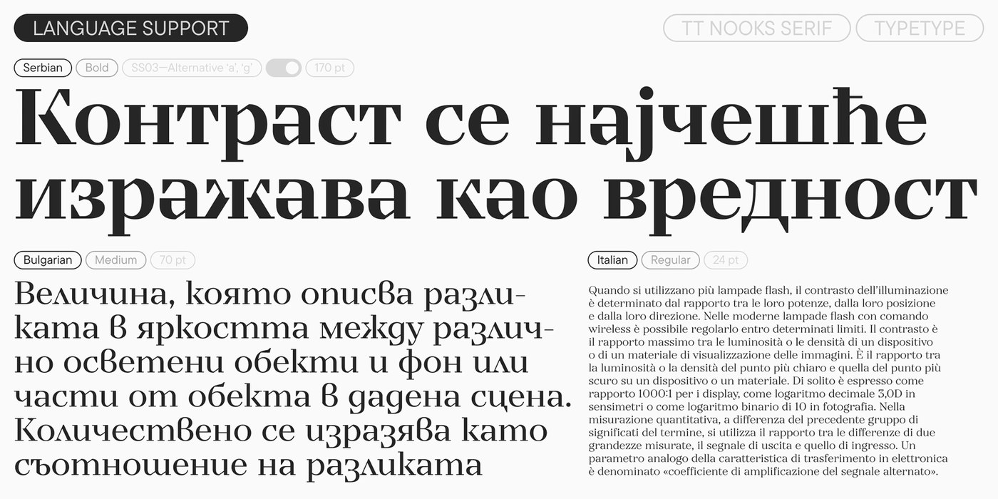
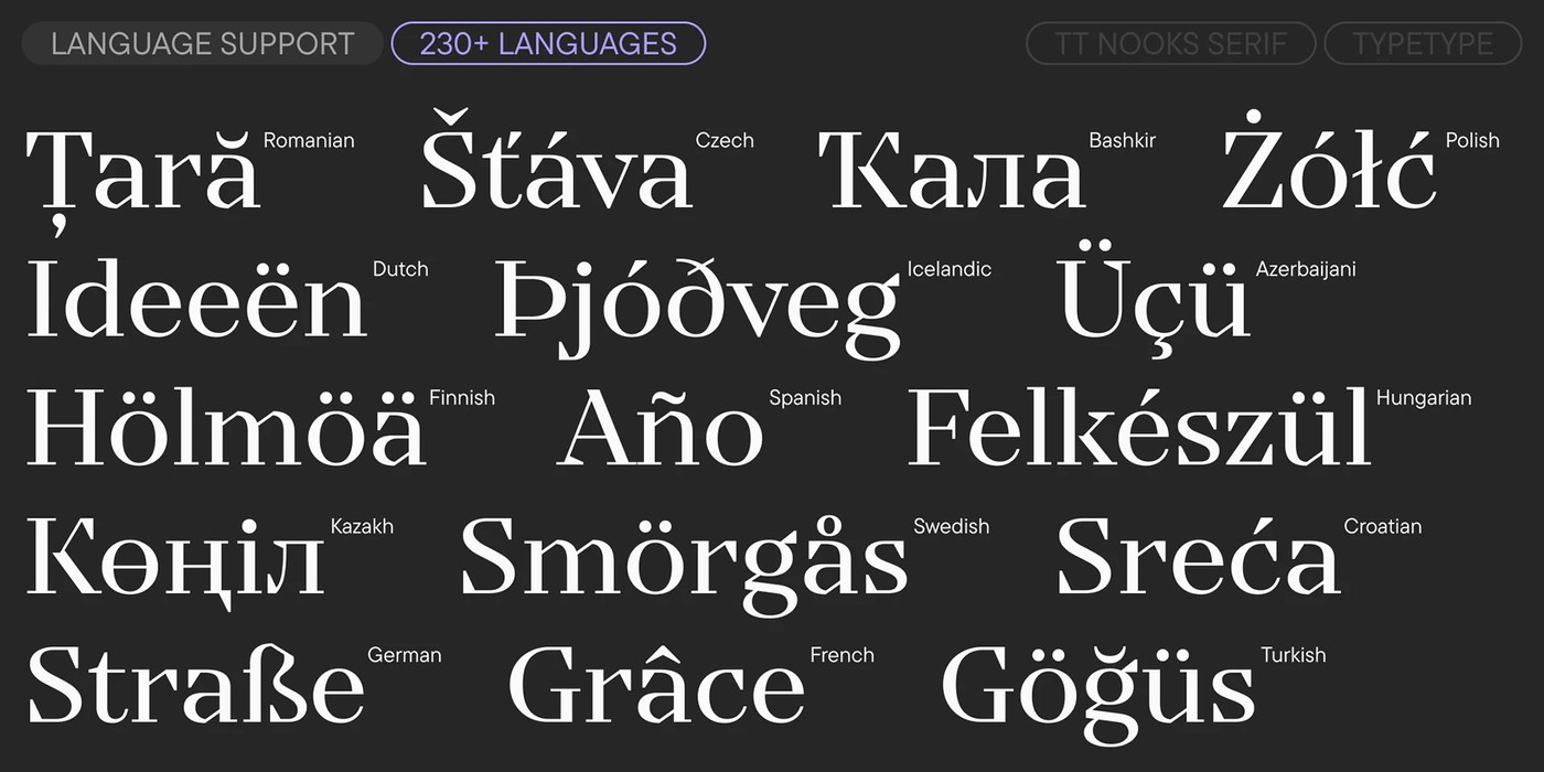
The updated release brings seven upright weights with a fast variable font. Weights step smoothly from light cuts to heavy black display styles. Even stem widths keep the family balanced across varied sizes. The studio expanded the glyph set to 904 characters per style. Helpful OpenType features add diamond punctuation and alternate glyph shapes for fresh layouts. Stylistic sets offer alternate forms for letters like Q, a, g, and y. The letterforms adapt with ease from small captions to giant headlines. Wide letter widths keep text clear in dense editorial spreads. Designers gain exact scale control across print and digital pages. The clean typography design system supports more than 230 global languages.
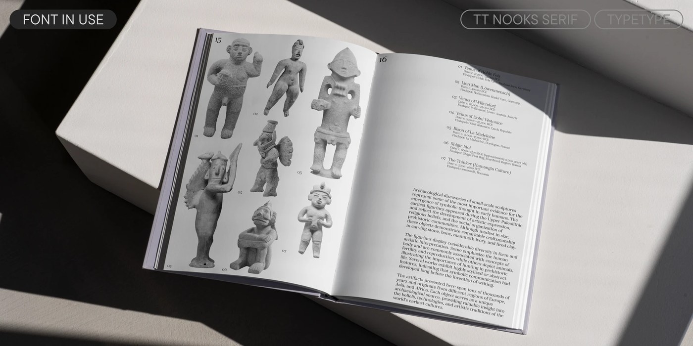
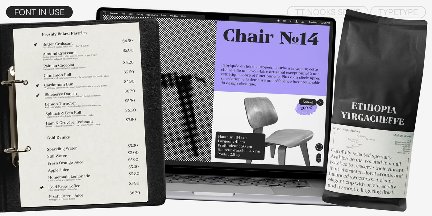
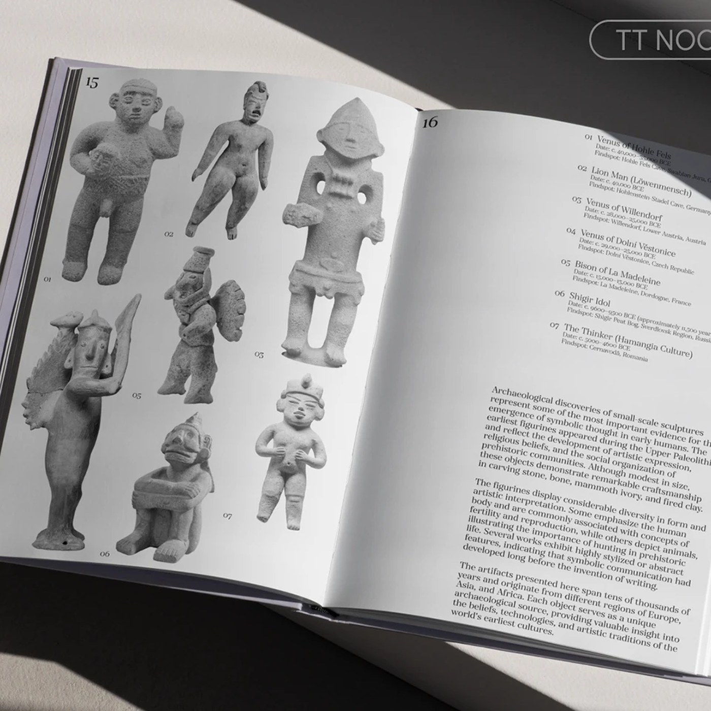
Specimen prints show the great range of the font family. Book spreads set clean text around photos of ancient stone sculptures. Daylight across the page reveals deep black ink on white paper. Crisp margins frame the artifact photos with quiet order. The letterforms anchor physical goods like leather cafe menus and coffee bags. On retail bags, bold headline letters build clear structure. The sharp serifs print cleanly on rough paper and flat screens. This flexible typography design brings stately weight to books and covers.
See the full typography design project by TypeType Foundry on Behance.