How Base Design Reimagined the Kanal Centre Pompidou Identity
Base Design built the Kanal Centre Pompidou identity on a variable typeface that breathes, flows and overflows, opening November 2026.
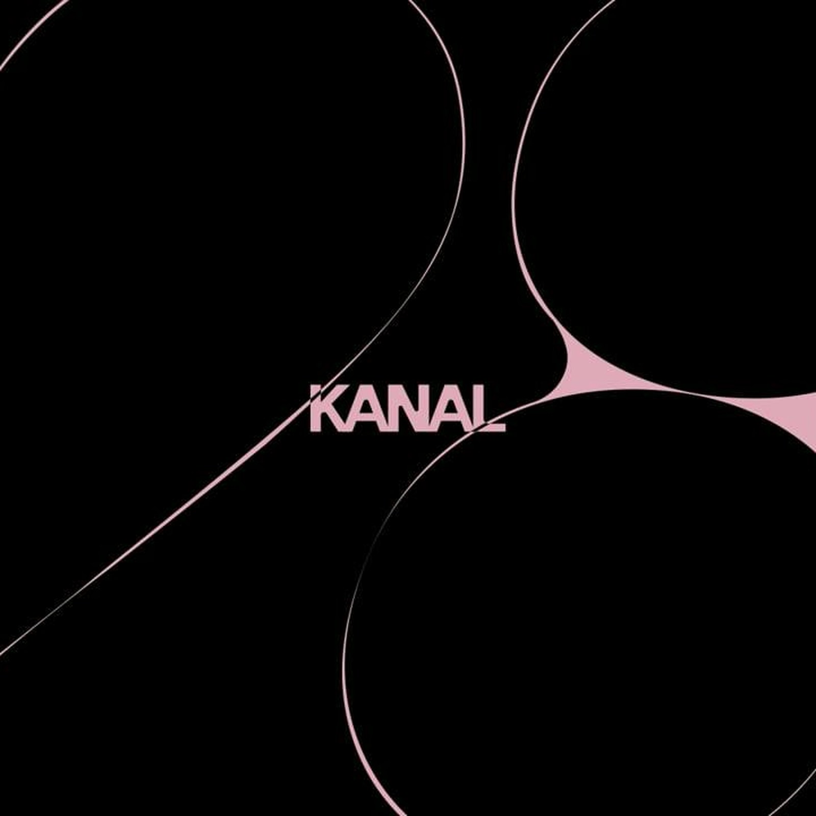
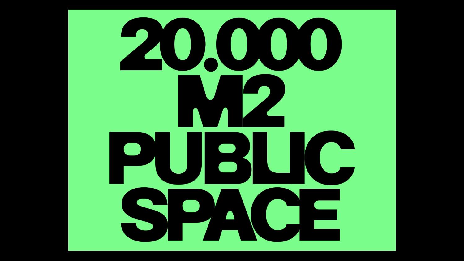
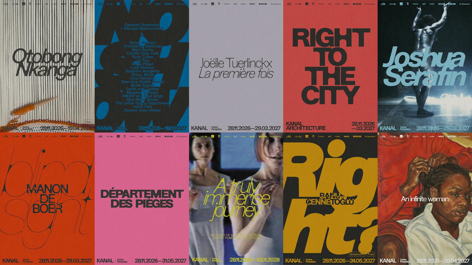
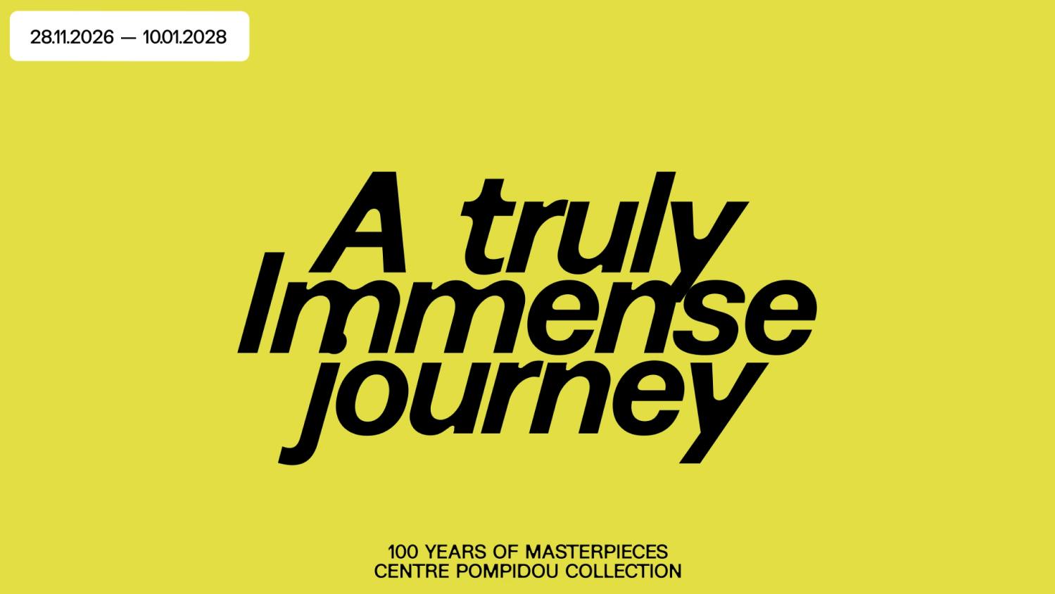
The first thing you notice is how little of the system sits still. The key art sets the KANAL wordmark in dusty pink against deep black, threaded through with thin lines that loop, cross and pool into solid shapes, as if a river delta had been drawn with a single gesture. The exhibition posters take the opposite approach: loud, flat fields of color. A red RIGHT TO THE CITY for Kanal Architecture. A hot pink DÉPARTEMENT DES PIÈCES. A green slab carrying 20.000 M2 PUBLIC SPACE. A chartreuse A truly immense. Each poster reads as its own event, yet every one obeys the same skeleton: the KANAL lockup and the season dates set small along the foot of the page. The studio describes the institution as a museum of multitudes, flowing and overflowing into Brussels and beyond. The graphics behave exactly that way.
Kanal Centre Pompidou identity: a typeface built to breathe
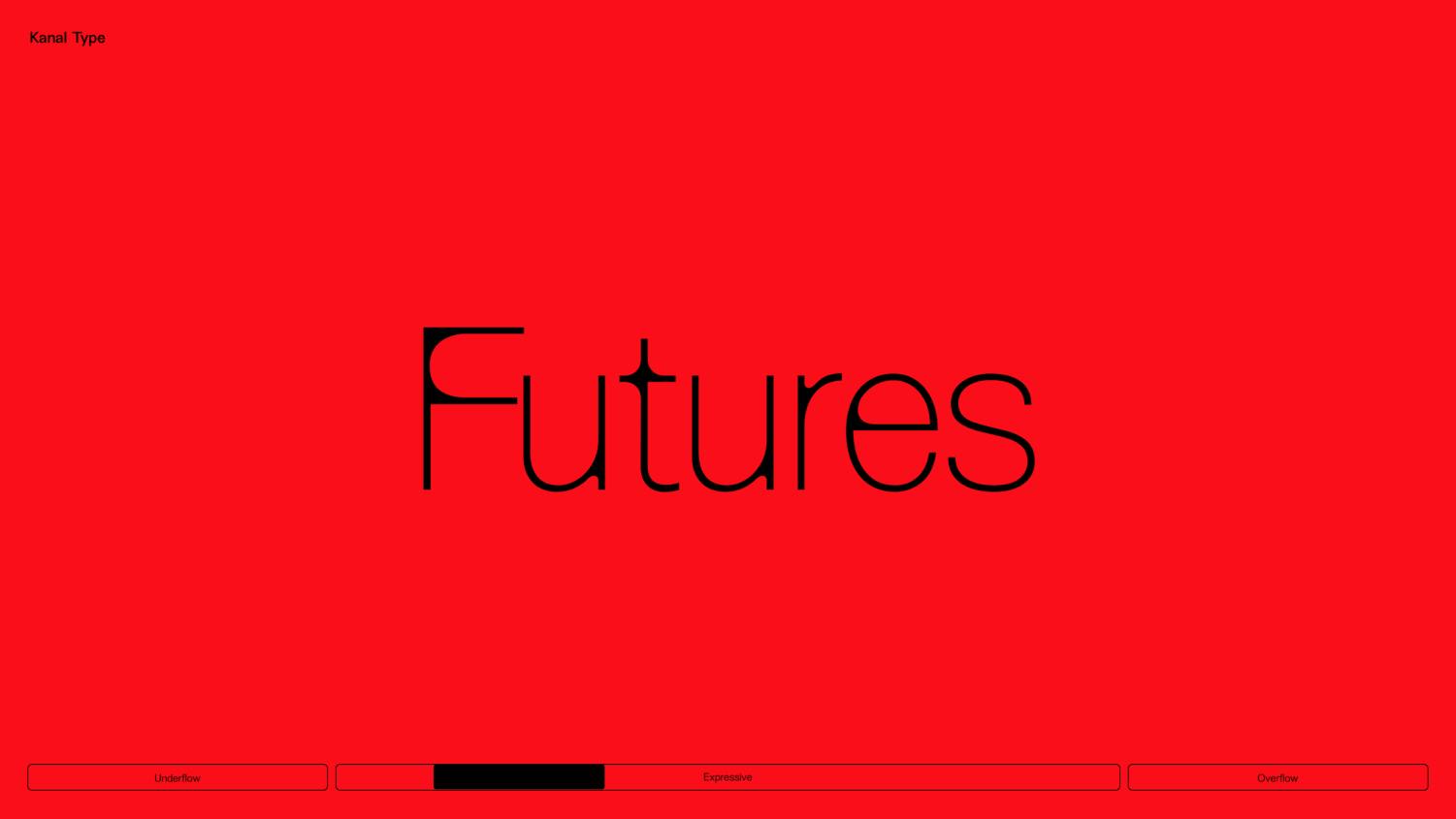
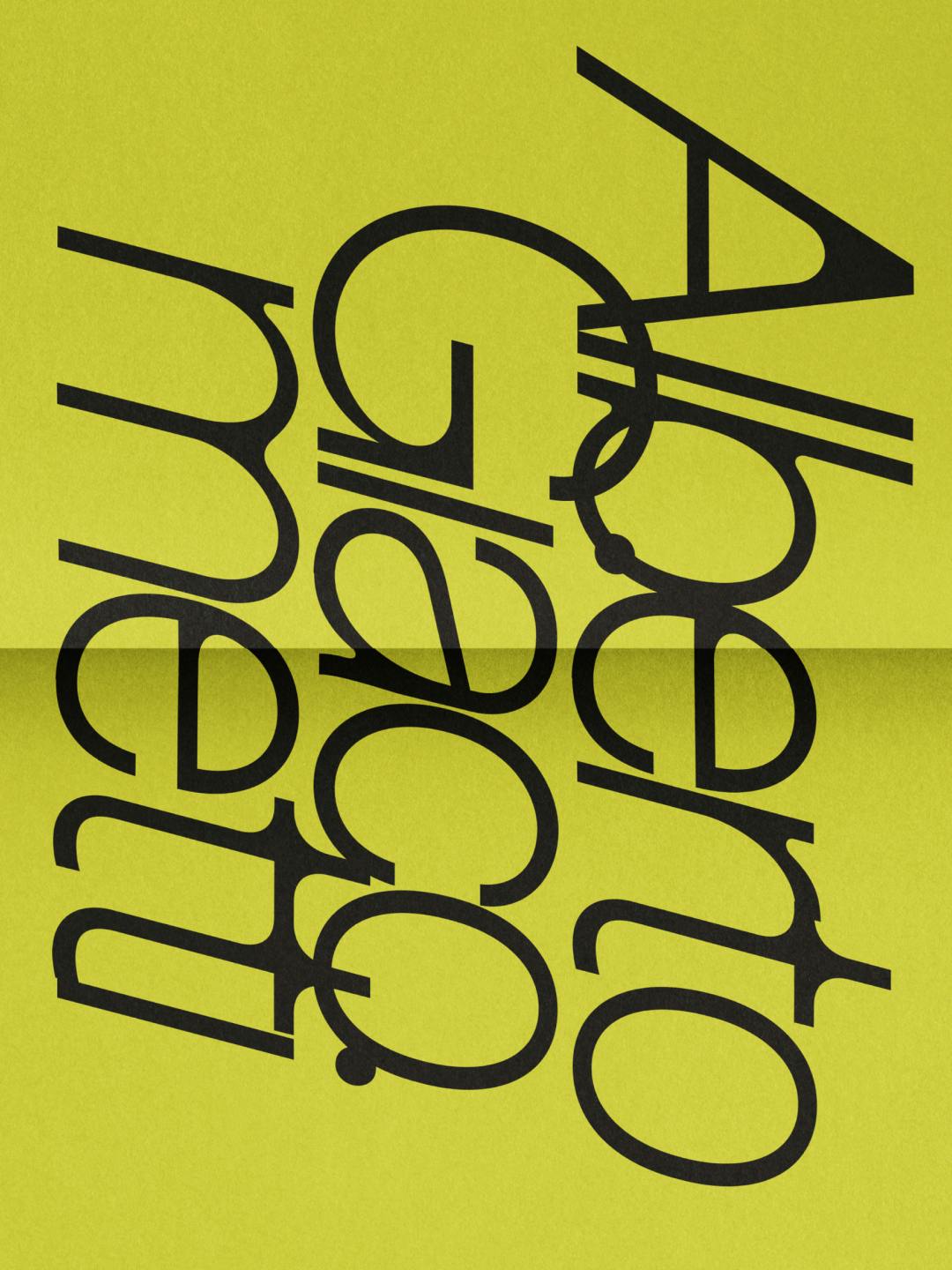
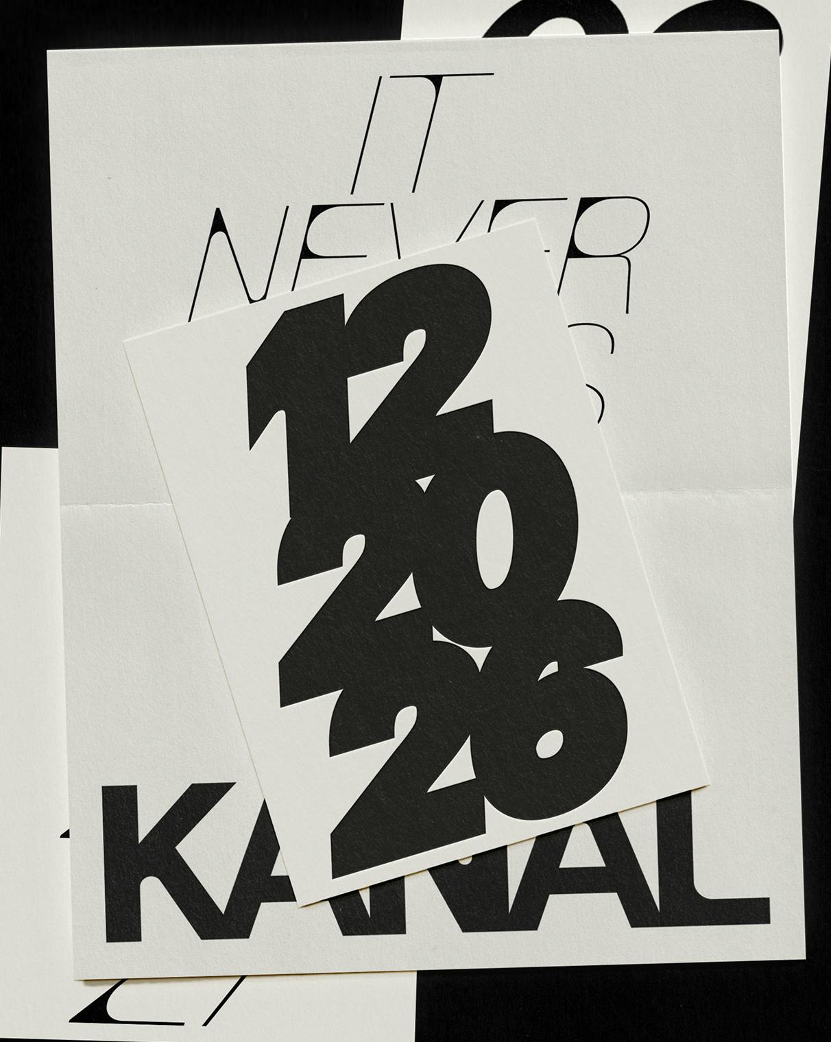
Typography does the heavy lifting, and it was drawn for the job. Base Design built the identity around a variable typeface developed with Charlotte Rohde, whose forms genuinely shift, flow and overflow. One axis runs from Underflow to Expressive to Overflow, and the specimens show what that means in practice: FUTURES set tall and looping on red, A truly Immense leaning across a lime field, the numerals 12 20 26 stacked like a date stamp on print ephemera. The wordmark itself stays put, blunt blocky caps in pink or black, which gives the whole system something to orbit around. The poster grid is where the discipline shows: every composition locks into the same footer, the KANAL and Centre Pompidou lockup with dates such as 28.11.2026-29.03.2027. One system, ten posters, no two alike.
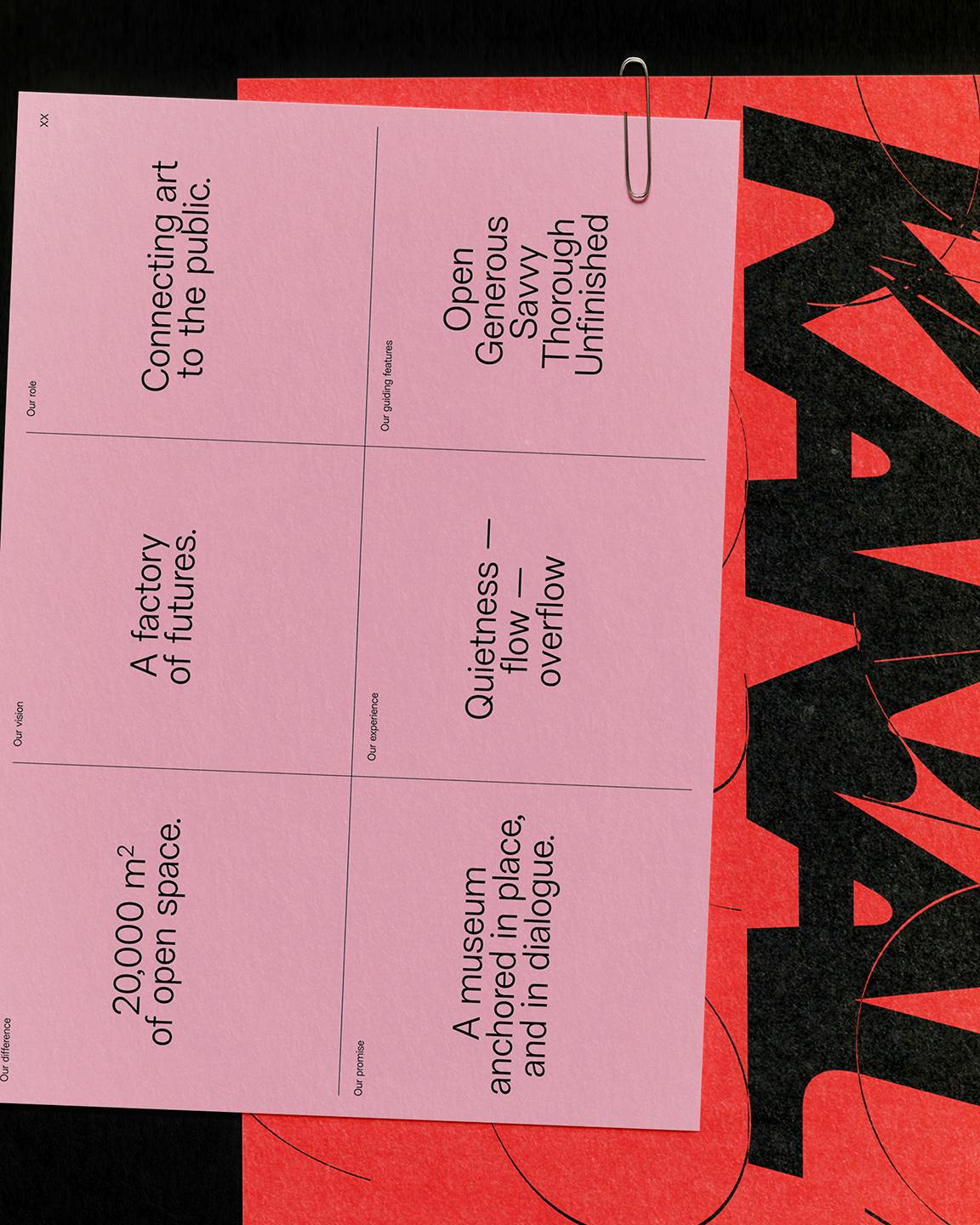
The identity extends past the page. A stack of print ephemera layers overlapping cards on uncoated stock: IT NEVER over 12 20 26 over the KANAL wordmark. A pink strategy card, held by a metal paperclip, carries the institution's own language: A factory of futures. 20,000 m2 of open space. A museum anchored in place, and in dialogue. The studio calls the whole thing a living system rather than a fixed expression, and that includes motion studies where the letterforms breathe and shift, plus a sonic identity shaped with Kiosk Radio, one of Brussels' coolest indie radio stations. The scale behind it is serious: 40,000 square metres of former Citroën garage along the canal, half of it free to enter, with the Centre Pompidou's collection behind the programme. The identity went public in January 2026, ahead of the November 28 opening, and it already has a 2026 Creative Belgium shortlist to its name.
See more from Base Design on their website.