Bruno X Visual Identity and Music Branding System
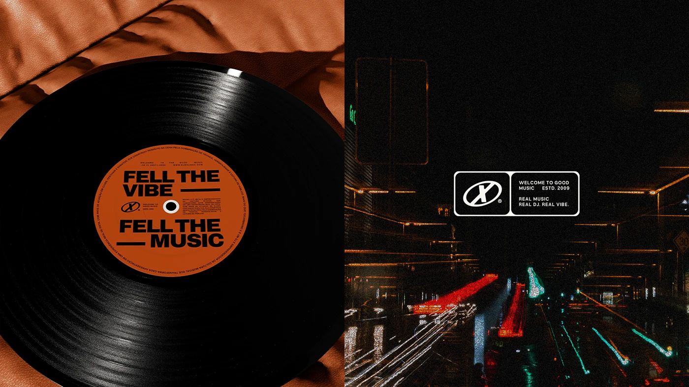
Bruno X branding identity system merges rhythmic typography, bold posters, and vinyl sleeve graphics for a Brazilian DJ studio.
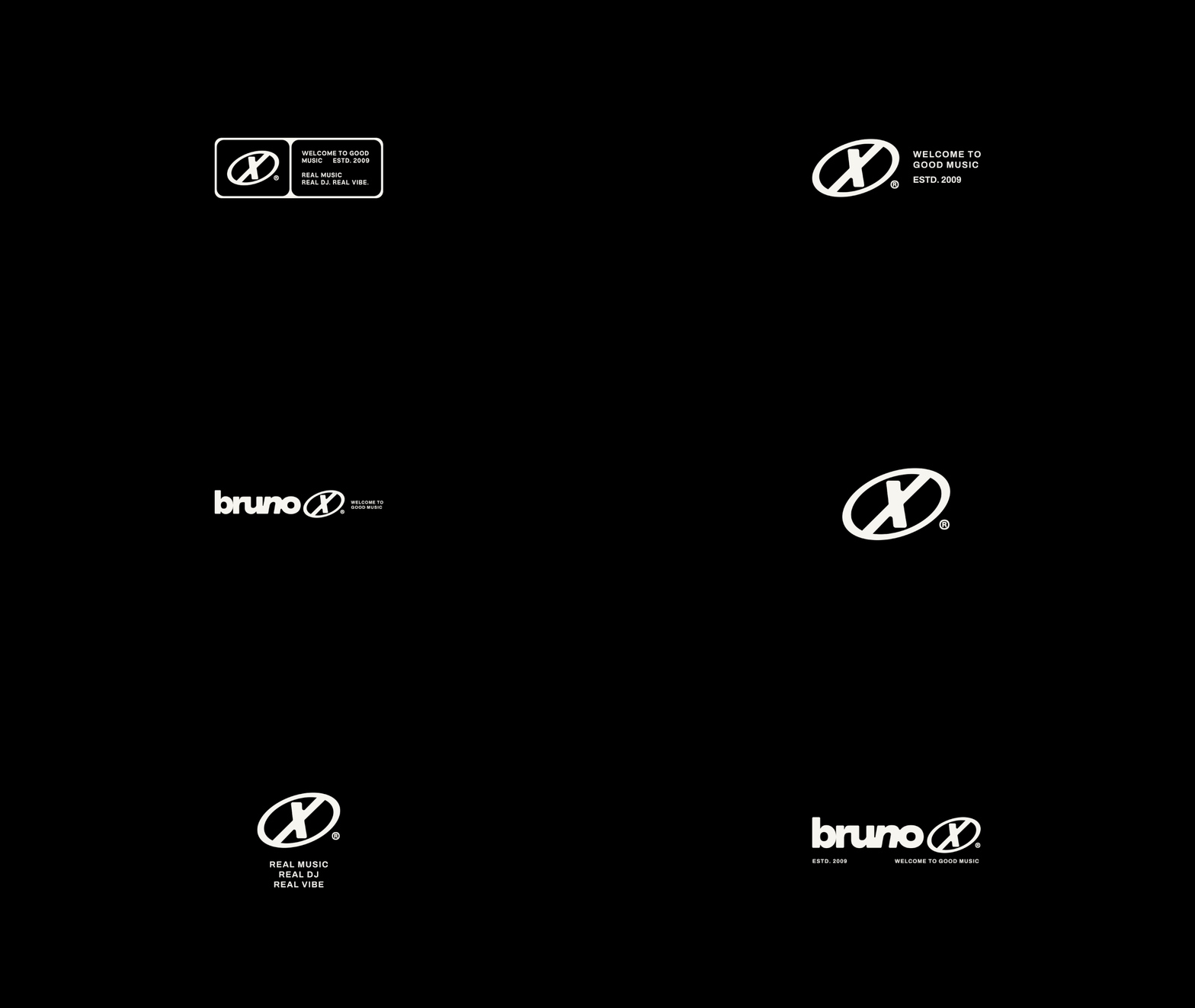
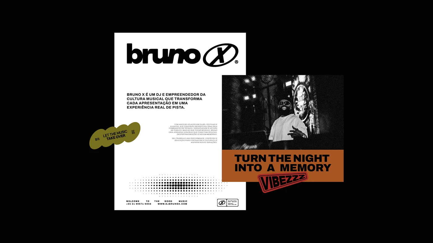
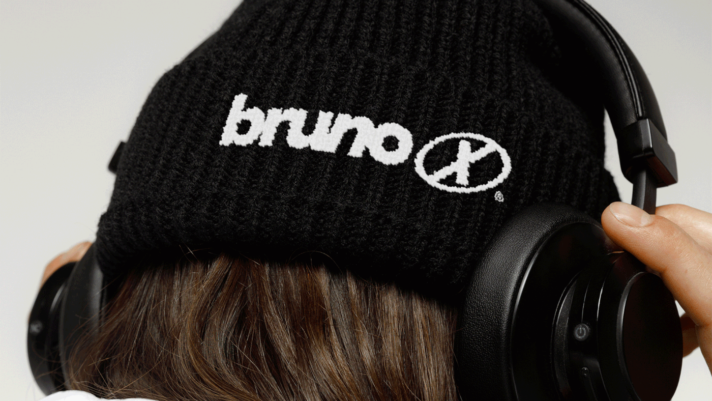
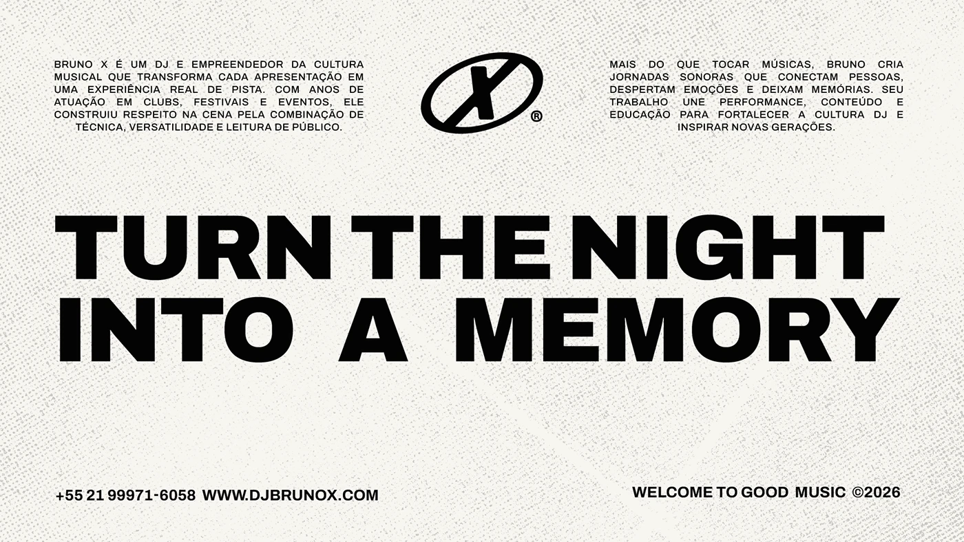
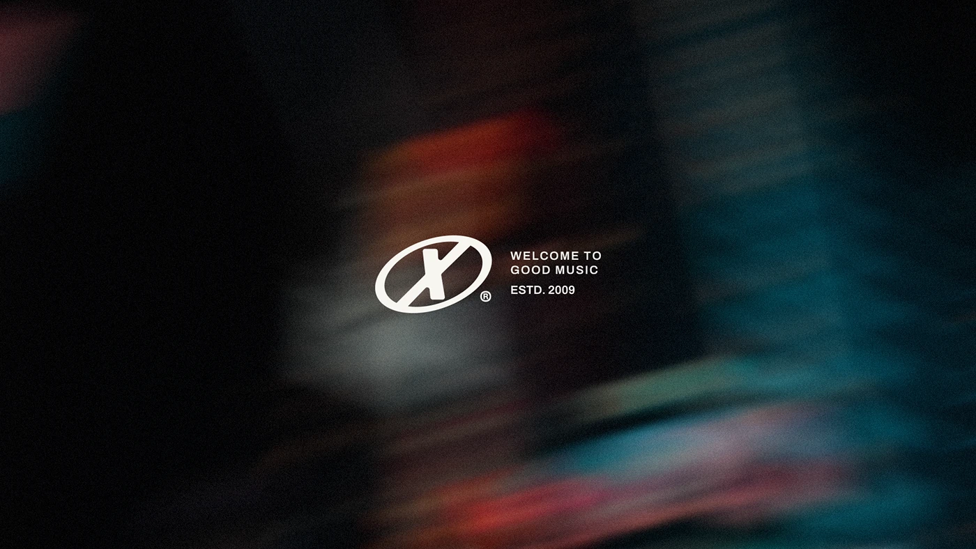
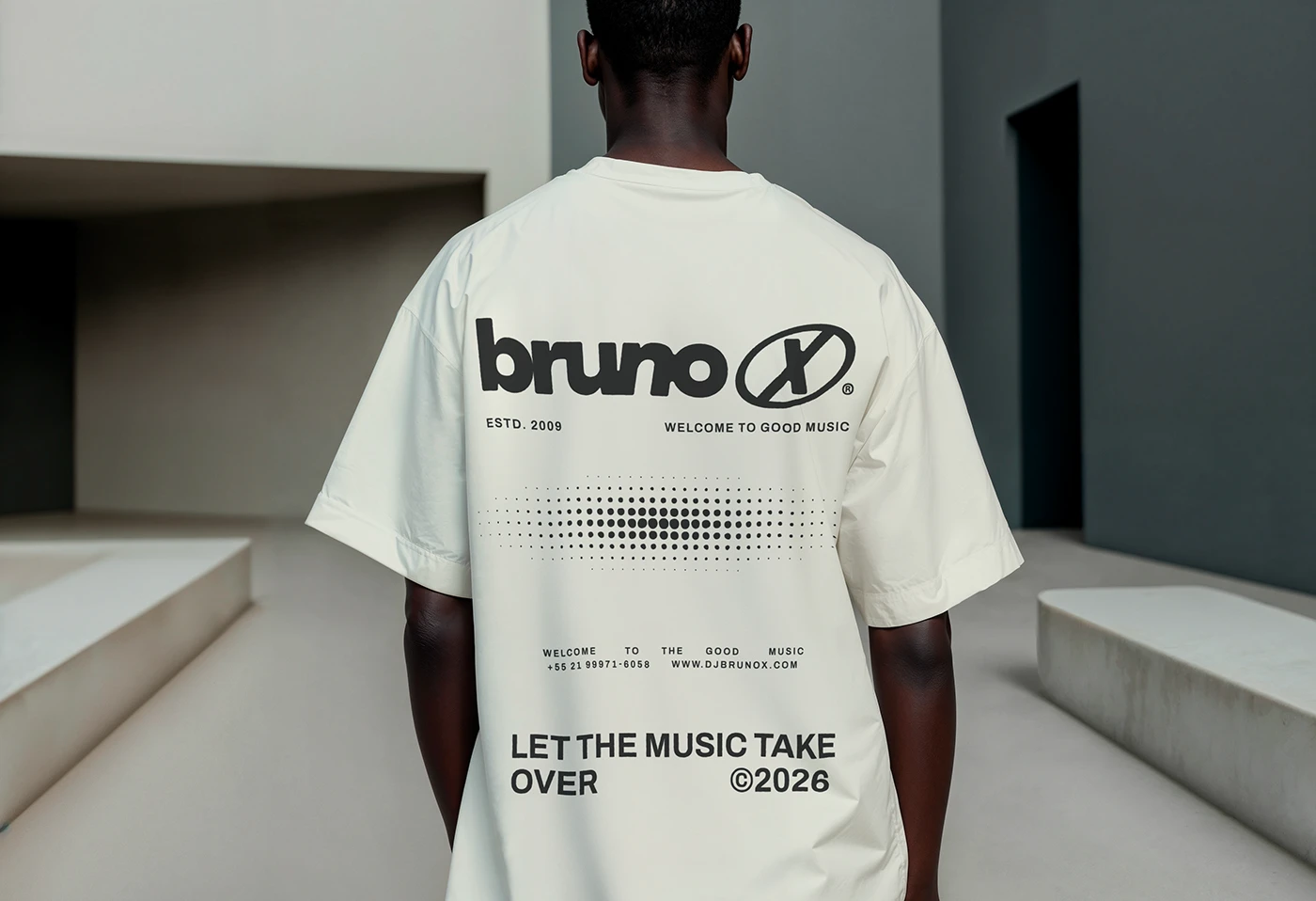
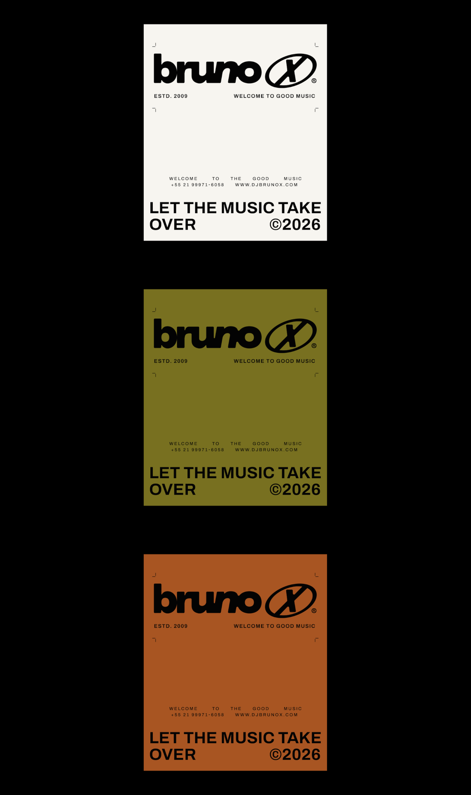
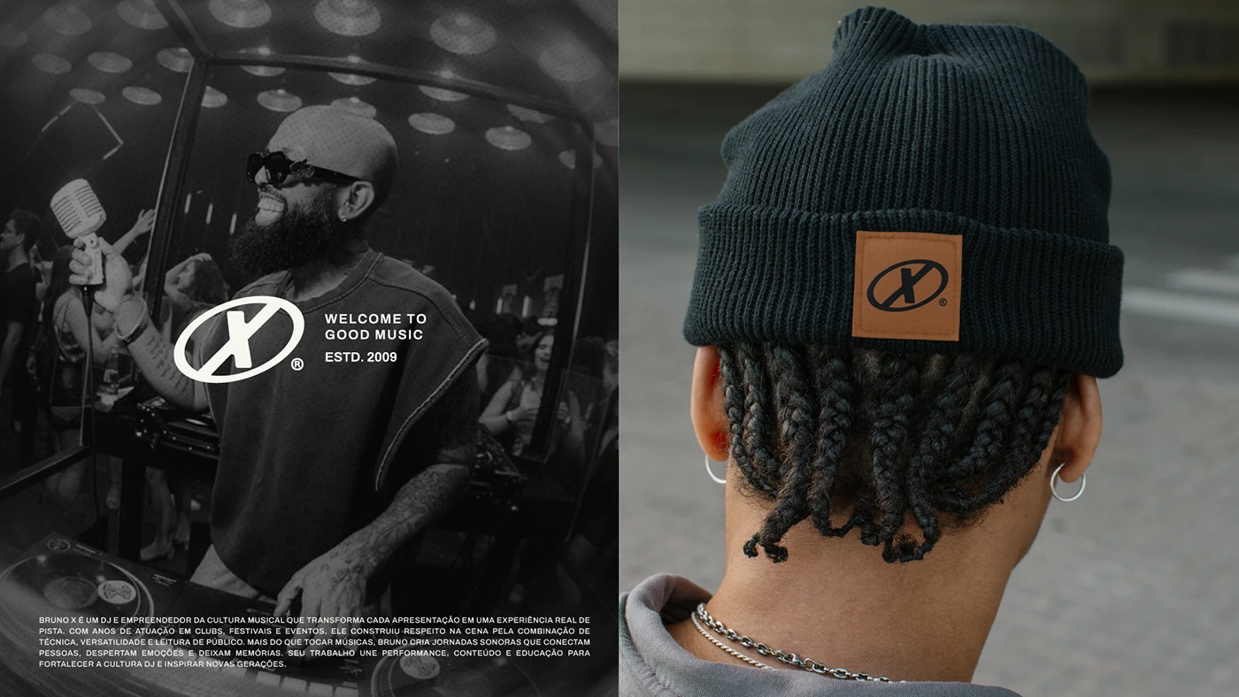
The music identity project balances high energy with clean visual order. Designed by Flávia Jackeline, Estúdio Bamba, and Nathalia Ultramar, the work builds a strong branding system. It spans event posters, vinyl record sleeves, web graphics, and team shirts. Bold graphic shapes ground every page layout. Clean grid lines hold text blocks in place. The main logo mark relies on tight letter spacing. Custom letter shapes mirror the fast spin of vinyl turntables. High visual contrast plays a key role across all print items. Dark black backgrounds contrast with crisp white type and bright color accents.
Rhythmic Grid Systems in Music Branding
Physical print items extend the branding system into real tactile items. Custom vinyl sleeves use heavy paper stock with raised text details. This design choice offers a rich tactile feel for record fans. Large event posters and DJ booth banners use strong size contrast. They grab fast visual focus in dark club rooms. The matching academy print items follow a neat visual grid layout. Simple learning charts, vinyl record care guides, and student certificates sit neatly inside modular layout boxes. Each item keeps a clear link to the main brand mark.
This full branding work connects DJ performance culture with clean graphic tools. Every single item—from social media posts to physical vinyl jackets—keeps strong visual clarity. The design work honors the fast rhythm of modern club sound. It gives the artist a clear visual voice across all key media channels. This music branding project shows how typography and grid lines build real brand strength. See the complete visual identity system on Behance.