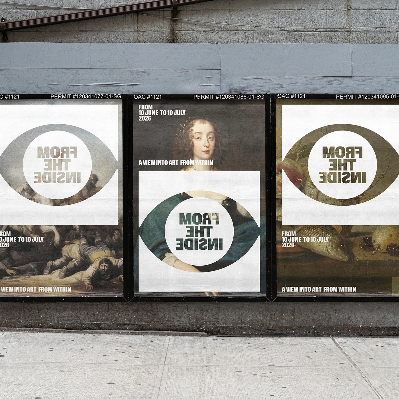
Visual Identity: From The Inside by Jarosław Dziubek
Discover the bold visual identity for From The Inside by Jarosław Dziubek. The exhibition system pairs classical art with mirrored typography.
Warsaw-based designer Jarosław Dziubek developed a conceptual graphic system for an art exhibition. The project carries the title From The Inside. Its central exhibition theme is a view into art from within. Dziubek explored how viewers perceive historical artwork through modern perspectives. Traditional exhibition graphics often remain neutral and secondary to the curation. Dziubek designed this distinctive visual identity to actively challenge that passive dynamic. The system inverts standard reading habits to provoke fresh visual curiosity. Mirrored letterforms symbolize the act of peering outward from within a canvas. Monochromatic contrast ensures strong public legibility on busy urban streets. The visual identity establishes an arresting dialogue between past and present.
The From The Inside Visual Identity and Graphic System
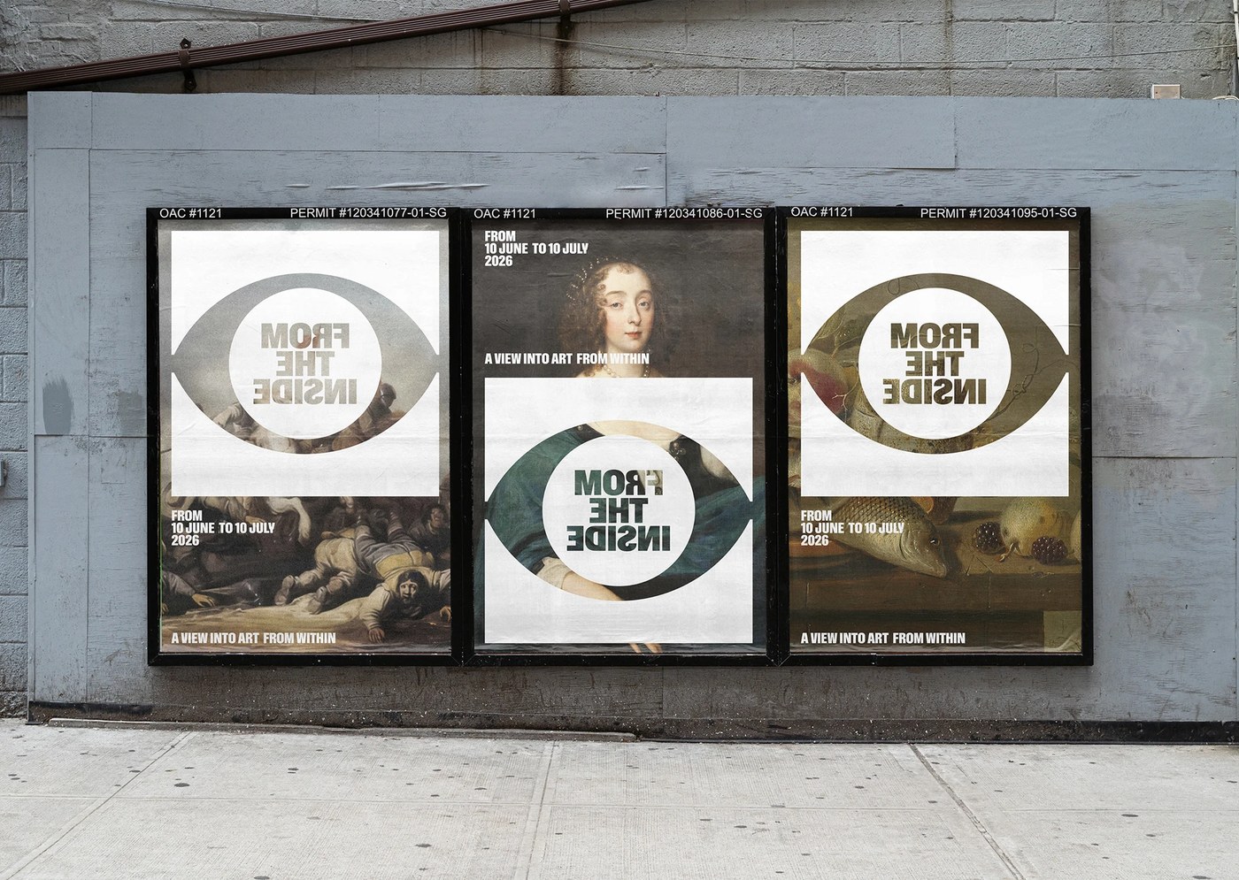
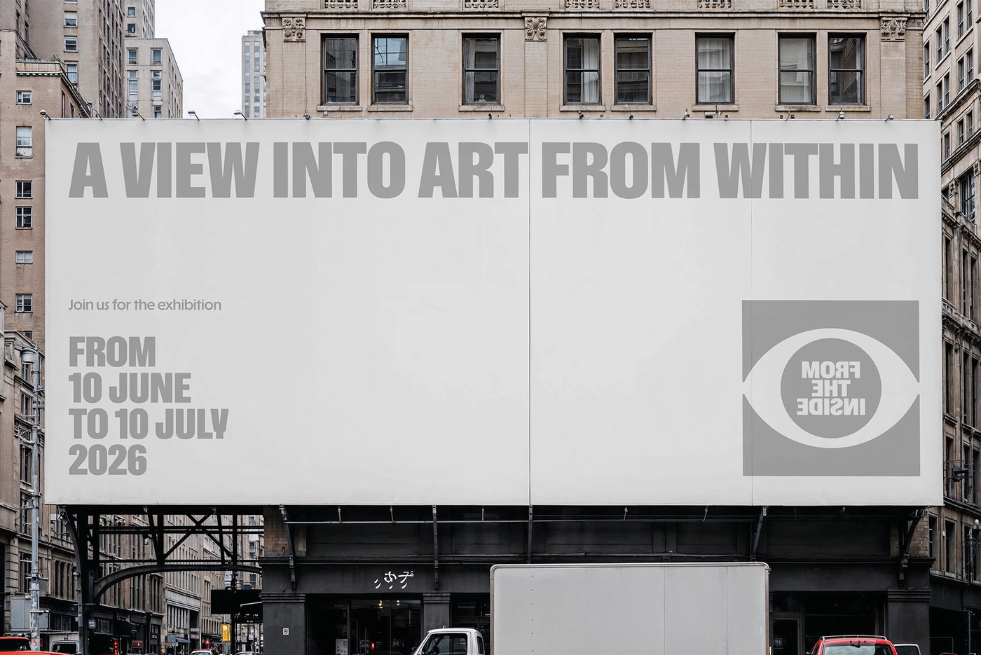
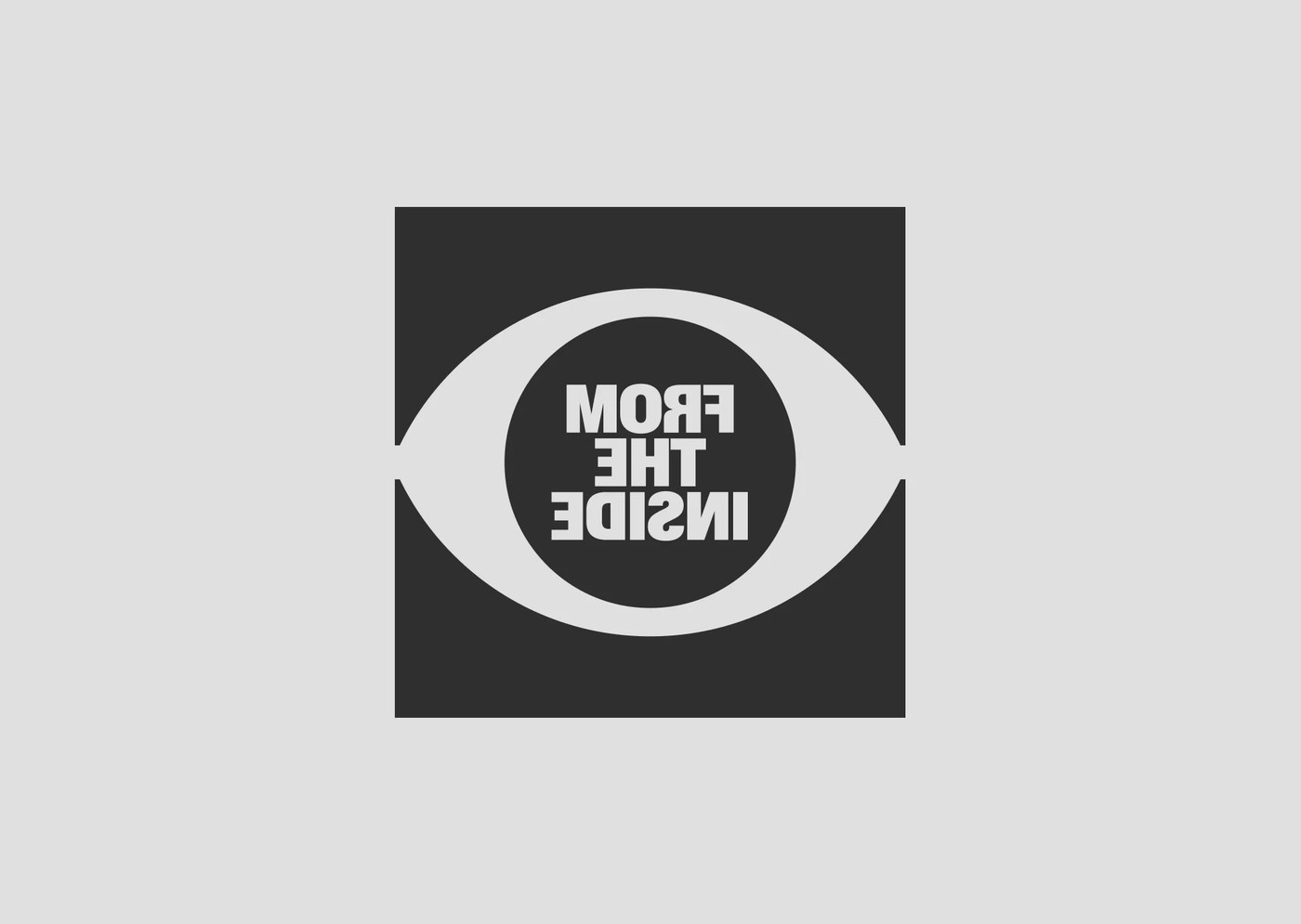
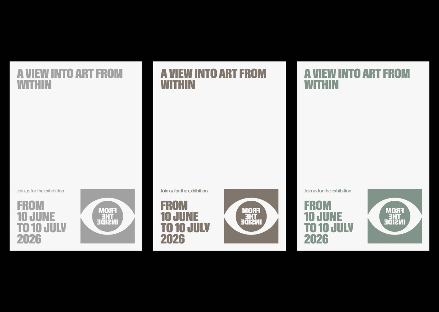
An eye-shaped aperture symbol anchors the entire visual identity. The graphic mark encloses bold typography with intentionally reversed characters. This typographic inversion mimics looking through an interior lens into external space. Monumental condensed sans-serif letterforms dominate outdoor event posters and hoardings. High-contrast typography clashes directly against classical Baroque and Renaissance oil paintings. Clean white graphic windows cut through detailed historical scenes and portraits. Municipal permit stencils and calendar dates frame the upper poster margins. Asymmetric typographic scales balance bold headlines against concise visitor information. Subtle tonal shifts between cool grey and moss green add quiet depth. The typographic hierarchy guides visitors across printed brochures and digital announcements.
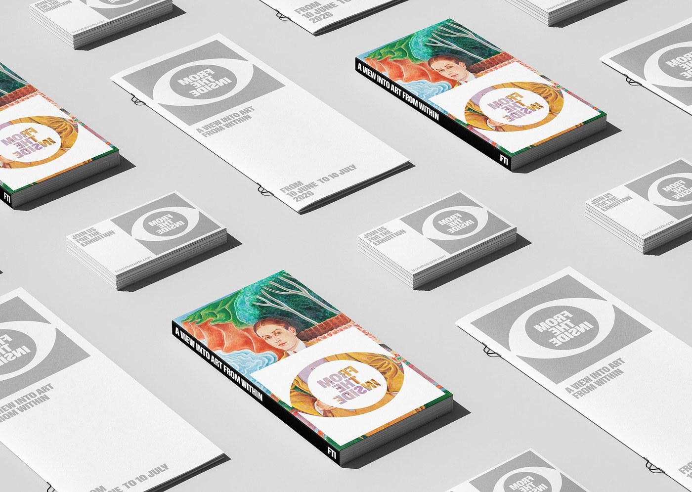
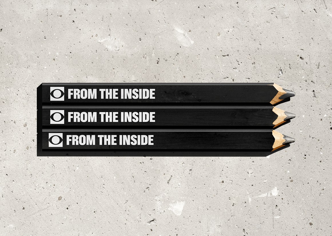
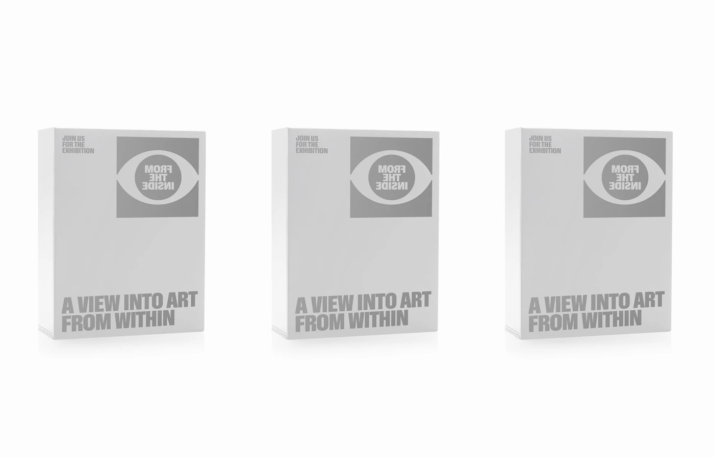
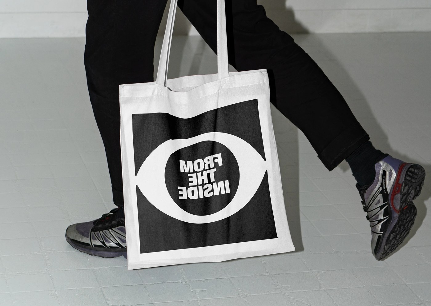
The visual identity translates effectively into tangible promotional and gallery artifacts. Street posters mount directly onto weathered wooden construction fences and hoardings. Exhibition catalog books feature full-color portrait covers with circular typography cutouts. Bound brochures use minimal black wire staples to maintain editorial restraint. Black carpenter sketching pencils feature white stamped lettering on raw concrete walls. Physical cotton canvas tote bags display the oversized eye aperture mark. Three-dimensional white catalog slipcases preserve generous white space on gallery tables. These deliberate material interactions root the graphic system in physical reality. Dziubek delivers an unforgettable visual identity that redefines exhibition communication.
See the full project by Jarosław Dziubek on Behance.