Union: Inside Two Times Elliott’s Visual Identity
Explore the Union visual identity by Two Times Elliott, pairing extended grotesk typography and Swiss grids with tactile print monographs.
Office branding usually tries way too hard. Over the past fifteen years, commercial real estate swung from stiff corporate landlord brochures to loud co-working spaces packed with neon signs and beanbags. Once the post-pandemic dust settled, a sharper hybrid model emerged across the UK: Managed Office Services, blending co-working agility with dedicated space leasing for growing companies. London studio Two Times Elliott partnered with Union, one of the pioneers of this sector, to strip away the category noise and claim a calmer position around "The Managed Office Experience." It doesn't chase co-working hype.
Architectural Restraint in the Visual Identity
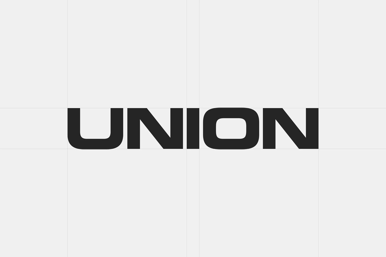
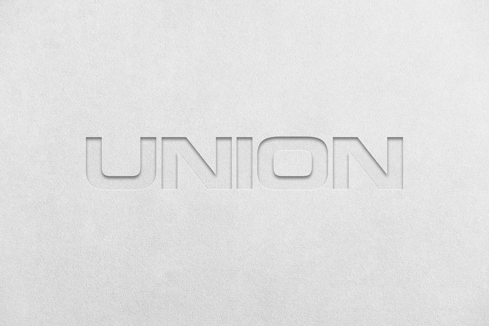
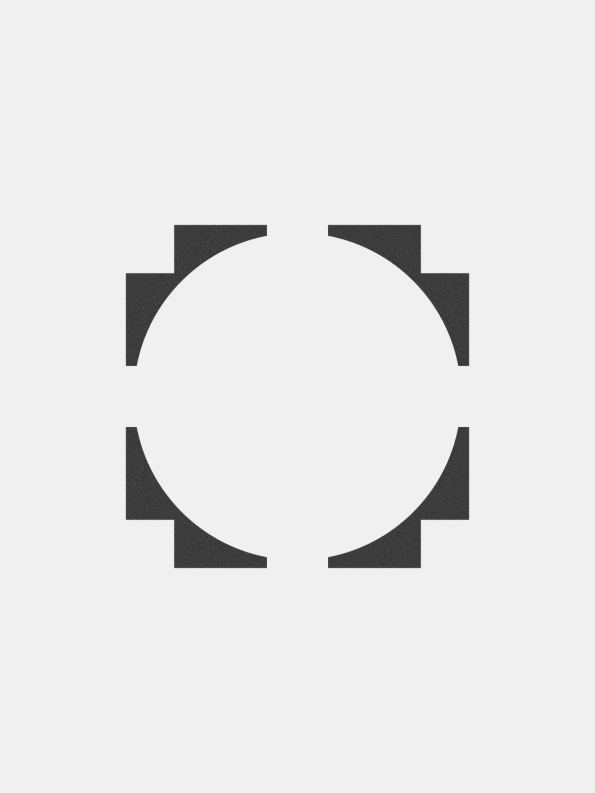
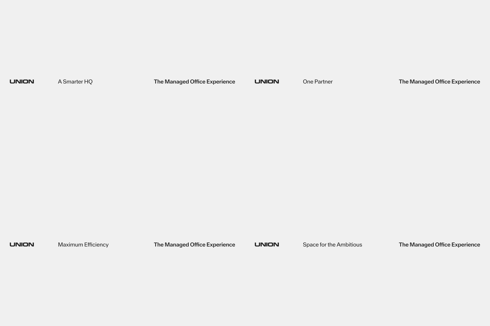
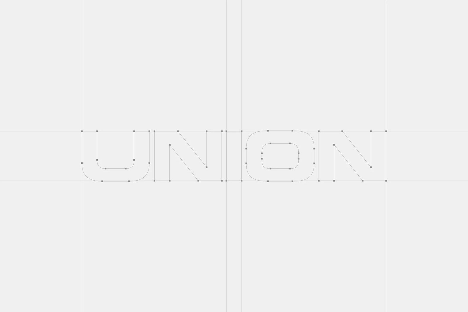
The type does the heavy lifting here. Constructed in Illustrator across a tight horizontal baseline grid, the custom extended UNION wordmark pairs wide, squared-off counters on the U and O with sharp diagonal strokes inside each N. Two Times Elliott paired that wide logotype with a standalone unification emblem — four stepped geometric corner brackets carved around an open circular negative space so separate forms lock into a single whole. There's zero decorative fluff. Whether blind-debossed deep into heavy off-white cotton paper or set alongside the "A Smarter HQ" tagline, the visual identity stays razor-sharp.
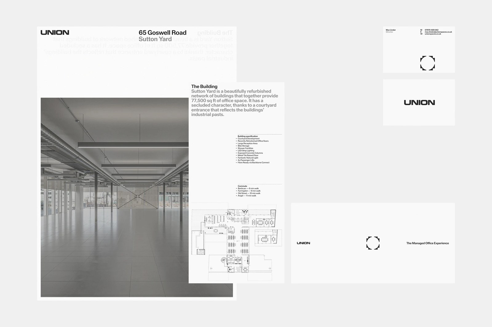
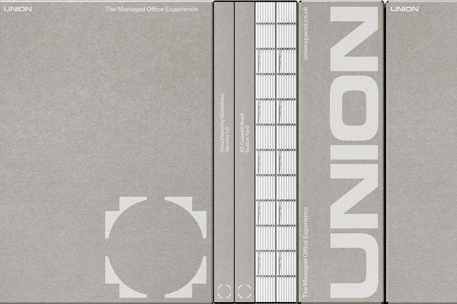
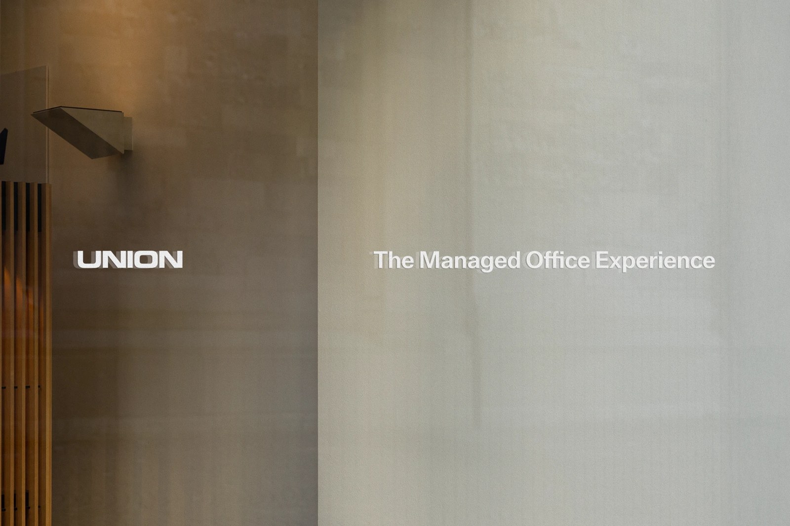
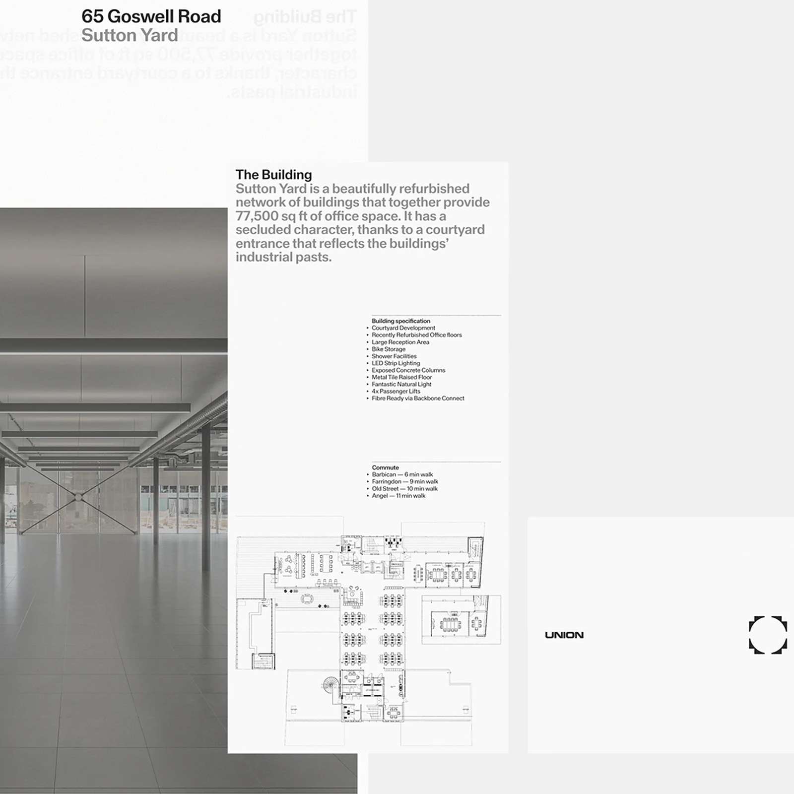
Nothing in the print suite feels disposable. For the Visual Identity Guidelines Version 1.0 and the 65 Goswell Road, Sutton Yard property monograph, the studio produced raw greyboard hardcovers and slipcases featuring exposed white thread signatures and crisp white spine typography. Inside the loose-leaf leasing sheets laid out in InDesign, translucent specification pages layer monochrome photography of the 77,500 sq ft courtyard building over CAD floorplans, technical bullet lists, and walking times to Barbican, Farringdon, Old Street, and Angel. Even the minimalist business cards for Director Max Linder, horizontal compliment slips, and frosted lobby glass signage carry that same quiet architectural discipline.
See the full project by Two Times Elliott on Behance.