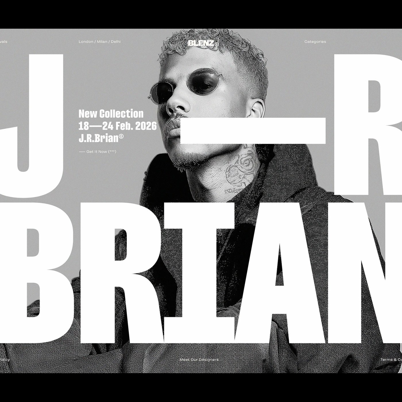
Typography Design: Filming Typeface by Rajesh Rajput
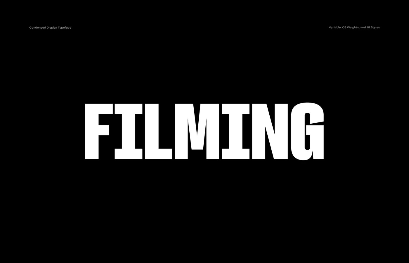
Rajesh Rajput created Filming Typeface in bold typography design. The condensed display family spans 18 styles and variable axes.
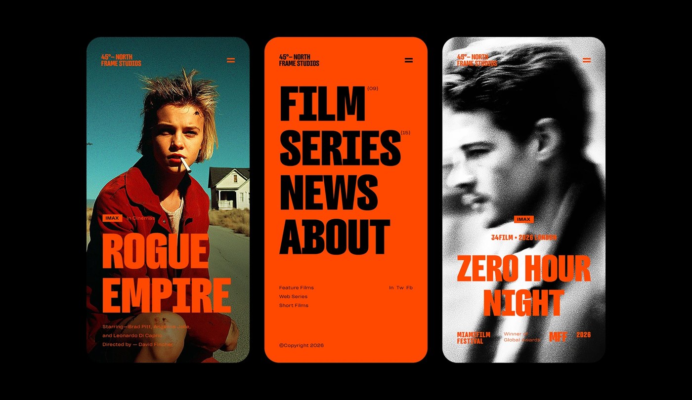
Rajesh Rajput built Filming as a tall display typeface. The letters carry tight vertical energy. Narrow letter shapes pack big visual weight into small widths. Deep black ink fills each tall stem. Flat outer sides give the letters a clean boxy profile. Small inner counters create sharp contrast with thick lines. This bold typography design gives movie titles a crisp look. Straight stems hold each baseline with firm stability. Solid geometry gives each character an assertive tone. Clean edges keep each condensed glyph sharp and clear. The letter shapes stay bold and clear at any scale.
Cinematic style and variable typography design
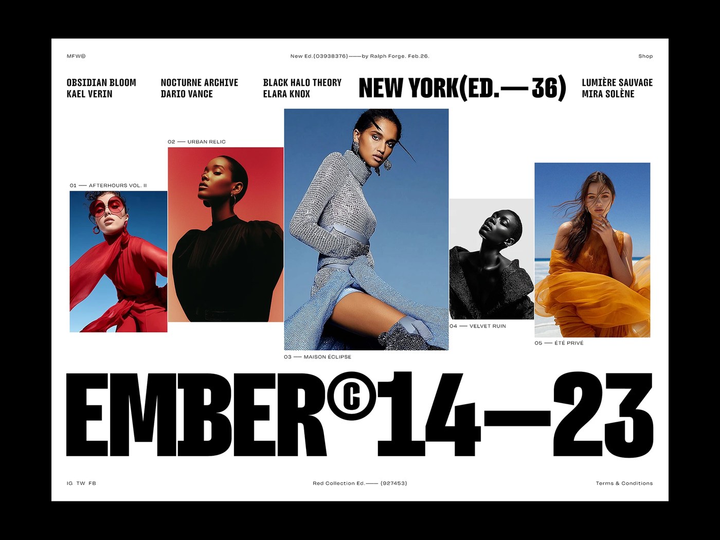
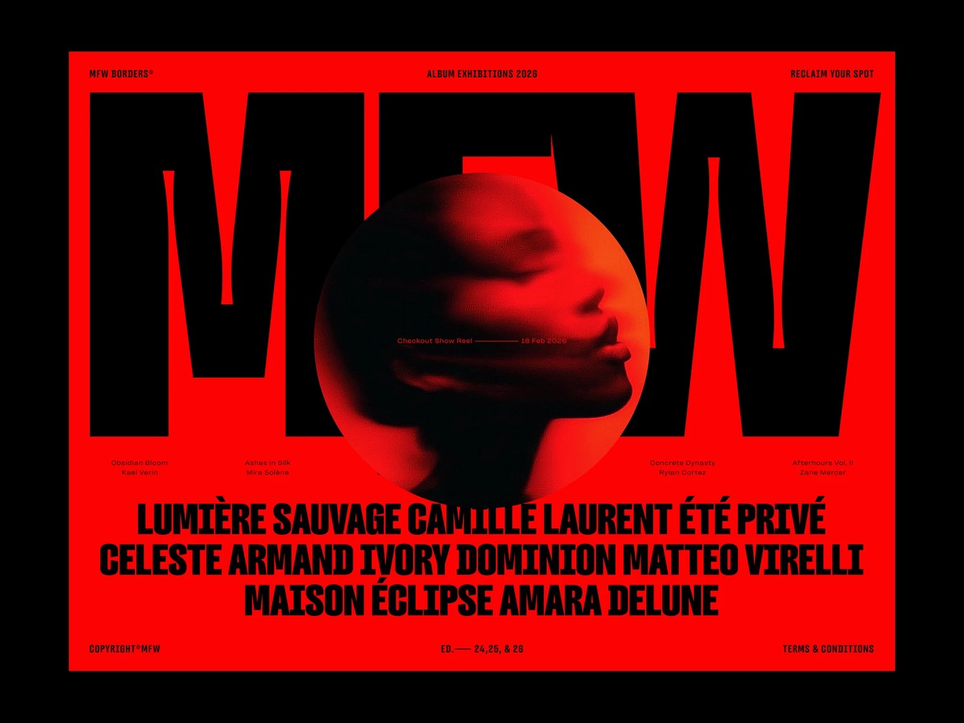
The type family contains 18 distinct styles across nine weights. Cuts step cleanly from thin hairline styles to heavy black forms. Nine weights give art directors total freedom in print. Designers can shift weight along a smooth variable axis. The flexible font keeps crisp edges on screens of any size. Tight letter spacing fits long words into narrow spaces. Expressive typography design scales easily from book jackets to big posters. Heavy headlines lock together into tight visual blocks. Clean vertical stems align along a tight modular grid. Simple grids keep secondary text blocks aligned with giant titles. Clear visual ranks guide the eye across complex poster pages.
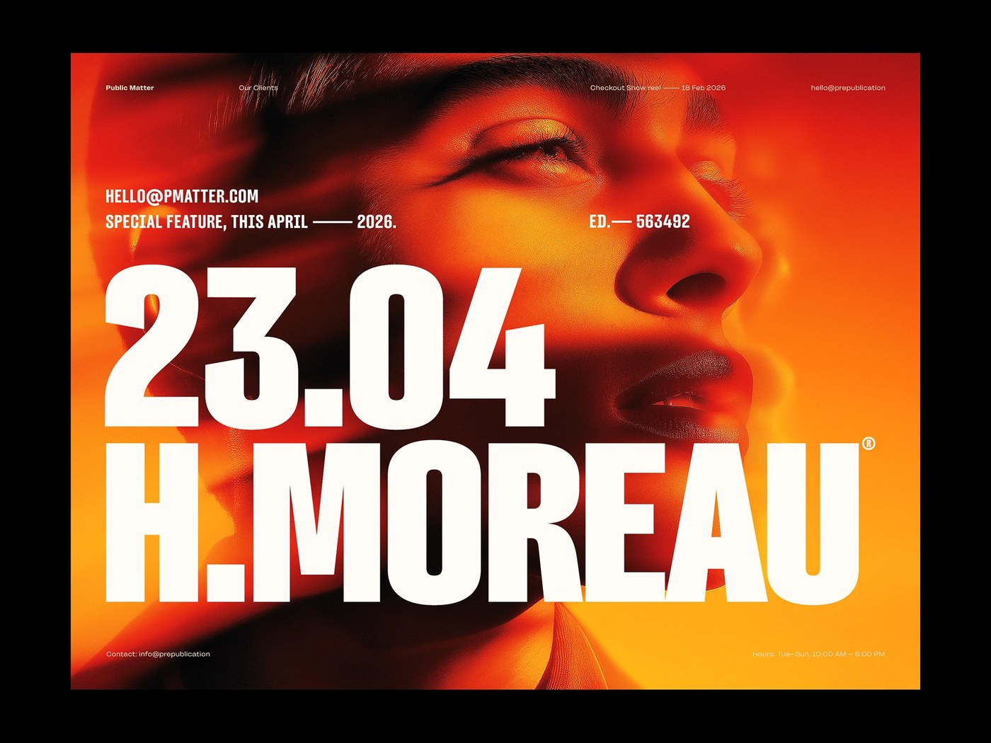
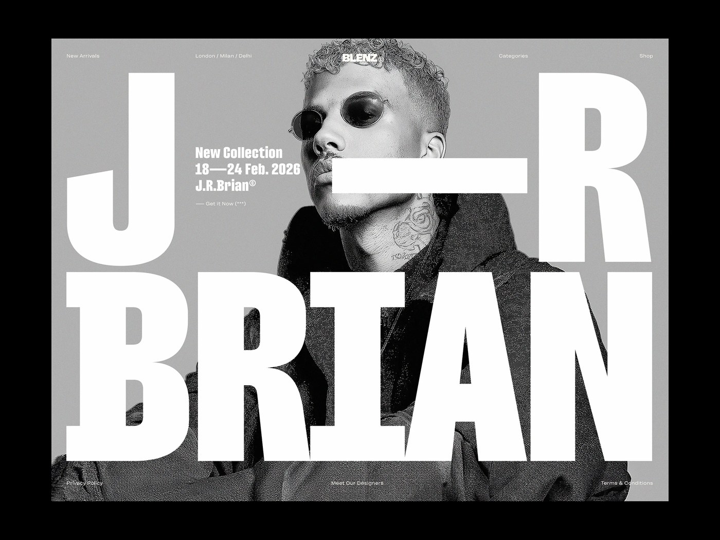
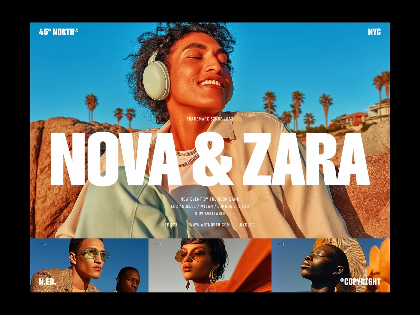
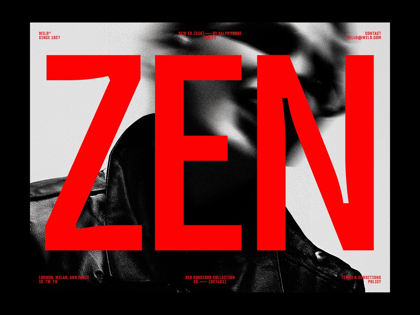
Printed specimen sheets show the font in dark film scenes. Large letters sit over high-contrast portraits with sharp drama. Dark cinematic backdrops frame each word with striking presence. Deep shadows on the page give the scenes strong depth. Test sheets prove how the glyphs work on rough paper. Bright white letters also look sharp on dark cloth and shirts. Rich black ink marks every line with crisp clarity. Screenprinted sheets hold tight letter gaps without ink bleed. The rich print finish highlights the tall letter stems. Fresh typography design balances raw graphic power with clean craft. Each printed sheet proves the strength of the full type family.
See the full typography design project by Rajesh Rajput on Behance.