Stellar Watch: A Playful Graphic Design Interface by Raw Color
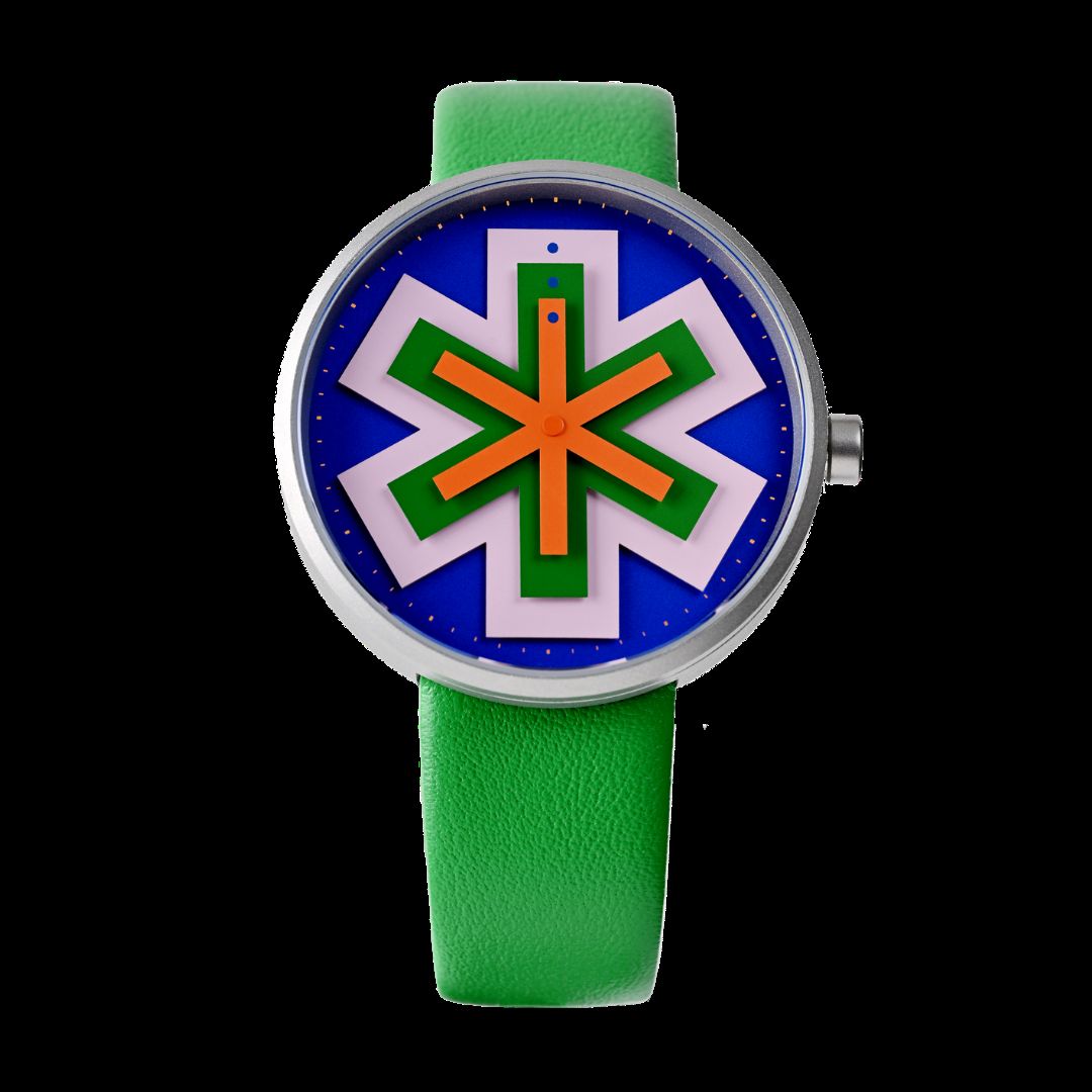
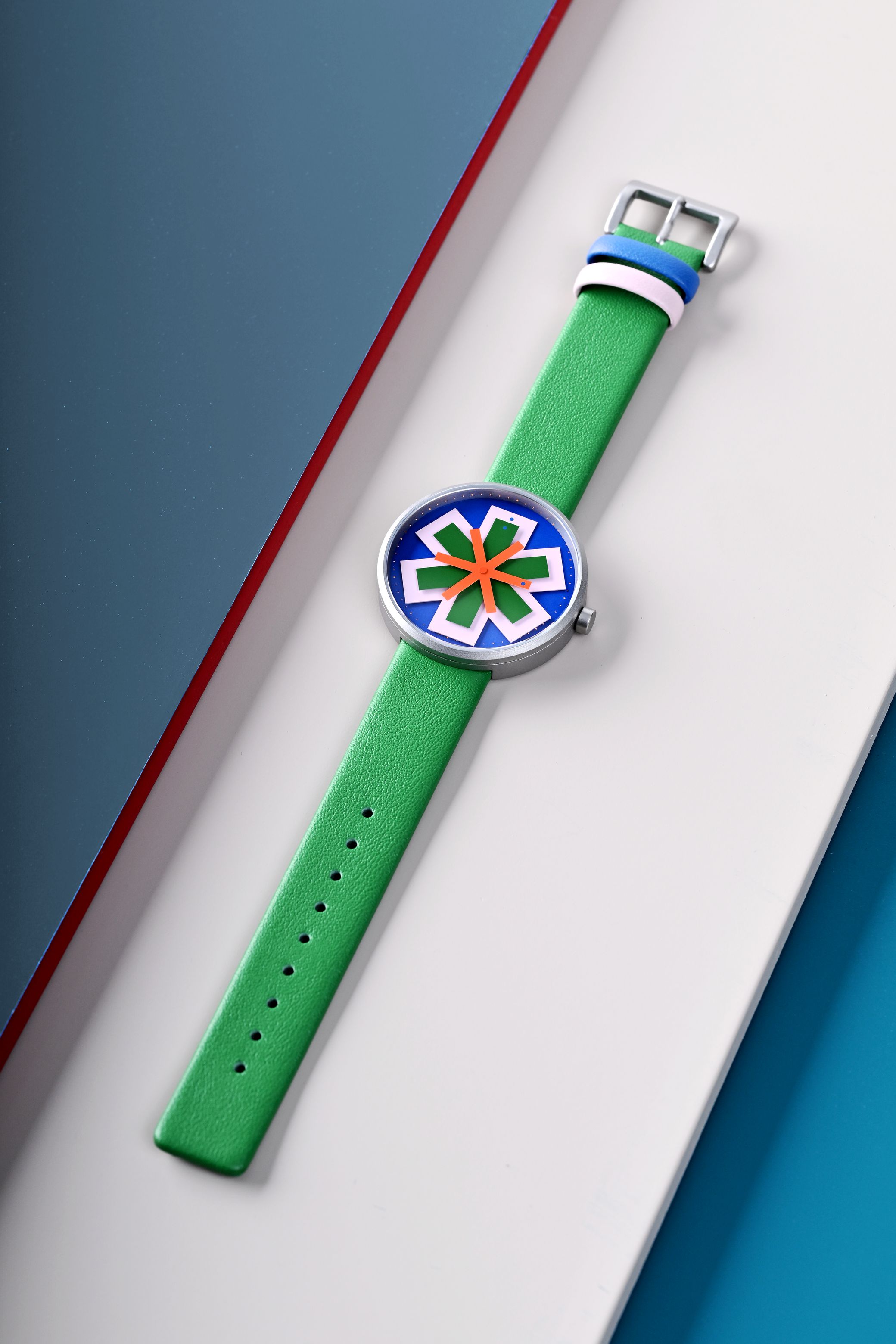
The Stellar watch challenges traditional time interfaces with a dynamic product design built from layered geometric hands.
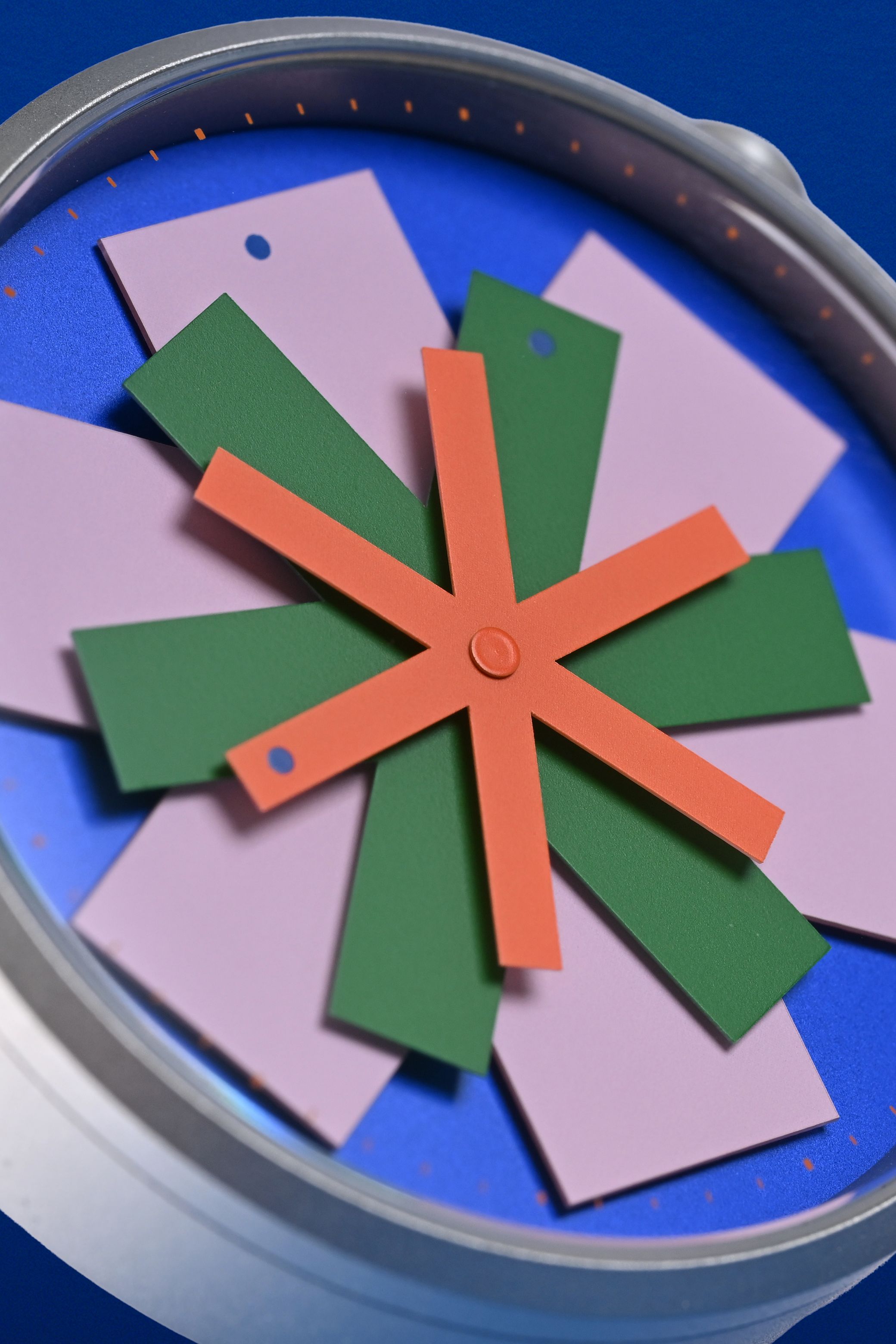
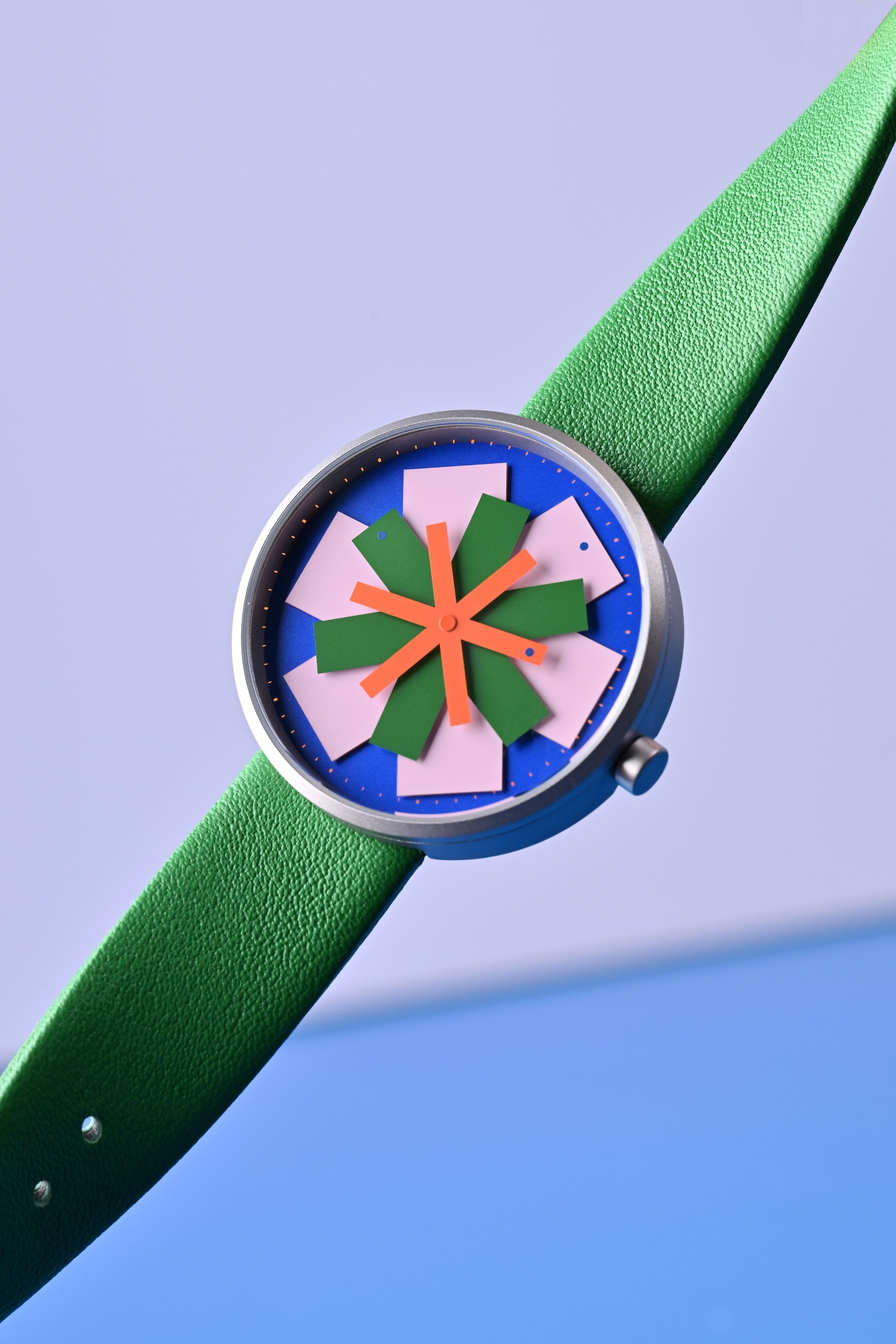
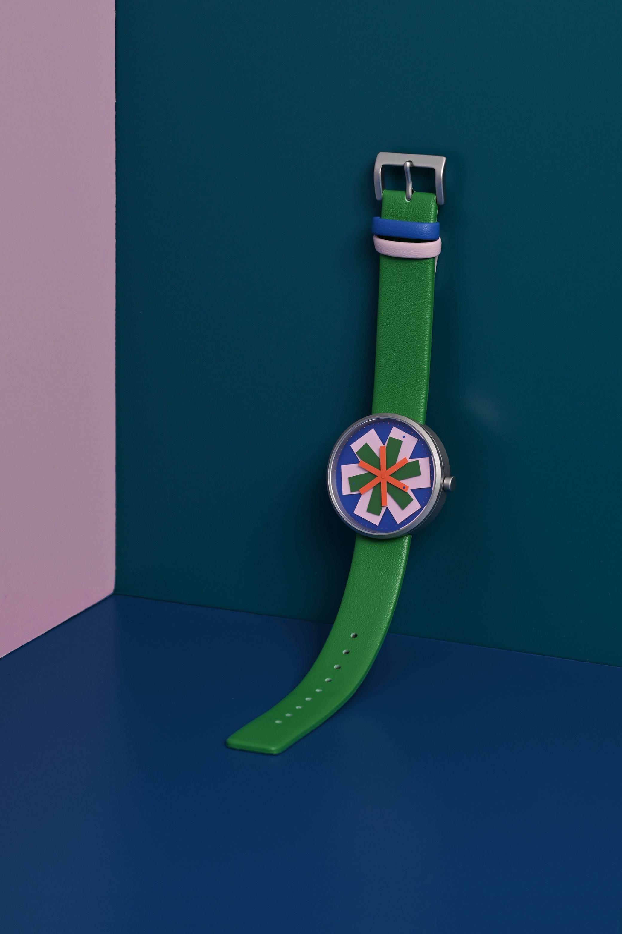
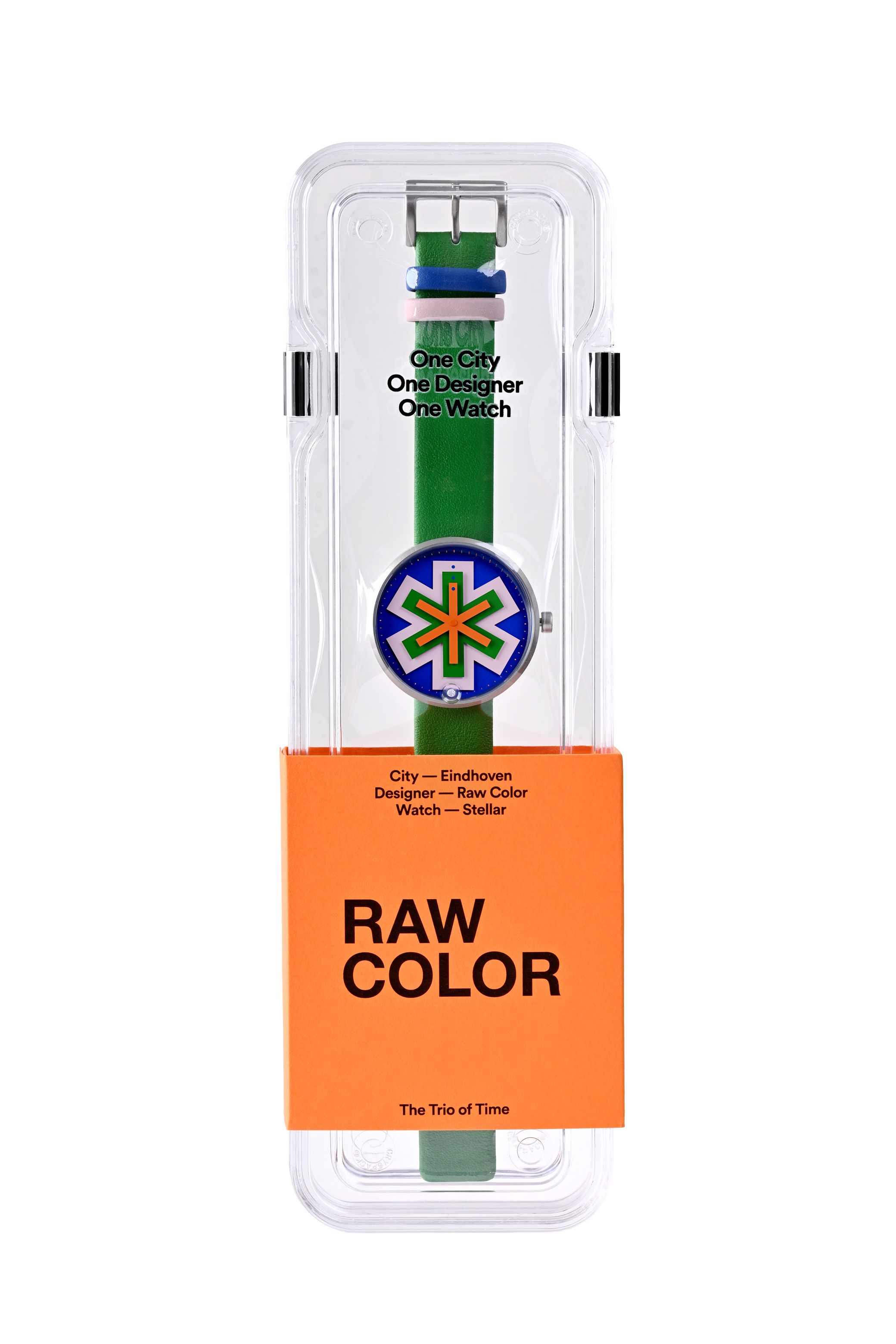
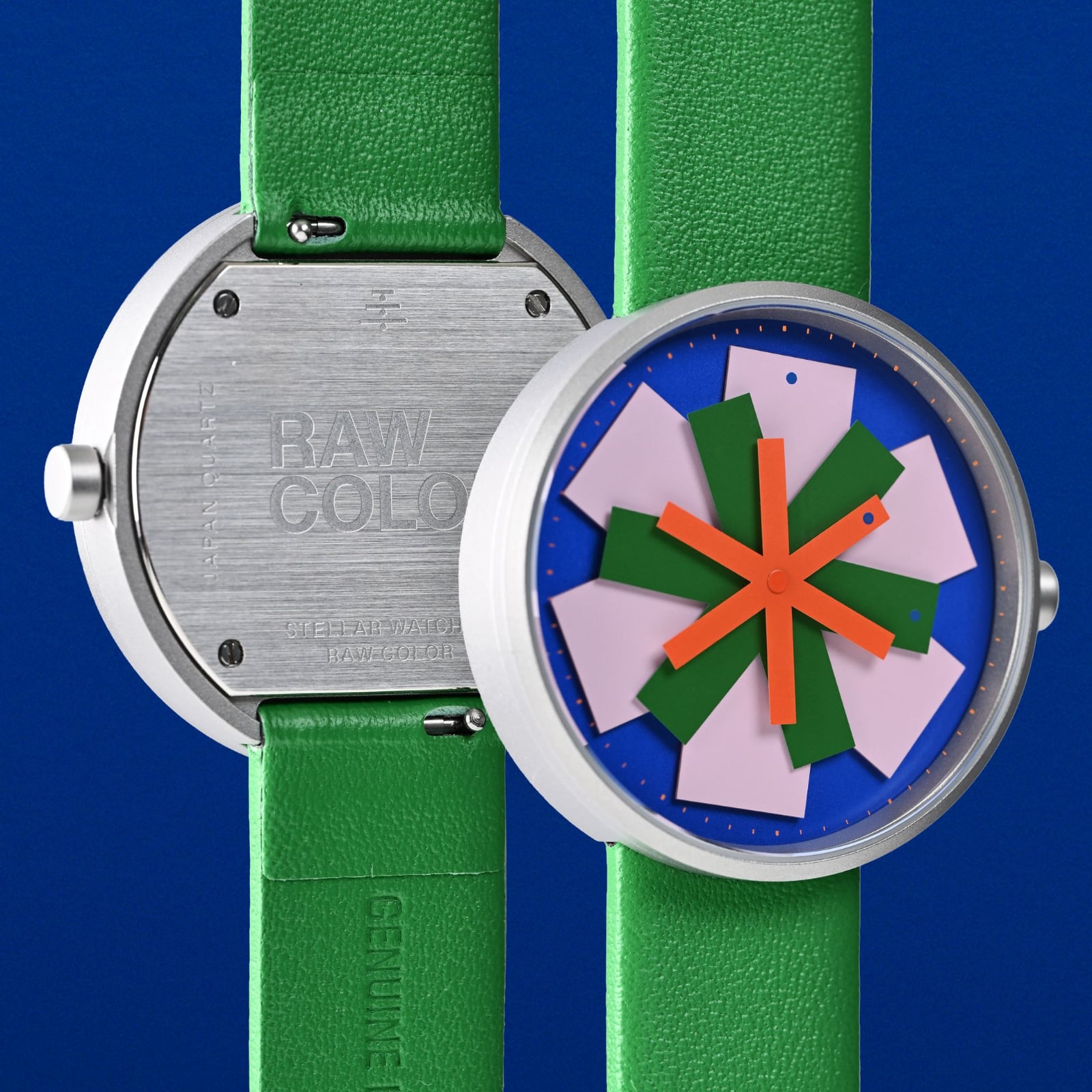
Designed by Eindhoven-based studio Raw Color for watch brand The Trio of Time (TTT), the timepiece turns utility into kinetic design. Co-founders Christoph Brach and Daniera ter Haar apply their structured research on color theory to the wrist. The watch dial acts as a blank canvas for graphic compositions that shift every minute. Instead of standard hands, the interface features six colored graphic arms that overlap on three separate layers. The design creates an evolving star-like geometry that feels alive. It is a product that merges precise watch engineering with clean, color-focused design philosophy.
Layered color theory in watch product design
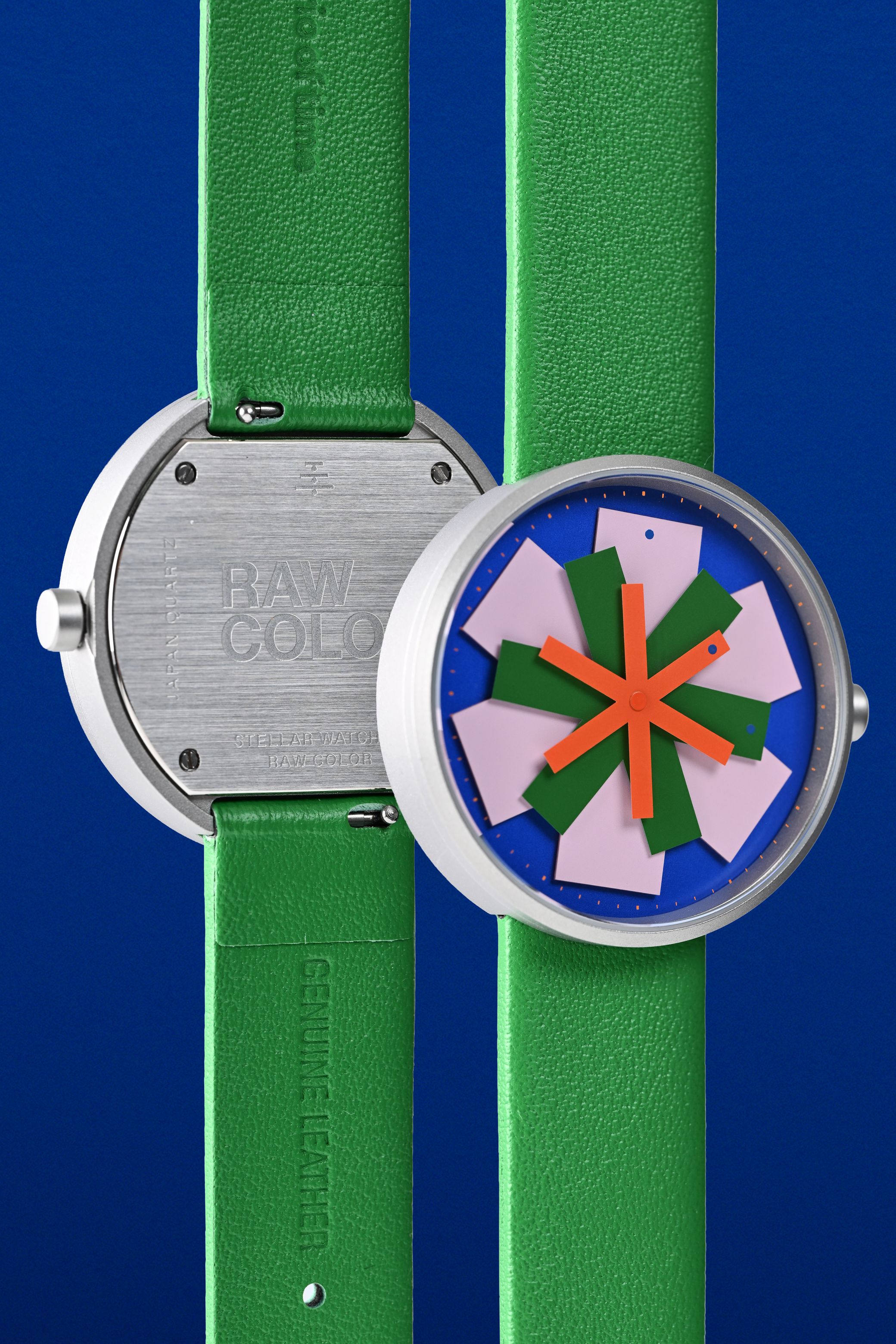
The visual system of the timepiece relies entirely on the interplay of color and geometry. As the colored arms move, they produce different star compositions against the matte charcoal grey dial background. A single small dot on one of the six arms serves as the primary time indicator, while the other arms form decorative, abstract patterns. The stainless steel casing and simple leather strap balance the dial's complex graphics. The team built a distinctive product through these details. This new design style changes how consumers perceive traditional timepieces. It shows how bold design decisions can define a product in a traditional category.
This design illustrates how everyday objects can benefit from an experimental design perspective. By removing the traditional three-hand display, Raw Color transforms the watch interface into a shifting graphic poster. The resulting design makes this watch project a benchmark for creative accessory design. The collaboration is proof that modern watch design can be playful, colorful, and minimalist at the same time.