Best of the Week: Sharp Display Type and Tactile Forms
We gather the best of the week features across branding, packaging, editorial design, and typography from ISO week 2026-W38, spotlighting architectural grids and tactile print craft.
This week’s editorial throughline explores the intersection of razor-sharp typographic geometry and physical substrate craftsmanship. Across independent publications, experimental display typefaces, and sculptural packaging systems, designers favored austere layout discipline and tangible material finishes over digital veneer.
Featured Design and Branding Picks
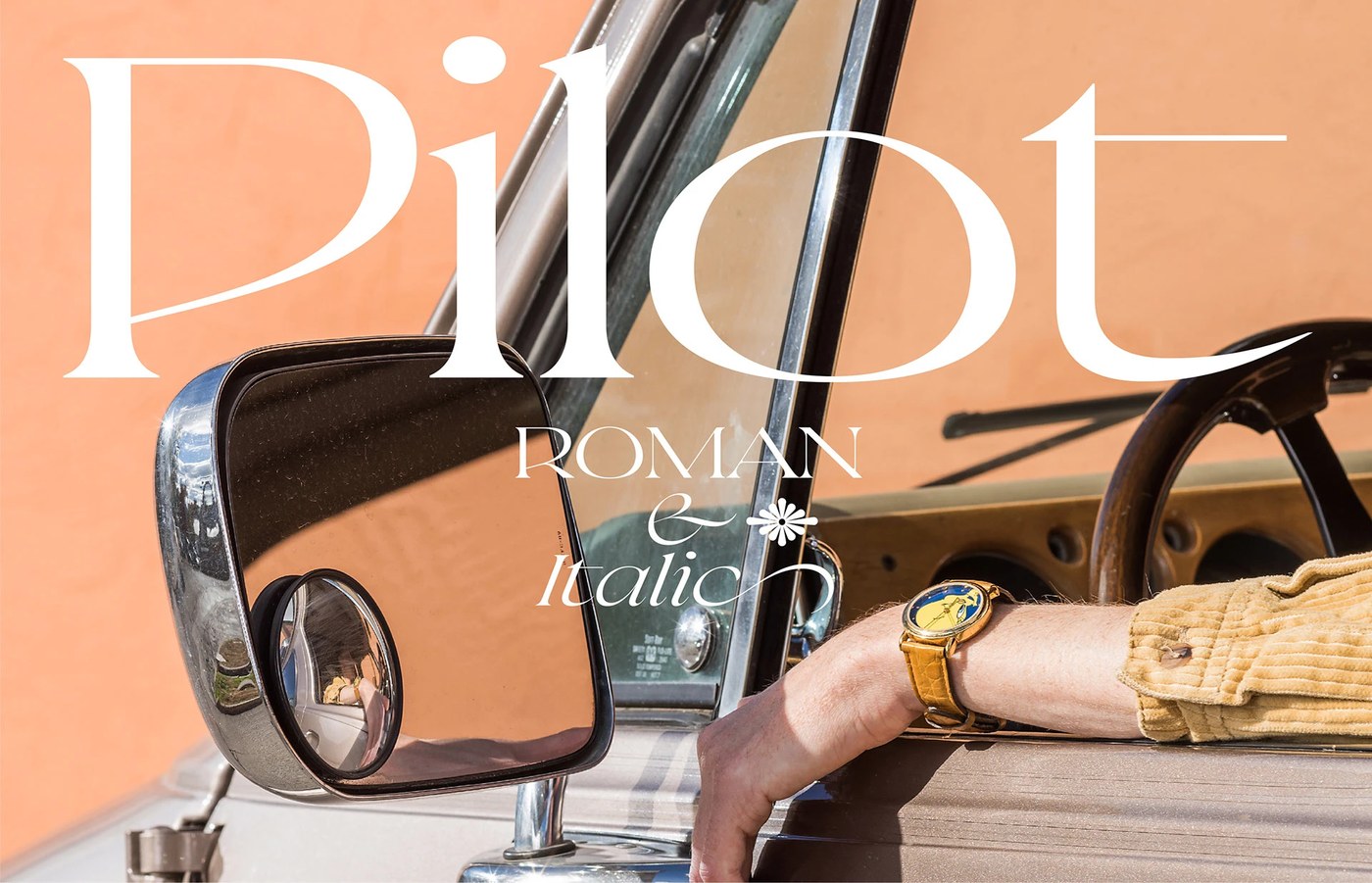
Pilot Typeface by Violaine & Jeremy
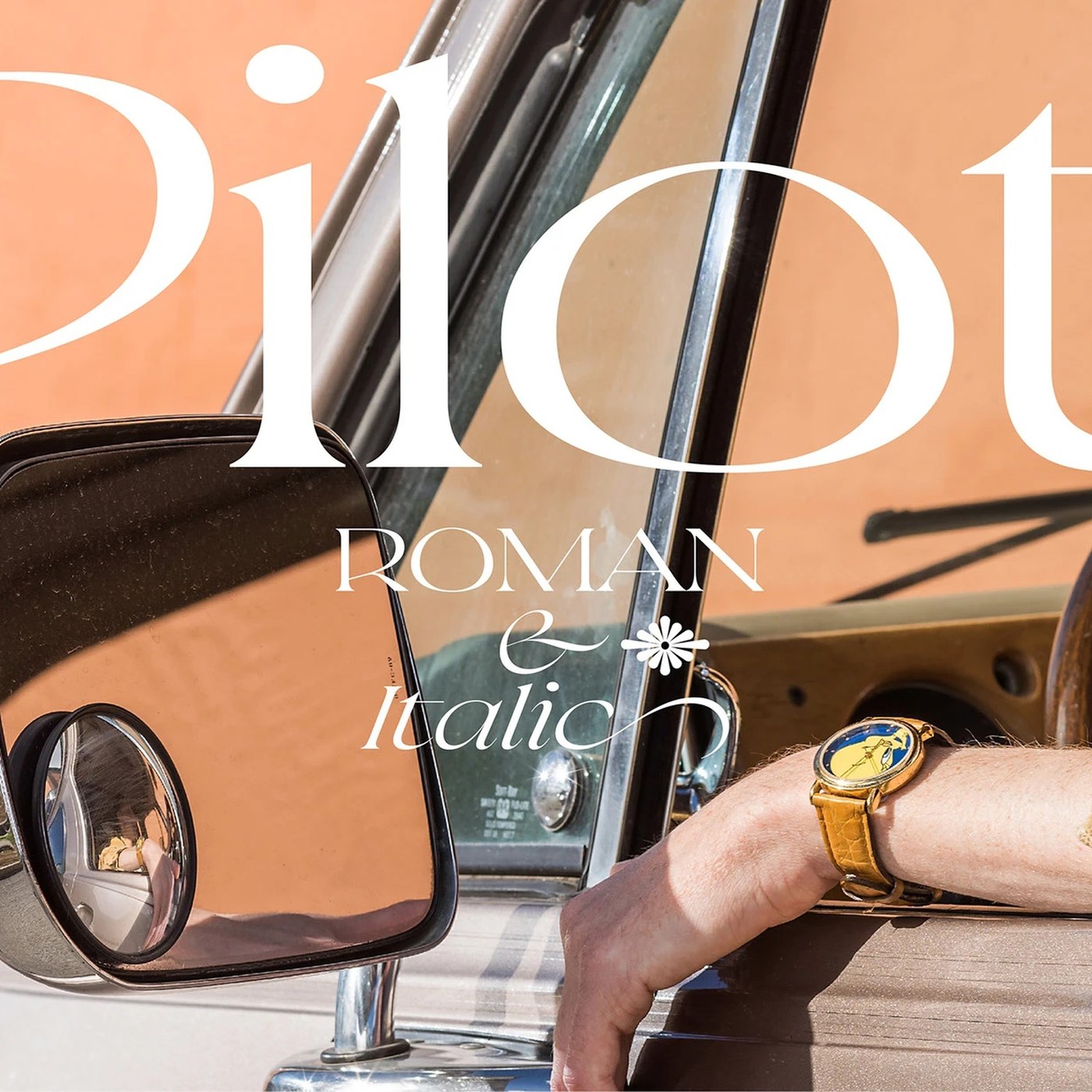
Parisian studio Violaine & Jeremy developed an extraordinary display typeface that balances aeronautical navigation geometry with high-contrast calligraphic tension. Its razor-sharp angular terminals and flared serifs command monumental authority across large-scale editorial specimens and poster compositions. The design demonstrates how technical telemetry and historical typographic discipline can merge into a singular, uncompromising visual voice.
View Feature
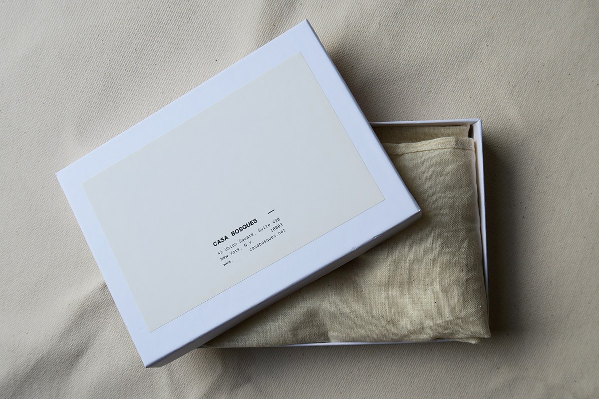
Casa Bosques Chocolates by SAVVY STUDIO
SAVVY STUDIO elevates artisanal culinary packaging into collectible fine-art edition prints through tactile restraint and material precision. Uncoated fine art paper wrappers, blind embossed foil marks, and subtle batch numbering establish a quiet dialogue between botanical poetry and confectionery craft. The modular packaging architecture treats chocolate wrappers as an archival canvas for multidisciplinary collaboration.
View Feature
RETIRO Restaurant & Wine Cellar by Luciano Quintana
Luciano Quintana crafted a warm, editorial hospitality identity for RETIRO that departs from conventional rustic dining tropes. Restrained classical serif letterforms pair with delicate calligraphic accents across embossed leather wine lists, receipts, and custom coasters. The tactile dining suite establishes a refined spatial harmony with the textured stone and ambient wood of the physical cellar.
View Feature
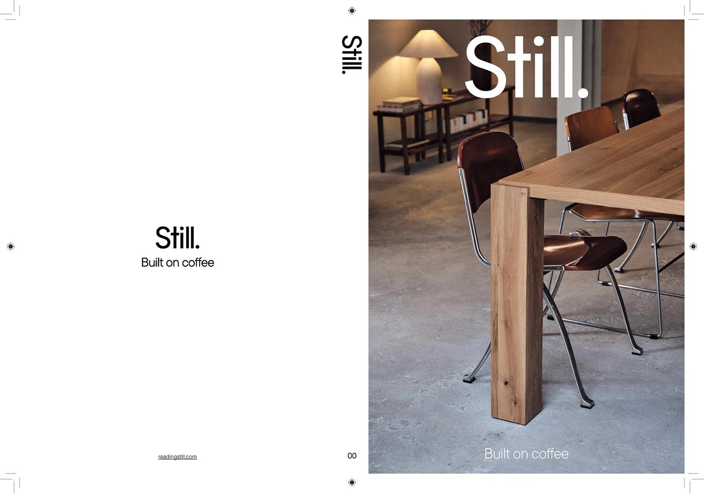
Still. Magazine (Issue 00) by Florian Cornut
Florian Cornut brought meditative Swiss grid discipline to the inaugural issue of Still Magazine, an archival publication exploring specialty coffee culture. The editorial pacing balances generous white margins and lowercase typography hierarchies against quiet, unvarnished photographic spreads. Printed on tactile Munken and Fedrigoni art papers with lay-flat binding, the journal redefines the rhythm of modern independent publishing.
View Feature
Mira Display by Mira Mayne
Mira Mayne translates optical lens geometry and W. A. Dwiggins’s M-Formula into a sculpted, subtractive display typeface. Convex and concave negative cuts carve away mass, creating razor-sharp planar facets that amplify typographic character at monumental scales. The resulting glyph system explores the boundary where reading resolution transforms into pure sculptural articulation.
View Feature
Fish Tin Packaging by Deoné Rabé
Deoné Rabé reimagined artisanal canned seafood by applying metallic ink lithography directly onto shaped aluminum sardine tins. Detailed heritage ocean wildlife illustrations pair with textured die-cut secondary paper sleeves and embossed foil accents. The tactile unboxing experience elevates traditional coastal canning into an artisanal kitchen collectible.
View Feature
Kononenko Architectural Website by Artem Shcherban
Artem Shcherban engineered an interactive digital platform for Kononenko Architectural Bureau that transforms architectural blueprints into fluid screen transitions. Subtle ink-hover cursor animations, circular navigation patterns, and generous white margins translate spatial craftsmanship directly into the browser. The minimalist digital experience prioritizes structural clarity and quiet interaction over heavy UI ornament.
View Feature
FORMAT Office Wayfinding by Blank Studio
Blank Studio integrated post-industrial architectural wayfinding directly into the raw concrete fabric of the FORMAT office building. Blackened matte steel directional plates, stark concrete wall stencils, and custom geometric pictograms provide high-contrast spatial orientation without visual clutter. The system treats environmental signage as a permanent, tactile architectural finish.
View Feature
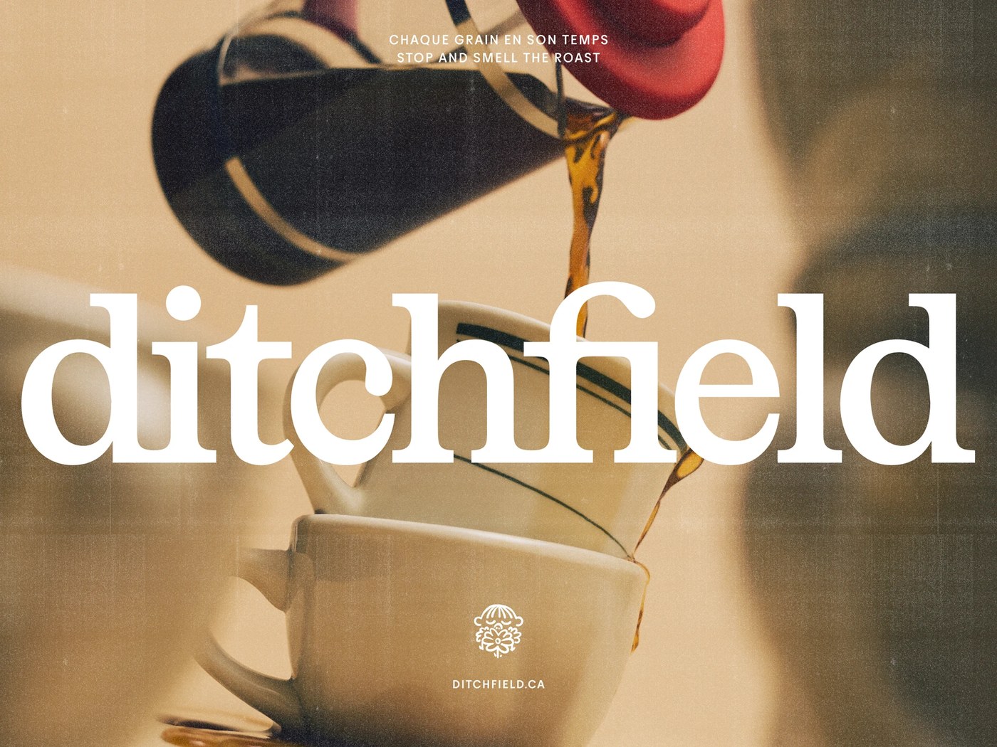
Ditchfield by Deux Huit Huit
Montreal studio Deux Huit Huit engineered a grounded, authoritative brand identity for specialty coffee micro-roaster Ditchfield. Rejecting predictable minimalist third-wave cafe aesthetics, the studio embraced warm earthen brown substrates, a mature redrawn wordmark, and narrative storybook illustrations. The system combines commercial packaging rigor with whimsical personal charm across bags, merchandise, and digital touchpoints.
View Project
M104 Architecture Bureau by Anastasiia Polyankina
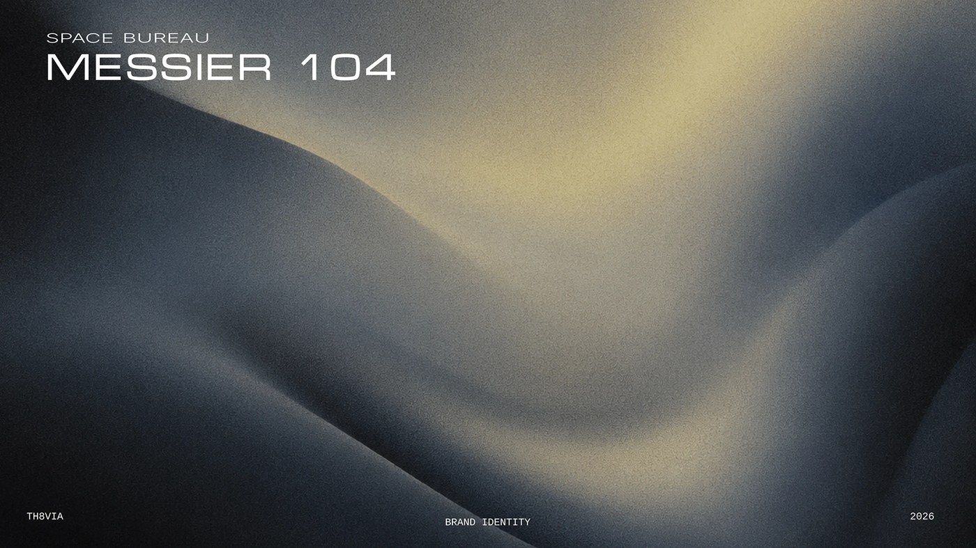
Saint Petersburg designer Anastasiia Polyankina developed a cosmic, architectural brand identity for M104 Architecture Bureau inspired by the Sombrero Galaxy (Messier 104). The identity anchors an expansive graphic framework with an orbital emblem, austere drafting grids, and technical monospace typography. Tactile stationery suites, blueprint folders, and architectural signage balance mathematical precision with spatial mystery.
View Project
Indoorra by Artı Stüdyo
Artı Stüdyo designed a disciplined visual identity for California luxury living and interior architecture brand Indoorra. Built around a clean geometric gateway mark that symbolizes spatial flow and transition, the identity reflects the architectural rhythm of bespoke kitchen and wardrobe systems. Material-inspired color swatches, tactile stationery, and balanced typographic hierarchies mirror the physical craftsmanship of the living spaces.
View Project
Next week, we turn our attention to experimental kinetic typography and motion identities, exploring how dynamic graphic engines shape contemporary brand expressions across responsive screens.
For more inspiration check out our curated selections on Abduzeedo.