Templo’s visual identity for DeafCity Hub is a fusion of creative coding, British sign language and gestural motion capture
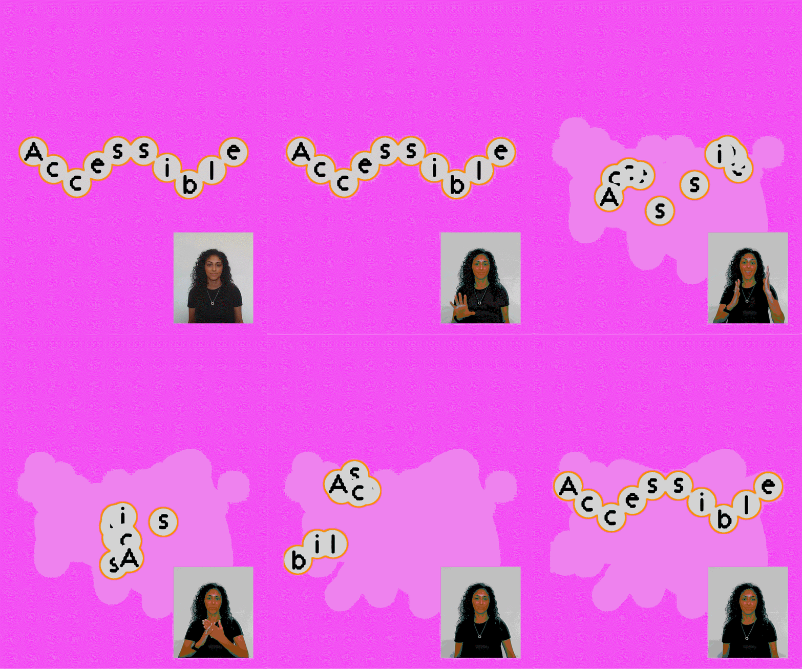
DeafCity Hub is a purpose-built, mixed-use cultural space and design concept dedicated to empowering and platforming the Deaf community. With a year-long pilot campaign to demonstrate the value of Deaf cultural spaces for Deaf and hearing individuals, and a brand identity created by Templo, the goals are front and centre: foster community, connection and collaboration whilst supporting the development of Deaf talent. The dynamic identity transforms with hand positioning and movement, utilising motion-tracking software to capture real hand gestures directly, ensuring all brand motion stems from genuine human movement rather than traditional animation, at once blending technology and typography.
Templo began with a process of exploring how communication happens beyond the spoken word. How can the physical gestures of British sign language become the foundations of the brand? Templo fused creative coding and motion-responsive software to create a unique visual language rooted in Deaf experiences, using bold palettes of pink and orange to intentionally stand out from other Deaf-led identities in the space, bringing energy and visibility to the brand.
“Movement, 3D spatial language and visual rhythm are at the heart of Deaf culture and communication. This bright, joyful motion identity doesn’t just represent DeafCity Hub, it animates our mission,” says Amanprit Arnold, founder of DeafCity Hub and Disability Urbanism, in Templo’s press release. “By seamlessly connecting design innovation, technology, typography and Deaf culture, it brings our authentically co-designed co-working and cultural space to life across every touchpoint.” Among the assets for the campaign, you can see people using the gestural technology to influence a flexible logo, which includes a modular typeface enclosed in bubbles that represent each fingertip – ten letters, ten fingers. When that logo breaks up and mimics a waving motion, the natural movement of captured hands is undeniable – it brings a warmth that is immediately recognisable and approachable.
Proving that world-class accessible design can be vibrantly visual (just like Deaf culture), the identity brings a unique sense of authenticity and authorship through assets that are designed by real hand-movement – although you can’t see the hands, it doesn’t mean they weren’t involved, a great lesson for digital designers. But as well as that, the campaign centres Deaf individuals, speaking in sign language and presenting how layered and expressive gestural motions can be.