Ambijus: Inside OlssønBarbieri Packaging Design
Oslo studio OlssønBarbieri crafts tactile packaging design for Ambijus, a fermented non-alcoholic wine alternative brewed in Norway by Leske.
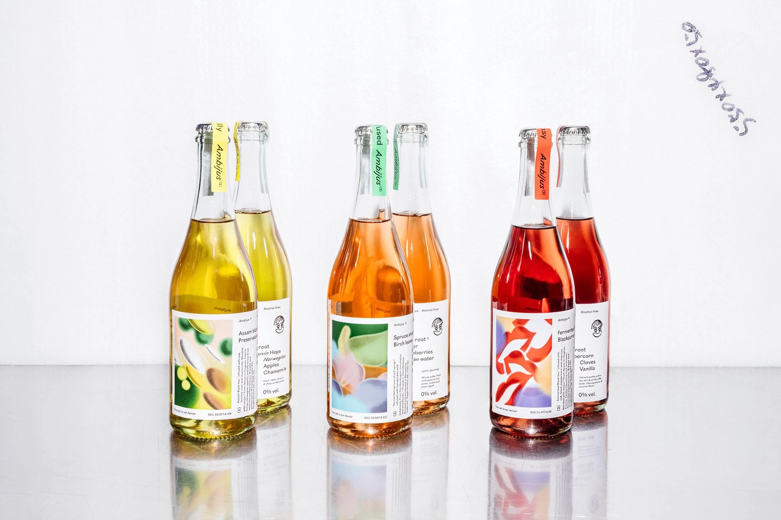
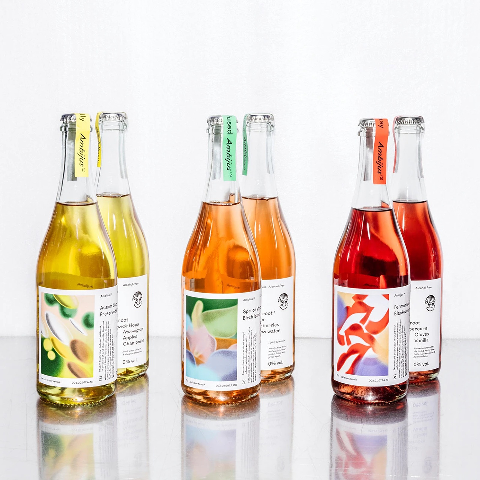
Most alcohol-free bottles try way too hard to mimic traditional wine châteaux. They lean on heavy crest engravings or apologetic zero-proof badges. When Norwegian beverage producer Leske asked Oslo studio OlssønBarbieri to help build a fermented NOLO drink from the ground up, the team coin-flipped the category on its head. They fused the word ambiguous with jus — the natural wine term for freshly pressed juice, landing on Ambijus. It's a name built for a drink that refuses to sit in one neat box. Even the first three releases wear oxymoronic titles: (1) Act Naturally, (2) Real Fantasy, and (3) Clearly Confused.
Fermentation Craft and Uncoated Packaging Design
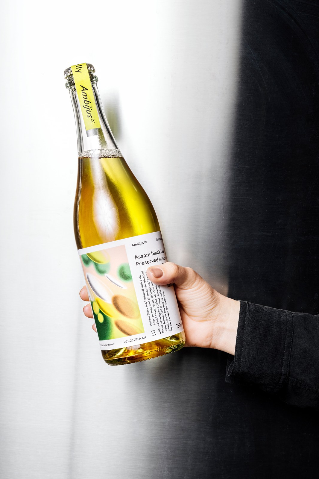
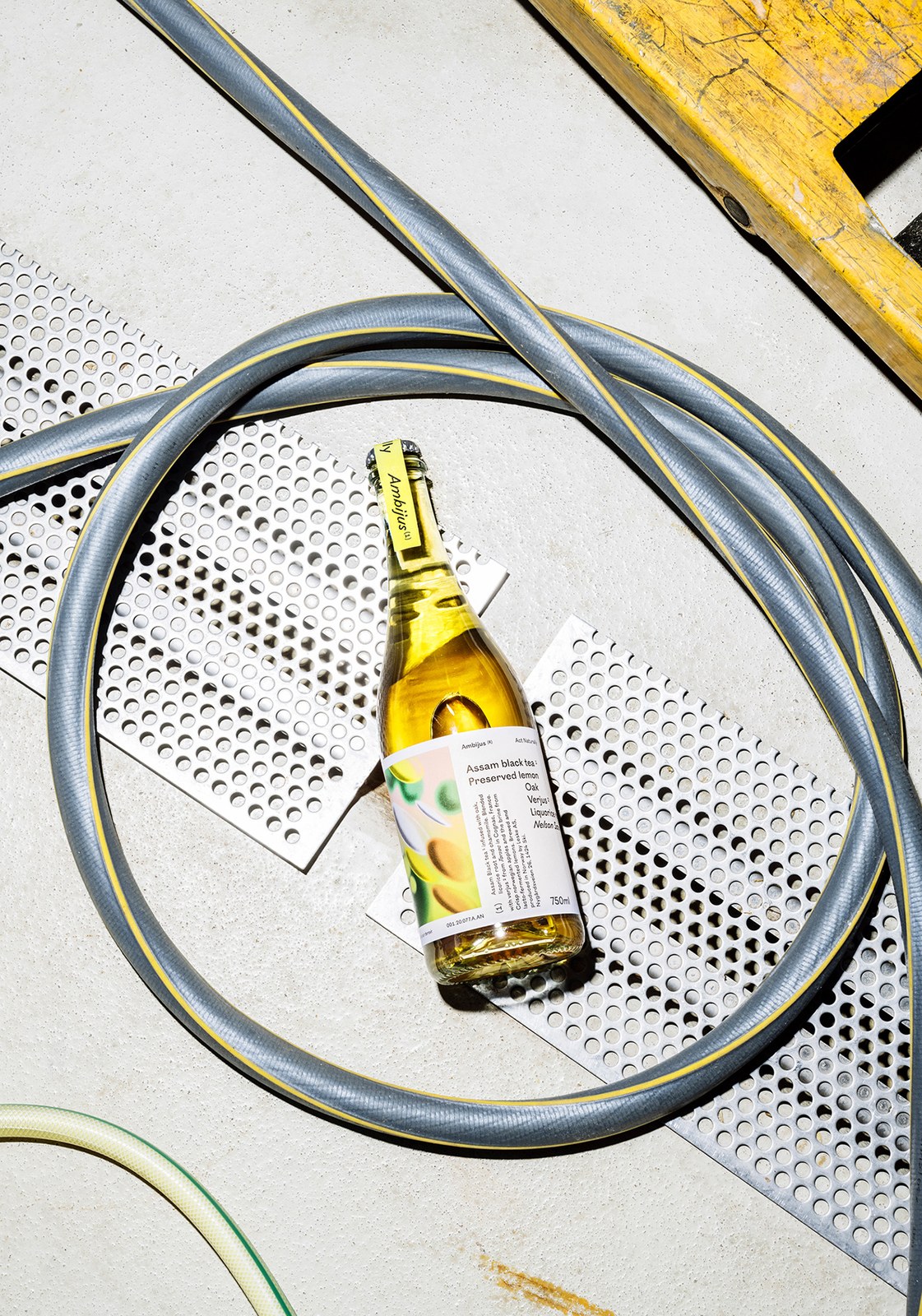
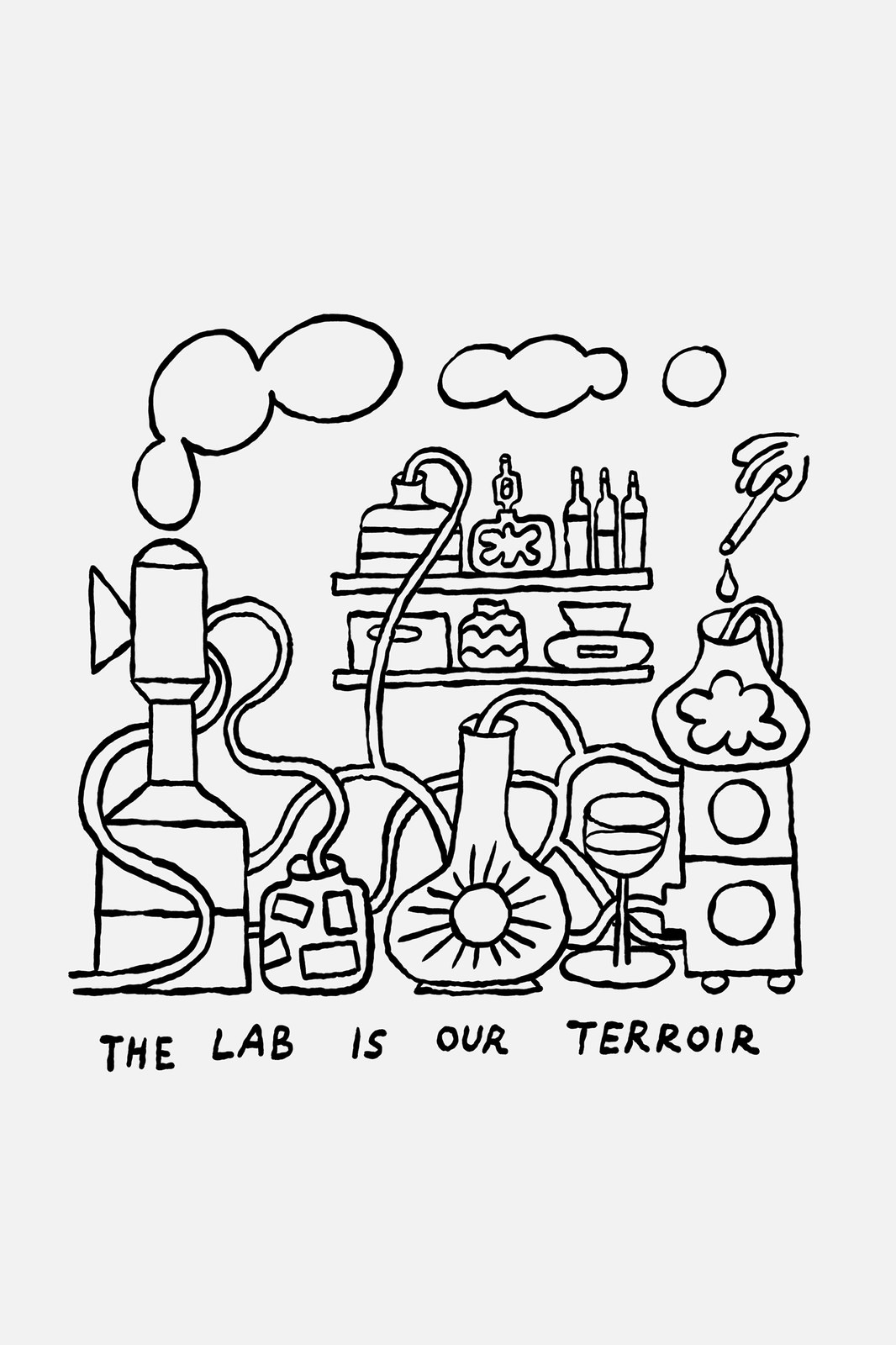
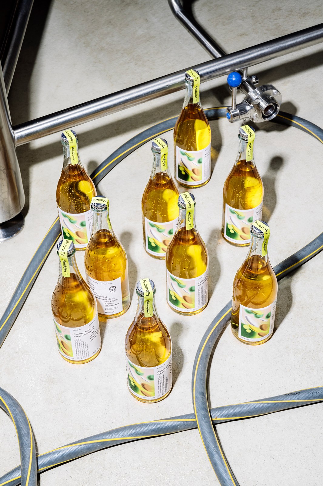
The label architecture treats flavour like a live chemistry experiment. Instead of hiding the process behind pastoral vineyard clichés, the identity rallies around a dry motto: The lab is our terroir. Norwegian artist Espen Friberg translated that line into a witty monoline drawing of bubbling flasks, coiled tubes, and a hand-held dropper feeding a stemmed wine glass, while also sketching the playful See-No-Evil hands emblem that sits above the 0% vol. stamp. Across the front of each 750ml flint glass bottle, uncoated paper wraps pair French artist Alexis Jamet's grainy analogue-digital artwork with a stepped typographic spec sheet. Jamet's soft airbrushed forms channel microorganisms for Act Naturally, sensory ribbons for Real Fantasy, and a hazy forest walk for Clearly Confused.
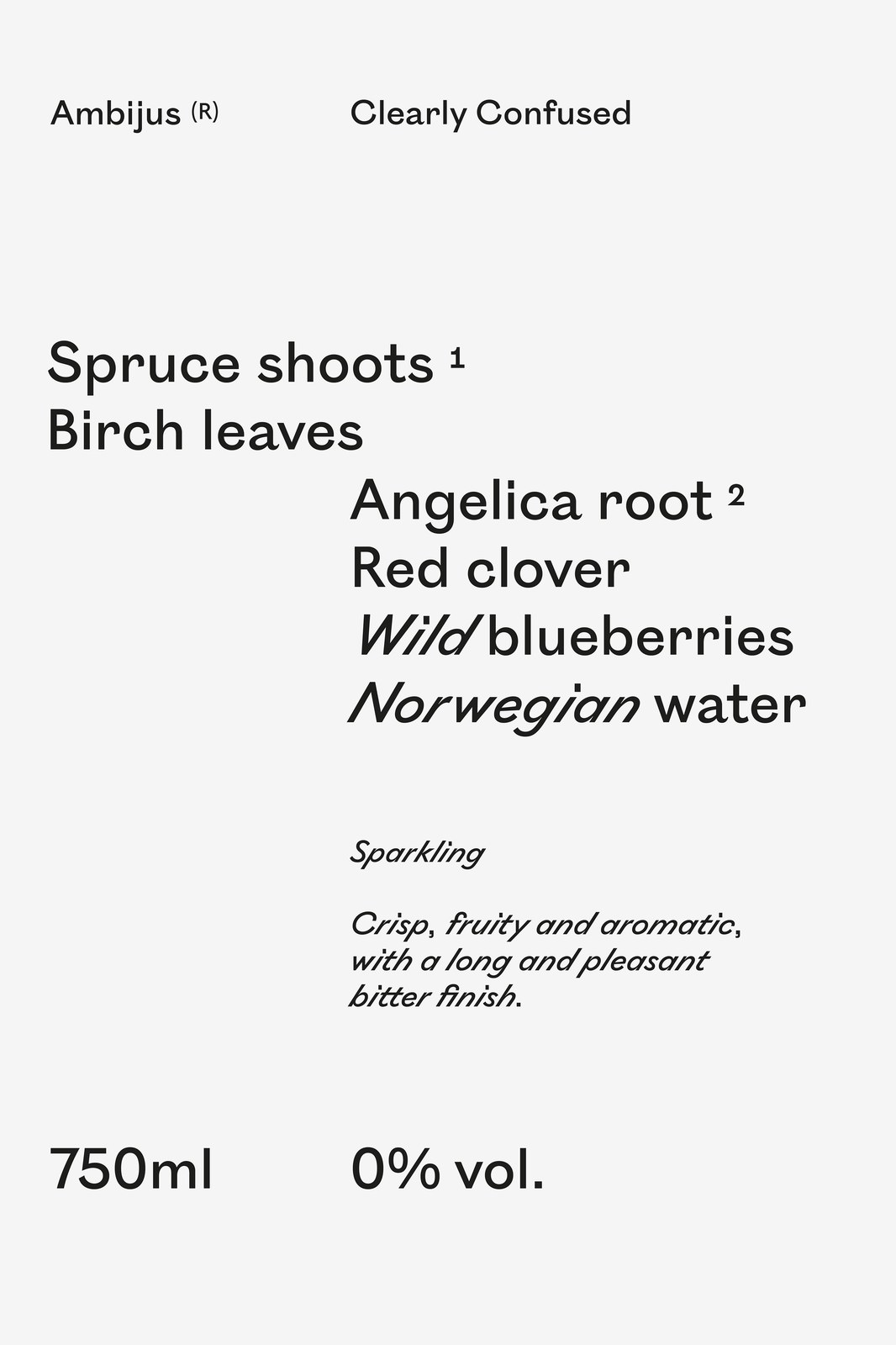
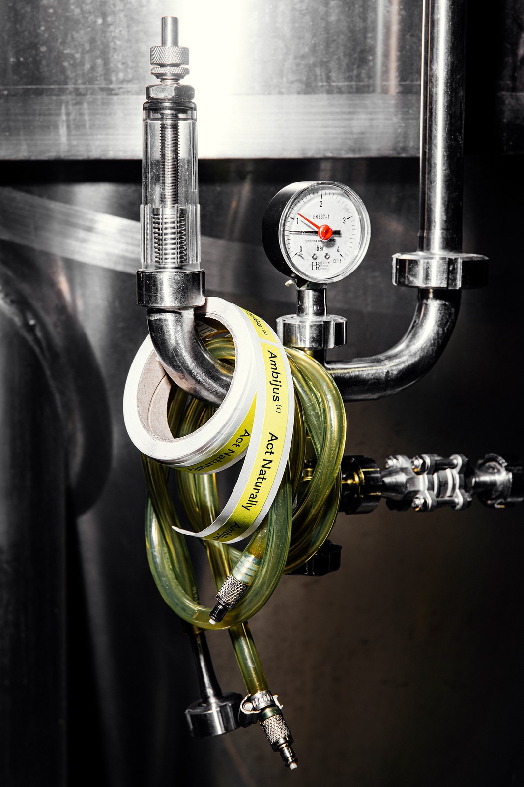
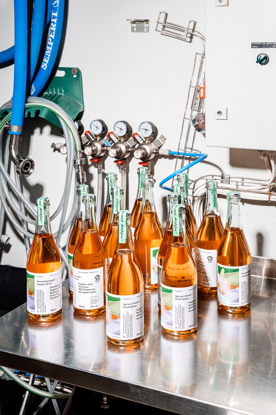
Type and colour do all the sorting here. On the Clearly Confused wrap, upright sans-serif lines for Spruce shoots 1, Birch leaves, Angelica root 2, and Red clover step down into slanted italics for Wild blueberries and Norwegian water, anchored by vertical footnote columns detailing Cognac verjus and lacto-fermented lemons alongside lot codes like 003.20.007.A.CC. Colour-coded paper neck strips in yellow, coral-red, and mint-green fold right over the silver metal crown caps. Photographed by Anne Valeur on the wet brewery floor beside stainless-steel pressure gauges and coiled hoses, these bottles don't feel like a compromise at the table.
See the full project by OlssønBarbieri on Behance.