Florian Cornut Unveils Café Gardo Packaging Design
Florian Cornut crafted modular packaging design for Café Gardo, uniting bold typography with Entre-Deux-Mers terroir and agroforestry coffee.
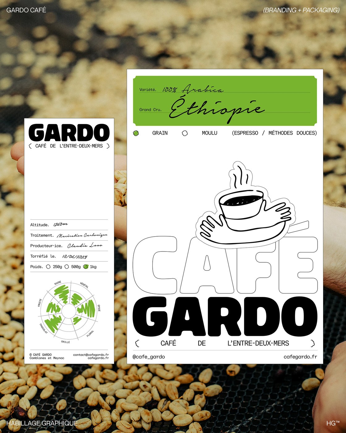
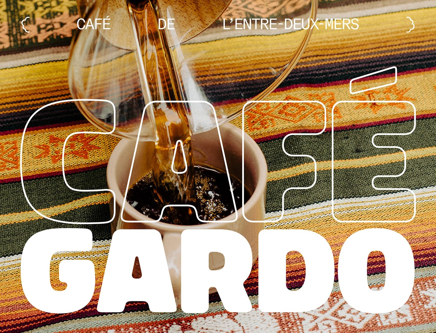
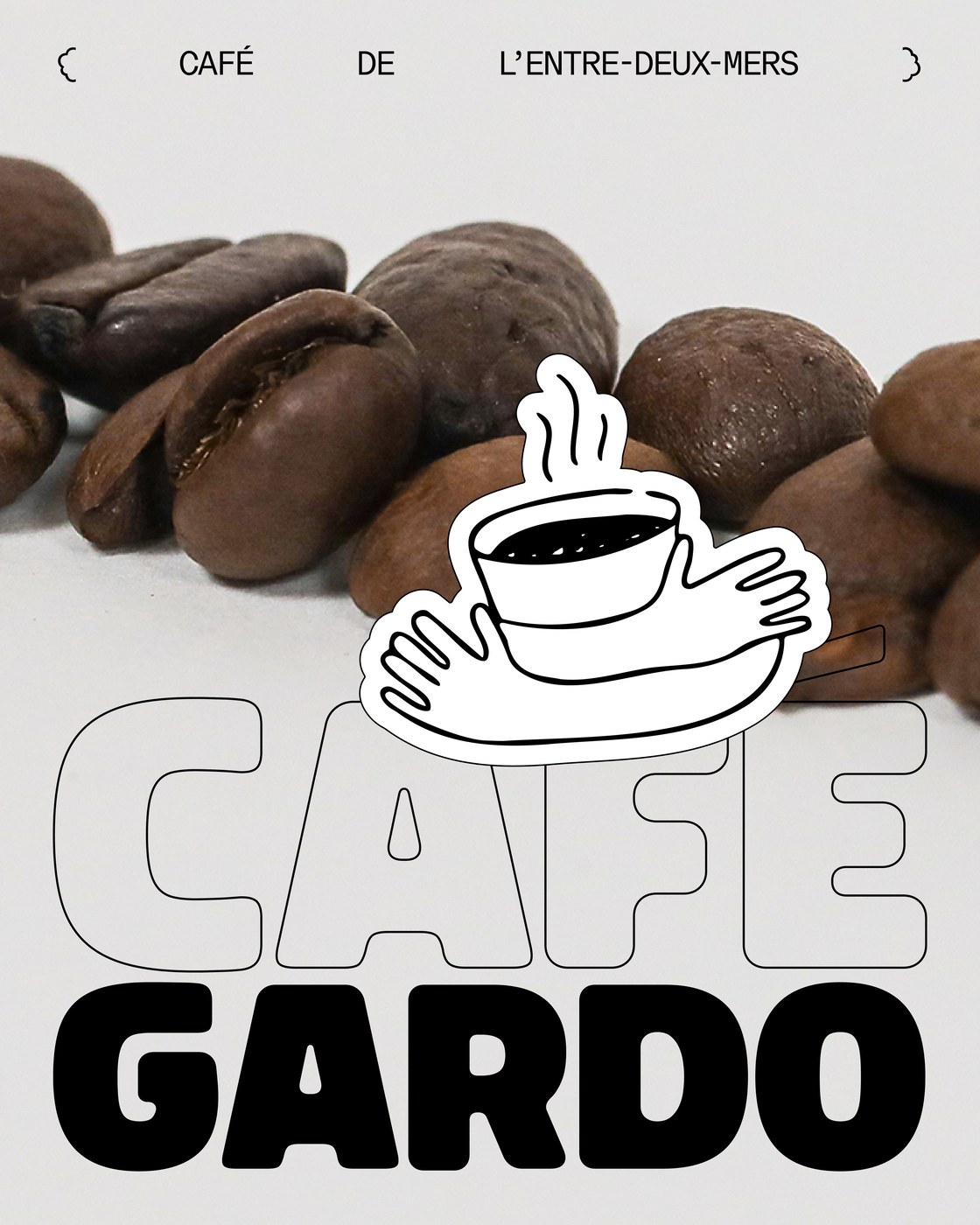
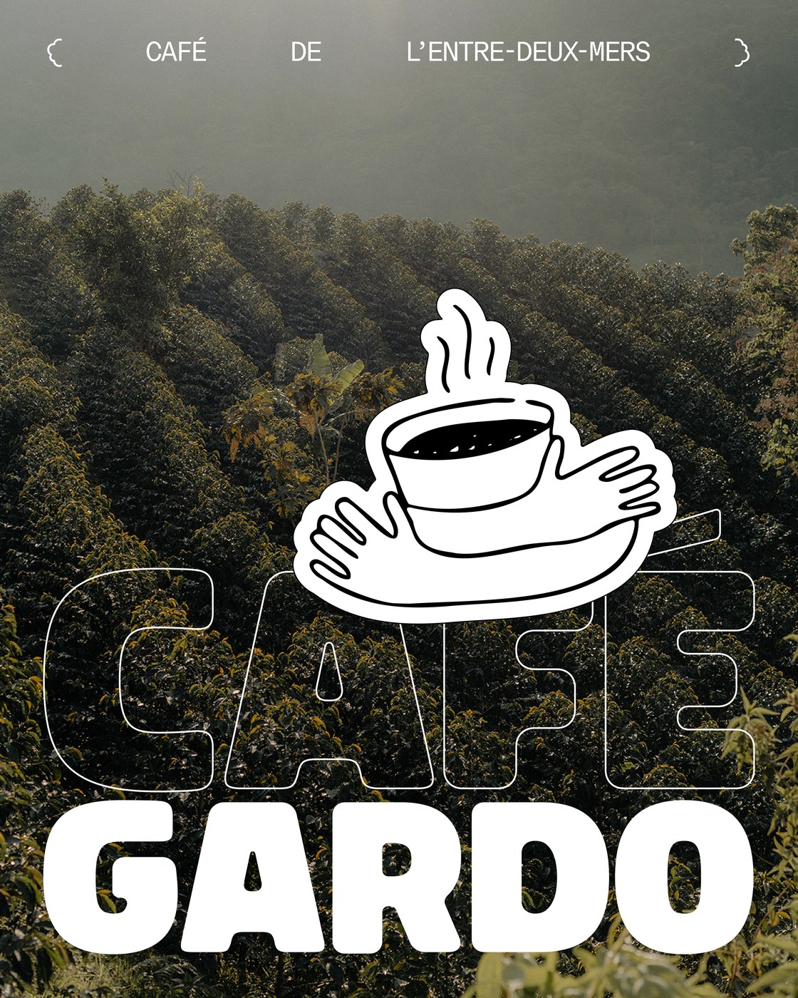
Café Gardo takes its name from the confluence of the Garonne and Dordogne rivers in southwestern France, the historic Entre-Deux-Mers region. Founded by artisan roaster Frank Soccio in Camblanes-et-Meynac, the roastery sources specialty beans from agroforestry farms, prioritizing low-carbon transport by sail. Art director Florian Cornut built an identity that reflects this connection to soil, river, and manual labor. Rather than adopting the sterile minimalism typical of third-wave coffee, the packaging design embraces tactile authenticity. Warm harvest tones, raw photographic textures of coffee origins by Grant Harder, and honest printing artifacts bridge agricultural provenance with contemporary graphic craft.
Modular Label Architecture and Expressive Packaging Design
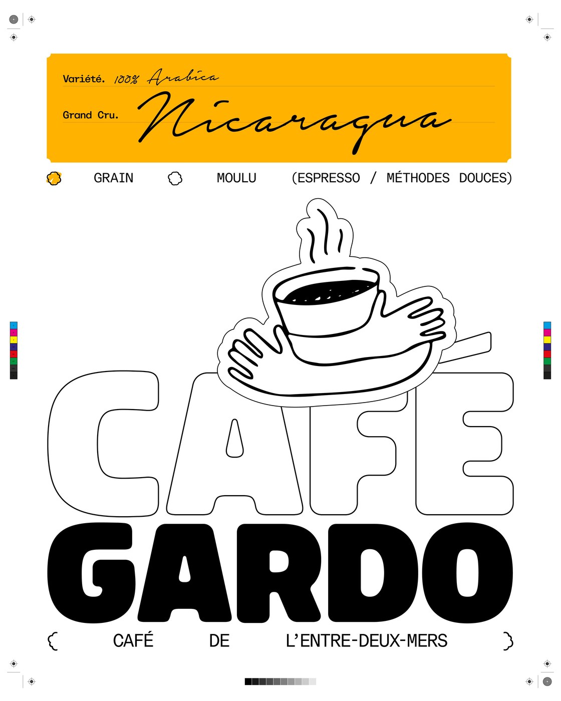
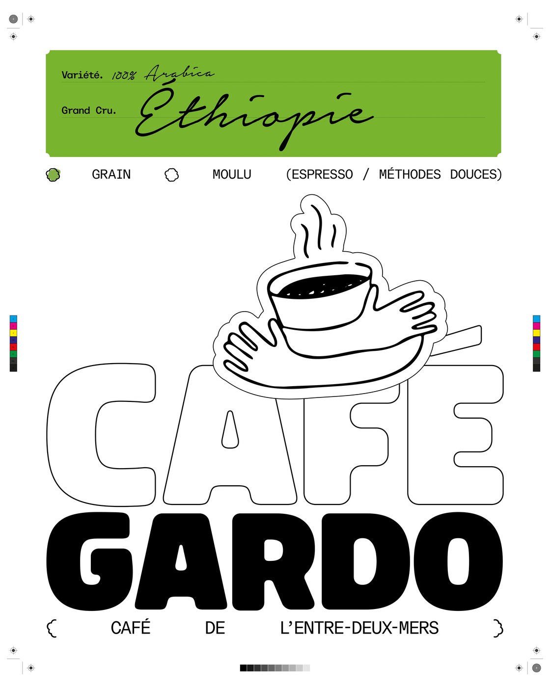
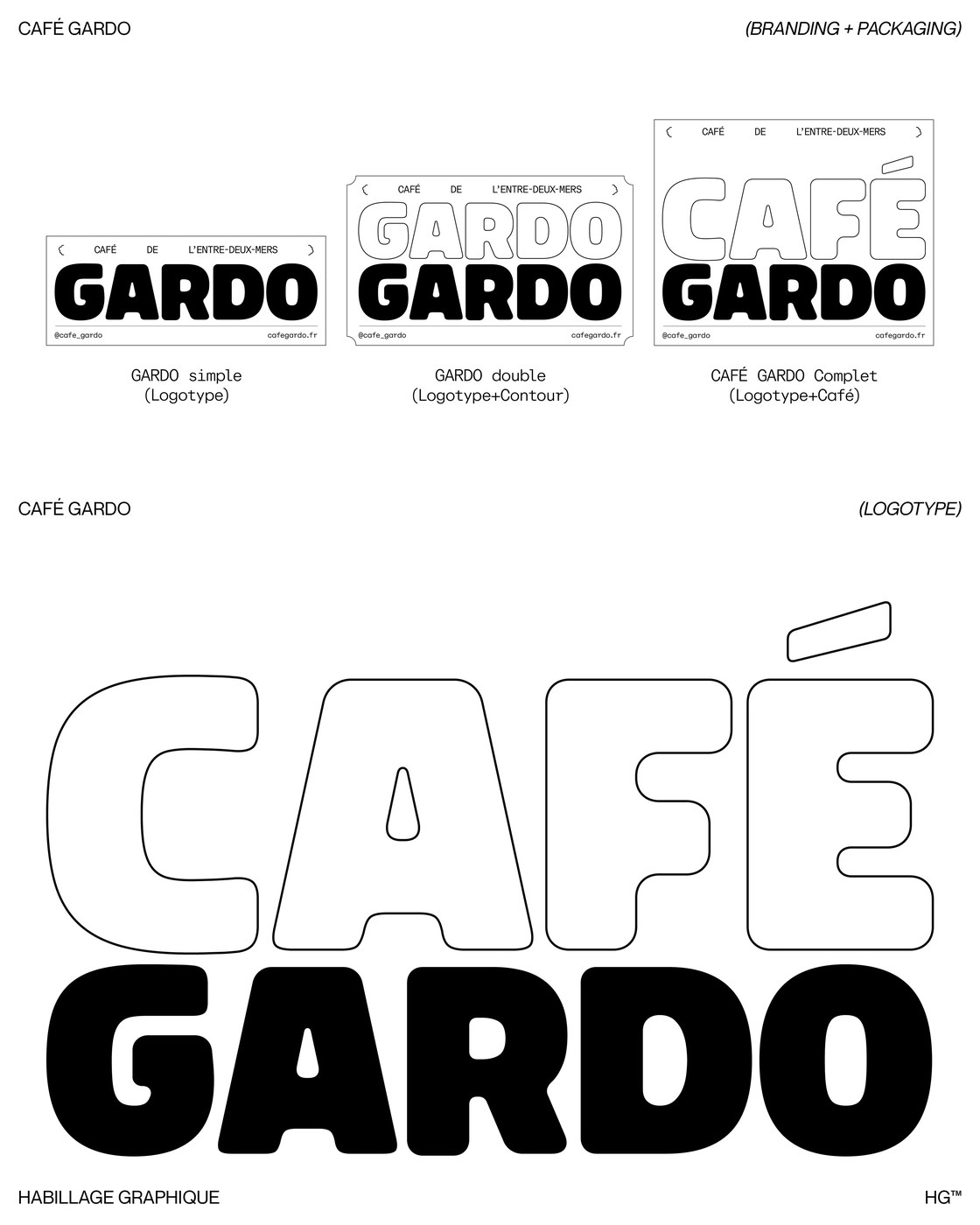
The typographic system hinges on a deliberate contrast between expressive display forms and technical precision. For the primary wordmark, Cornut deployed Bolota by Gabriel Pang. Its pillowy, ultra-bold contours provide volumetric weight to GARDO, paired with an open outline treatment on CAFÉ that balances mass with negative space. This playful display presence is disciplined by ABC Repro Mono from ABC Dinamo. Monospaced annotations, technical brackets framing { CAFÉ DE L'ENTRE-DEUX-MERS }, and structured selection grids anchor production details with utilitarian clarity. The typographic hierarchy ensures that variety names and harvest notes read with effortless legibility.
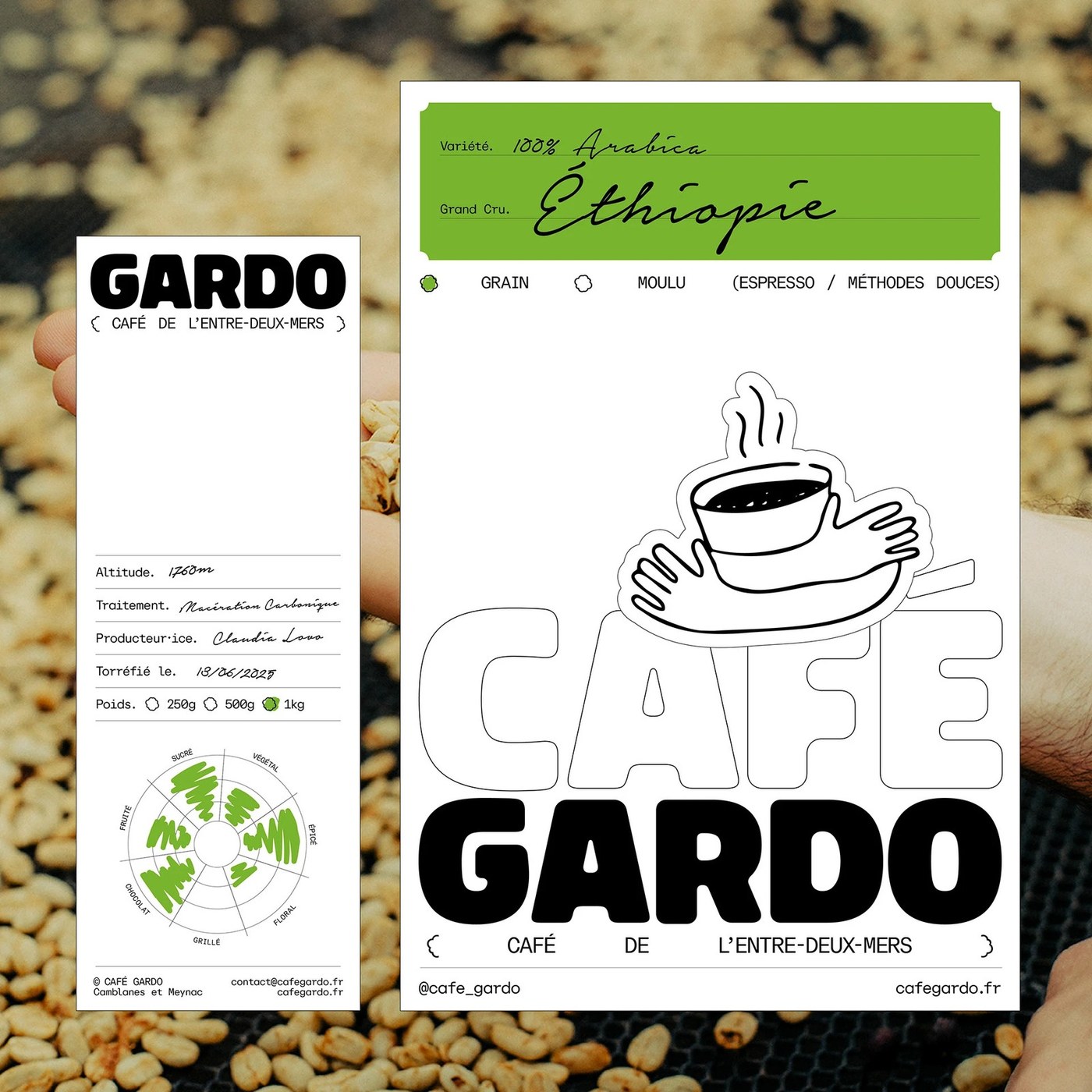
The packaging system utilizes a modular card and sticker hierarchy applied directly to retail pouches and production batches. Distinct color-coded headers distinguish single-origin releases, pairing golden ochre for Nicaragua with deep foliage green for Ethiopian micro-lots. Accompanying side cards function as technical tasting dossiers, detailing elevation at 1760 meters, carbonic maceration processing, roast dates, and producer credits for farmers like Claudia Lovo. A circular radar flavor wheel maps taste notes across fruit, sugar, spice, and floral profiles. At the visual core, an illustrated mascot of cupped hands cradling a steaming coffee bowl—animated by Baptiste De Almeida—reinforces the communal human ritual behind each brew.
See more from Florian Cornut on Behance.