Himkok RTD: Inside OlssønBarbieri's New Packaging Design
OlssønBarbieri crafted tactile packaging design for Himkok RTD, pairing matte aluminium cans with Nordic apothecary distillation cues.
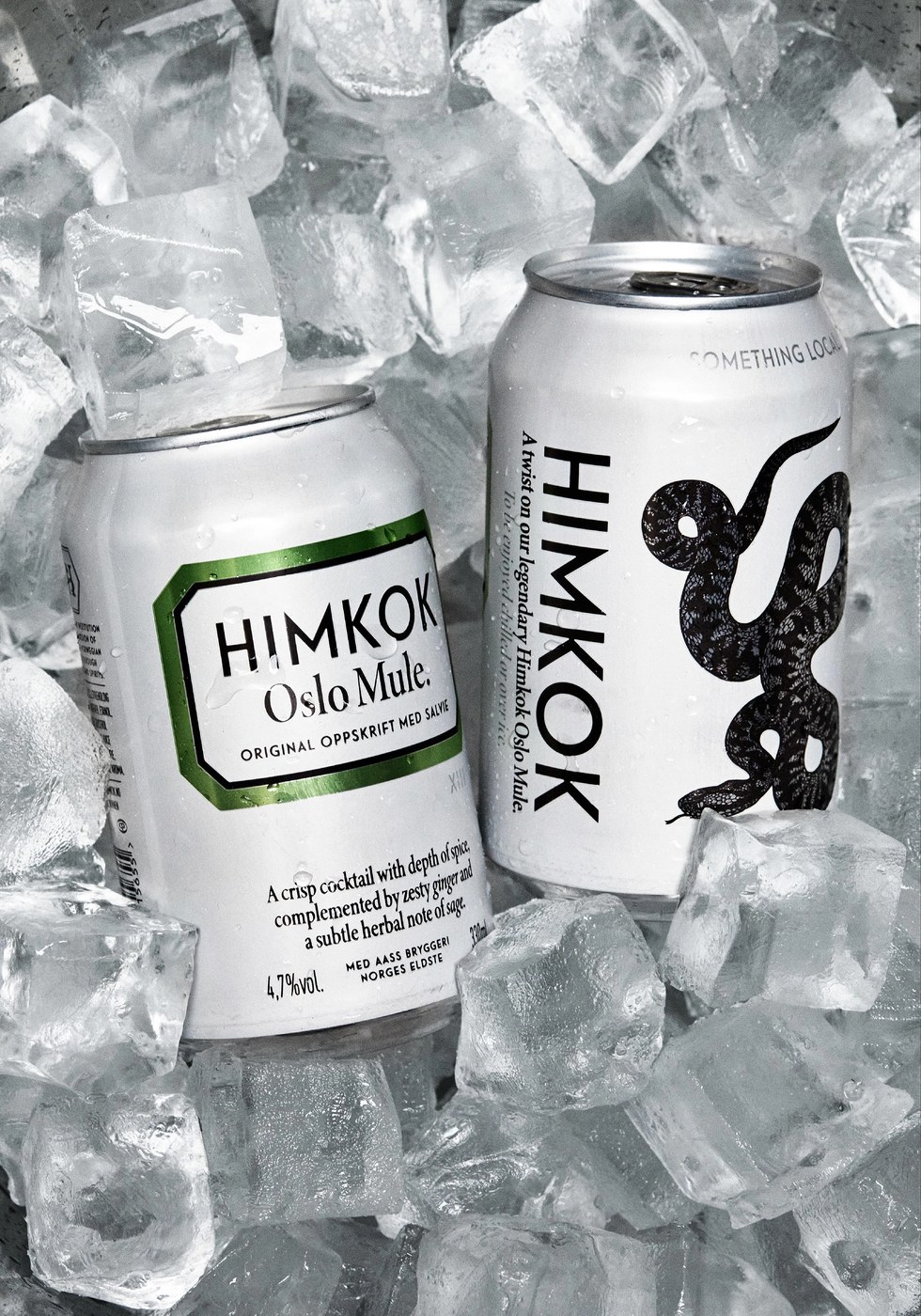
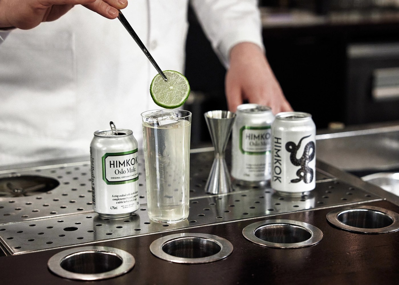
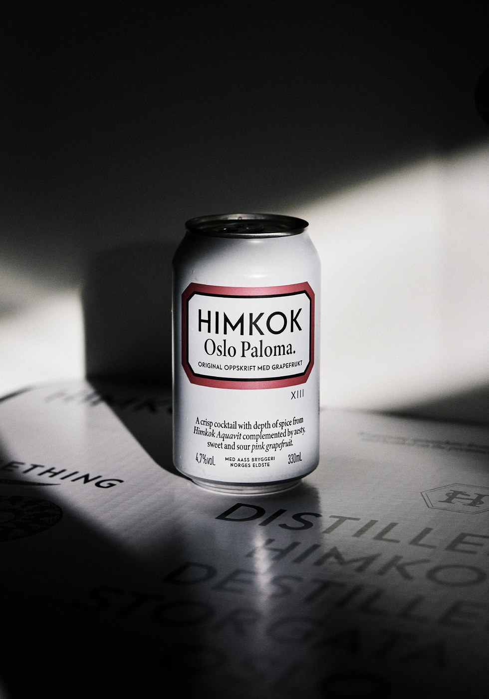
Himkok ranks among the top cocktail bars in Oslo. When city bars closed, the bar team entered food stores. OlssønBarbieri brought craft drink culture to simple aluminium cans. The project launched with Oslo Mule and Oslo Paloma recipes. Each drink uses Himkok Aquavit at 4.7% ABV to meet strict laws. In Norway, Himkok means moonshine and hints at local herbs. The packaging design balances bar grit with clean apothecary order. Rather than using loud store graphics, the cans stay calm and plain. The metal can becomes a pure home for fine craft drinks. Every detail honors the spirit of Nordic drinks made with care.
Apothecary Restraint and Tactile Packaging Design
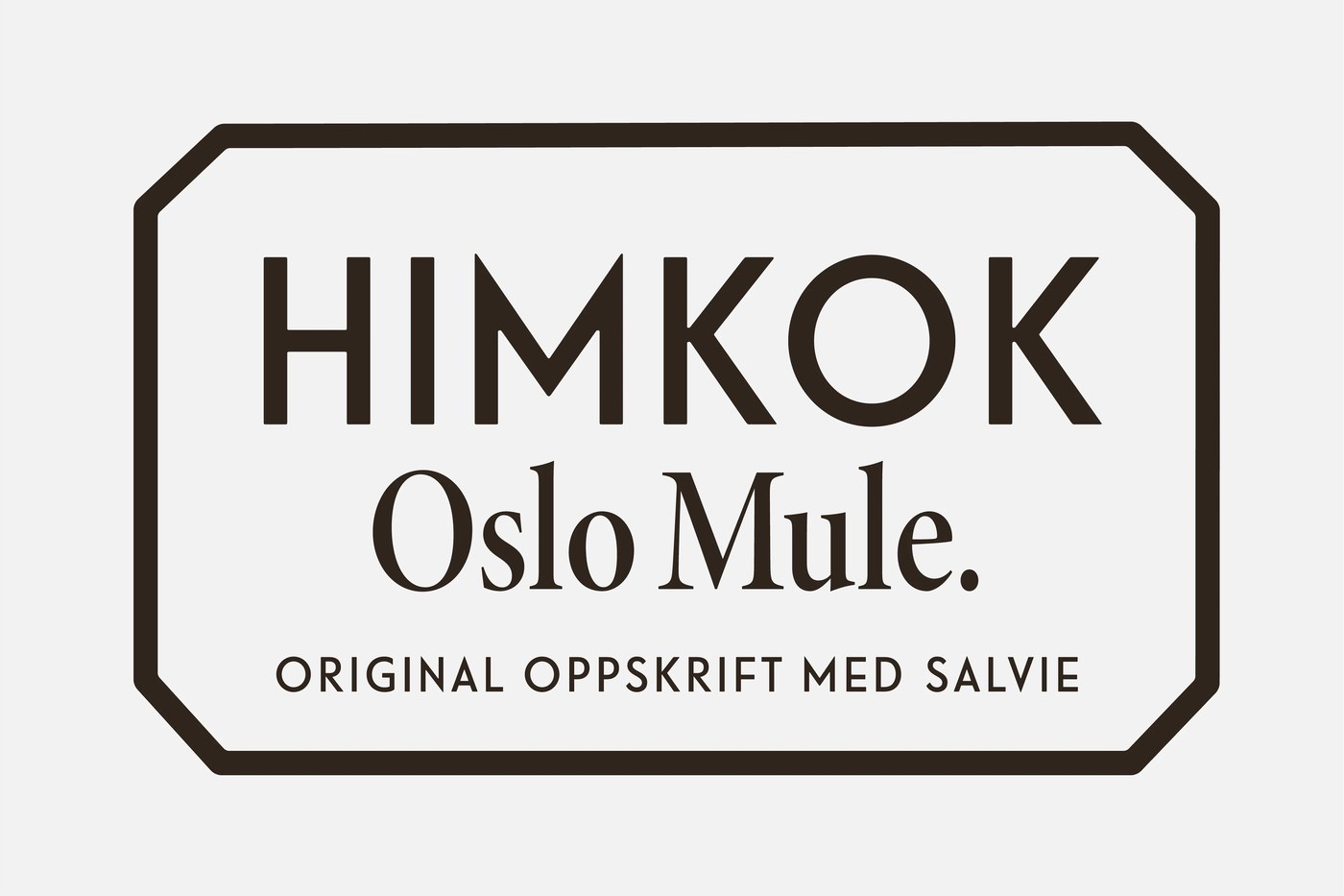
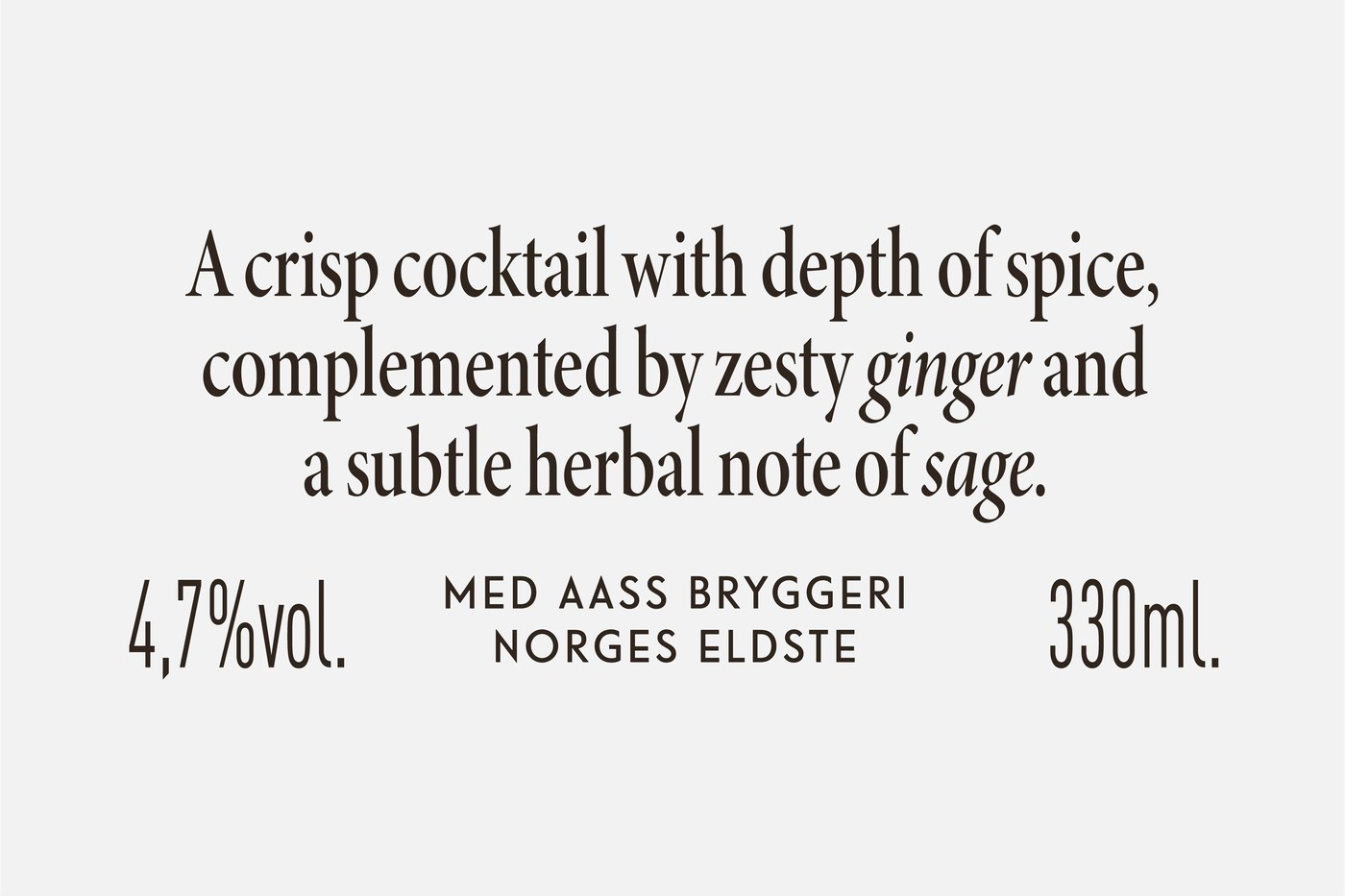
The label system sets up clean signs on the curved metal. The studio put the bold Himkok mark right at the top. This placement builds quick trust with shoppers in retail aisles. Drink names sit below in crisp letters with fine spacing. Short lines list fresh juice, herbs, and botanicals in each mix. Small data grids recall classic drug store labels from old times. The text notes the work with local brewer Aass near Oslo. Neat baseline grids keep legal text and alcohol data sharp and clear. This structured typographic framework brings clinical rigor to modern packaging design.
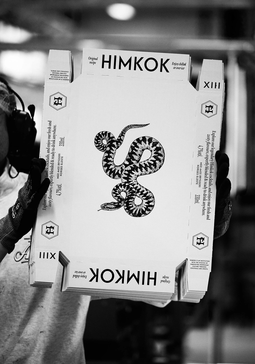
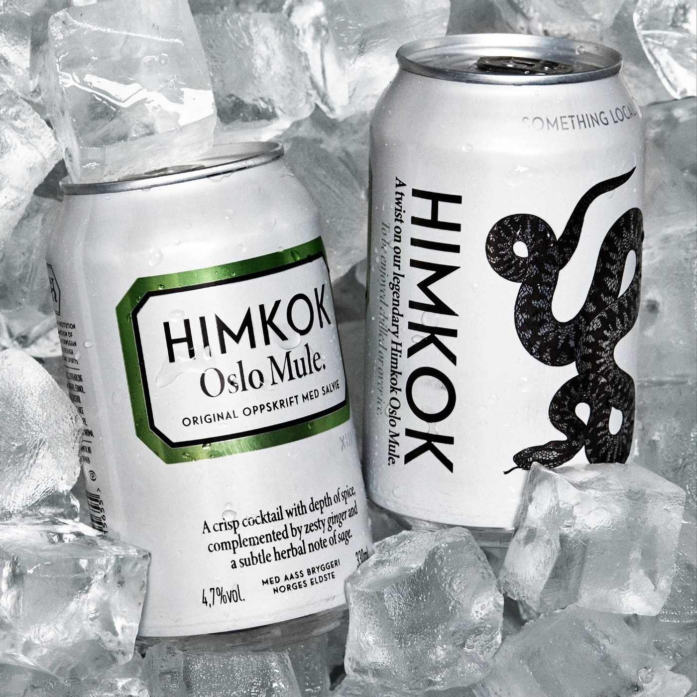
Production craft relies on flexo print on raw aluminium cans. OlssønBarbieri coated each can in flat chalk white ink. Key graphic zones leave bare metal open to catch light. This method gives raw shine to the viper drawn by artist Esra Røise. The viper is the only venomous snake in Norway. Subtle metallic inks mark each drink recipe on shop shelves. Soft metal tones catch the light without loud colors. Contrast between chalky ink and bare metal gives rich depth. OlssønBarbieri shows how quiet packaging design honors honest Nordic distilling.
See more from OlssønBarbieri : ) on Behance.