Pentagram unveils dynamic visual identity for historic music venue De Bijloke
Muziekcentrum De Bijloke in Ghent is recognised as one of Europe’s most distinctive performance venues. Housed inside a medieval hospital founded in 1251, the main hall features a 13th-century oak roof structure paired with modern acoustics that wrap the audience around the stage. Following extensive restorations, it operates as the world’s oldest permanent music venue.
Ahead of its 2026 and 2027 concert season, De Bijloke appointed Marina Willer and her team at Pentagram to overhaul its brand identity. The primary objective was to broaden the venue’s reach beyond its traditional visitor base without alienating existing patrons.
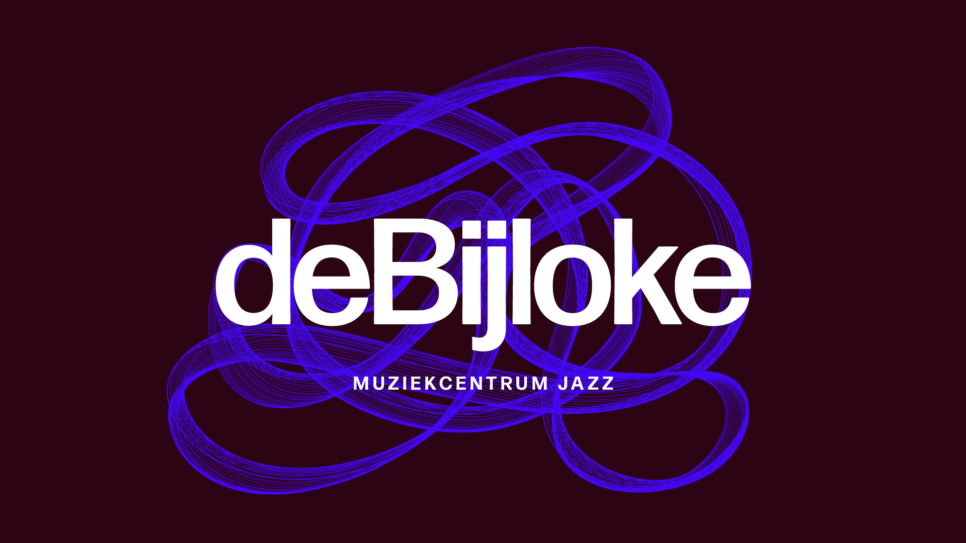
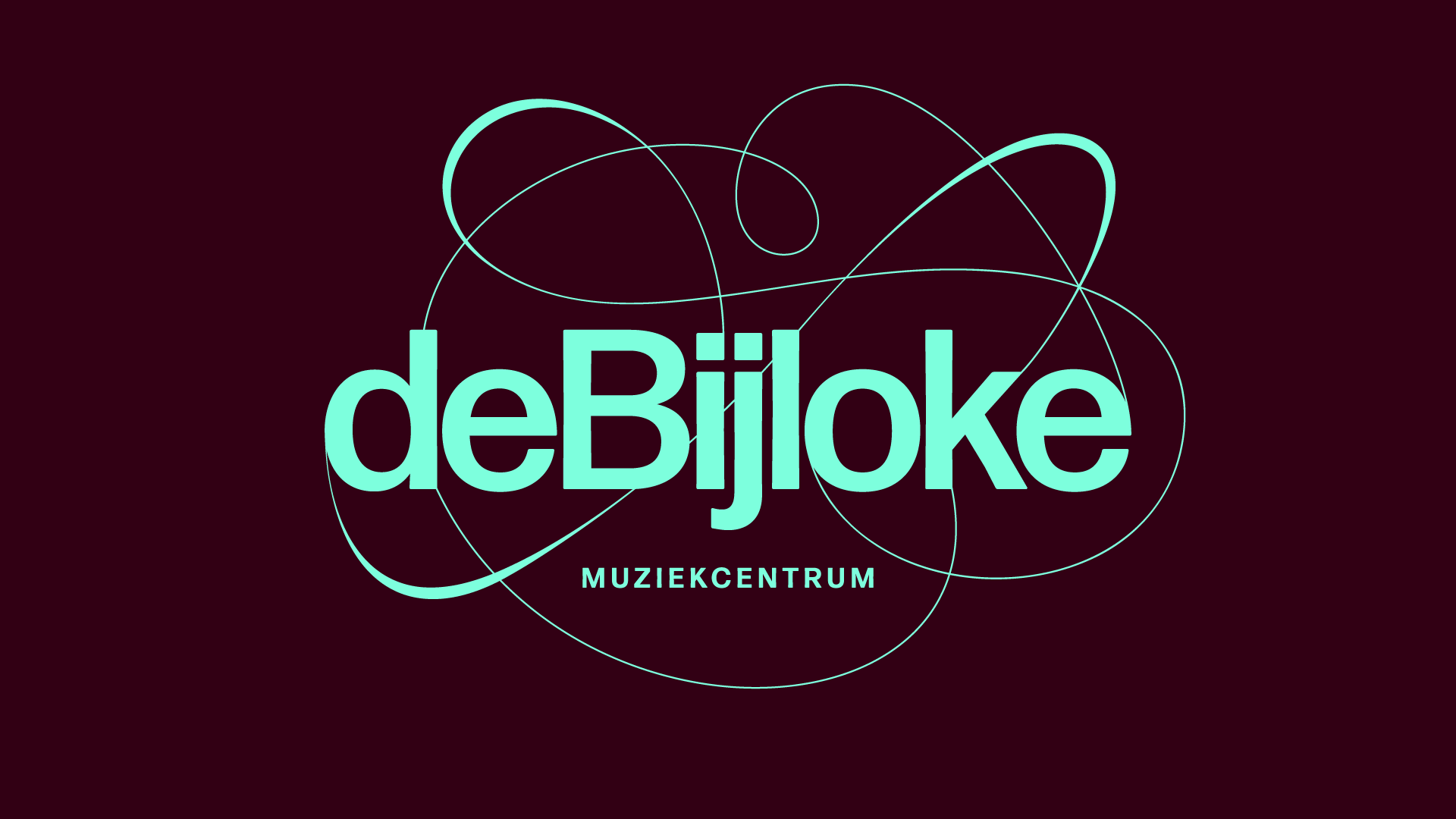
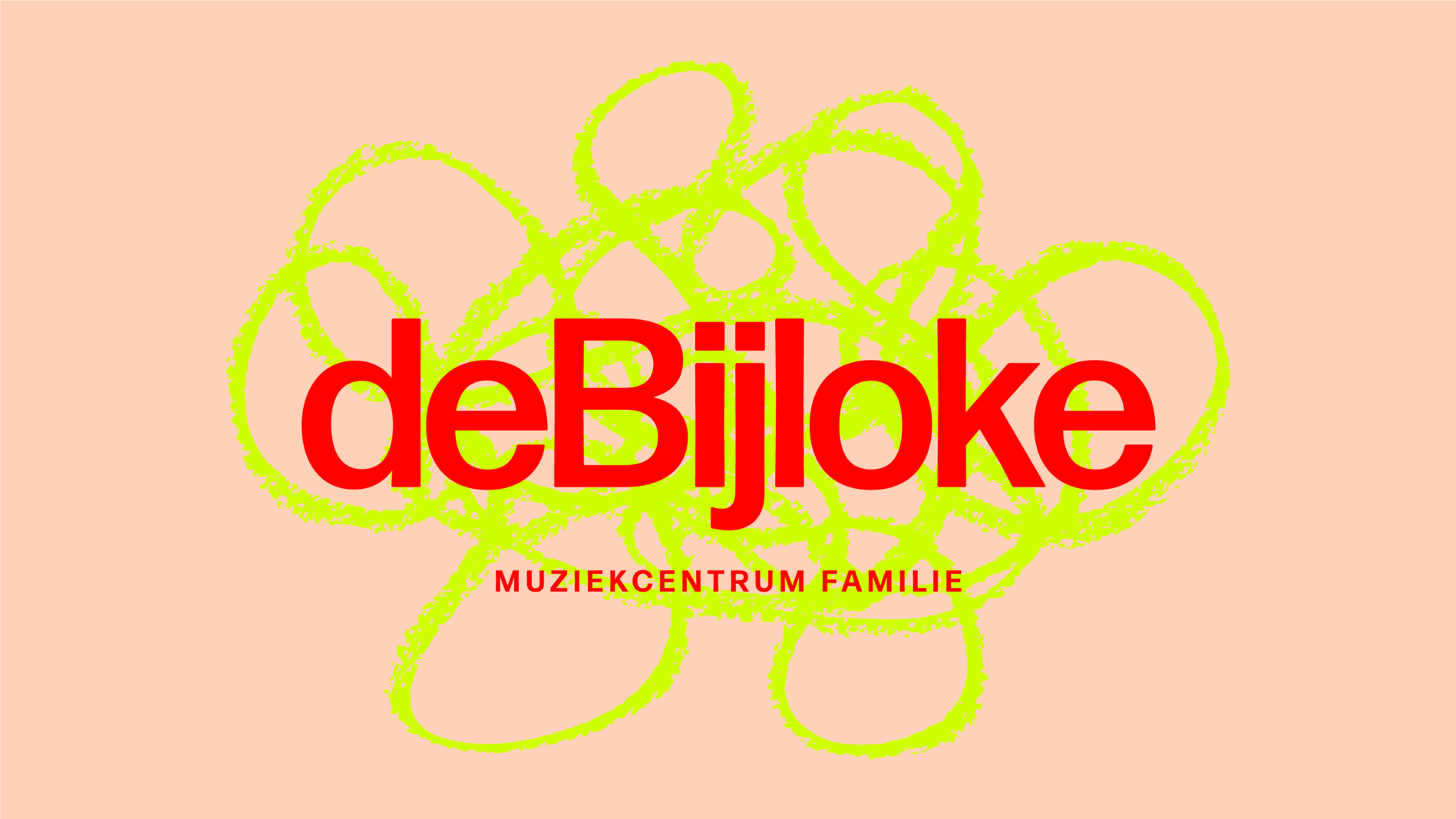
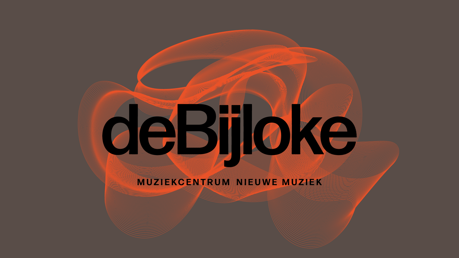
“The brief was to make the brand feel less historical, as it mostly attracts older generations, and the programme includes a broad range of music from classical, early music to jazz and new, experimental music genres,” said Willer.
The identity is built around a core positioning: Alive in every moment. Past, present and future. This narrative frames De Bijloke’s performance halls as active environments, connecting historical architecture with contemporary live performance.
Movement through notes and oscilloscopes
To develop a flexible visual language, Pentagram investigated how physical motion and audio frequencies could be rendered graphically. The design team conducted collaborative workshops to examine different forms of notation, performance movement, and audio visualisation.

“We explored many inspirations in workshops with the clients,” explained Willer. “In our research, we looked at many ways that music can be visualised through movement, from my own way of creating doodles, to how artists trace their body movement, to various dance and music notations. One of those stood out from John Cage. But all the others also informed the visual outcome, especially the oscilloscope and how it visualised sound.”
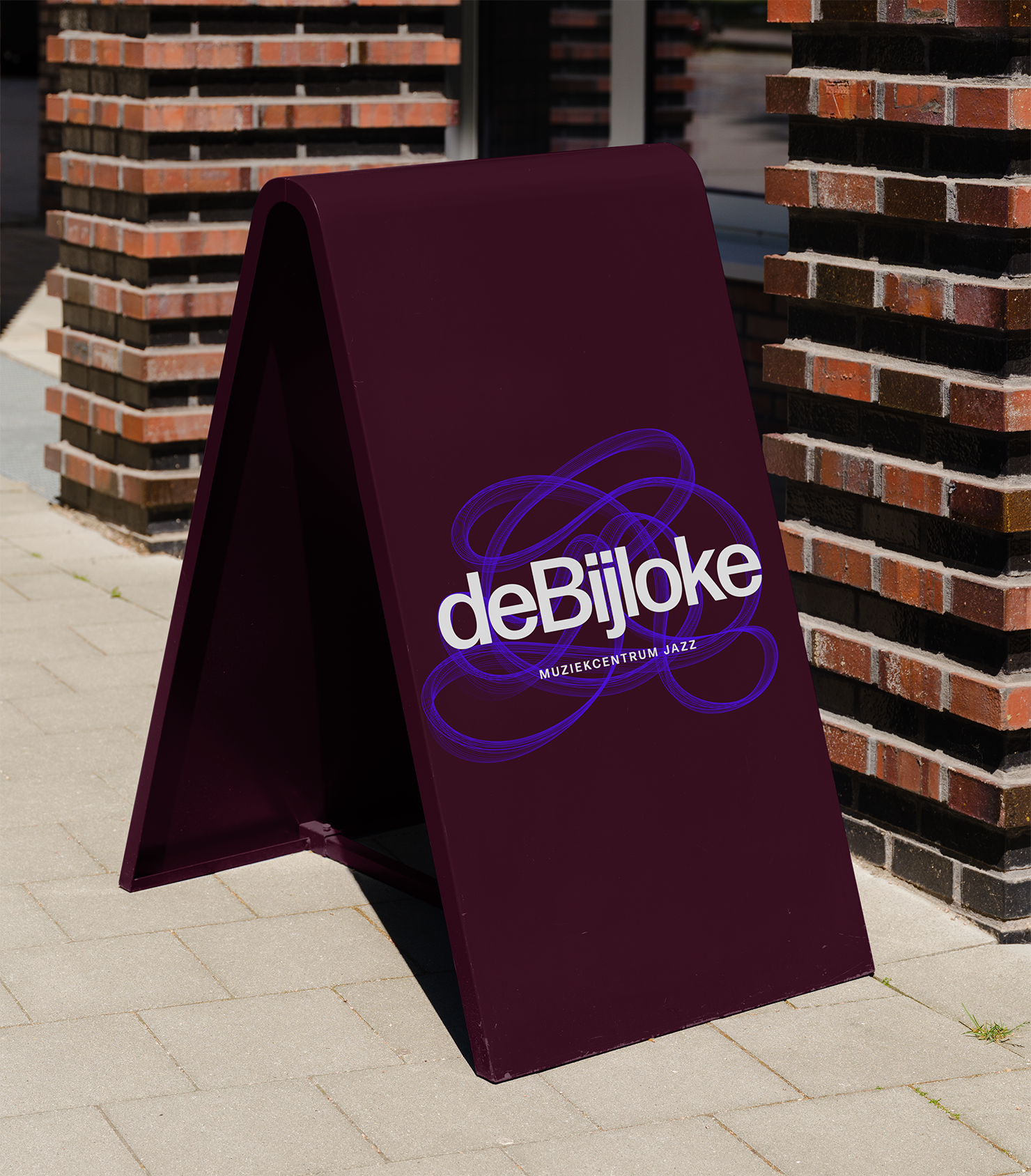
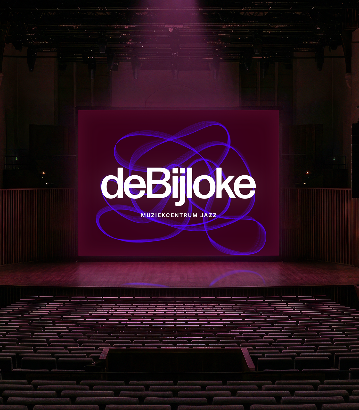
The core logo takes the form of a continuous, swooping line that echoes John Cage’s graphic scores alongside oscilloscope wave signals. The master mark offers a refined structure suitable for classical programming, while complementing a modern typographic system.
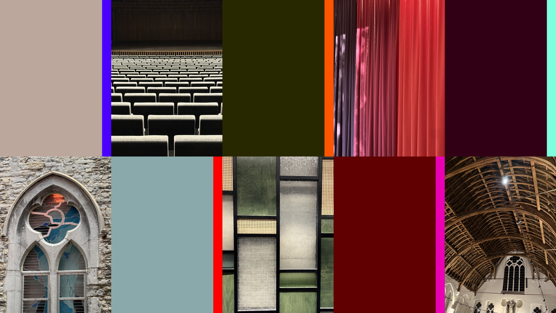
Pentagram specified Forma DJR as the primary typeface, providing a neutral counterweight to the expressive visual elements. The primary colour palette draws directly from architectural features across the building, including stained glass, timber beams, and stage curtains, paired with vivid accent tones to represent individual genres.
Adapting genres and custom tools
While the central identity caters to classical and overarching venue communications, Pentagram created distinct graphic variations for specific genres across the schedule.
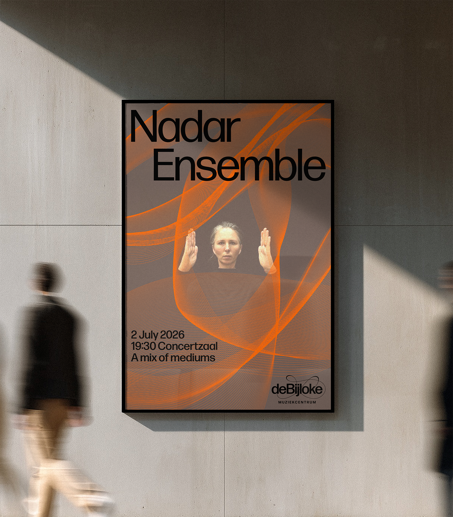
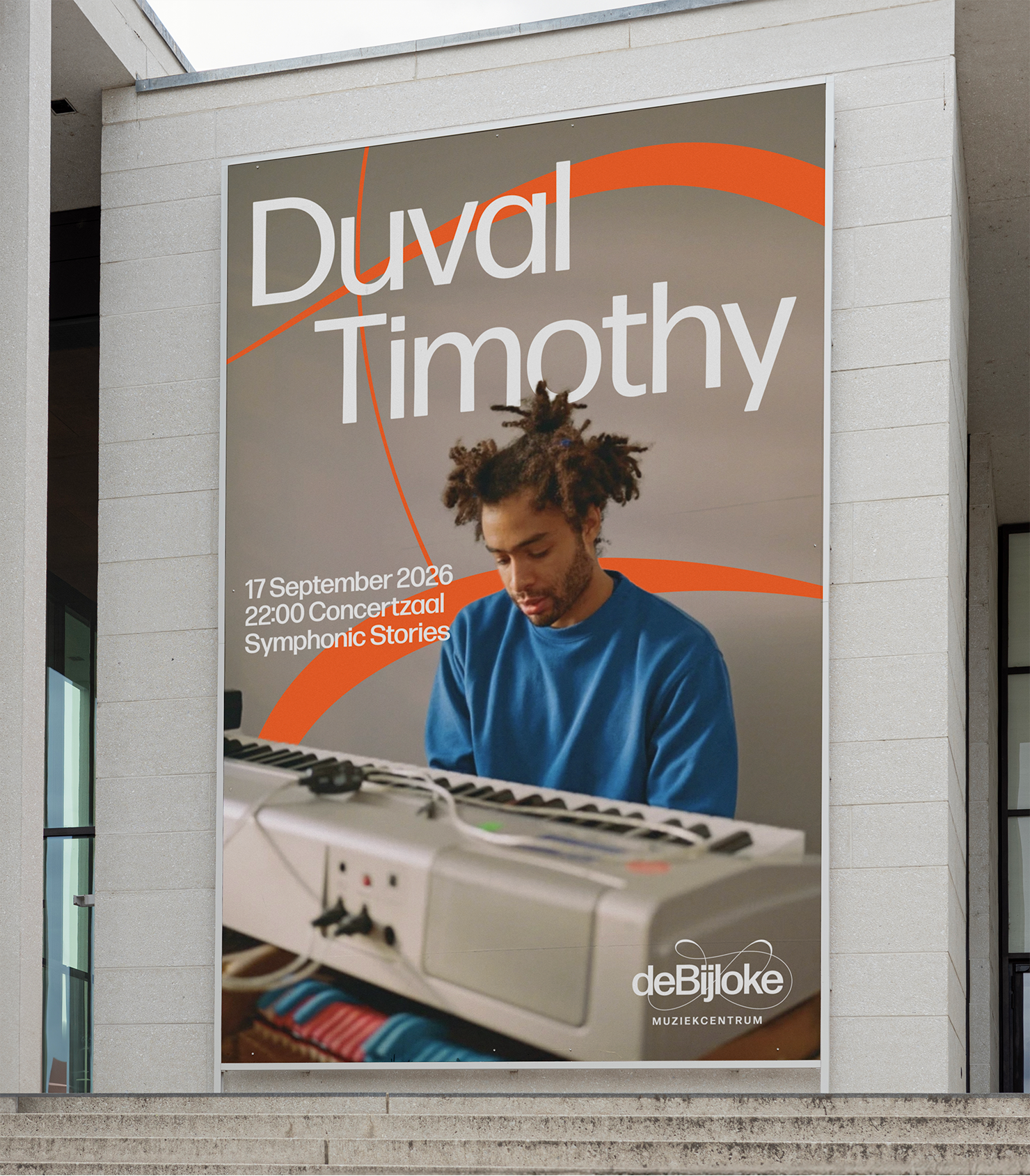
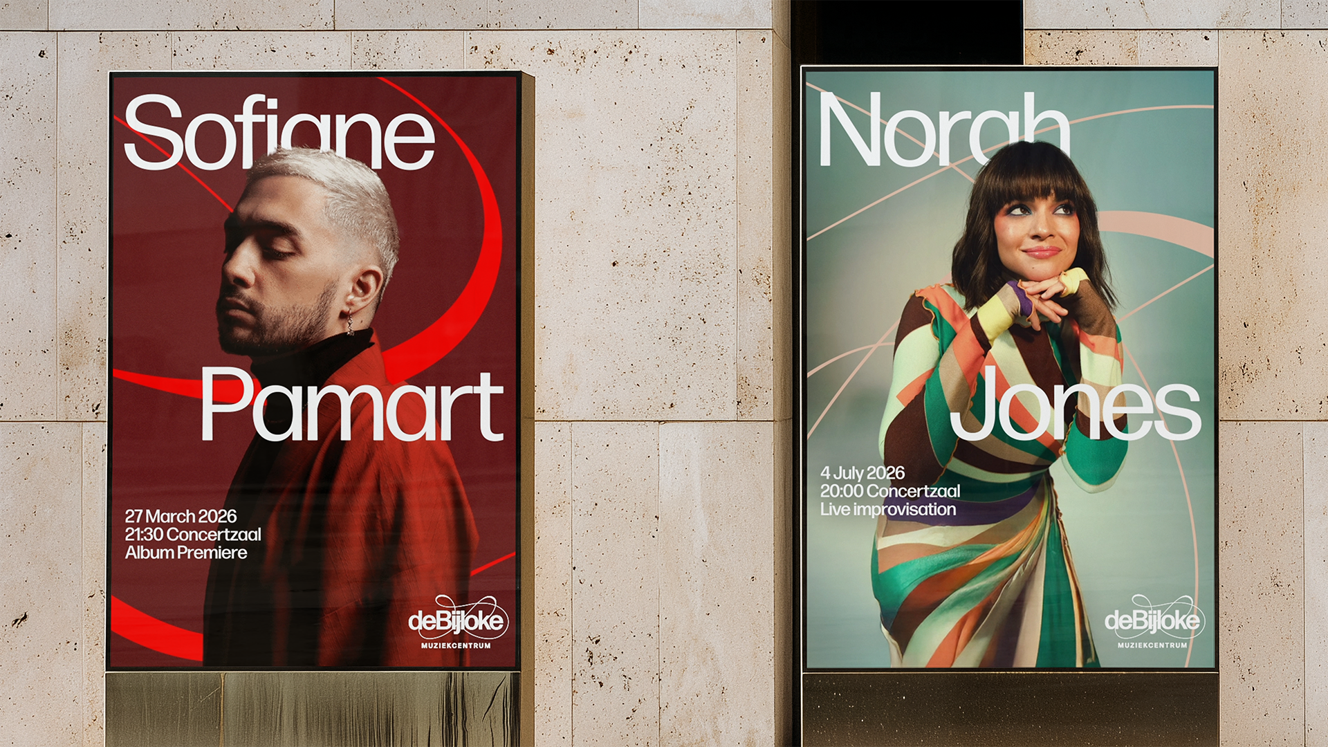
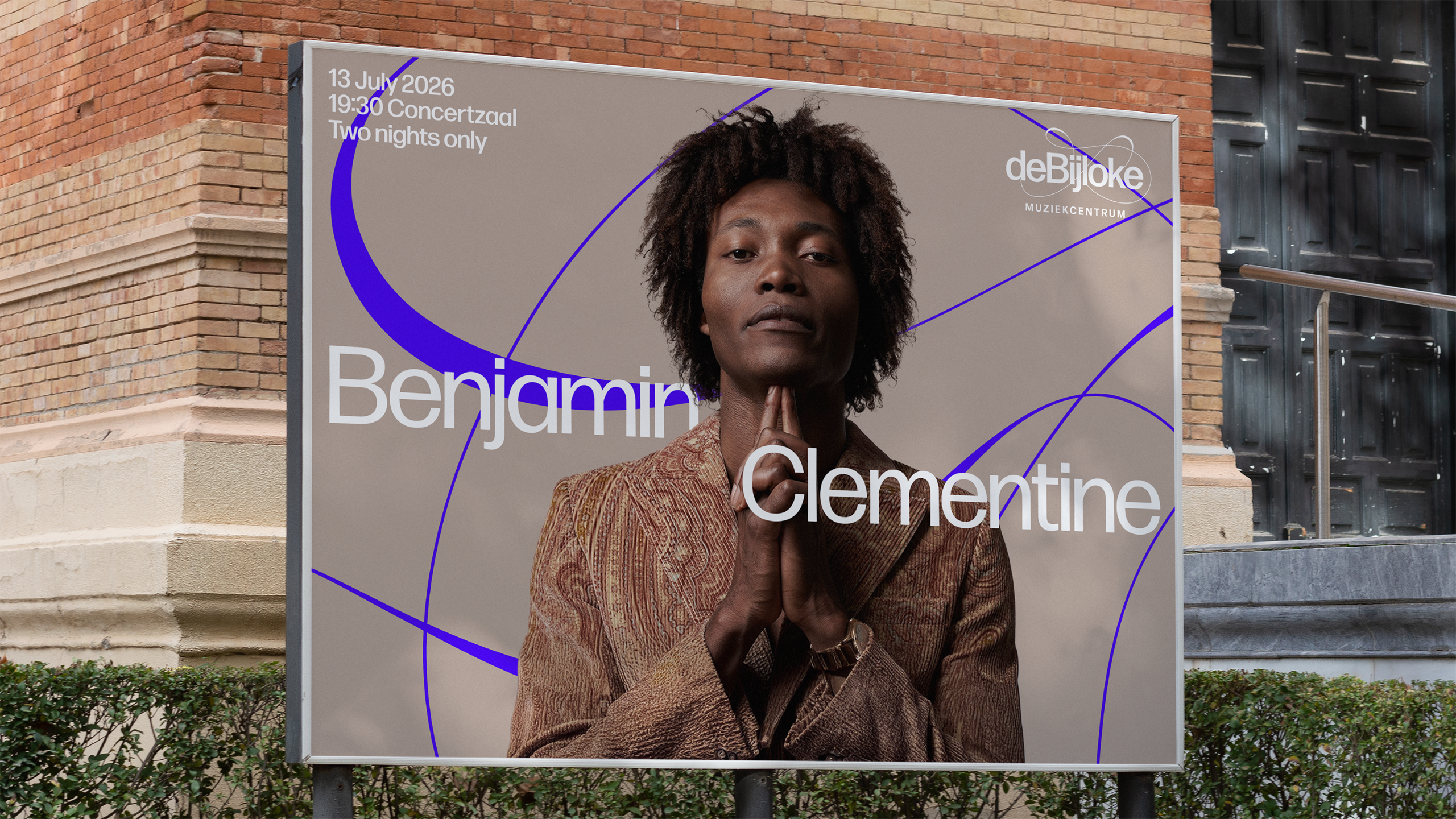
The visual treatments for jazz and new experimental music derive directly from oscilloscope audio-visualisations, capturing the improvisational nature of those performances.
“The main logo is really well crafted and considered, reflecting a very curated, sophisticated programme of music and leans onto classical music a bit more,” Willer noted. “The versions of the logo for jazz and new music, still using the same basic form, were created directly from the oscilloscope image and with motion at its heart.”
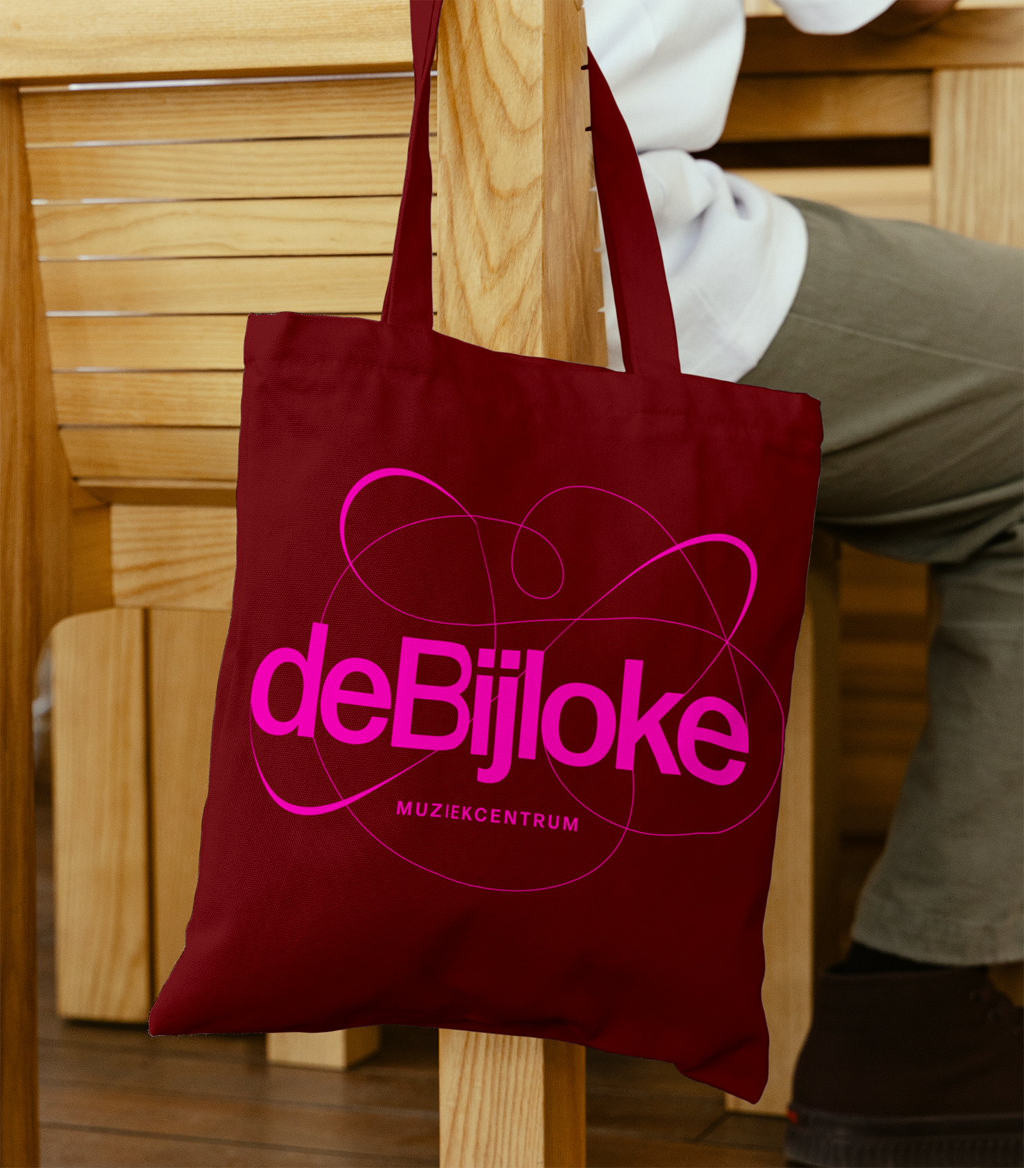
For family programming, the studio developed a freer graphic treatment. “The family programme has a version of the logo inspired by the master brand symbol but scribbled with crayon in a very free, expressive form,” Willer added.
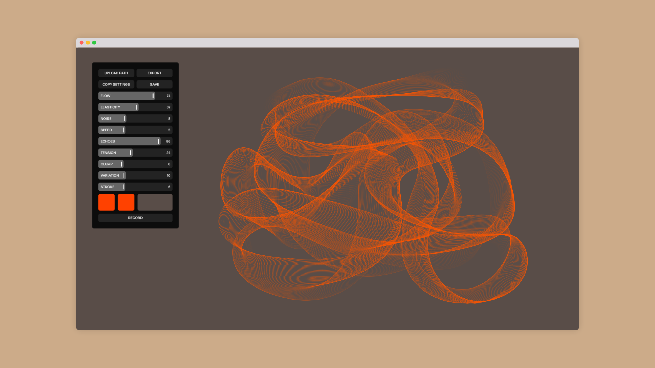
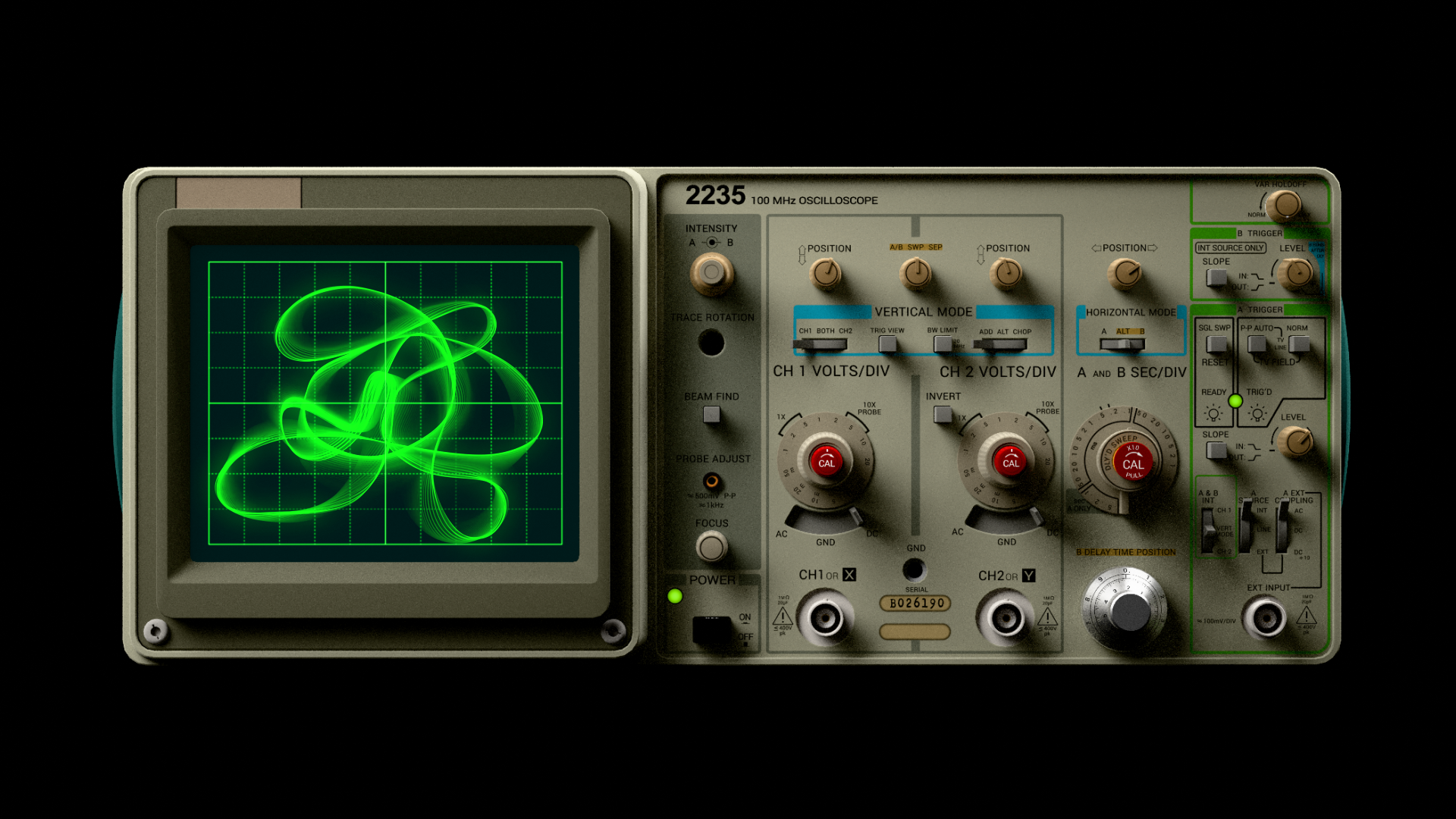
To enable De Bijloke to generate motion graphics across digital platforms, Pentagram built a custom generative software tool. The system allows the brand’s oscilloscope patterns to be animated, transformed, and exported for motion design outputs.
Addressing the implementation of this software, Willer explained that the system was built specifically to match the venue’s internal resources. “We created the simplest generative tool for use here,” said Willer. “The Bijloke team has one designer, and he has been involved throughout the process with my team to contribute to the creation and learn how to use the tools.”
The project was led by Pentagram partner Marina Willer alongside design team members Rita Desport, Martin Grigorov, Hamlet Auyeung, Thomas Chan, Fenella Rogers, and Emily Ueike. The brand strategy and narrative were developed by Ashley Johnson, Ishaan Pamnani, Ruth Jamieson, and Luka Elliott.