KUB Candle Brand Identity Branding by Taisia Vystavkina
Taisia Vystavkina creates the KUB candle branding identity using geometric candle forms, bold colors, and custom box packaging.
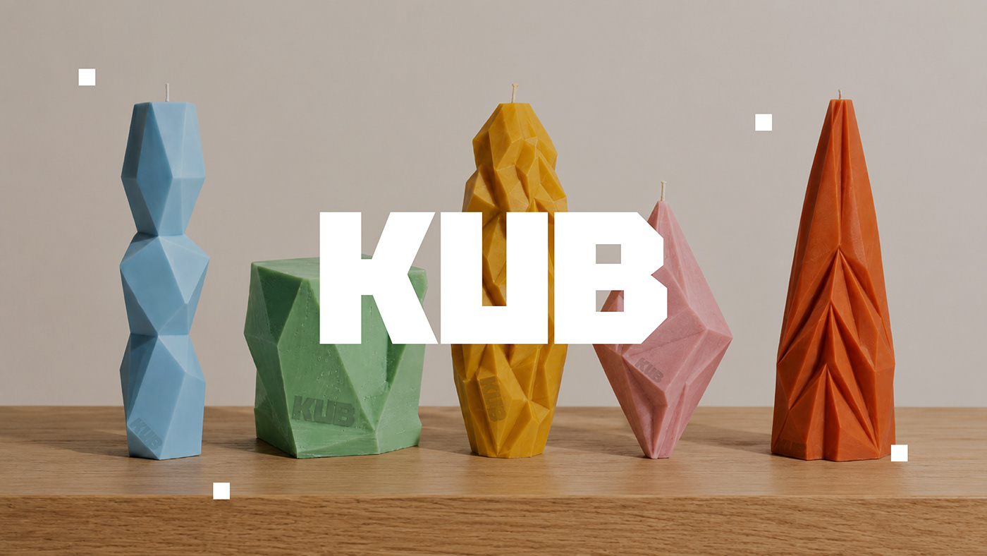
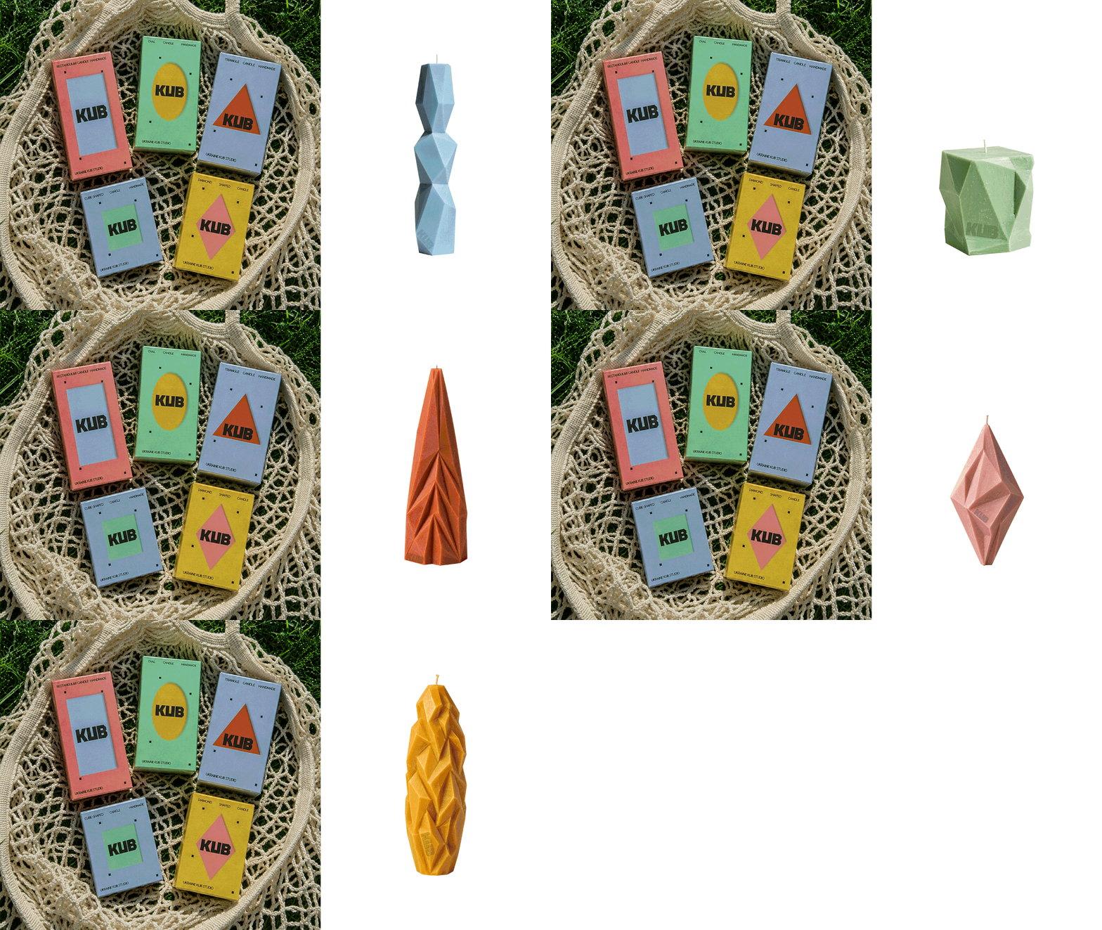
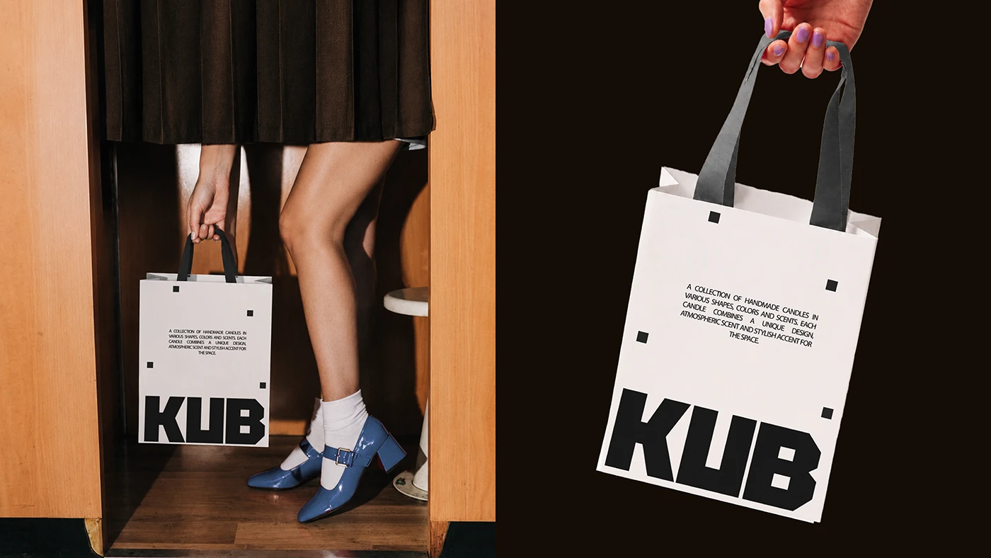
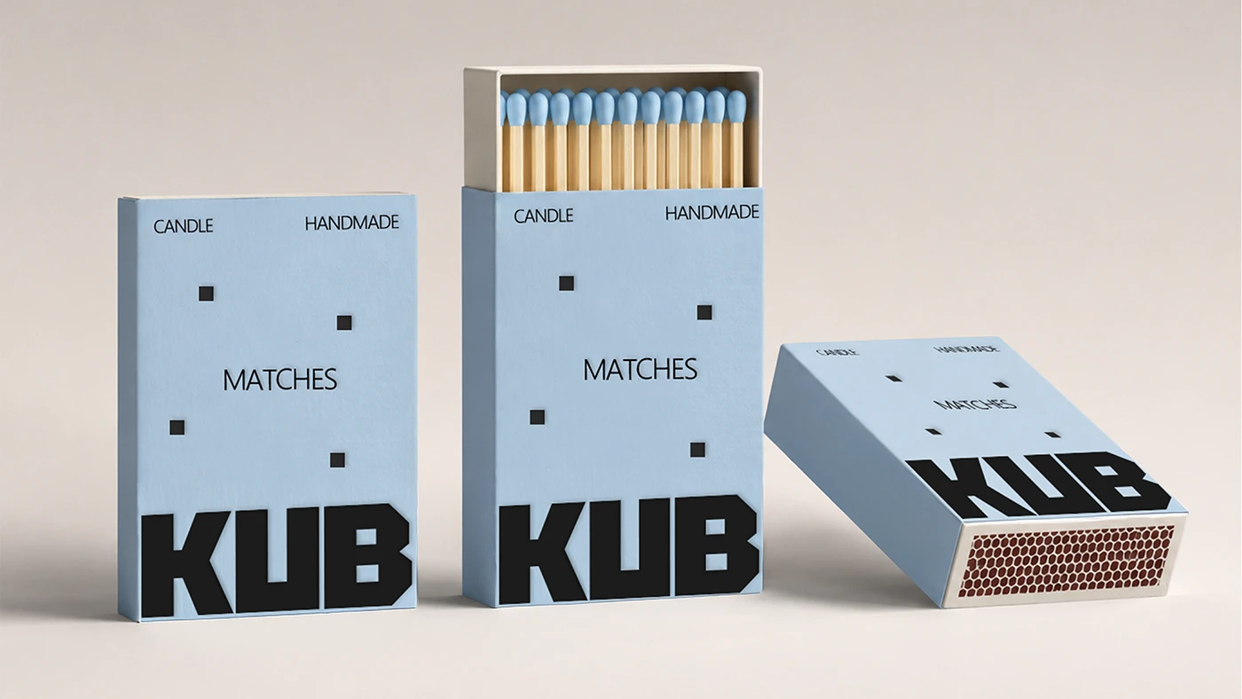
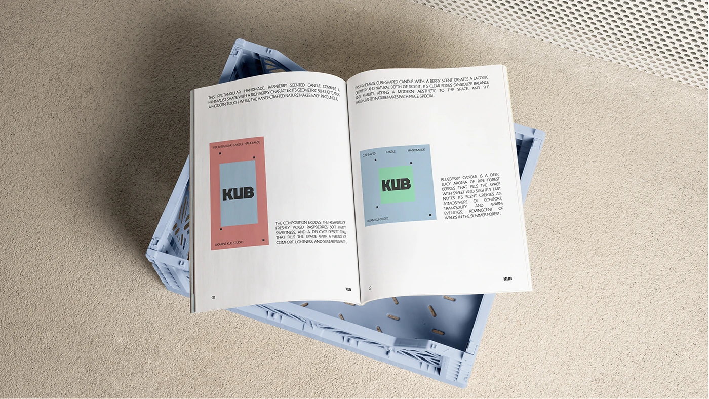
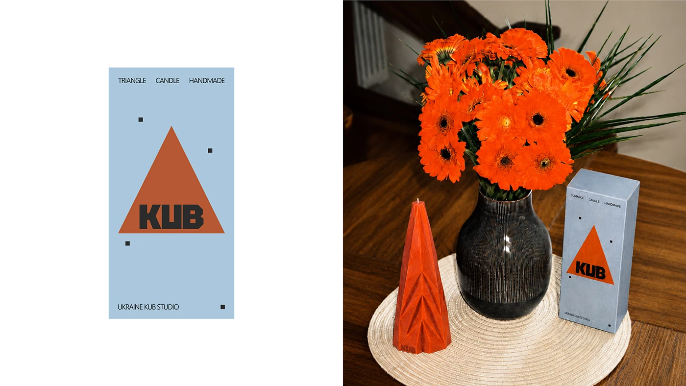
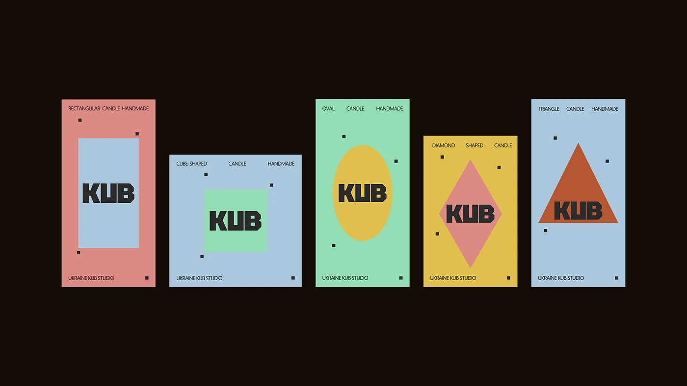
Taisia Vystavkina created a clean visual identity for home scent brand KUB. Candle branding often relies on quiet store labels or plain glass jars. Here, the designer builds a clean branding language around five sharp wax shapes. Heavy sans serif letters anchor the main logo across printed box sleeves and matchbooks. A bold color palette matches clear wax tones to specific home scents. The full branding project balances angular product shapes with clean paper grids. High-contrast ink density keeps each printed box looking sharp on retail shelves. Clear line spacing gives header text a clear stance on entry doors.
Geometric Candle Packaging and Branding System
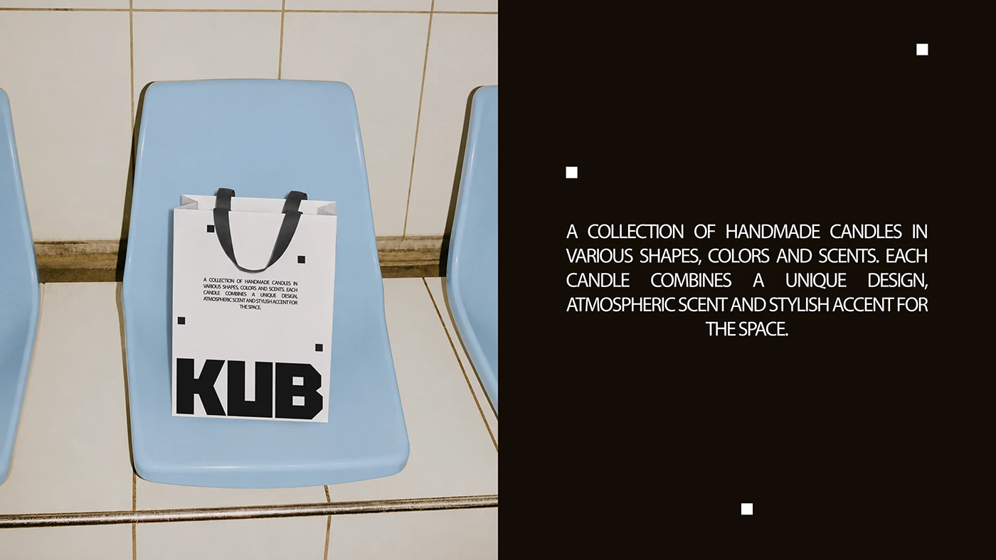
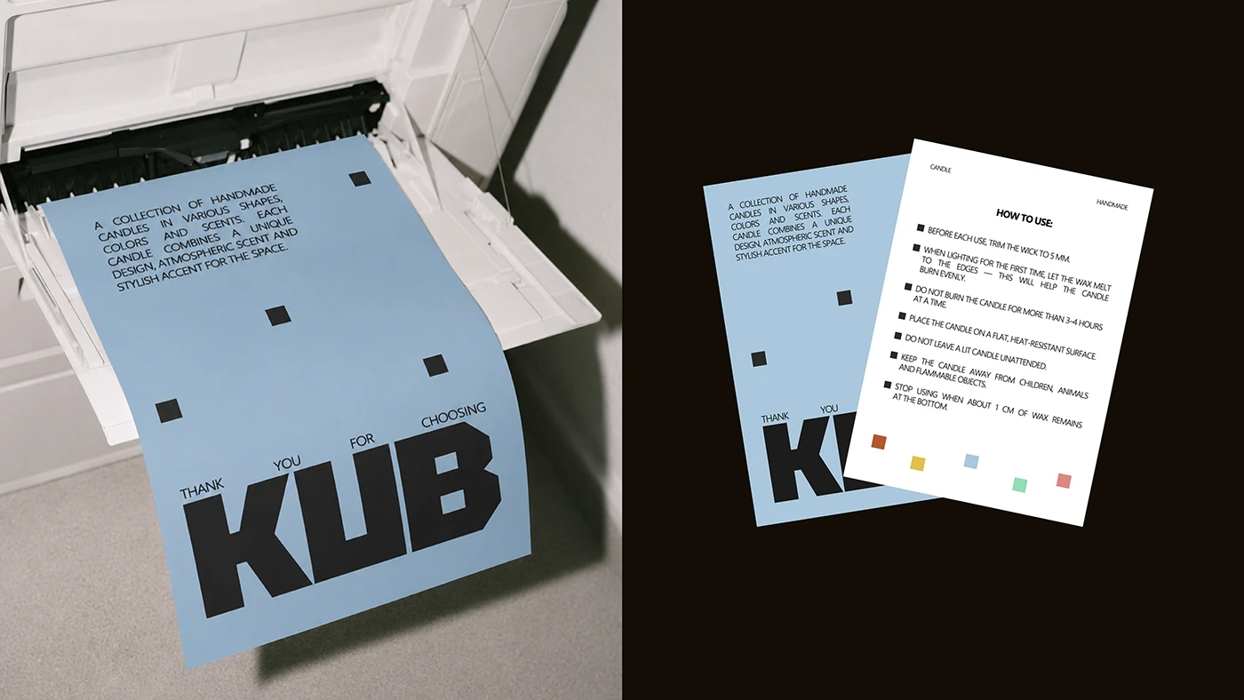
The visual system extends across box sleeves, scent tags, tissue paper, and shipping boxes. Each box uses heavy card stock with embossed grid lines that stand out on store displays. The KUB wordmark acts as a repeated stamp across paper wraps and safety labels. By making sharp candle forms a core part of the branding language, the designer creates a strong physical feel. Deep color fields and white space keep product text easy to read. Simple grid lines guide scent notes for clear reading. Soft paper textures feel good in hand during opening.
The project balances playful product shapes with clean visual style. Neat layout grids organize scent notes, burn times, and wax care tips without clutter. The print items give the product line a solid stance. The work shows how targeted consumer branding strengthens product identity without extra art. Simple type choices make scent labels easy to read on shelf displays. To explore full identity specs and print items, explore Taisia Vystavkina's project portfolio.