Taste Health Nutrition Branding and Packaging Identity
Taste Health is a modern nutrition branding and packaging project by Dex Studio featuring bold typography and cobalt blue color fields.
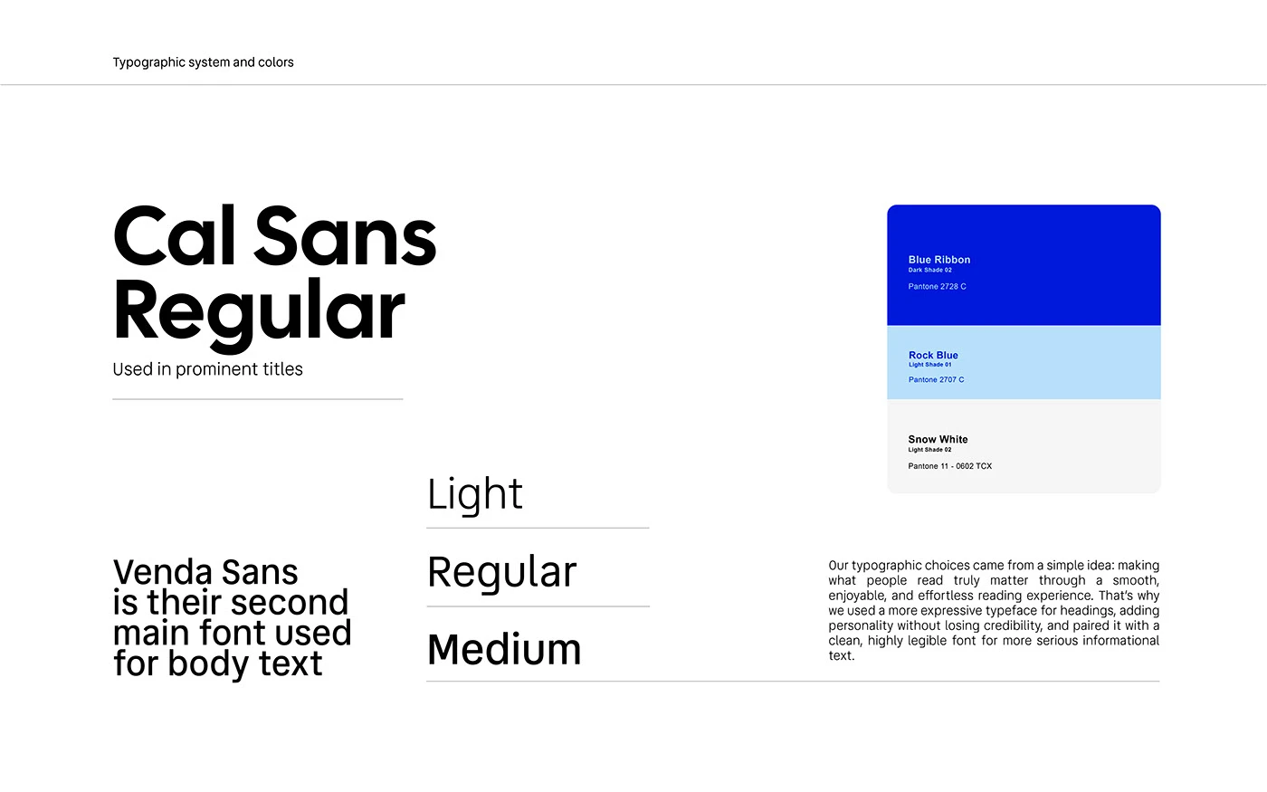
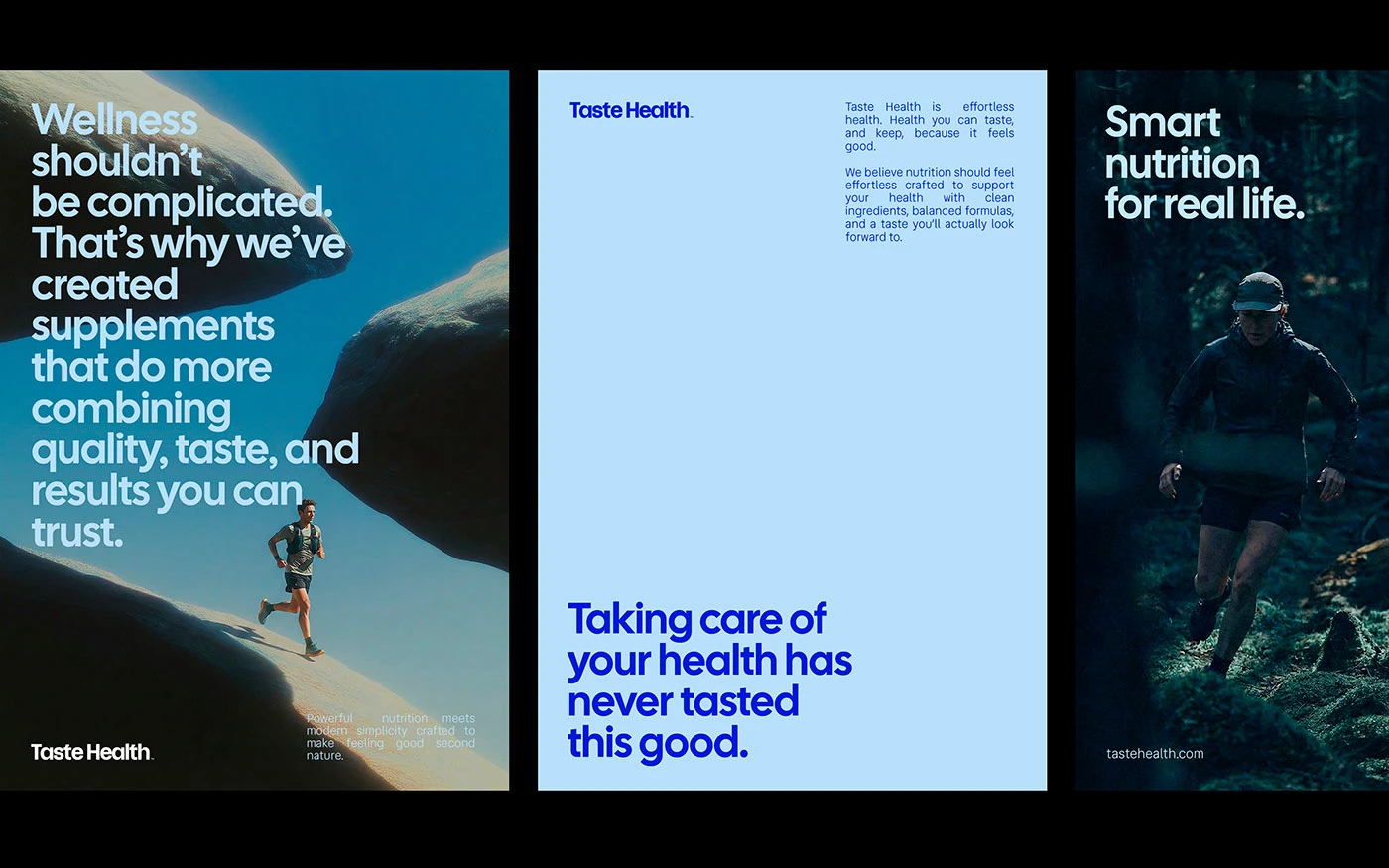
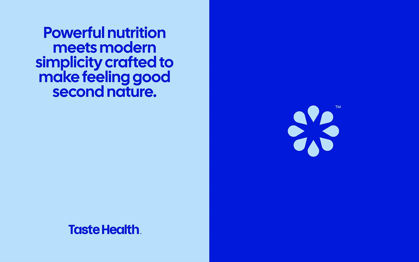
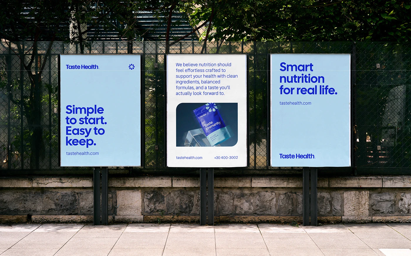
The visual system creates a fresh look for daily food supplements. At the core of the branding sits a bold sans serif wordmark set in deep cobalt blue. Design teams Dex Studio, Drielly Adriana, Caio Resende, and Rodrigo Balbino pair the main type with a clean petal star icon. The layout pairs pale blue panels with rich royal blue color blocks. High contrast type lines deliver direct health lines with zero visual fuss. Every poster layout treats the brand name as the primary graphic point. Clean grid lines keep each layout clear and sharp.
Bold Nutrition Typography and Modern Product Branding
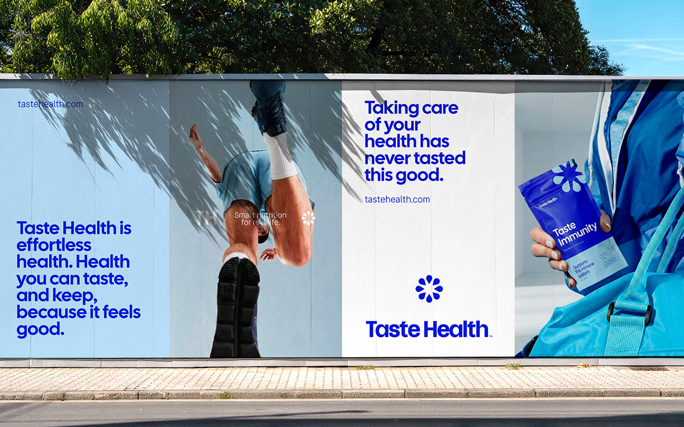
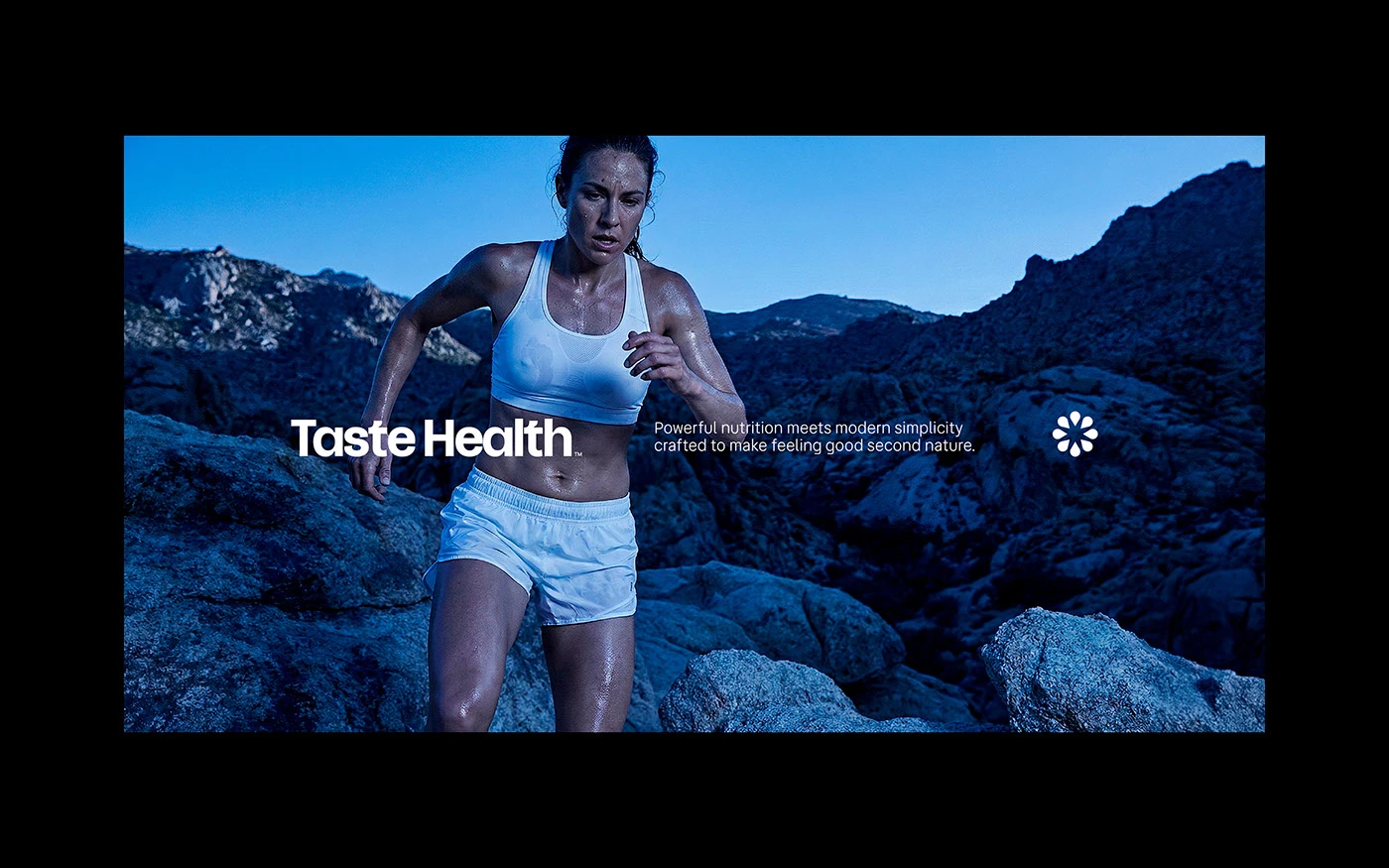
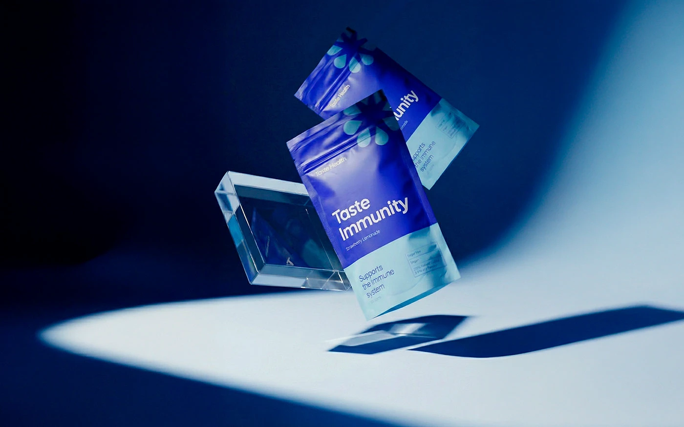
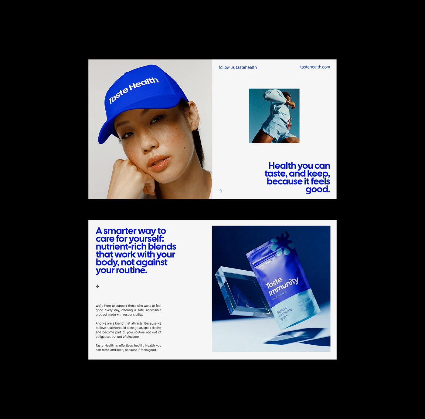
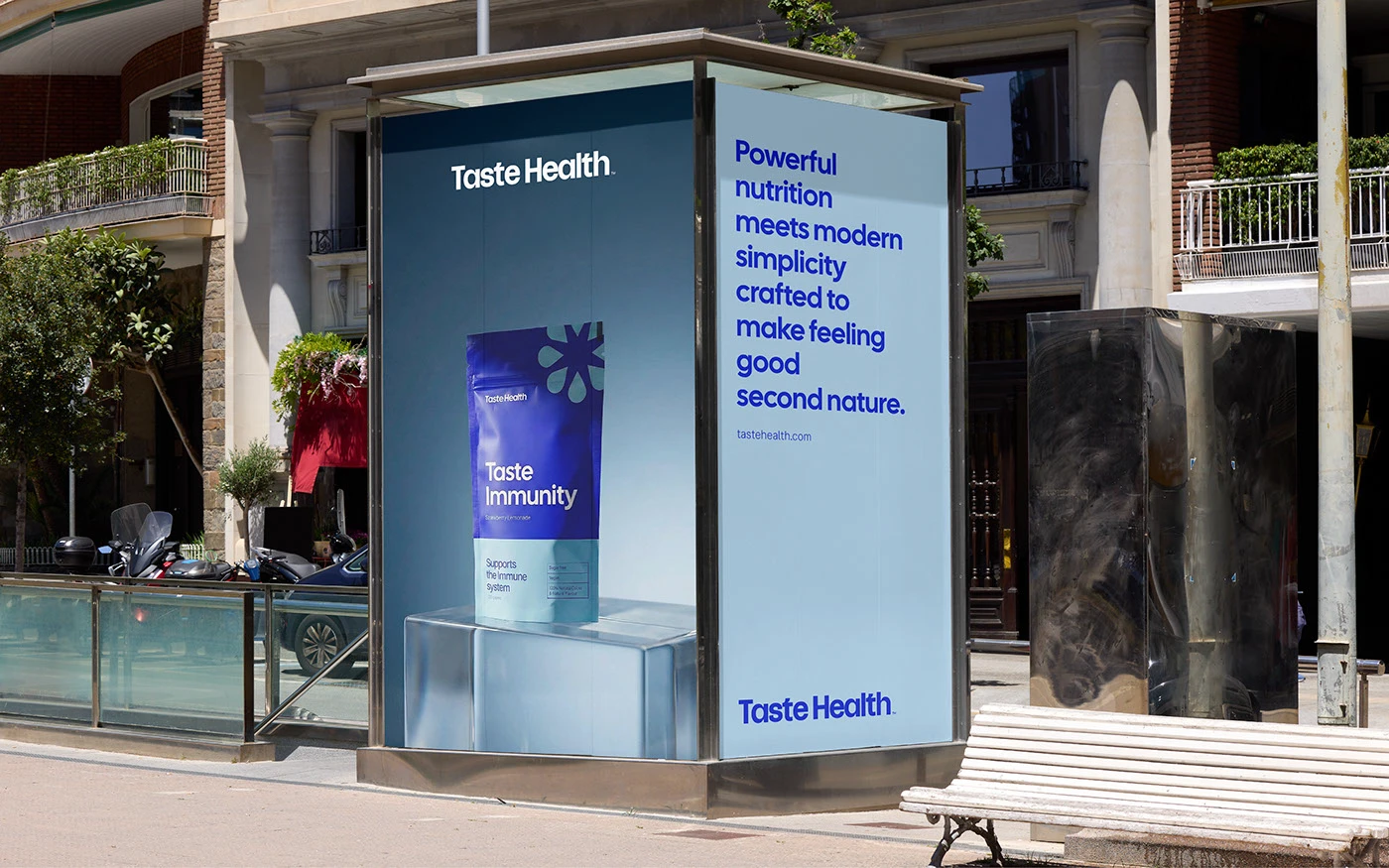
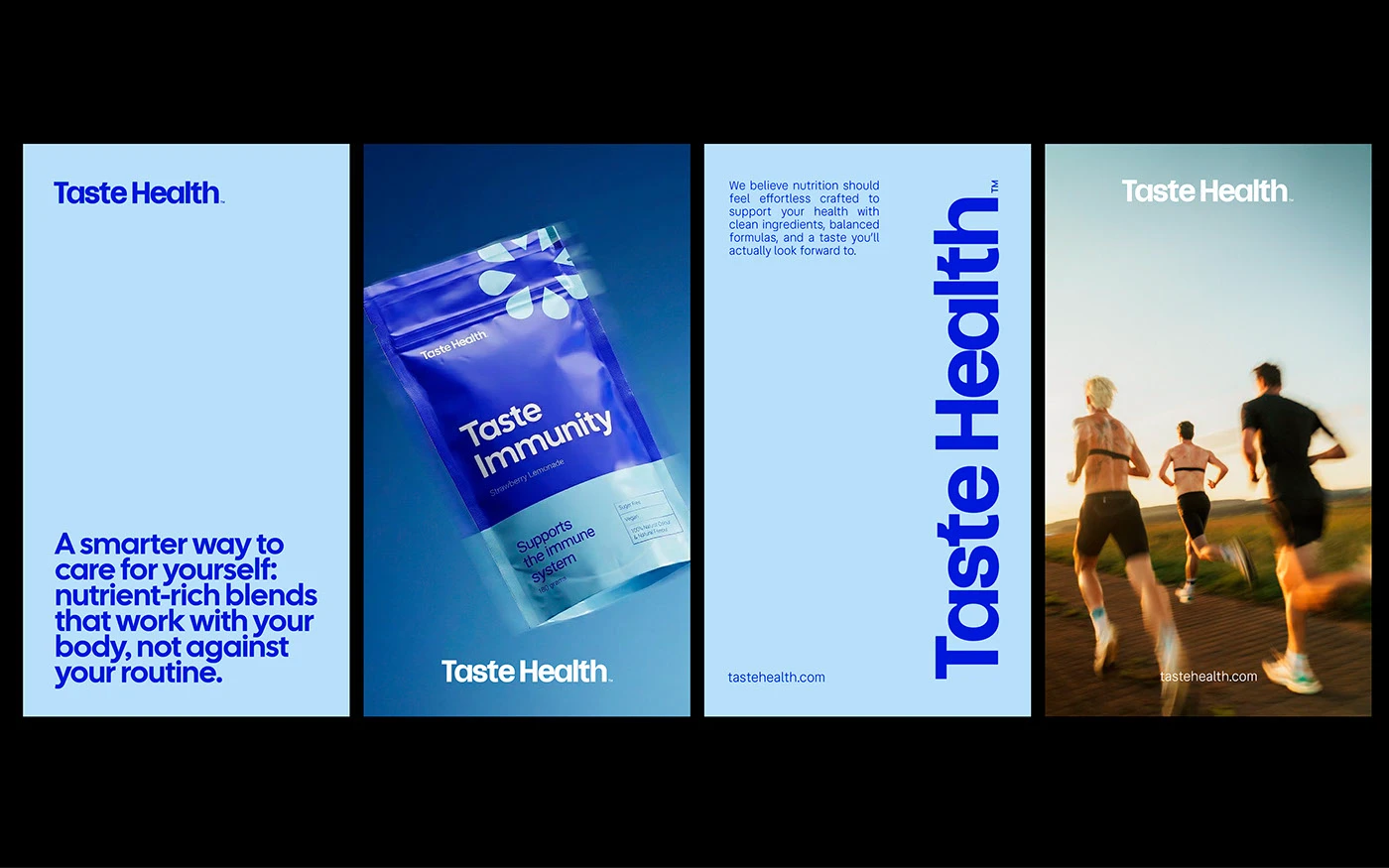
Physical pouch packs move the branding to store shelves and city streets. Matte stand up pouches show the petal symbol above clean product names like Taste Immunity. Large outdoor billboard panels place the blue text over clear sky fields and athlete photos. Street kiosks and bus stop posters show the nutrition packs on glass cubes. The contrast between deep blue ink and soft sky blue fields makes every message easy to read. Each printed item shows a clean balance of text scale and white space.
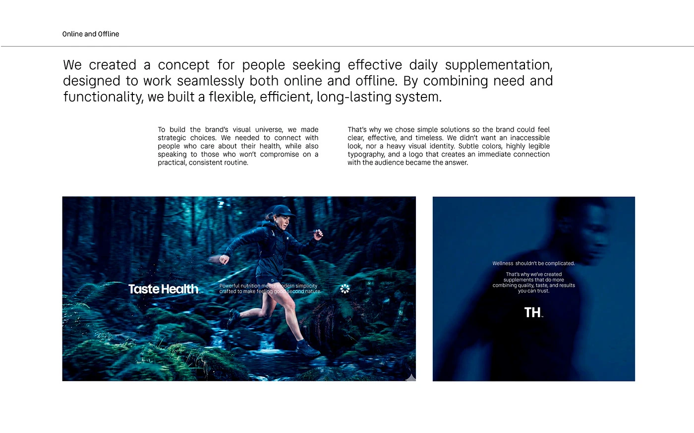
The project shows how smart branding shifts wellness away from cold clinic tropes. By using friendly blue tones and bold typography, the visual identity builds a good daily habit. The complete system balances active lifestyle photography with clean type blocks. It offers great ideas for designers building health product systems and package labels. Every piece keeps the message direct on print and digital screens. Clear packaging details make each pouch stand out. Explore the complete brand identity case study on Behance by Dex Studio.