Brand Identity: (RE)DOMMA by Gabriel Maciel
Explore the brand identity for (RE)DOMMA by Gabriel Maciel, translating tattoo artistry into geometric typography and folded paper polygons.
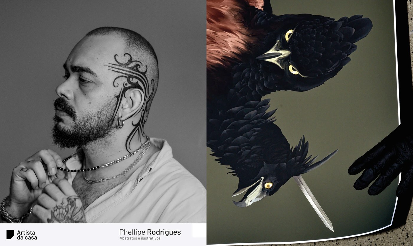
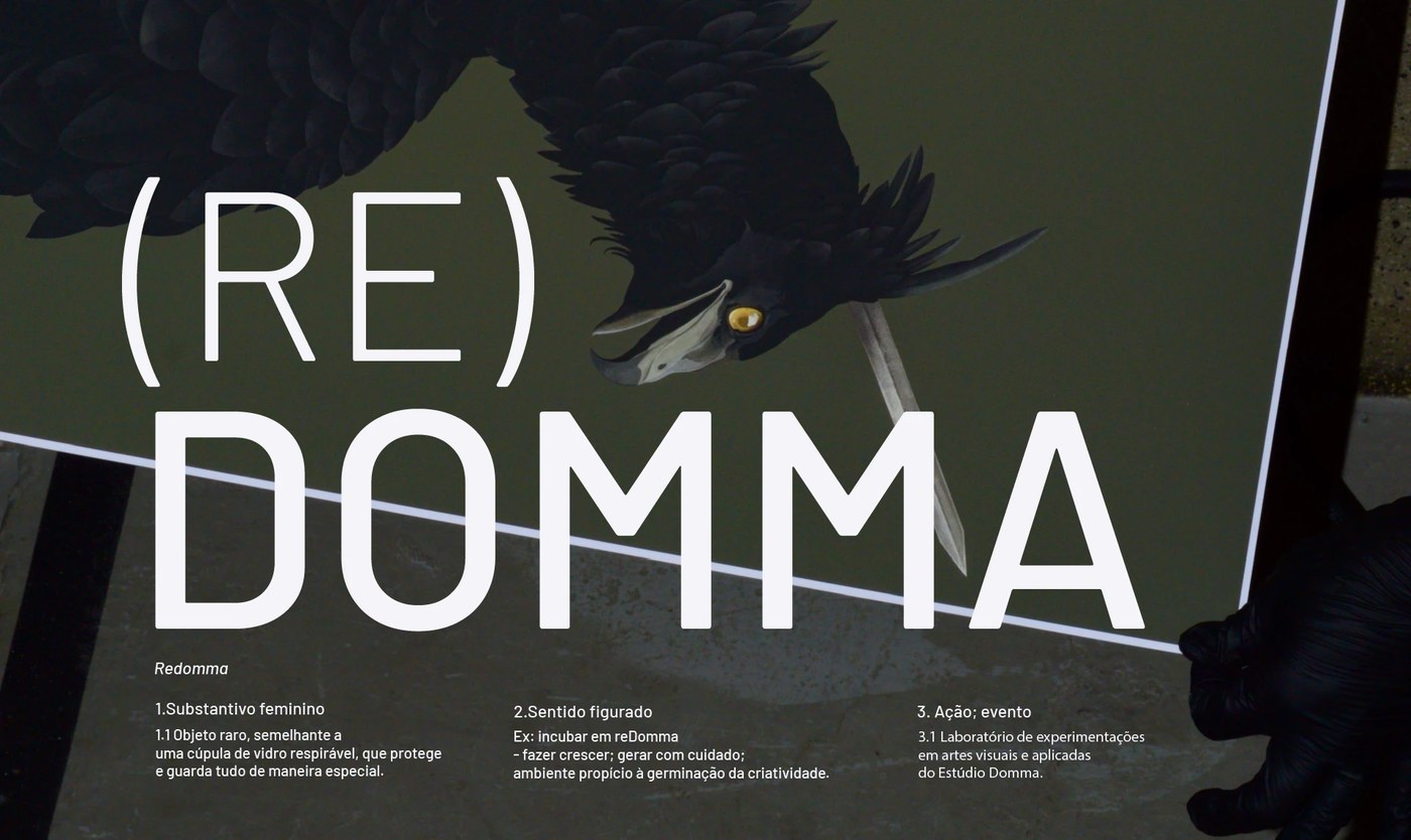
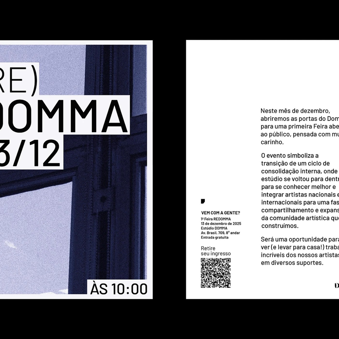
Tattoo culture often relies on predictable blackletter tropes, distressed textures, or illustrative flash motifs when translating its aesthetic outside the parlor. For (RE)DOMMA, Brazilian designer Gabriel Maciel formulated a distinct visual architecture for an art fair conceived by Domma, a renowned tattoo studio based in Belo Horizonte. Conceived as an experimental laboratory, the event allows resident tattooists to step beyond skin and express their creative voice across fine art mediums, from ceramics and screenprints to canvas paintings. The brand identity draws its conceptual foundation from the Portuguese word redoma—a protective glass bell jar that symbolizes care, incubation, and uncompromised creative exploration.
Geometric Typography in Brand Identity
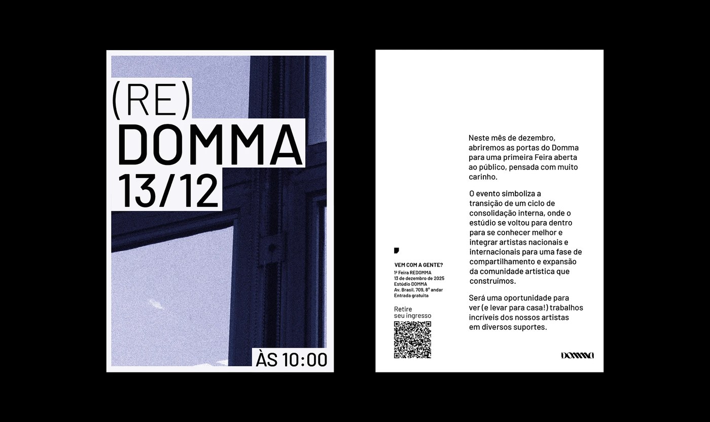
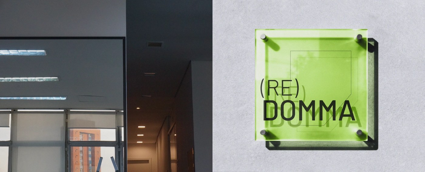
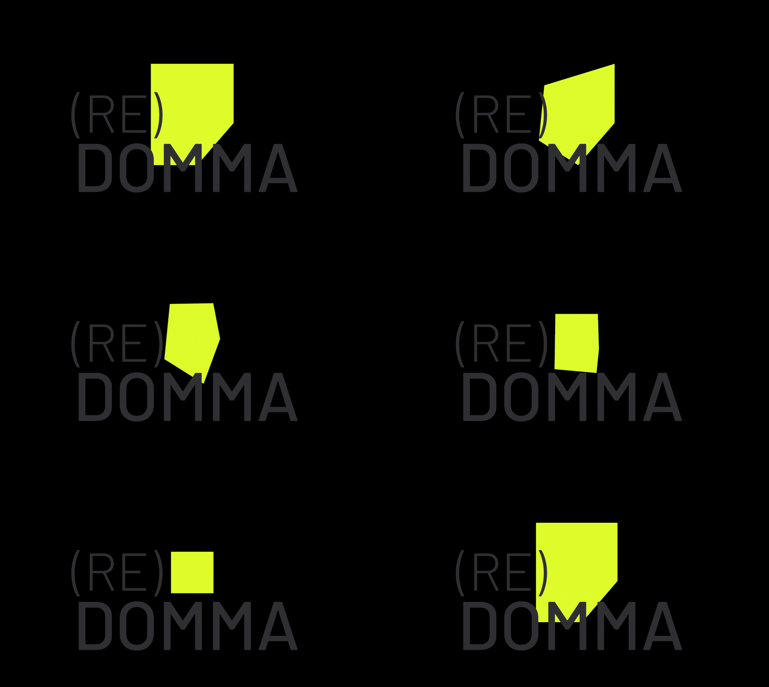
To express this protective sanctuary visually, the custom uppercase logotype adopts rigid, linear geometry that echoes the monumental industrial windows of Domma’s physical workspace. Intersecting diagonals and sharp apexes lend the letterforms architectural authority, creating immediate graphic tension against organic tattoo artworks. Complementing the wordmark is a modular polygonal graphic device symbolizing folded paper. Representing the raw sketchbook substrate where every tattoo concept begins, this faceted polygon folds and shifts across layouts, framing artist profiles and holding disparate media in a unified brand identity framework.
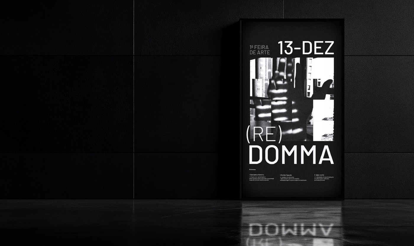
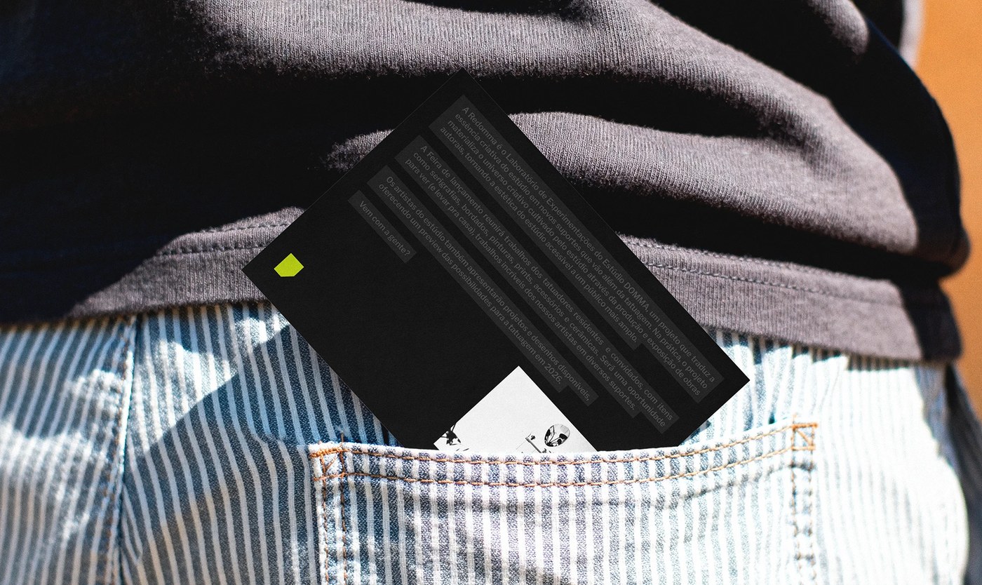
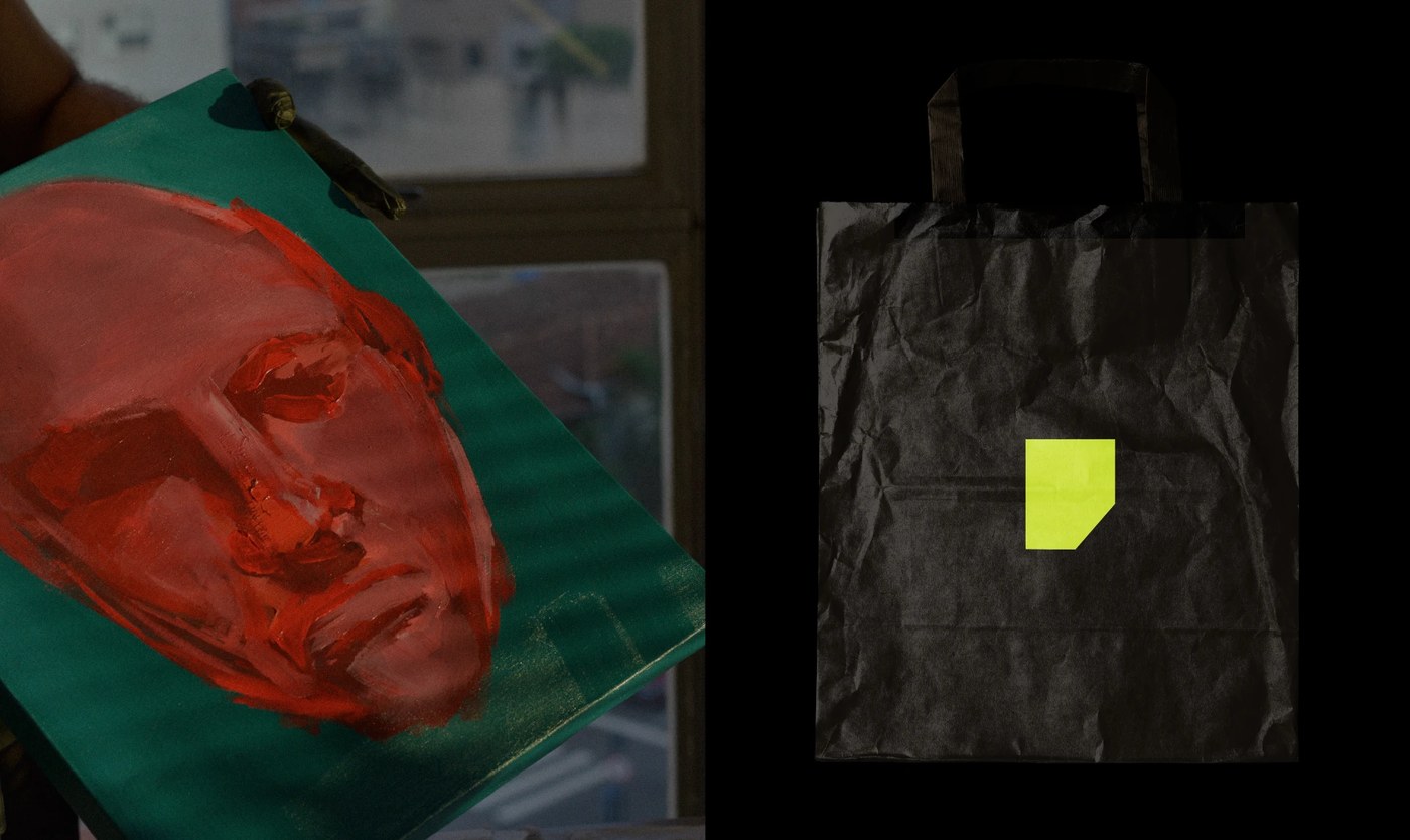
Materiality drives the fair’s physical collateral across exhibition spaces and urban street applications. Large-format screenprint posters feature heavy ink deposits on uncoated newsprint, while physical touchpoints include durable canvas tote bags, custom workwear jackets with embroidered patches, and printed ceramic exhibition tags. Production execution developed in Illustrator and Photoshop ensures that fine linework and precise geometric angles reproduce faithfully across textured textiles, matte paper stocks, and architectural signage. Through disciplined layout grids, this brand identity anchors an independent studio event as an enduring cultural institution.
See the full project by Gabriel Maciel on Behance.