BUILDWORKS Brand Identity Branding by Dati Kopadze
Dati Kopadze creates the BUILDWORKS branding identity using bold structural type, industrial stationery, and clean grid layouts.
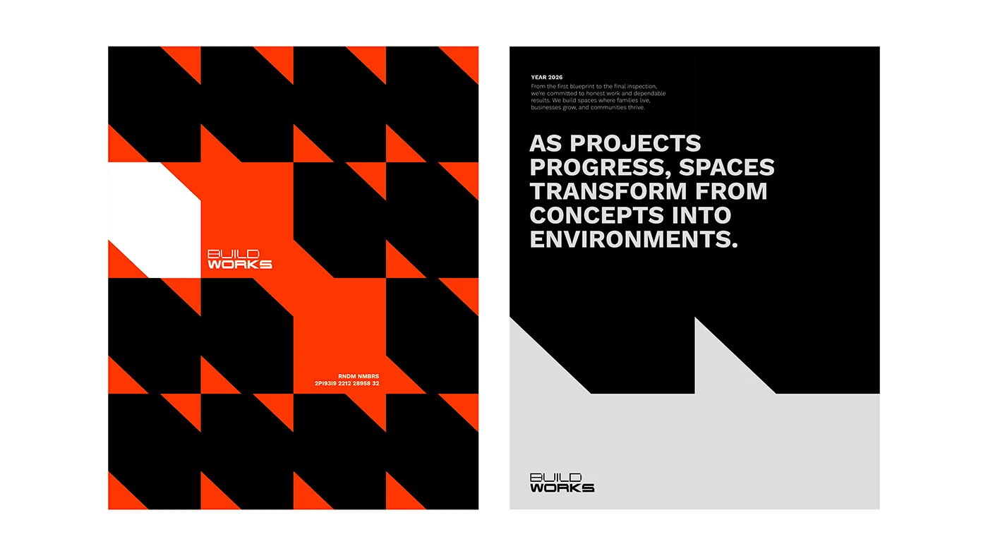
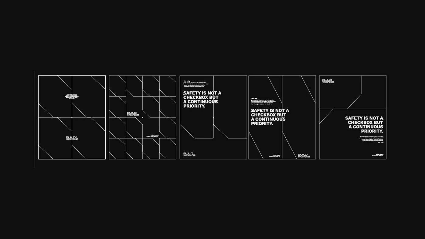
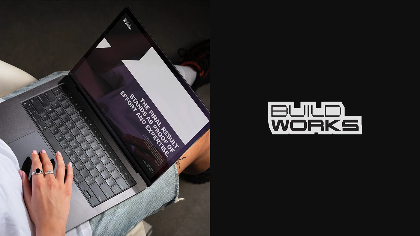
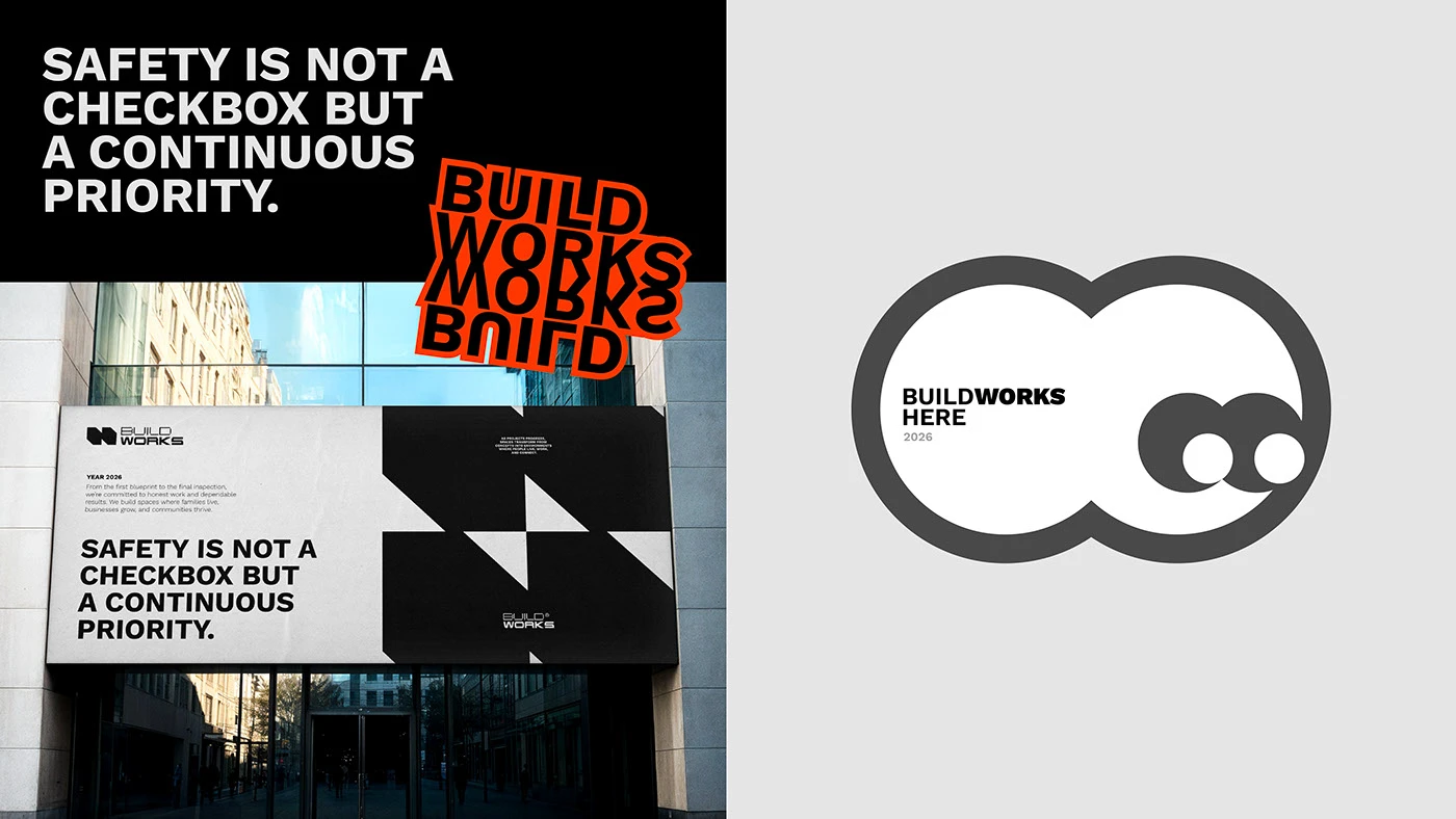
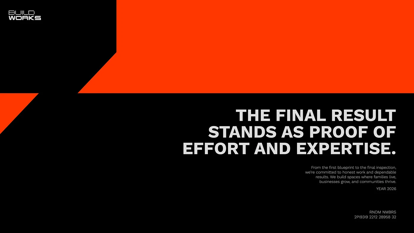
Dati Kopadze created a strong visual identity for construction firm BUILDWORKS. Building branding often relies on generic hard hat icons or plain block letters. Here, the designer builds a clean branding language rooted in grid lines and bold typography. Heavy sans serif letters anchor the primary wordmark across printed job site wraps and tool marks. A simple black and white palette pairs deep black ink with warm gray paper stock. The full branding system turns simple grid lines into clear visual symbols. High-contrast ink density keeps each printed sign looking sharp on job sites. Clear line spacing gives header text a clear stance on site doors.
Structural Construction Layouts and Branding System
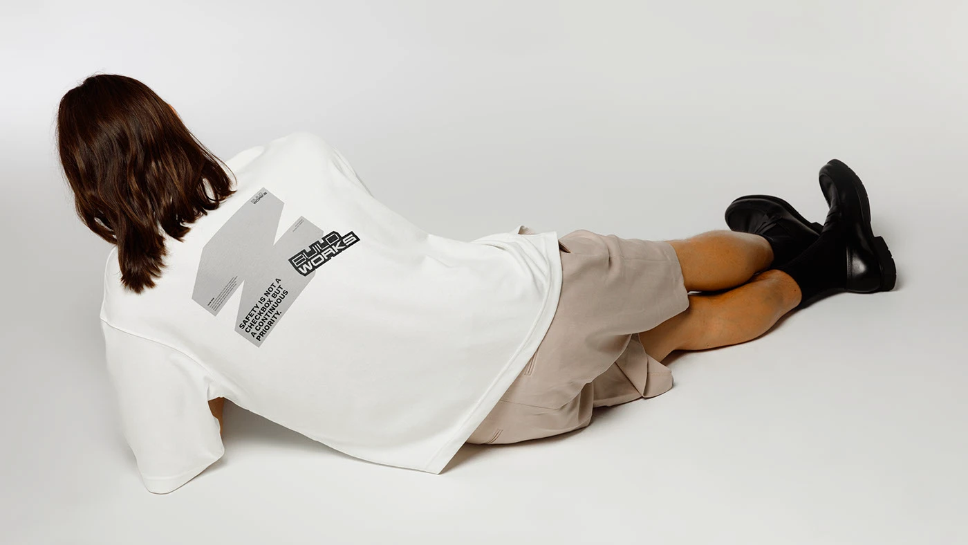
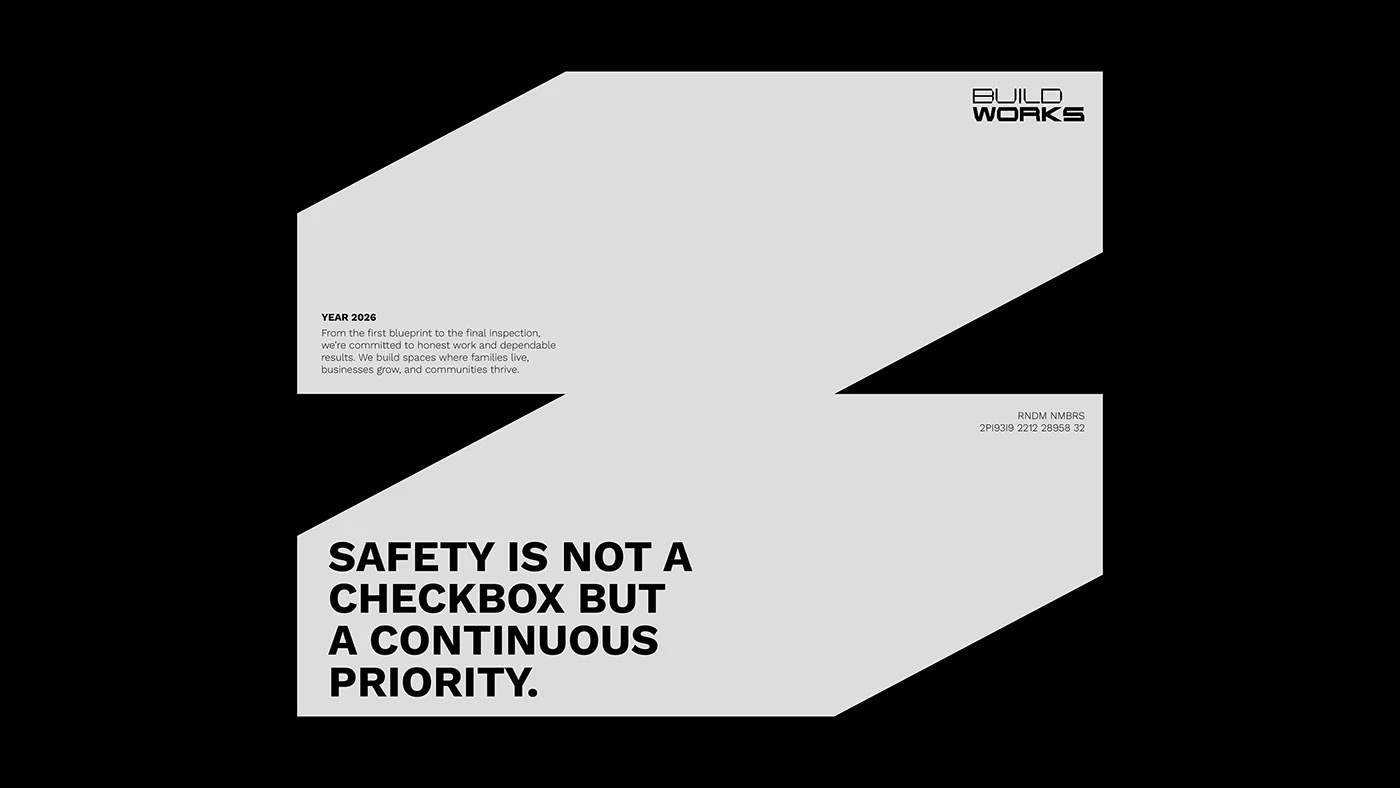
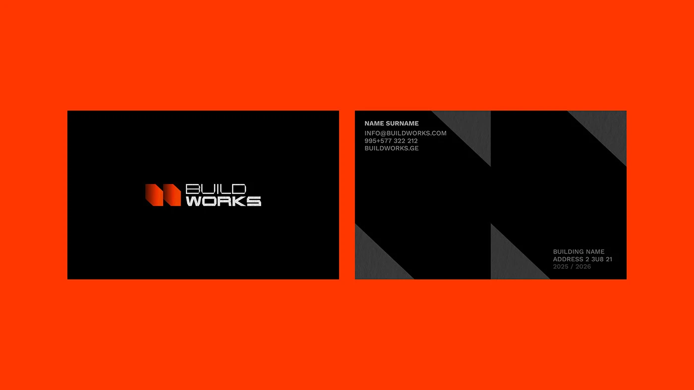
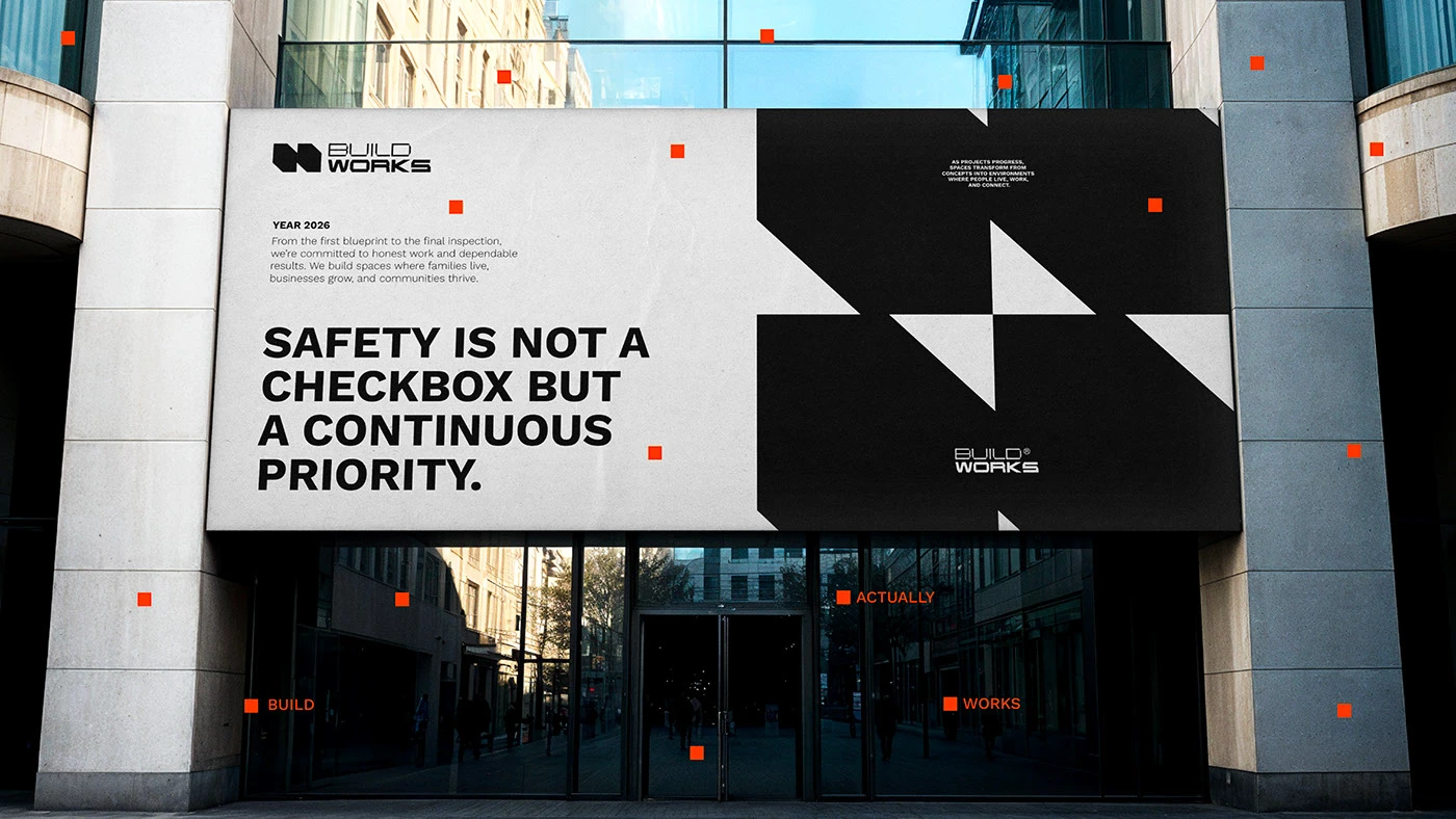
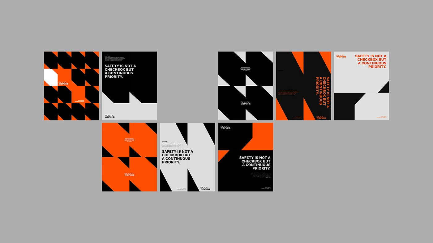
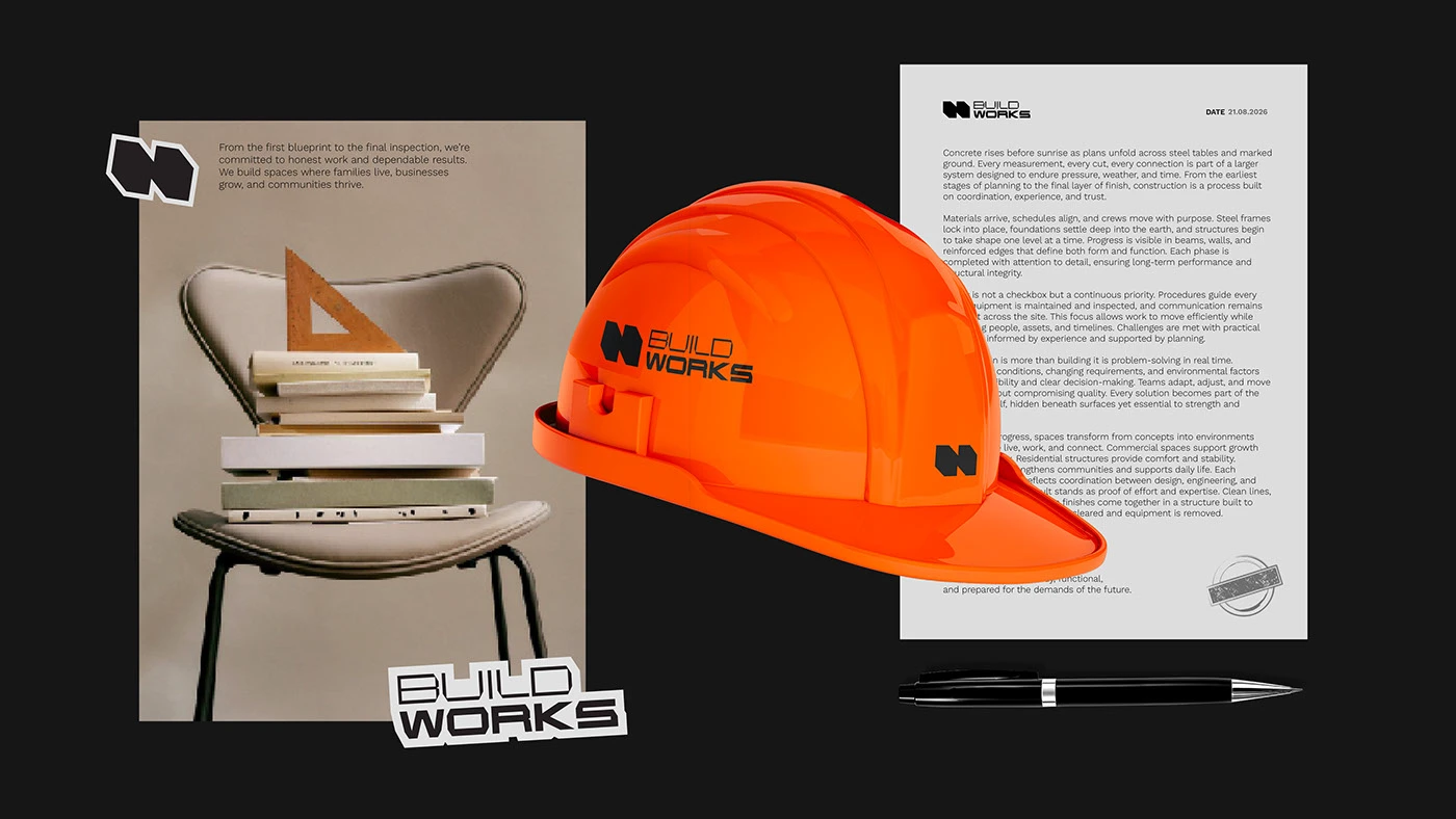
The visual system extends across site banners, safety gear, blueprint folders, and corporate paper assets. Each paper item uses heavy card stock with embossed grid lines that stand out in client meetings. The BUILDWORKS wordmark acts as a repeated stamp across page headers and project plans. By making grid lines a core part of the branding language, the designer builds a solid physical feel. Deep black fields and clean white space keep project facts easy to scan. Simple grid lines guide project facts for clear reading. Soft paper textures feel good in hand during reviews.
The project balances raw site strength with clean visual style. Neat layout grids organize project dates, engineer names, and safety rules without clutter. The print items give the company a solid stance. The work shows how targeted corporate branding simplifies print text without extra art. Simple type choices make site signs easy to read on screen and paper. To explore full identity specs and print items, explore Dati Kopadze's project portfolio.