Inside Senhor Paulinho’s Brand Identity for Arado 2026
Arado 2026 by Senhor Paulinho is a brand identity system for Madrasta Dance built on hand-drawn typography, ink textures, and yellow posters.
Portuguese graphic designer Paulo Graça (known as Senhor Paulinho) designed the visual system for the 2026 edition of ARADO, a dance and performing arts festival organized by Madrasta Dance across Pias and Ferreira do Zêzere. The word "arado" translates to plow, carrying the literal idea of cutting open a path through raw earth. The mark moves like a dancer. Built around an ochre yellow (#F6CE60), carbon black, and stark white palette, this brand identity treats layout composition like live choreography where control and improvisation push against one another.
Choreographed Typography in a Living Brand Identity
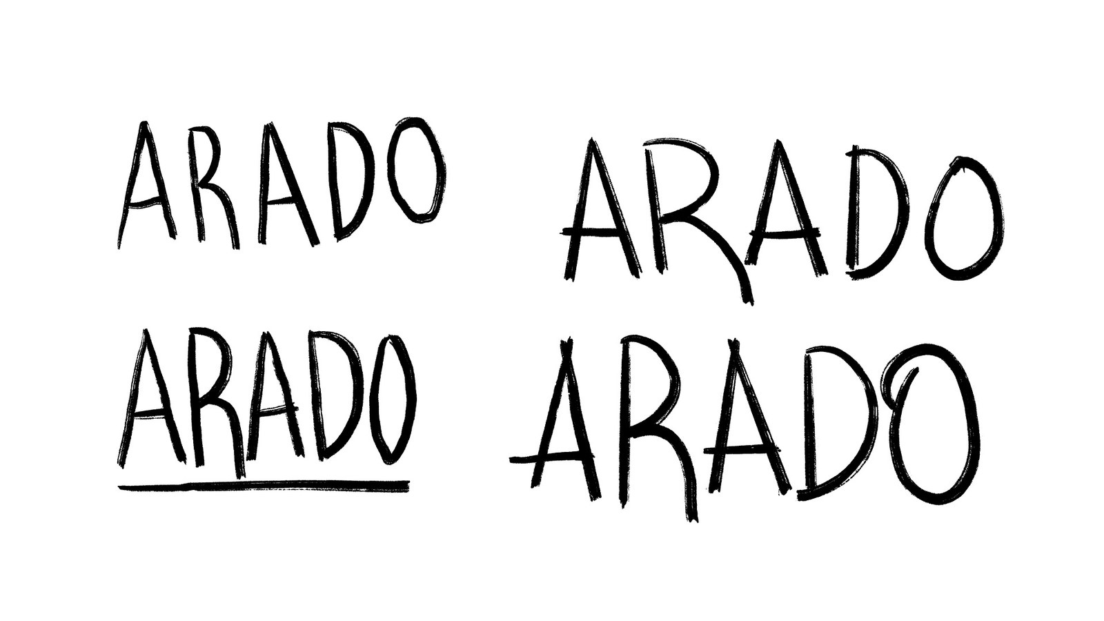
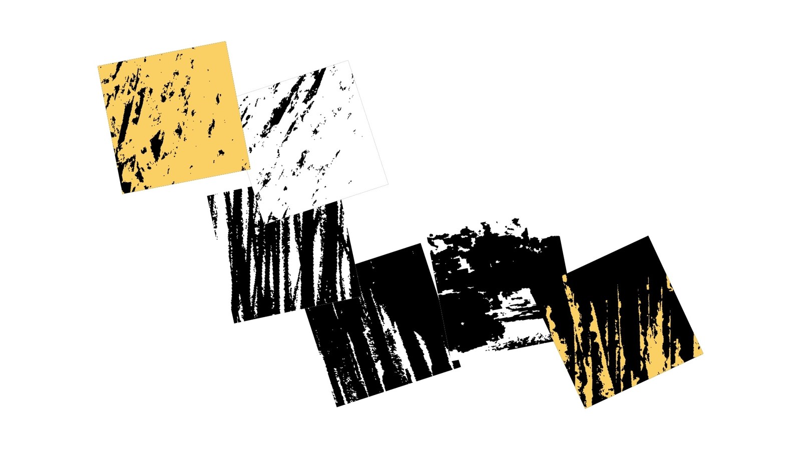
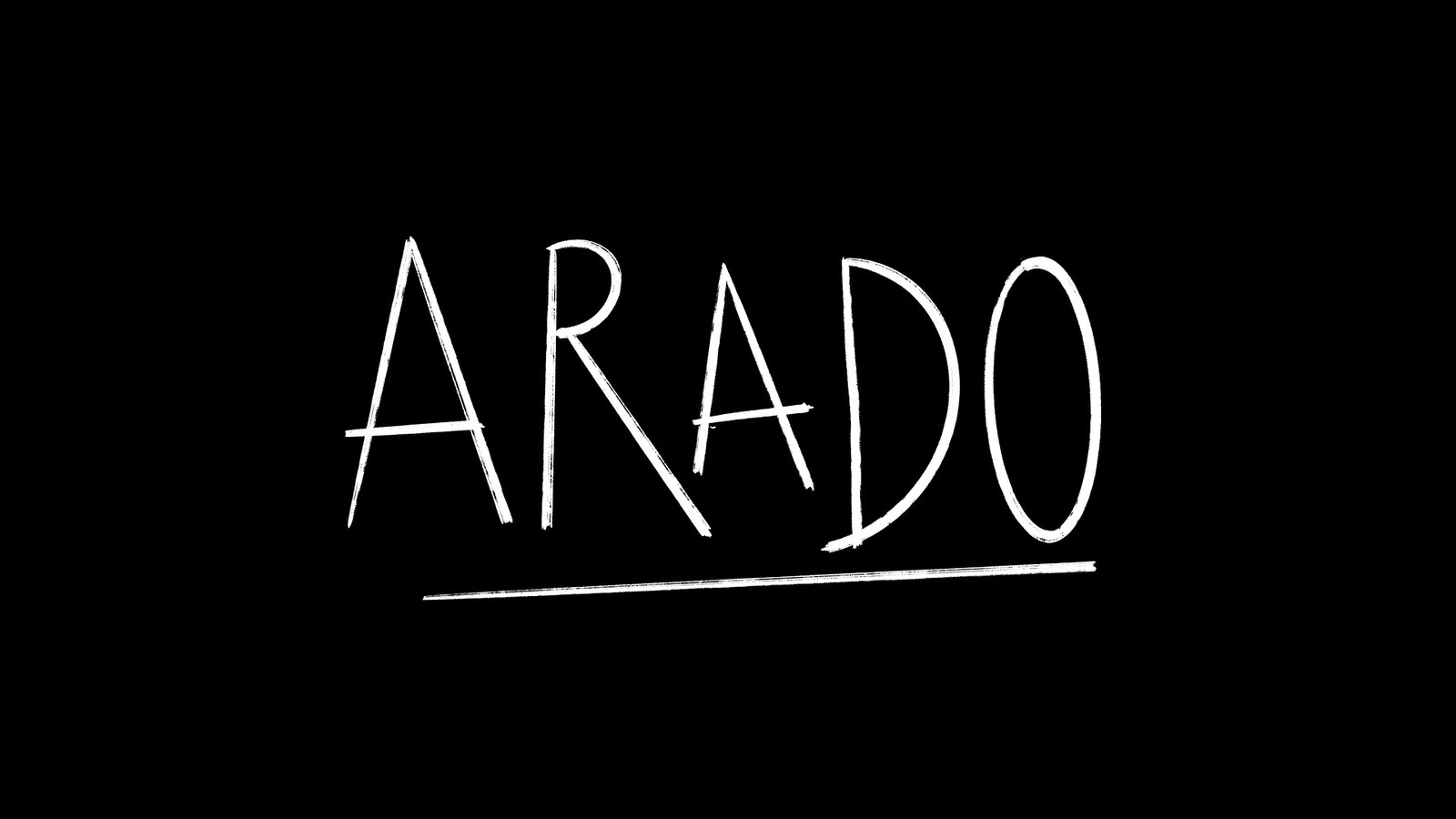
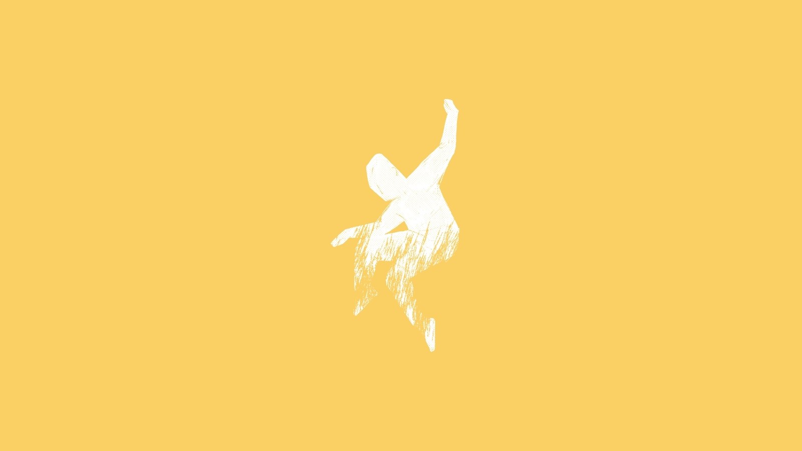
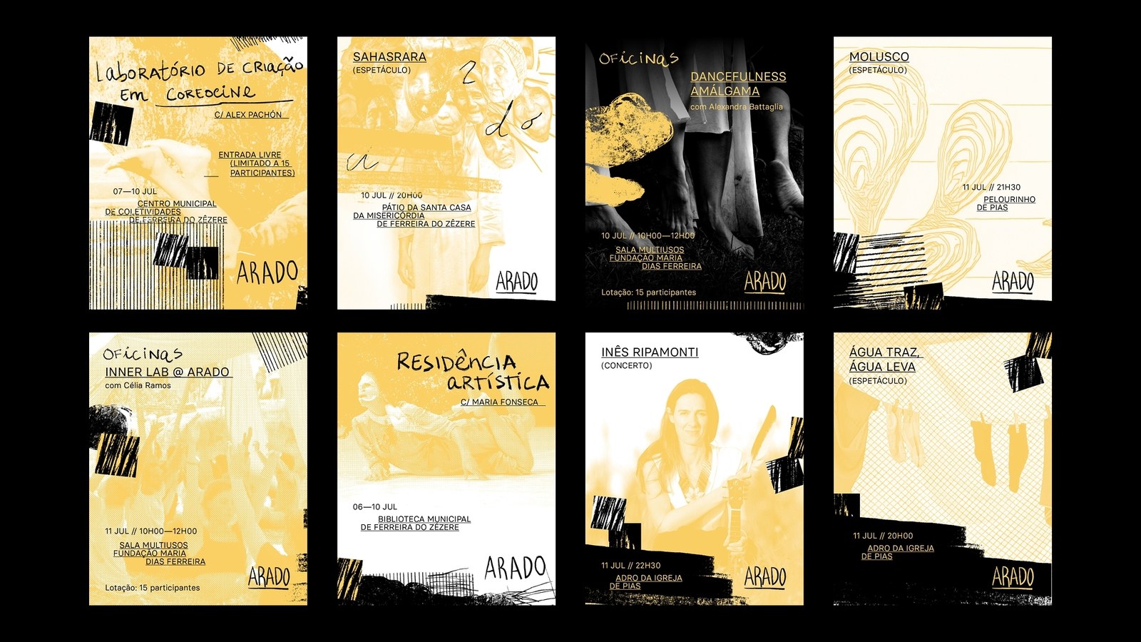
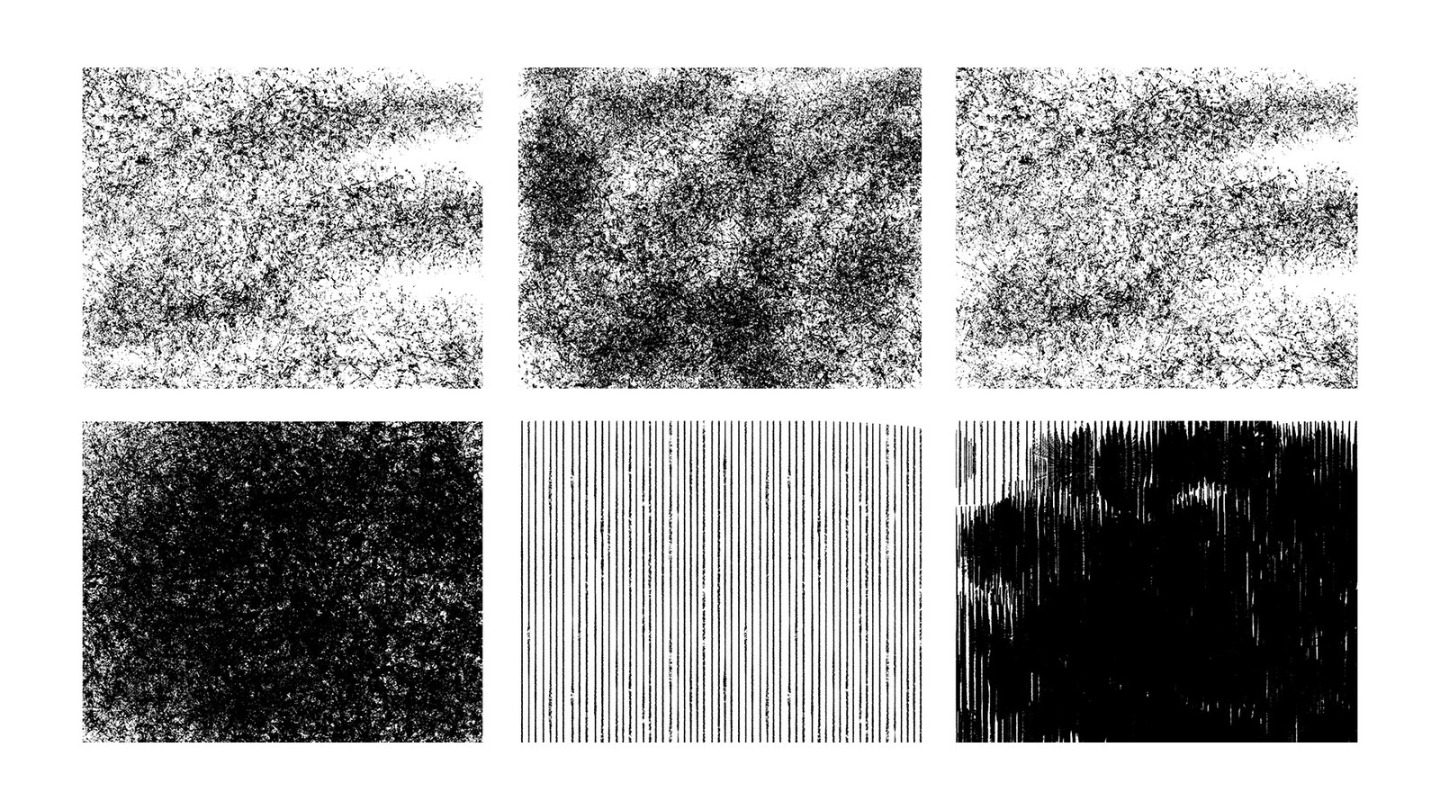
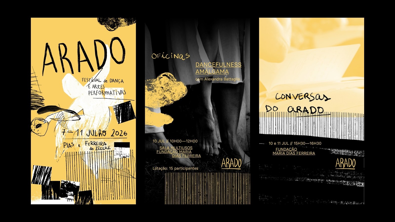
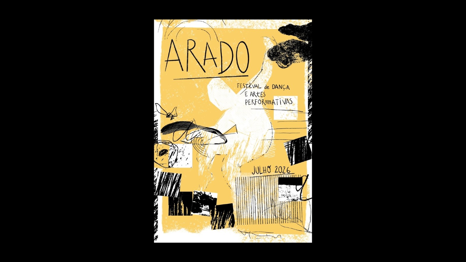
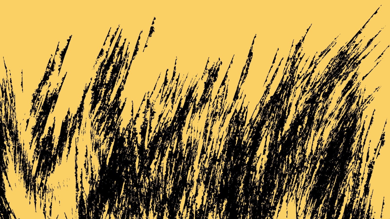
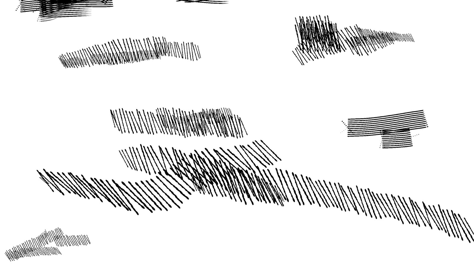
Everything starts with physical mark-making on paper. Senhor Paulinho pairs a tall, scratchy handwritten typeface with six distinct ink and dry-brush textures: dense charcoal stippling, parallel vertical comb strokes, and cross-hatched pen lines. Across the wordmark sheets, the five letters of ARADO shift in width and slant across four variations so the logotype never freezes into a static stamp. It breathes on the page. When layered over the white chalk silhouette of a leaping figure or cropped into rotated square swatches, those rough ink edges give the brand identity an urgent, handmade pulse without losing legibility on event grids and vertical story templates.
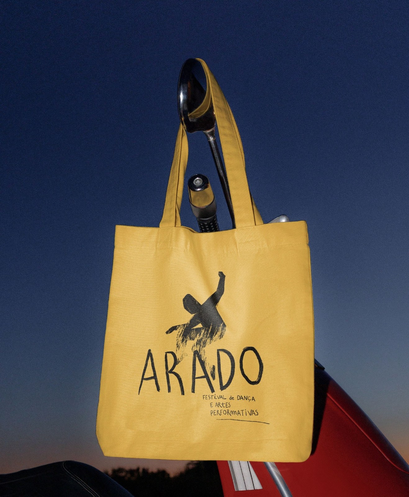
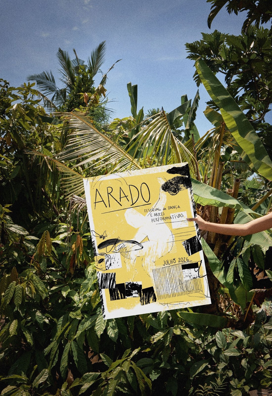
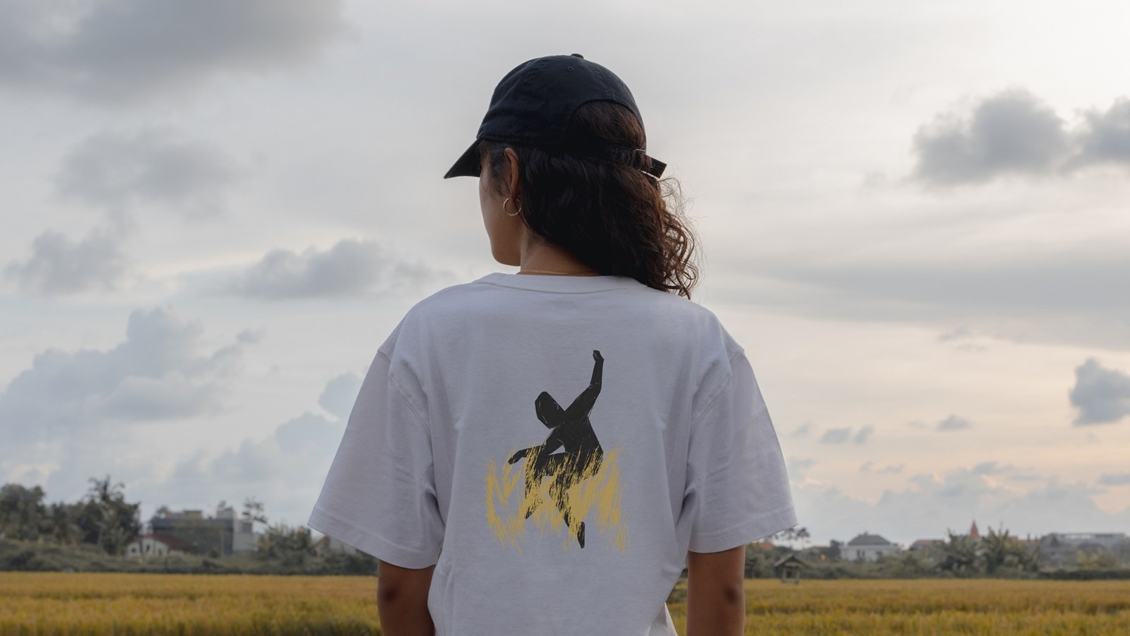
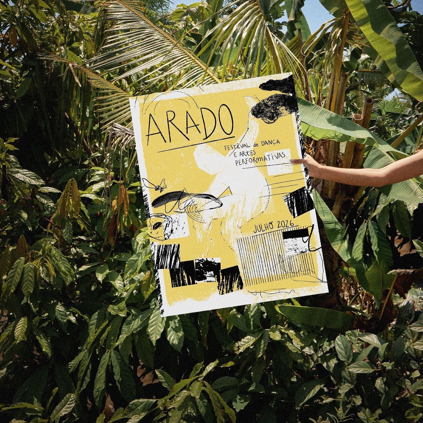
The system holds up cleanly when translated from screen to physical print and textiles. On the July 2026 main poster, the hand-lettered header sits above tilted black texture blocks, fine ruled baselines, and monochrome photography snippets that anchor workshop and performance schedules. That same visual tension carries over to the ochre yellow canvas tote bag and heavyweight white t-shirt, where the stenciled dancer and brush-stroked wordmark sit directly in the fibers. Every layout feels hand-pulled and immediate, proving a festival brand identity doesn't need rigid corporate templates to stay cohesive across print, motion, and apparel.
See more from Senhor Paulinho on their official website.