Typography: Fluxetype Variable Typeface by Nikita Kanarev
Discover Fluxetype, a versatile typography system by Nikita Kanarev bridging humanist sans and serifless roman across three variable axes.
Bridging the structural clarity of a humanist sans with the classical proportions of a serifless roman requires exceptional anatomical precision. Designed by type designer Nikita Kanarev, Fluxetype establishes a cohesive visual language engineered for digital screens, kinetic motion, and large-scale print specimens. The release covers over three hundred languages across Latin and Cyrillic scripts, offering eighty-four pre-set static instances alongside a unified variable font continuum. Rather than forcing designers to combine unrelated font families across different brand touchpoints, this typography system delivers an adaptable voice from micro captions to monumental exhibition titles.
Three Variable Axes in Contemporary Typography
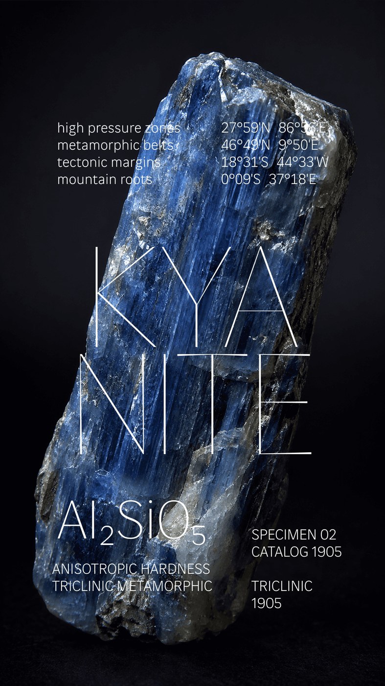
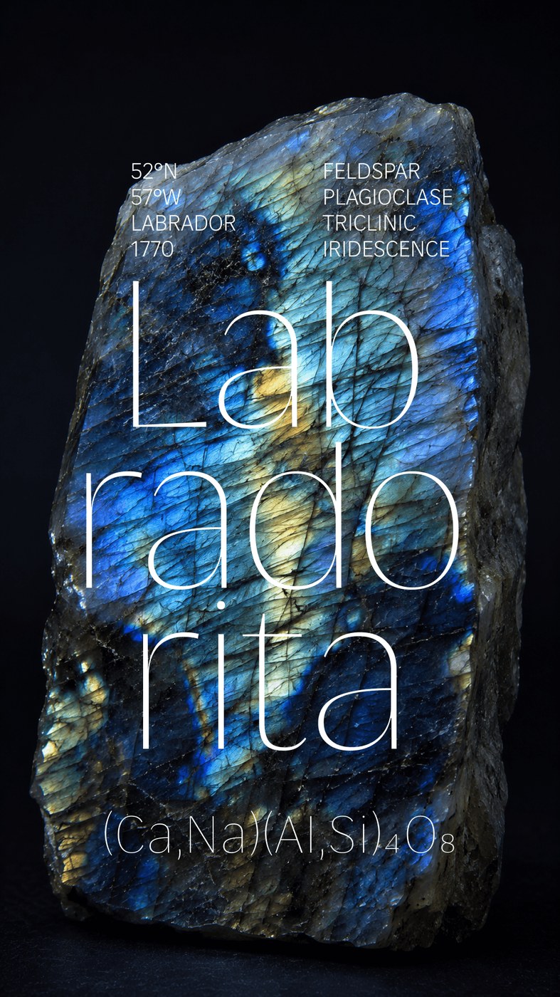
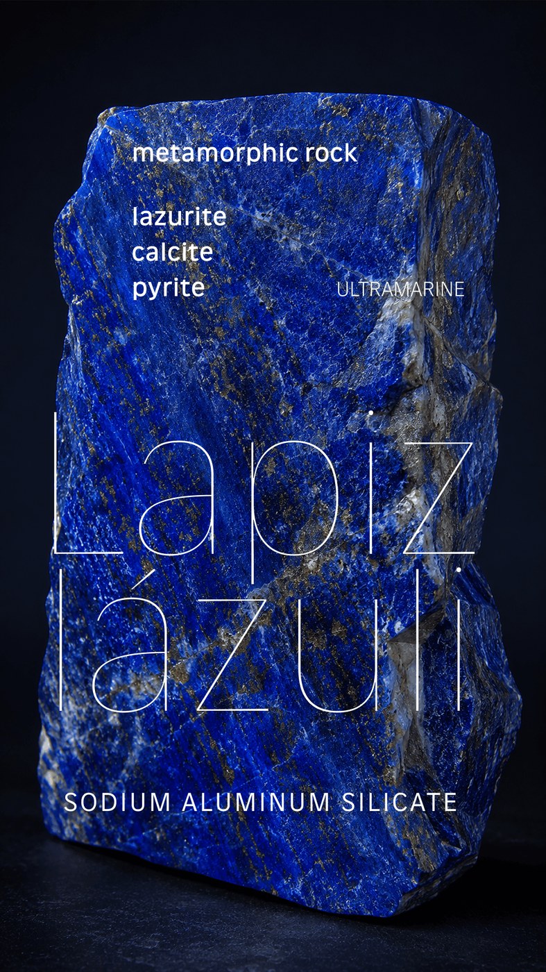
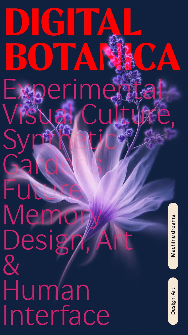
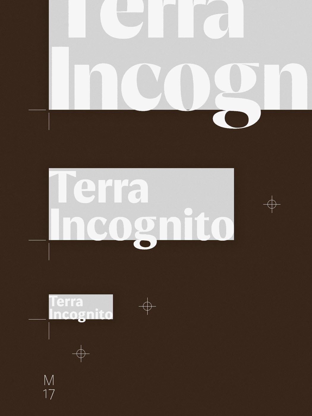
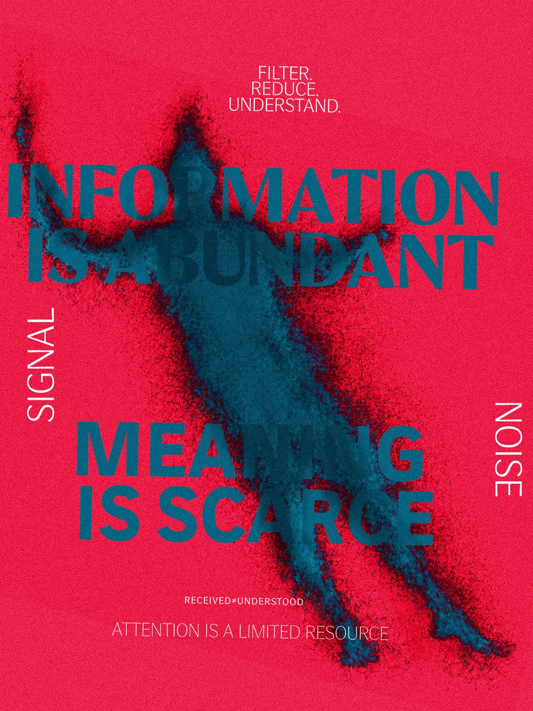
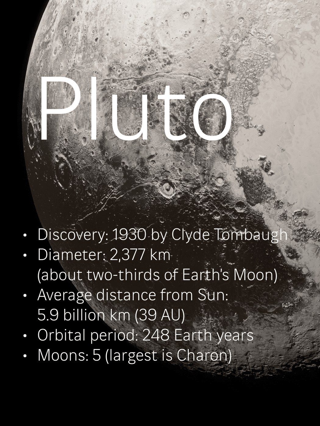
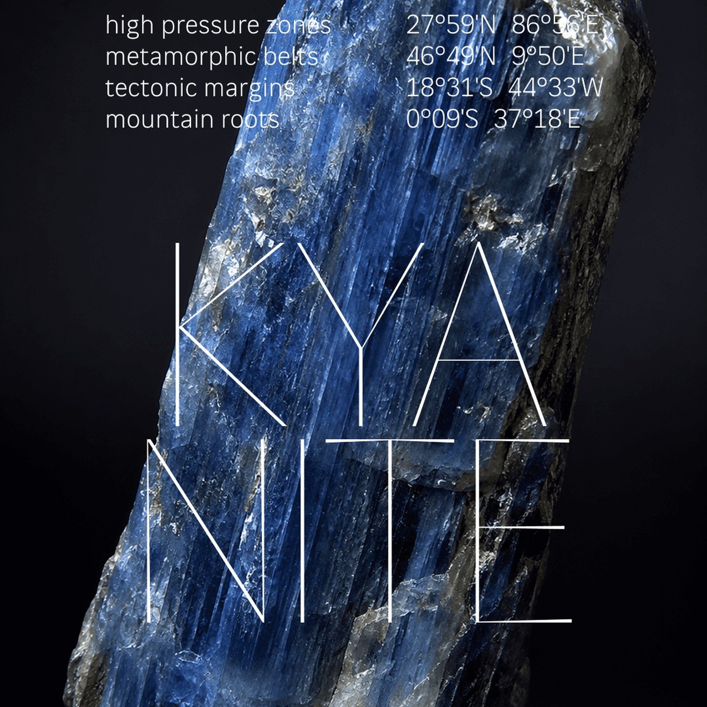
The accompanying specimen posters demonstrate the family's broad expressive range by pairing letterforms with high-texture macro photography and scientific telemetry. In the mineral specimen series, hairline display weights overlay crystalline kyanite, iridescent labradorite, and lapis lazuli rocks, framed by chemical formulas and geographic coordinates. Other posters present optical scaling tests and registration crosshairs, proving how subtle stroke modulations preserve legibility against granular backgrounds. Planetary diagrams and botanical compositions further highlight how high-contrast letterforms interact with complex natural textures without losing structural tension. This refined typography approach treats geological surfaces as integral layout backdrops.
Beneath its expressive display qualities lies rigorous interface utility. Fluxetype introduces three dedicated x-height modes: Petite at seventy percent, Normal at seventy-four percent, and Grande at seventy-eight percent. In Grande mode, ascenders and descenders automatically reduce. This allows lowercase body text to maximize optical volume in dense digital UI navigation while maintaining comfortable line spacing. By fluidly shifting from zero-contrast text weights to high-contrast display cuts, this sophisticated typography project offers art directors a comprehensive tool that resolves the font pairing challenge across editorial publications, digital products, and physical posters.
Explore the full variable typeface and specimen posters by Nikita Kanarev on Fluxetype.