Manifest rebrands flexible workspace operator Landmark Space as Elementa Workspace
The brand transformation will roll out across all thirty of Elementa’s properties, anchoring the operator’s market position in measurable research regarding human performance, focus, and well-being in the workplace. The visual identity centres on a dynamic grid framework that draws inspiration from the periodic table and the multi-functional layout plans of flexible modern offices.
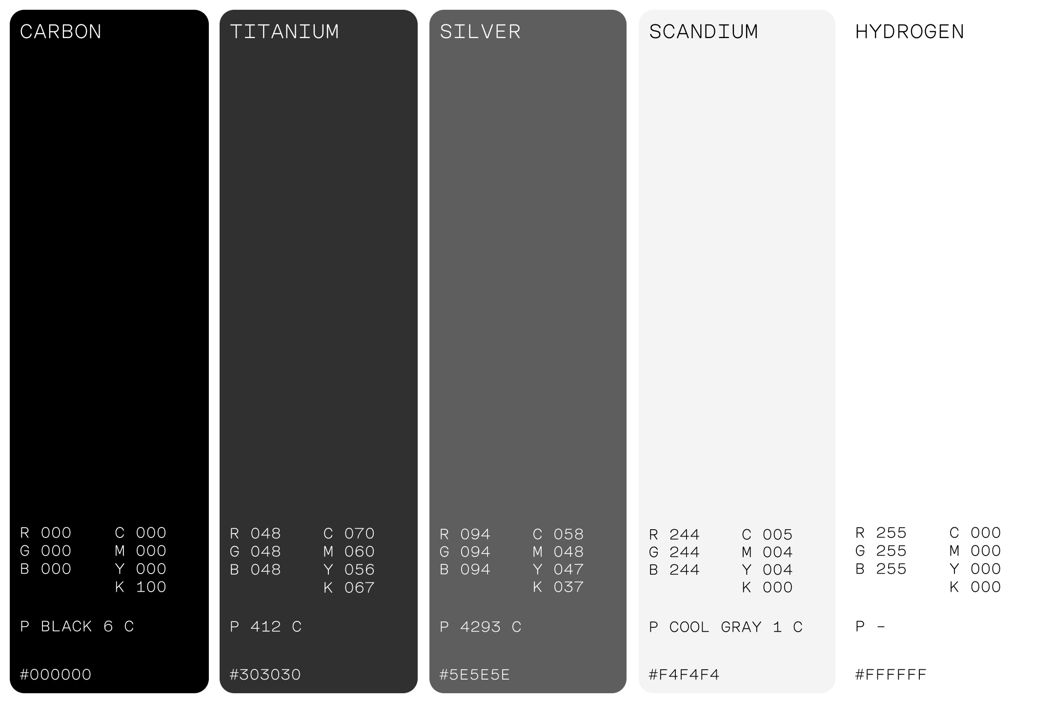
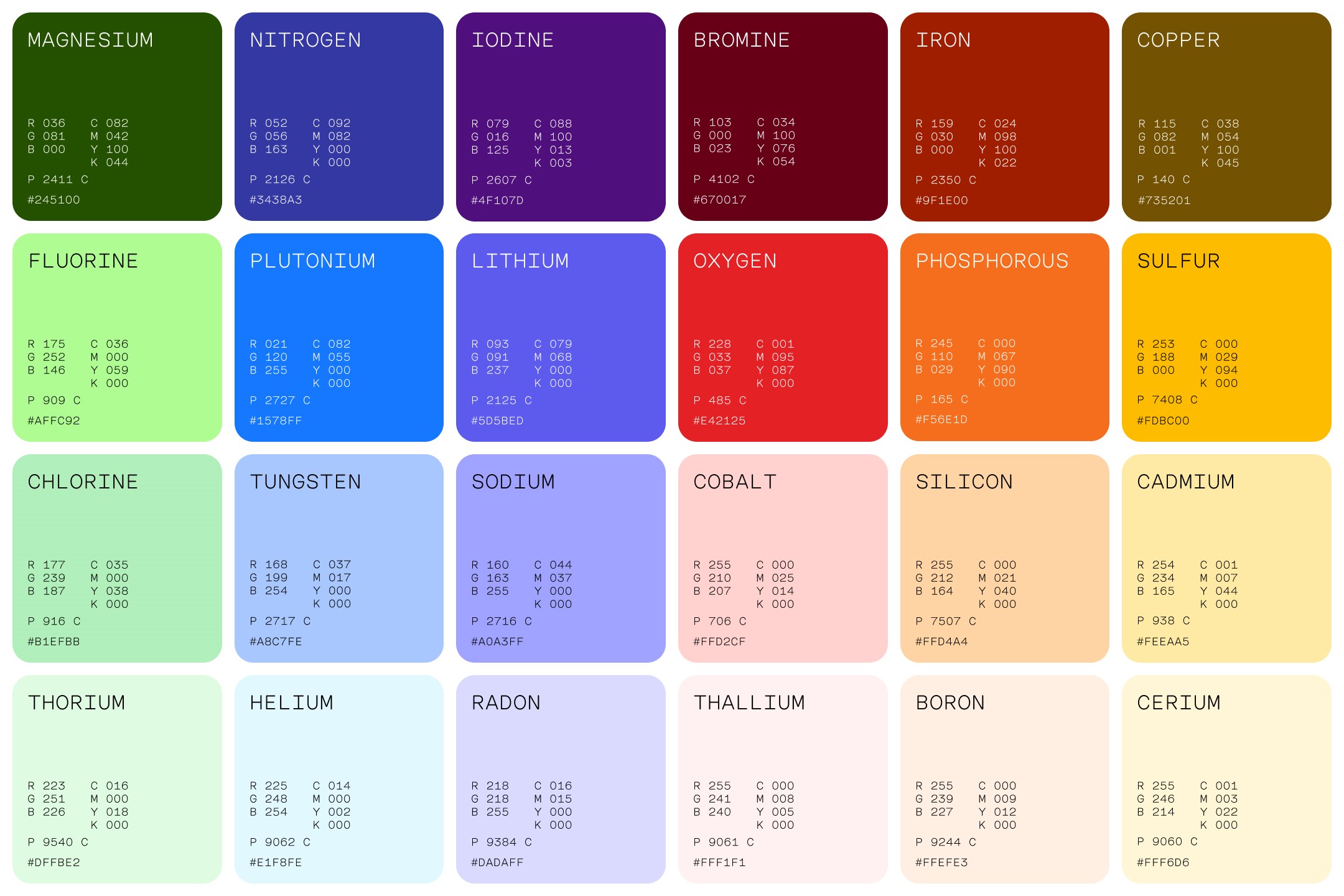
Manifest created a visual language using a technical colour palette divided into core neutral base tones, including Carbon, Titanium, Silver, and Scandium, complemented by a broad range of vibrant accent colours named directly after chemical elements such as Magnesium, Plutonium, Cobalt, Oxygen, and Helium.
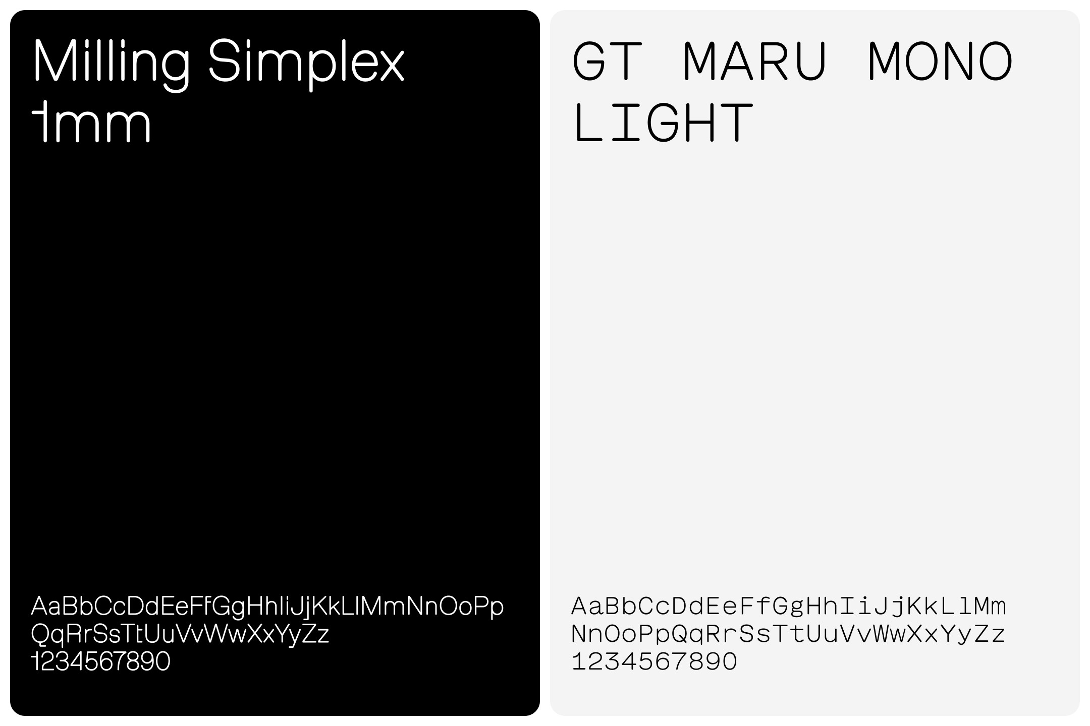
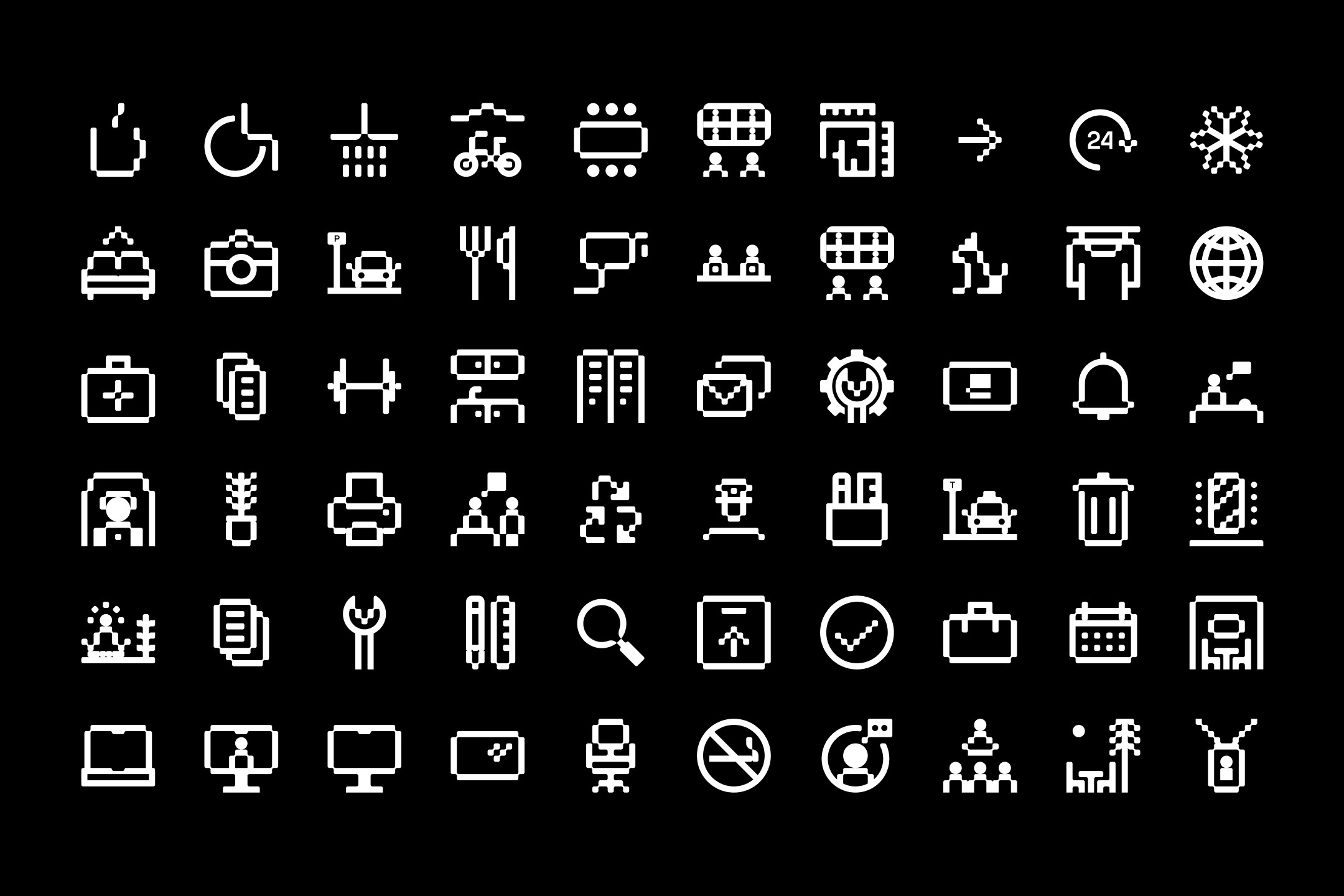
Typography is led by Milling Simplex 1mm and GT Maru Mono Light, paired alongside a bespoke suite of grid-based, pixelated icons designed for signage, digital navigation, and physical touchpoints.
Kate Cox, chief revenue officer at Elementa, said, “Elementa is a brand unlike any other in the category. The way Manifest works is to identify the cultural significance of a brand and bring that to life through both strategy and creative execution. The result is something quite extraordinary that is already making a positive impact on our business.”
Delivering scale across thirty locations
Manifest expanded the core identity across a multi-disciplinary brief, developing tailored sub-brands for each of Elementa’s thirty locations alongside a redesigned website and overhaul of the company’s digital marketing ecosystem.
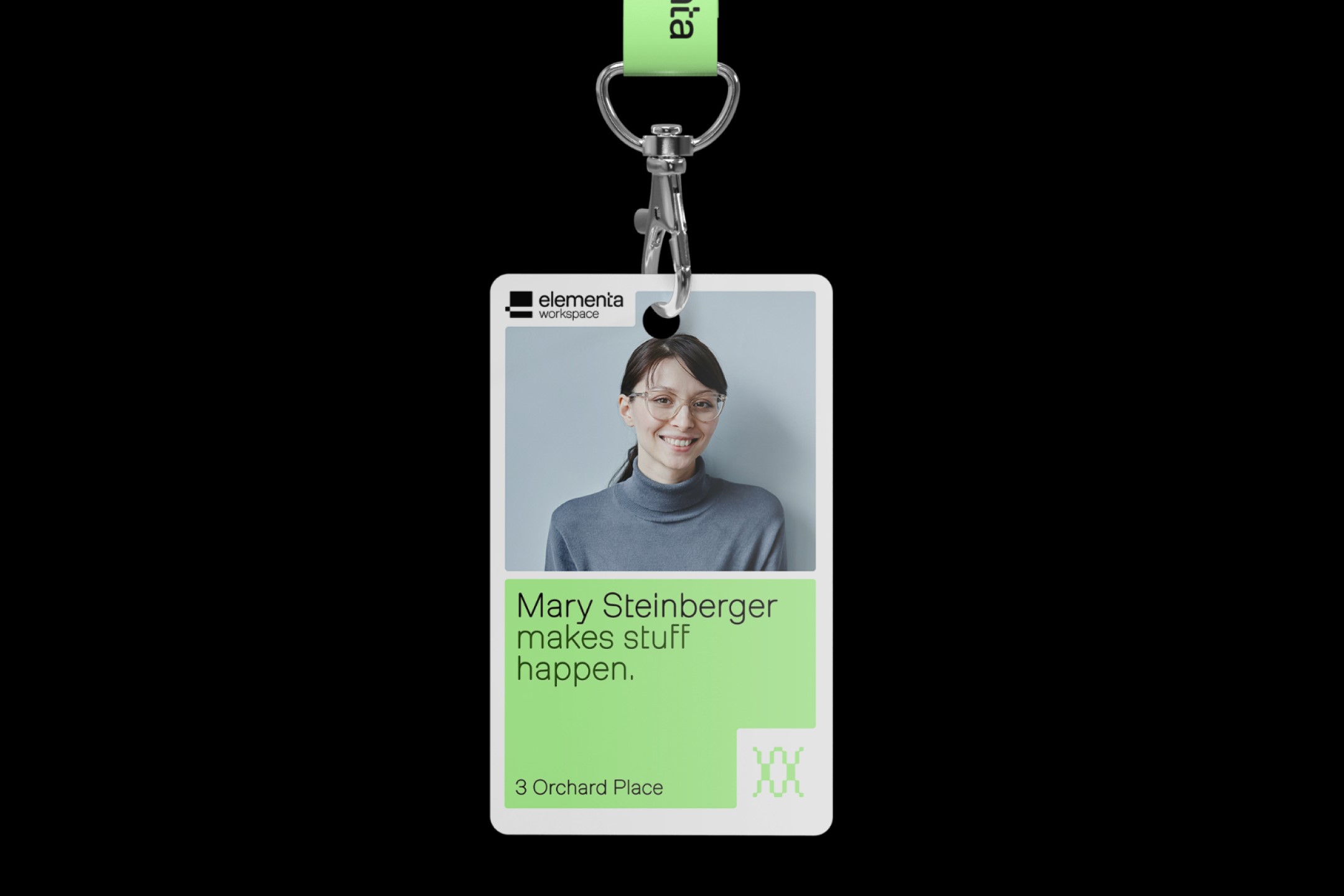
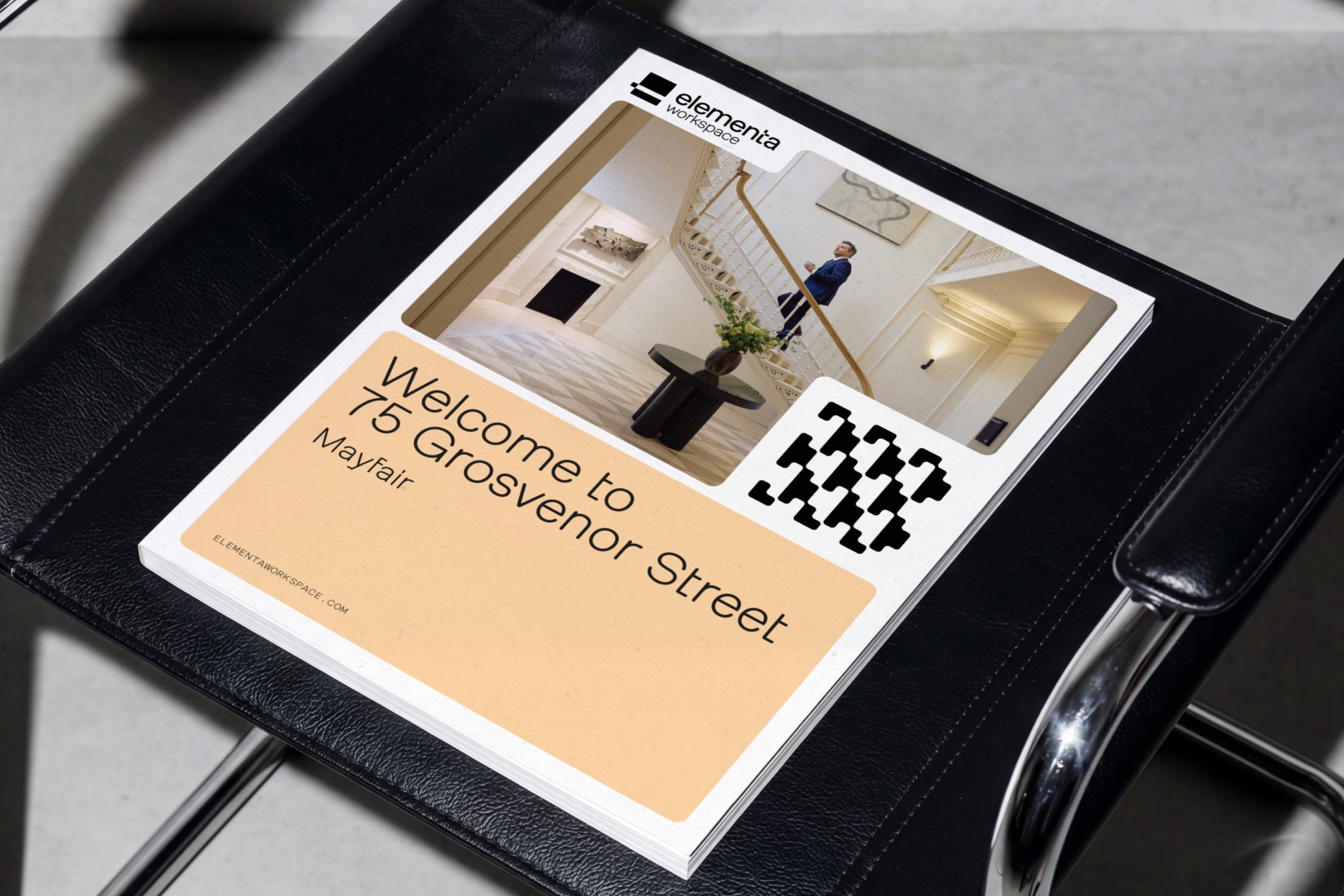

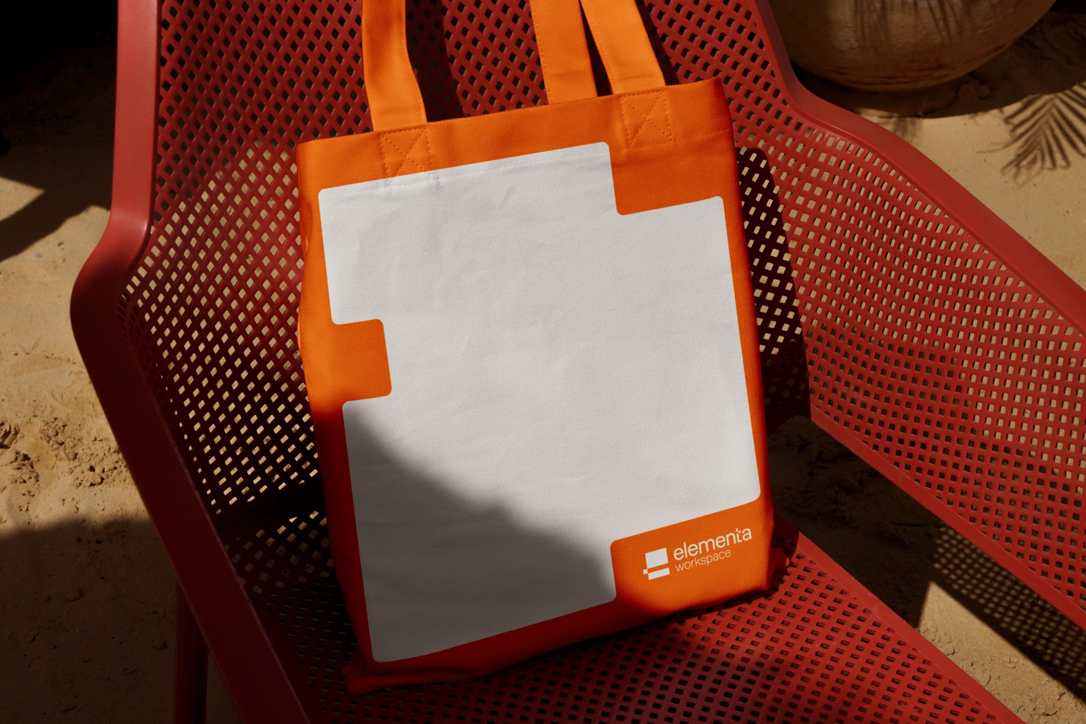
To support the launch, the agency produced a go-to-market toolkit covering social media assets, display advertising, event management guidelines, and thought leadership frameworks, alongside providing direct public relations and social media management support.
Martin Farrar-Smith, chief design officer at Manifest Group, said, “The new name and strategic direction opened up a huge world of opportunities for the visual direction. This is a huge market where all the major players are clawing to own a niche, but our research proved the customer is looking for a holistic solution.
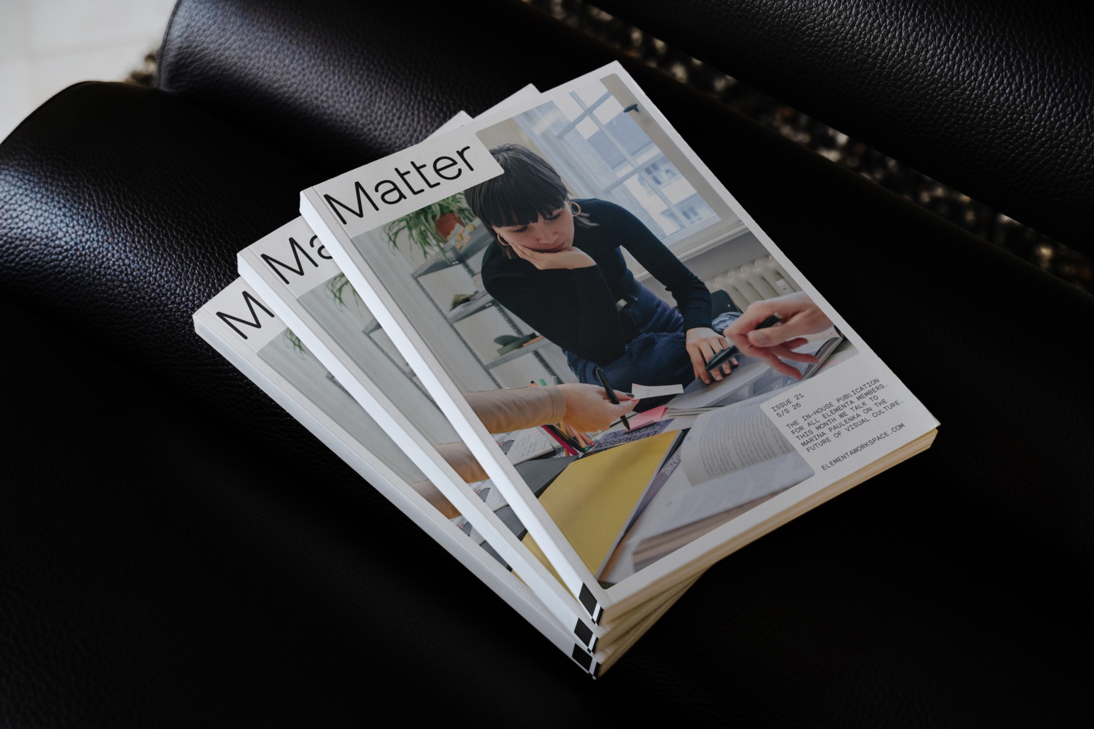

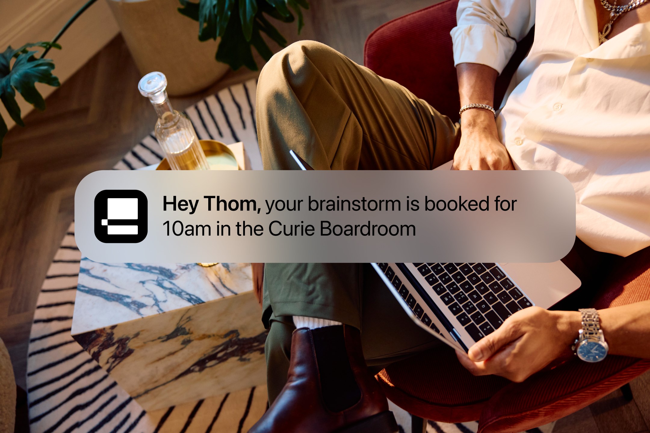
“Elementa is built to make a comprehensive approach feel controlled and comprehensible, and it is a real shift not just for the organisation, but for the sector as a whole.”
Long-term strategic framework
The rebrand reflects a long-term commitment to human-centric design standards across all future site developments.
Cox added, “The Elementa brand gives us something most operators in this market don’t have — a name and identity backed by a decade of evidence and human-centric design. Science at Work isn’t a campaign line; it’s the standard we’re now building every new building against. And Manifest isn’t just a creative partner; it’s a strategic advisor, which is how we’ve reached such a high quality of work.”
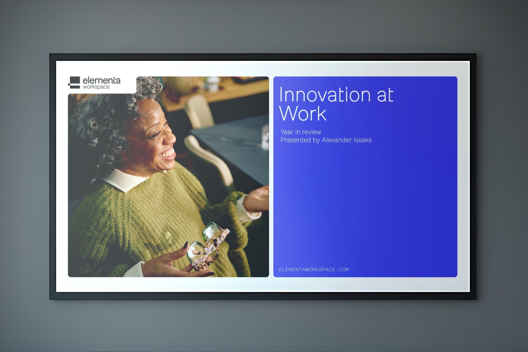

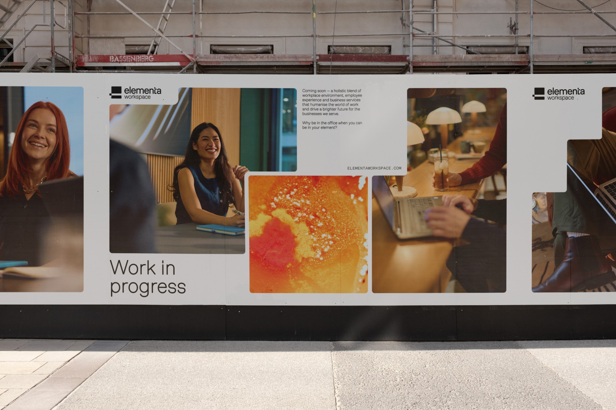
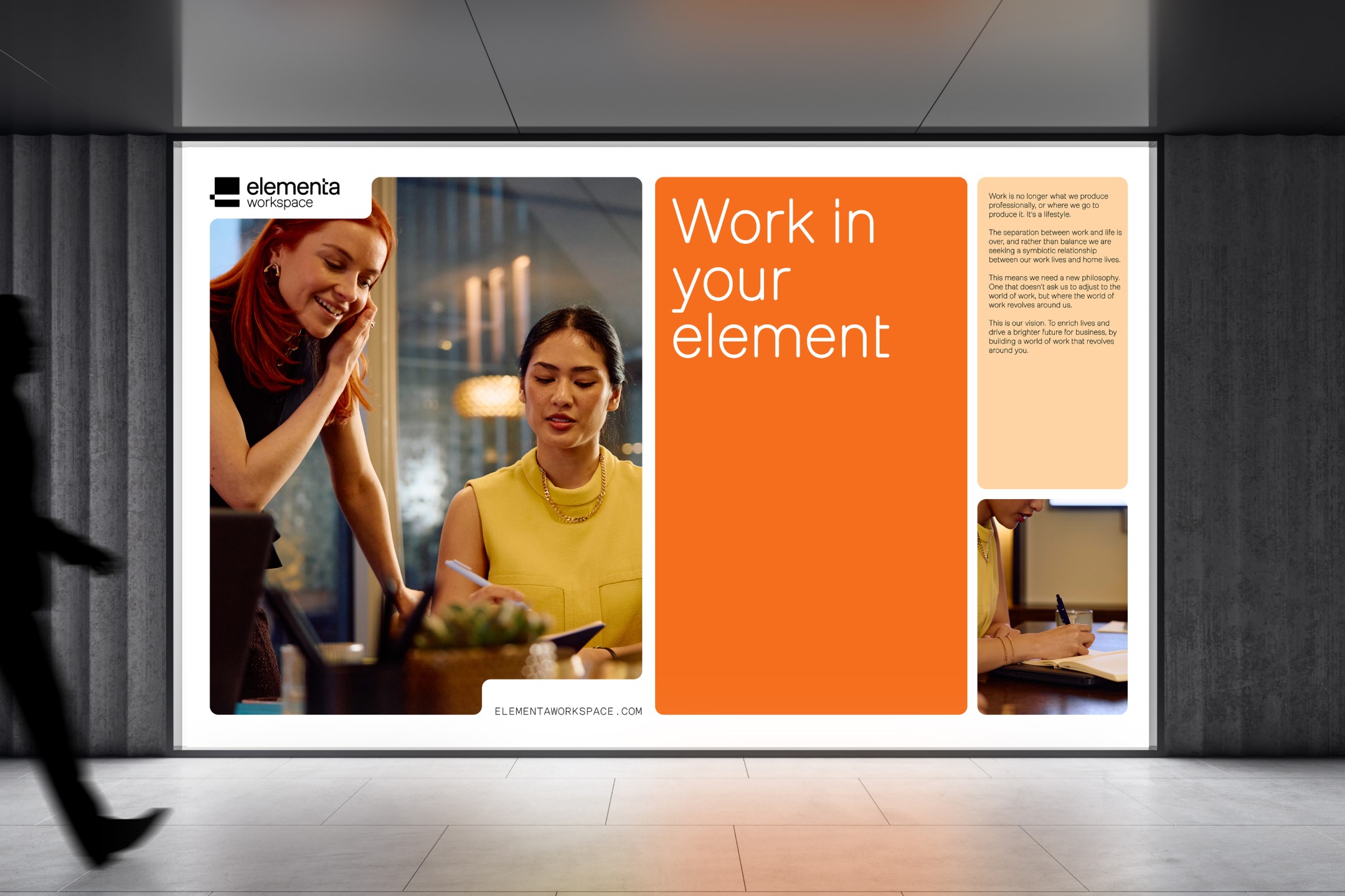
The full visual identity system is now live across Elementa’s digital platforms and is actively being rolled out across its physical workspace estate.