Amaru Photography Brand Identity and Editorial Design
Amaru is a lifestyle photography brand identity by Fernando Rodrigues inspired by Andean cultural heritage and warm earth tones.
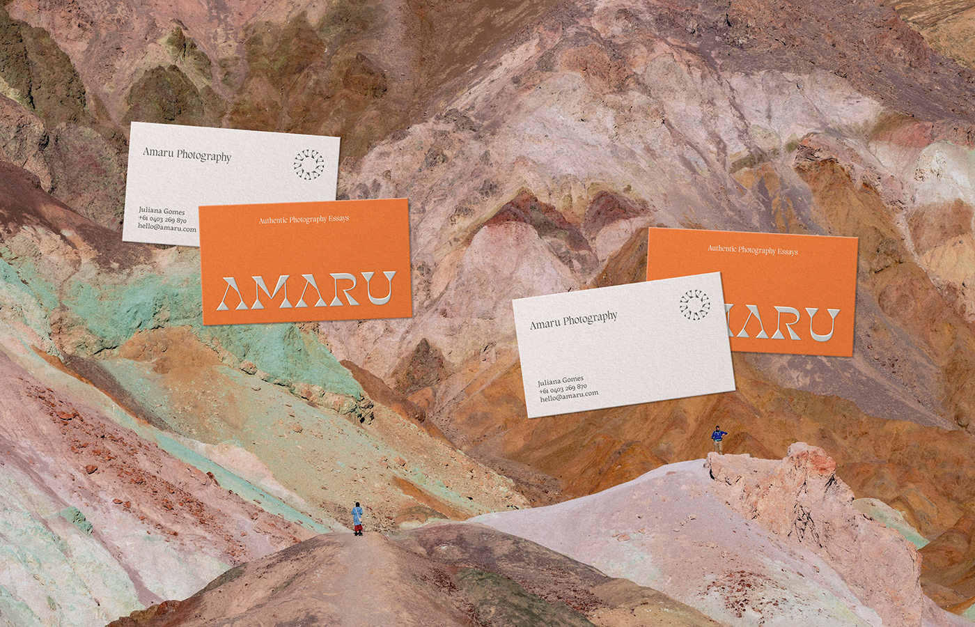
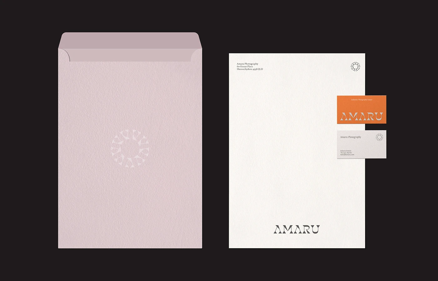
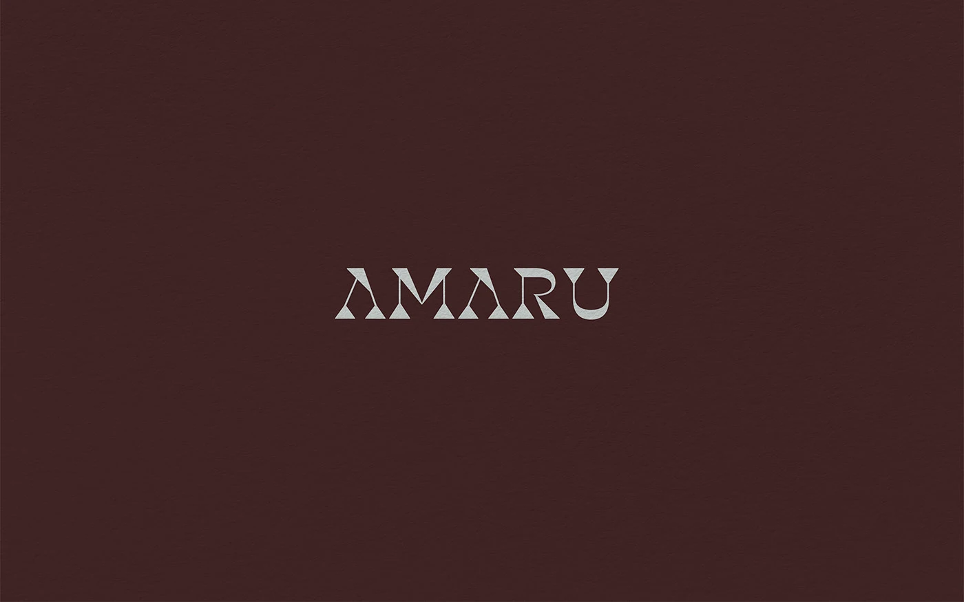
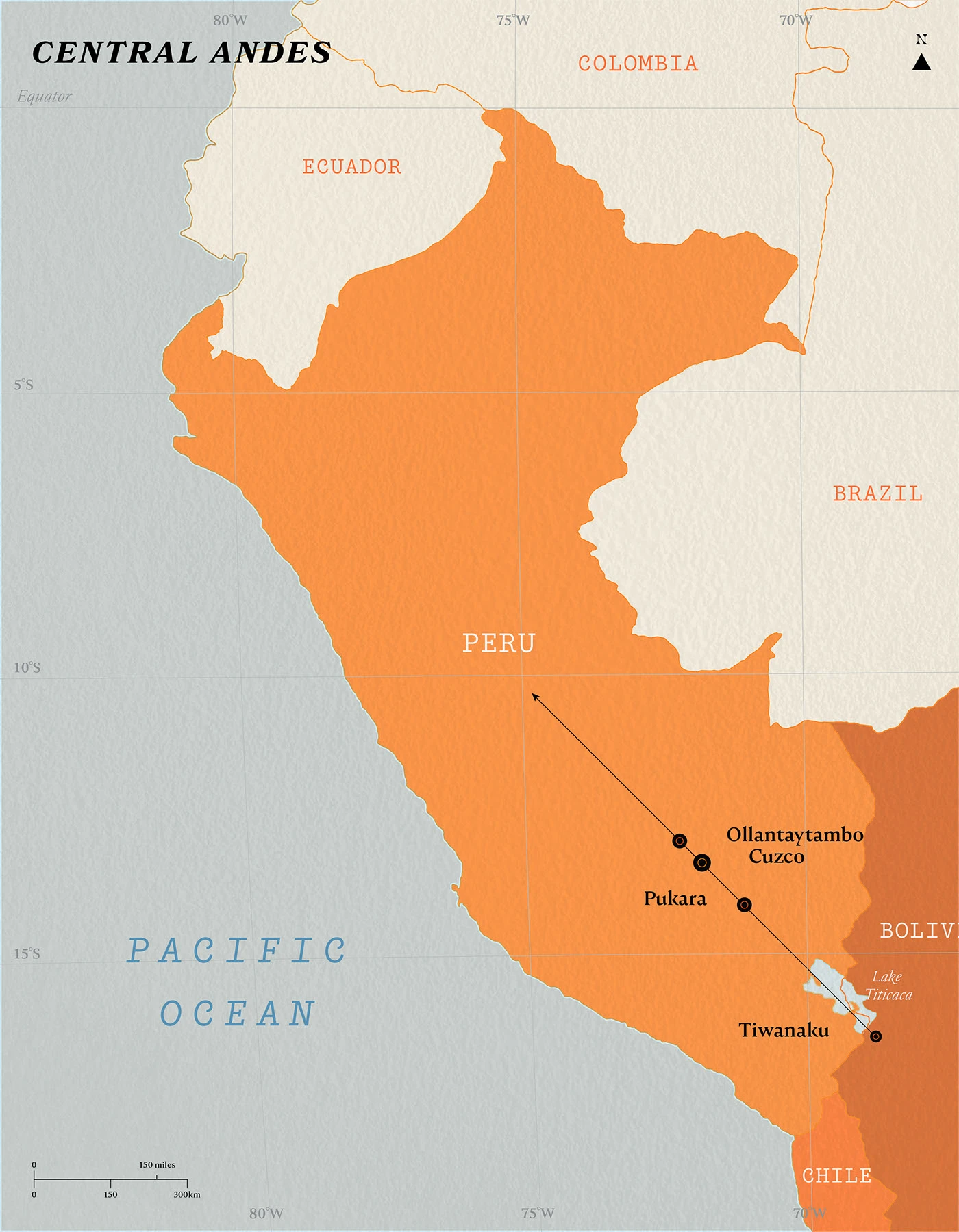
The visual system creates a calm look for an Australian photo studio. At the core of the brand identity sits a custom wordmark drawn from sacred Quechua roots. Designer Fernando Rodrigues built letter shapes with sharp serifs and sweeping curve lines. The color set pulls rich mineral tones straight from mountain peaks in Bolivia and Peru. Warm orange paper pairs with deep forest green, dusty rose, and dark soil brown stocks. A round sun mark adds quiet detail across print sheets. The clean print rules give the brand identity a direct voice. Soft neutral tones give each item a warm touch.
Andean Cultural Roots and Lifestyle Brand Identity
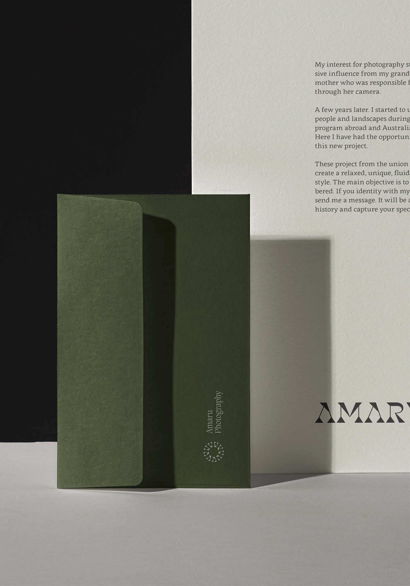
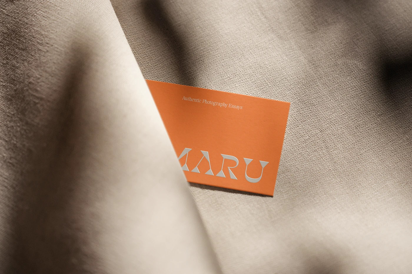
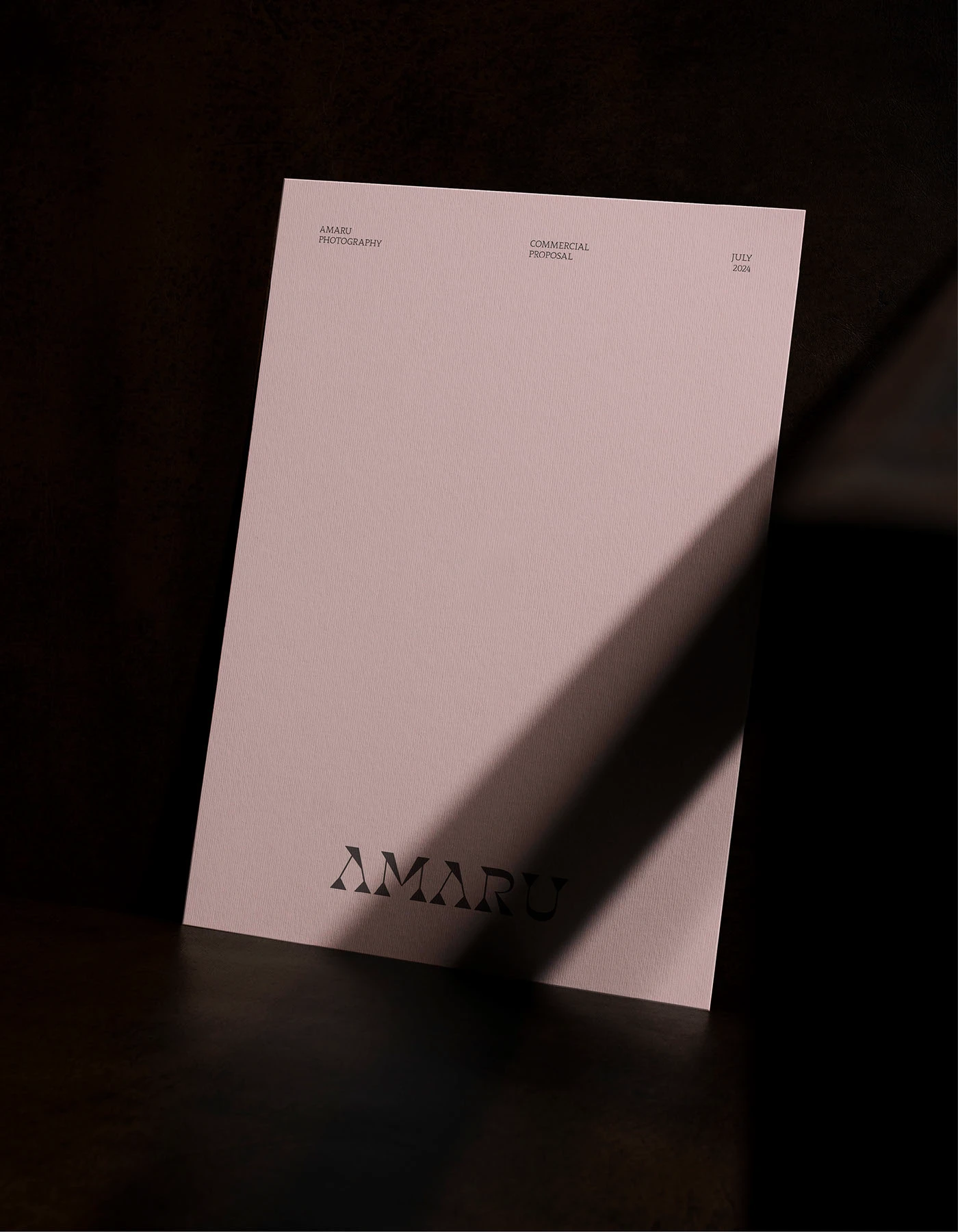
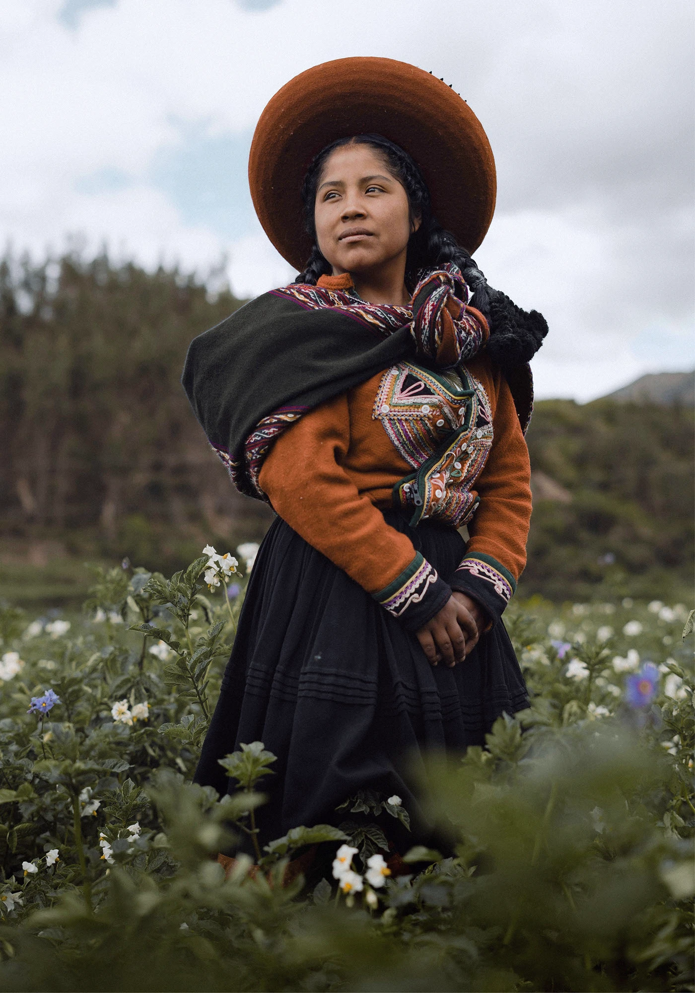
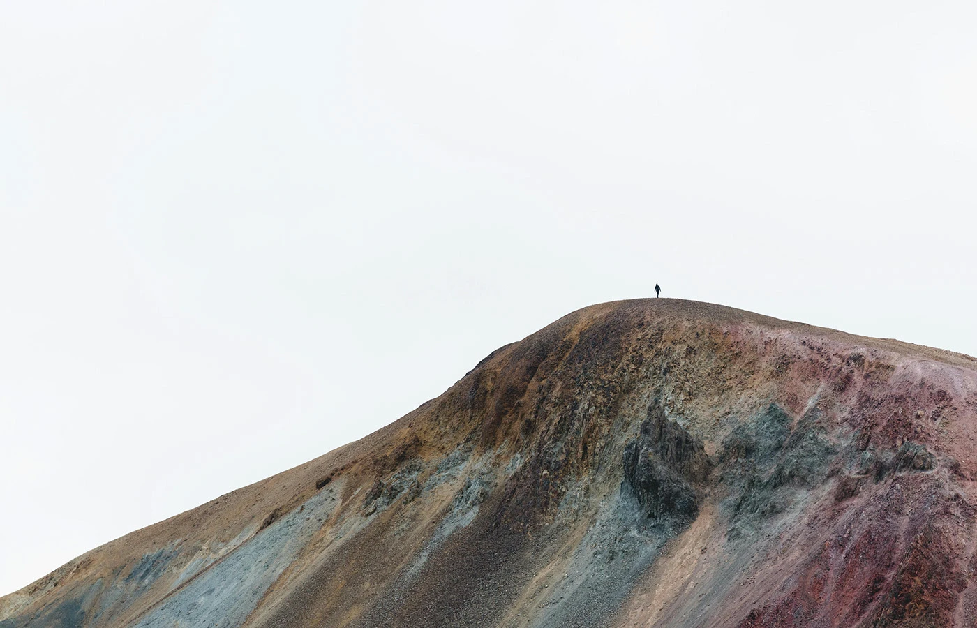
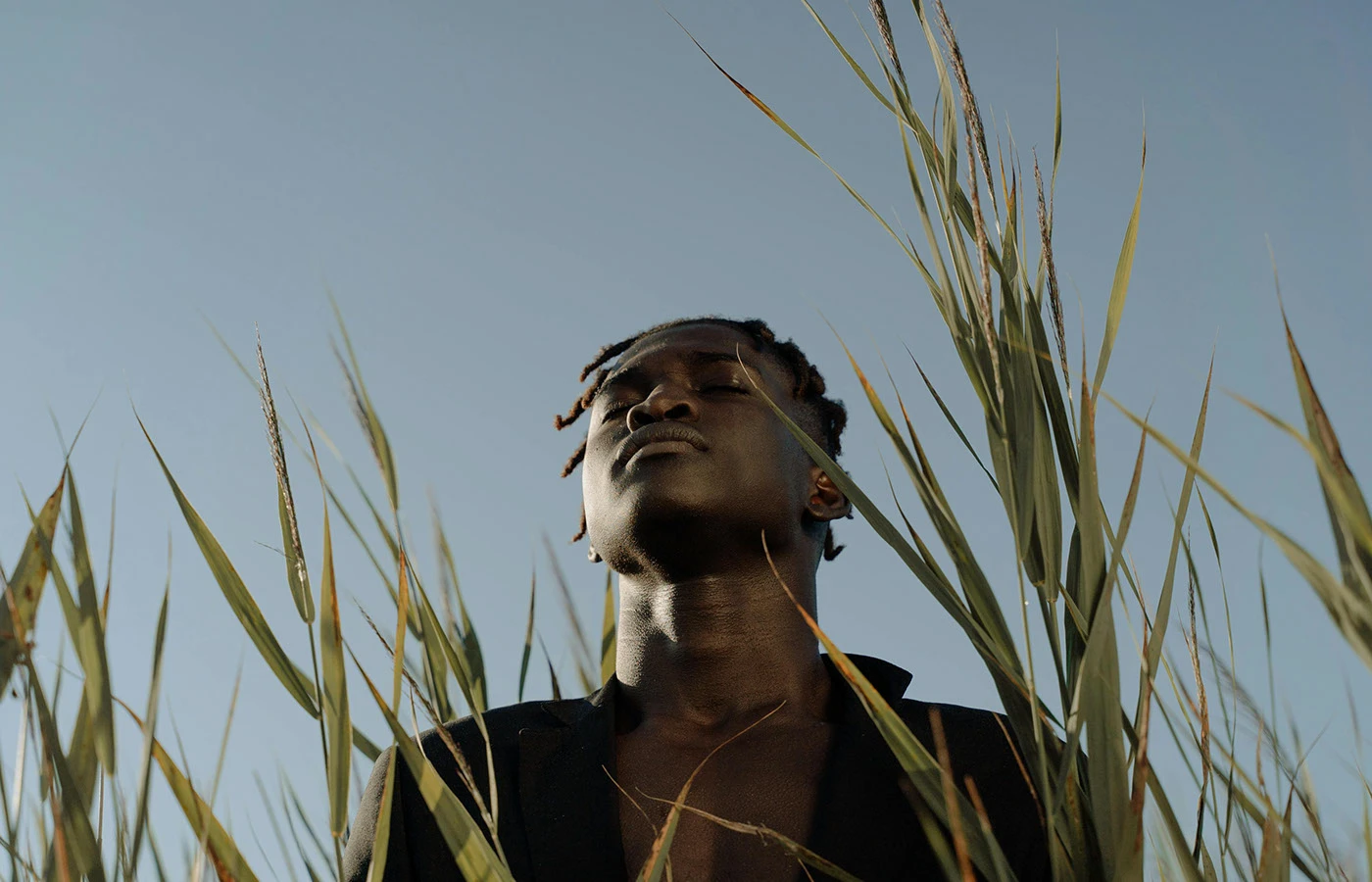
Physical paper goods carry the brand identity into client hands. Heavy cards use soft cotton paper tucked inside linen folds. Studio proposal sheets use clean serif text with wide white space and soft shadow angles. Mail folders feature small stamped marks on rich green paper. The layout pairs raw hill photos with simple type to tell travel stories. Strong contrast between warm earth colors and crisp type keeps the brand identity clear and grounded. Simple grid lines keep each print piece sharp. Pure craft shines on every single page.
The project proves how smart brand identity design links personal history with daily work. By pairing folk symbols with modern print layout rules, the visual system feels both soulful and clean. It offers clear ideas for designers building lifestyle studio marks and boutique print suites. Every piece keeps the brand language direct and warm. Clear grid rules make each paper sheet stand out. Explore the complete brand identity project on Behance by Fernando Rodrigues.