Graphic Design: SIPF by Foreign Policy Design
Explore the graphic design for the Singapore International Photography Festival by Foreign Policy Design, built around a shutter-split grid.
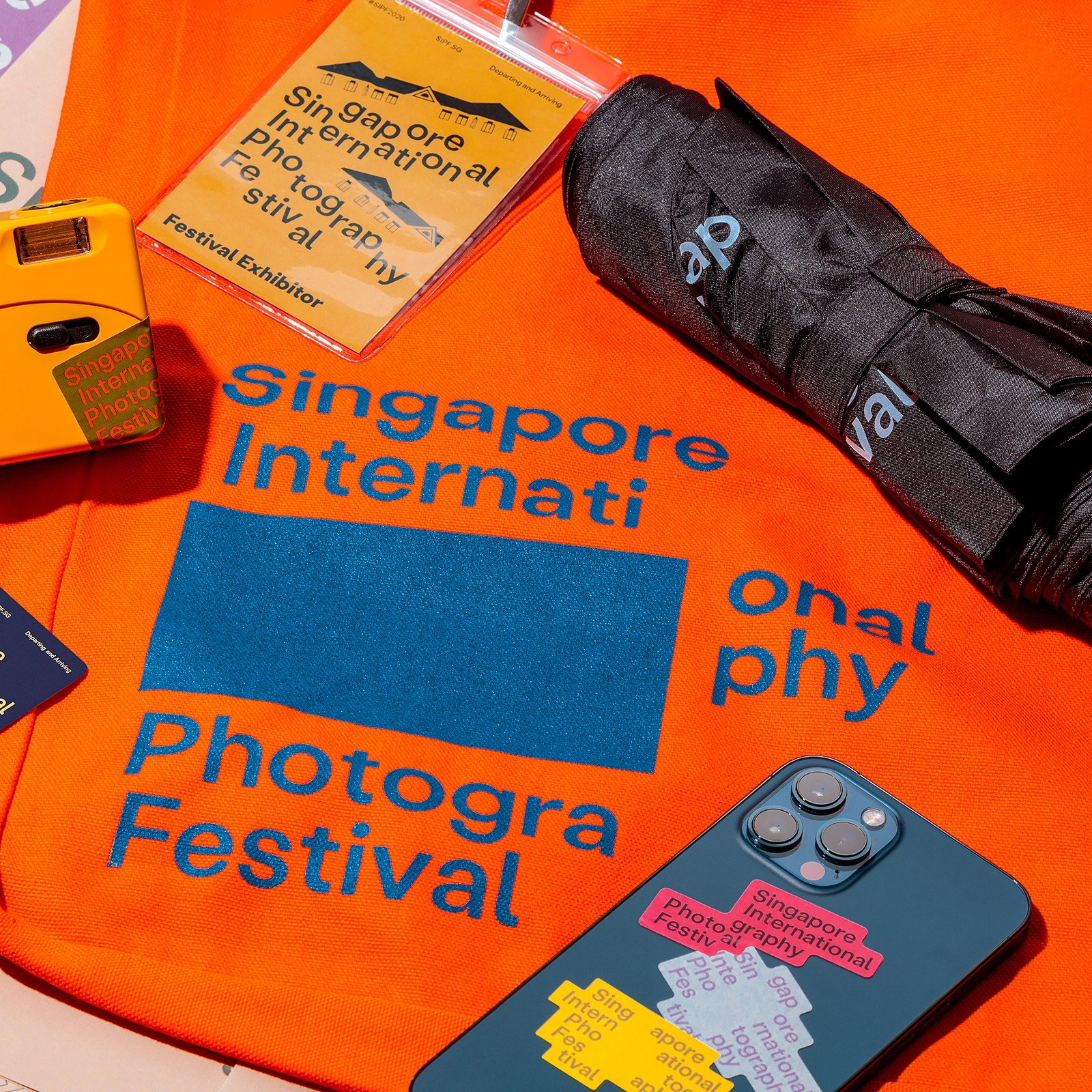
Photography doesn't happen in a vacuum. When Foreign Policy Design took on the 7th edition of the Singapore International Photography Festival (SIPF), they noticed a clear disconnect in past editions: the festival mark and the exhibited photographs barely spoke to each other. For the 2020/2021 edition, Festival Director Gwen Lee anchored the programming around the theme Departing & Arriving, reflecting on migration, belonging, and personal journeys across two centuries of Singaporean history. Drawing directly from editorial layouts where captions and images share the same narrative frame, the studio built a flexible system where the logotype physically wraps around every photograph.
Shutter-Split Typography and Modular Graphic Design
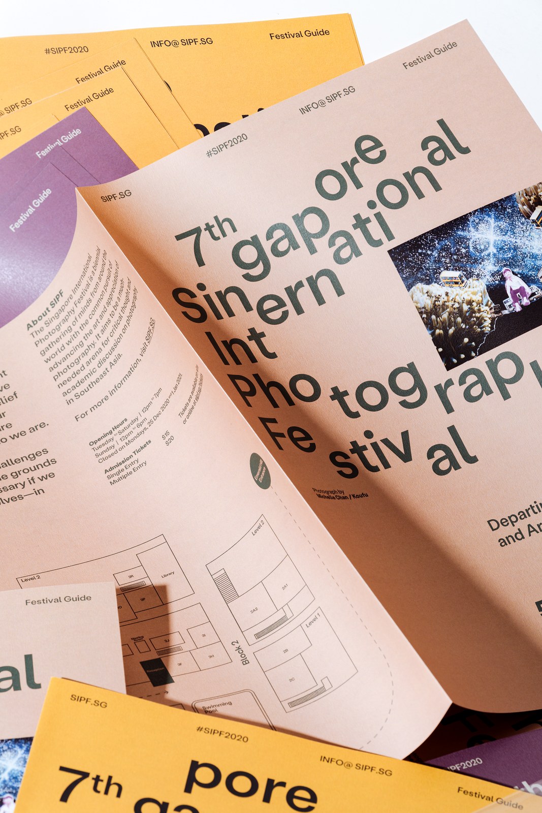
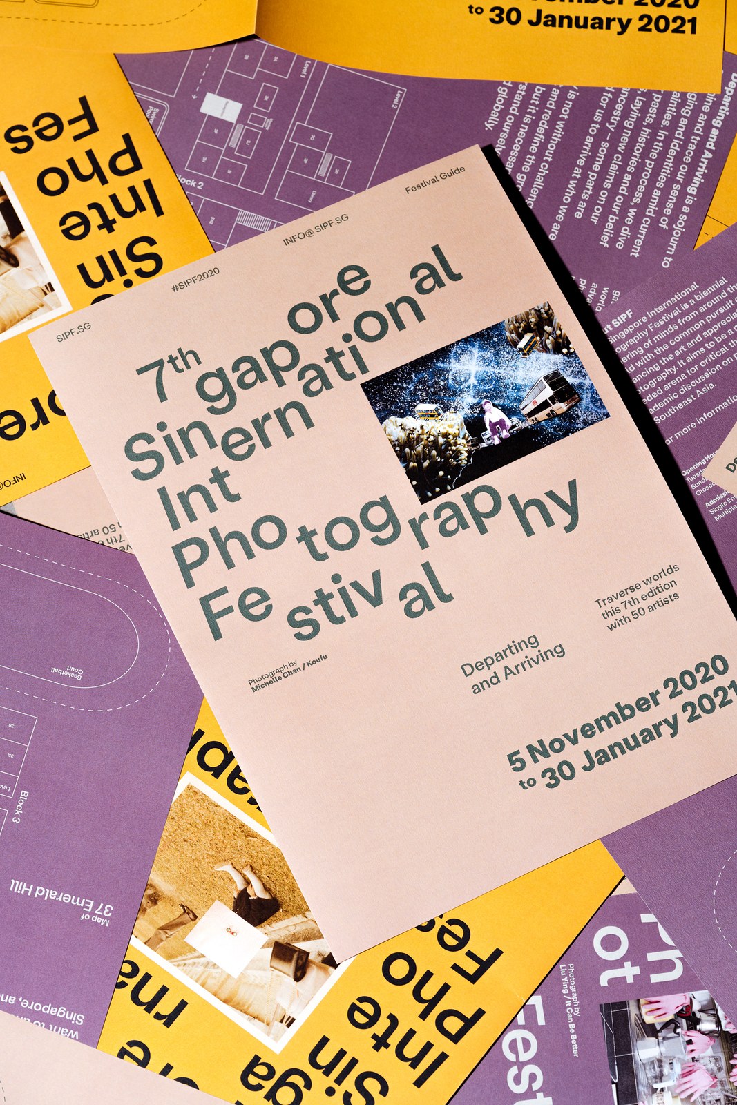
The type moves like a camera shutter. Instead of locking the festival name into a static corner badge, Foreign Policy Design sliced the clean grotesque wordmark mid-word in Illustrator and InDesign so syllables step, stagger, and hug the edges of rectangular image blocks. It's a simple mechanical rule that never gets old. On the blush-sand cover of the printed Festival Guide, dark forest-green letters split around Michelle Chan's photograph Koufu, while the unfolded interior reveals crisp isometric floorplan maps of the 37 Emerald Hill venue alongside saffron-yellow and plum-purple print variations.
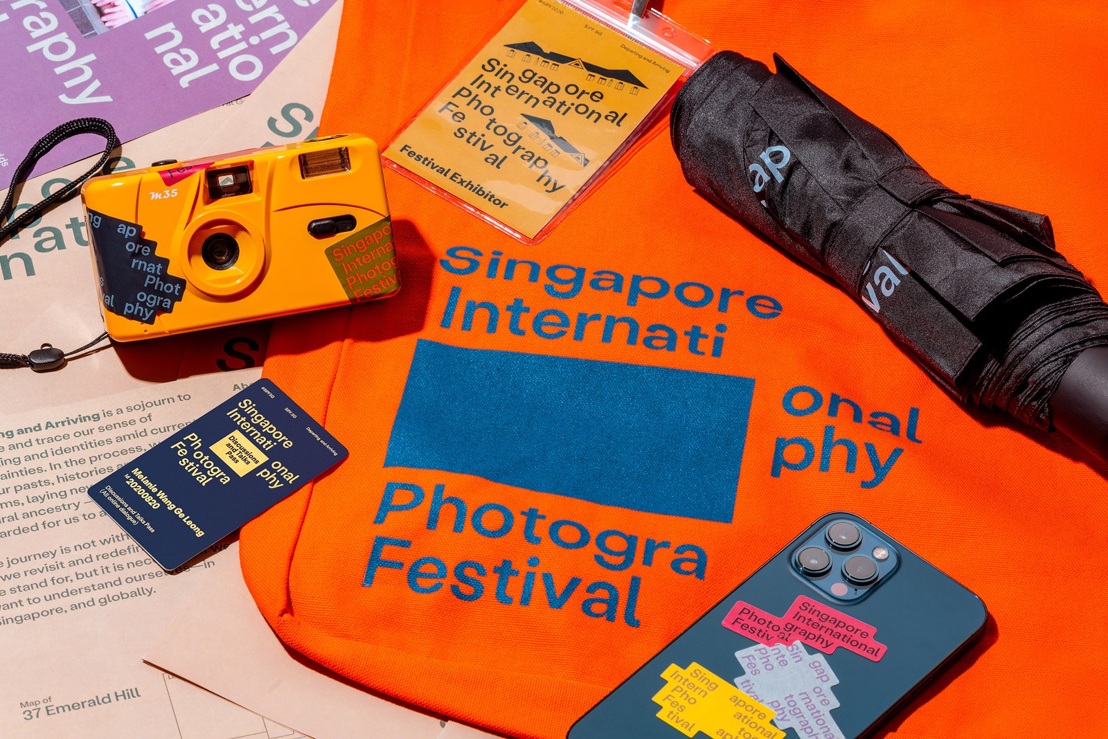
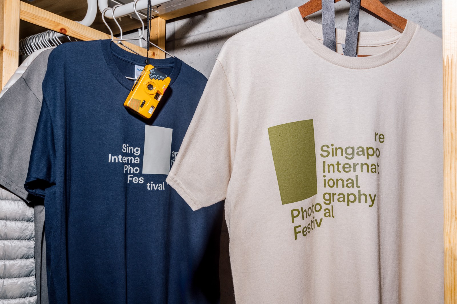
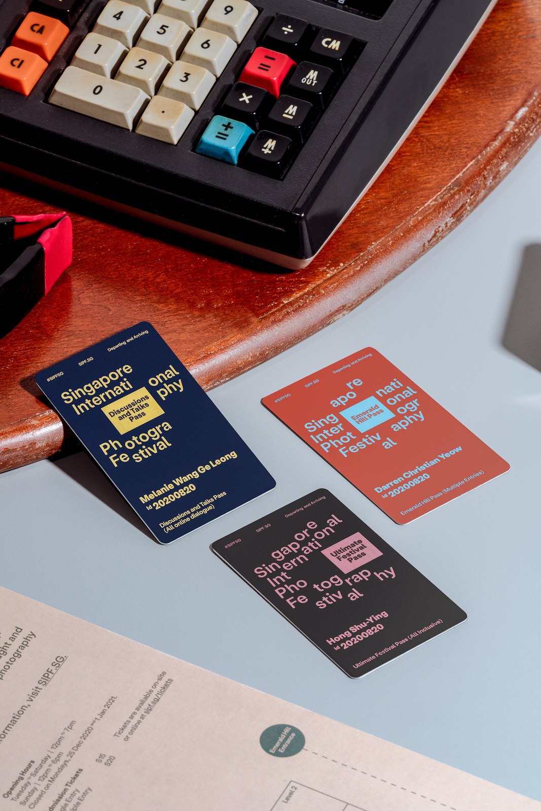
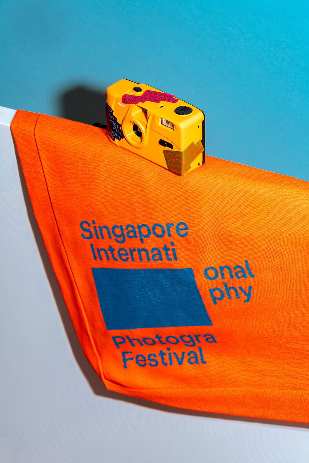
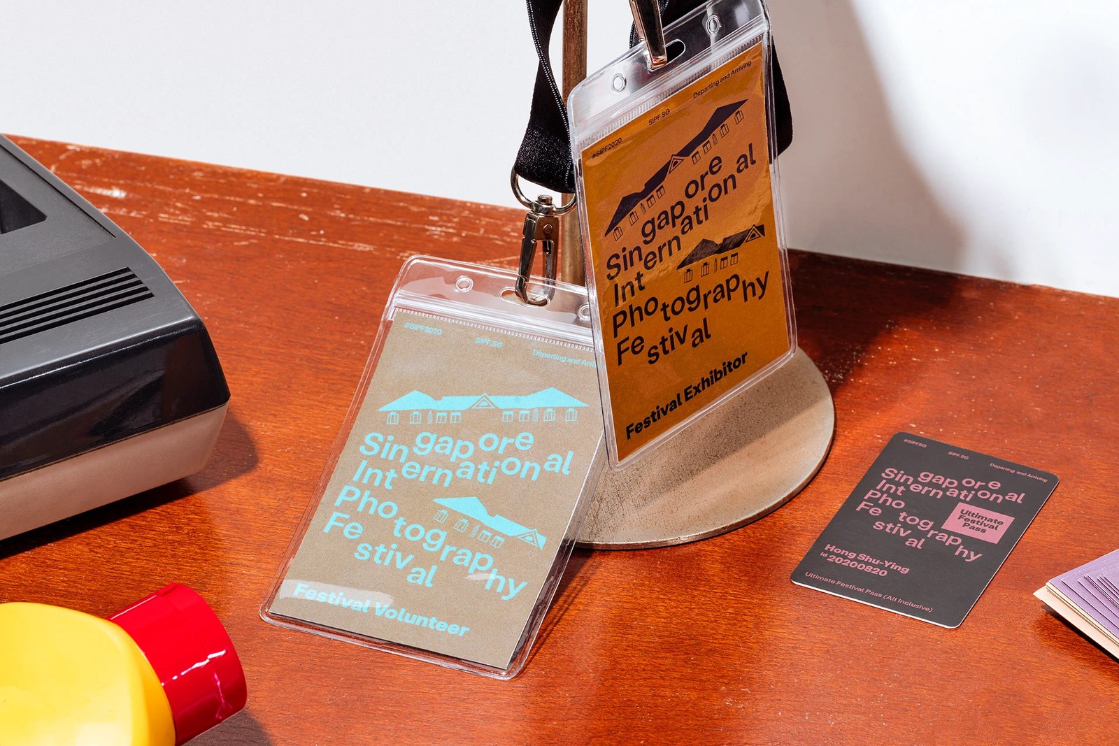
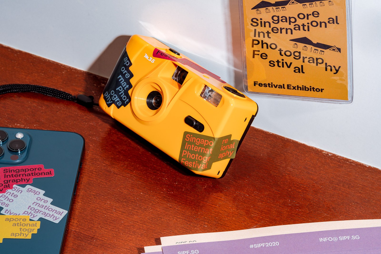
Color carries real photographic history here. The studio pulled its palette directly from the analogue film work of William Eggleston, Stephen Shore, and Saul Leiter — pairing warm ochre, terracotta, and mustard yellow against deep navy, cyan, and charcoal. You can see how well those tones hold up across the physical merchandise and passes. Rounded-corner access cards for the Discussions and Talks Pass, Emerald Hill Pass, and Ultimate Festival Pass nest color-coded ticket badges right inside the split typography, while lanyard inserts weave in line-drawn heritage rooflines. Even when pandemic delays pushed the schedule from August 2020 into January 2021, the system flexed cleanly from cobalt-printed orange tote bags, cotton t-shirts, and die-cut camera stickers to live-streamed talk graphics.
See the full project by Foreign Policy Design on Behance.