What Instagram’s brand refresh signals about its future
Instagram has launched its first major design shift since 2016. The rollout of the design has so far focused largely on its new wordmark, which was revealed initially by Instagram’s head, Adam Mosseri, on the social platform, accompanied by a simple paragraph:
“The wordmark at the top of the app hasn’t changed in 10 years, so it was time for a refresh. Cleaner and more modern, with references to the original and the simplicity and craft that’s always made it Instagram.”
The new design sees the platform move away from its old style cursive script logo for a refined look more suited to the digital age. It hasn’t abandoned cursive entirely – the n and the s at the start of the mark are still linked, as are the r and a towards the end, but the rest of the words are separated. This has given rise to the loudest criticism the new logo has received so far: that it looks like it says Instagzam.
A post from Instagram’s design team delves into its thinking in more detail, explaining how the team examined hundreds of styles – from “simple, utilitarian type” to “nostalgic or film-inspired concepts” before “landing on something that is rooted in the Instagram we love, being fresh and simple”. The final mark does work as a bridge from the old logo – which now looks immediately old-fashioned – to one more suited to the contemporary.
The design team’s post appears to share something of their process in getting to this new look via a series of sketches that all contain pencilled notes. Perhaps they genuinely did print out the proposed logos as they went along and made notes, but there’s something rather faux about this – as if analogue evidence of the human hand needed to be shown for us to believe in the design team’s passion for the project.
The refreshed brand system puts our community’s creativity and self-expression front and centre. It’s designed to spark courageous action
This emphasis on the ‘human’ (i.e. not the big corporate tech machine – and definitely not AI) is even more strongly felt in Instagram’s wider explanation of the brand’s evolution in a blog post on Meta’s website, which reveals more of the brand system plus how it might be used in ads.
The brand’s familiar colour gradient and signature camera logo (which first appeared in its major 2016 refresh) remain in place, and the brand has leaned further into analogue touches elsewhere, from references to photographic contact sheets and the announcement of a new handwriting typeface, Instagram Pen.

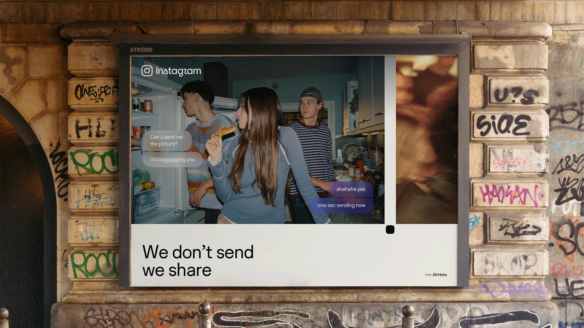
The ads feature casual, unpolished imagery of young people hanging out, or making art, and are accompanied by lines that put an emphasis on ‘making’. Some of these are punny – ‘It’s yours for the making’ – others a bit tortured, such as ‘If you’re making something, you’ve already made it’.
The style of the ads is reminiscent – somewhat ironically – of Polaroid’s recent campaign, which is set in direct opposition to AI. This makes perfect sense for Polaroid’s products, but – rather like ChatGPT choosing to make its first major ad campaign using analogue techniques – there is a tension in seeing big tech firms romanticising the pre-digital age.
Throughout the new branding there is an emphasis on community and creativity, with May Hartono, director of brand design at Meta, commenting: “The refreshed brand system puts our community’s creativity and self-expression front and centre. It’s designed to spark courageous action and give people the confidence to create and show up as themselves, freely and fully.”

This may stick in the craw of creatives who feel that Instagram has abandoned them in favour of an algorithm that celebrates reels and has clearly being trying (and failing) to compete with TikTok to win over the teen audience.
Does this mean that the brand will genuinely try and make the social channel a friendly, creative space once more? Or, like the nostalgic celebration of pre-digital creativity in the campaign, is it all just vibes?
Certainly, it seems an attempt to once again lure back the young to the platform. While Instagram skews towards a younger audience, with the majority under 45 and over 60% in the 18 to 34 band, a recent Washington Post article about a leaked internal memo from Mosseri revealed a determined strategy to win back teens and “make the app the world’s largest platform for teens by 2027”.
This ambition comes at a time when Instagram faces multiple lawsuits in the US for encouraging addictive and damaging behaviours in teens. The brand has attempted to combat scrutiny with its Teen Accounts initiative, but with countries, including the UK, planning to introduce social media bans for under 16s, this seems too little, too late.
Instagram is facing another challenge among teens: simply not being the cool place to be, compared to other channels such as Snapchat and TikTok, and a rising desire by youths to no longer make their lives entirely public.
Some of the anxiety this must be causing the company leaks through in the campaign, with lines such as ‘We don’t send, we share’ sounding less like a tagline and more a plea for its young audiences not to give up on the old ways of doing social. But when has pleading with the young ever worked?