Packaging Design: Casa Bosques Chocolates by SAVVY STUDIO
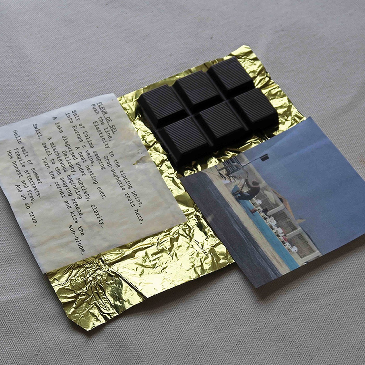
SAVVY STUDIO crafts packaging design for Casa Bosques chocolates. Travel photos and poetry accompany fine single-origin dark bars.
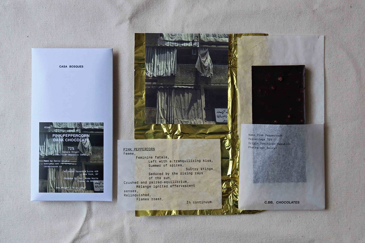
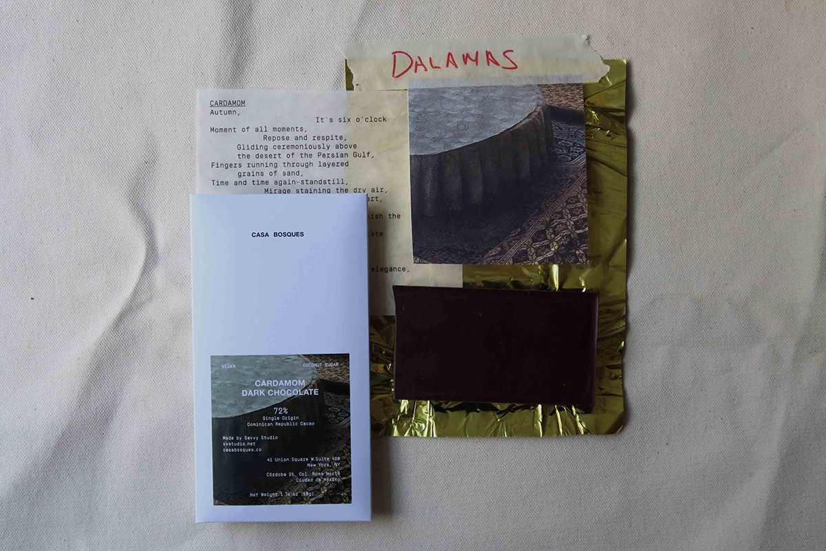
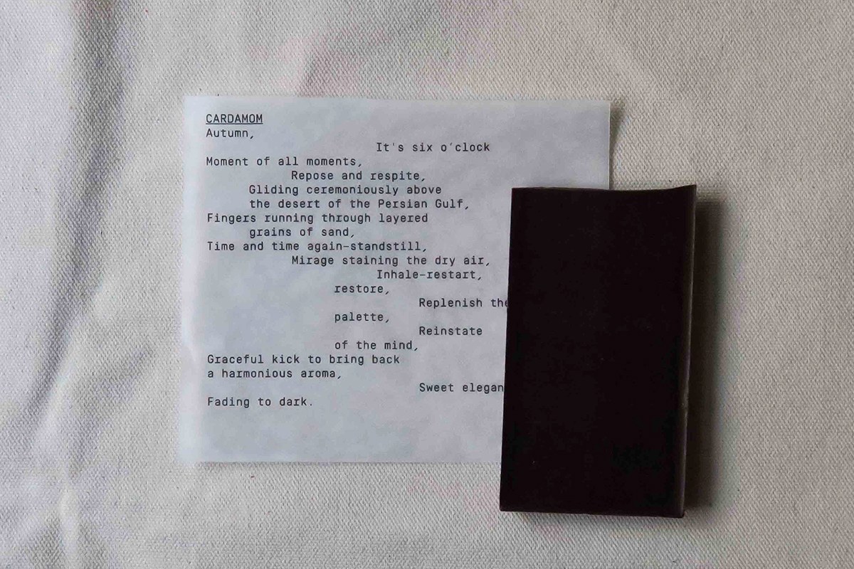
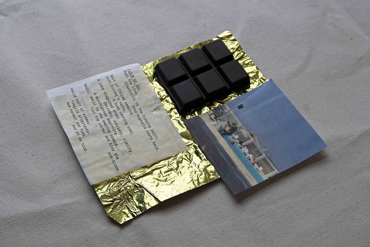
Casa Bosques blends fine cacao with travel memories. SAVVY STUDIO shares a personal process for this run. The studio links each bar to a poem and a place. Travel photos from Beirut and Turkey guide each recipe. A guest poet wrote short lines for each bar. Pink peppercorn and cardamom build rich tastes. The project treats food packaging design as an art print series. Each bar feels like a small gift from a real trip. The work turns fine chocolate into a quiet keepsake. Every flavor carries a distinct sense of location.
Tactile Packaging Design and Story
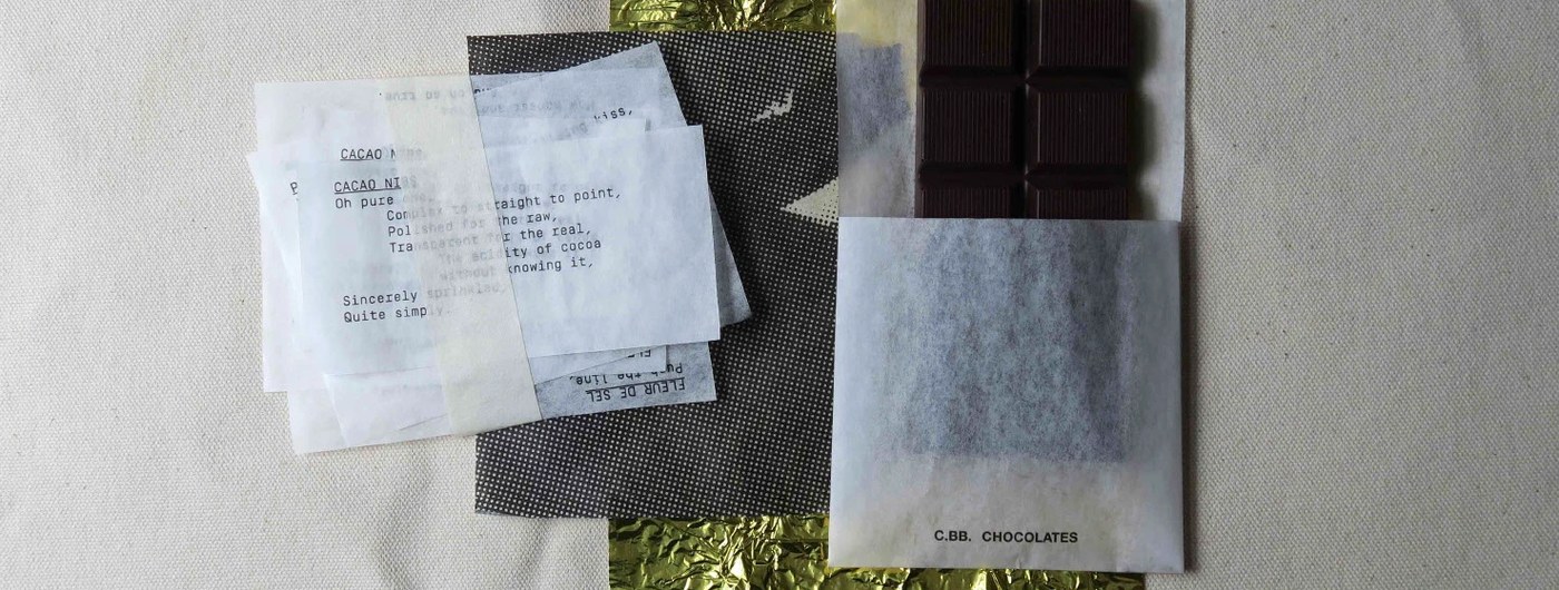
The visual system relies on quiet print restraint. Labels feature clean mono type from a manual machine. Neat rows show cacao levels, origins, and city names. The design avoids loud graphics or cheap tricks. Open white space gives each paper label room to breathe. Thin vellum slips set printed lines over travel photos. This clear packaging design layout brings calm order. A simple grid lets the reader take in each small detail. The clean font stays humble. The quiet imagery speaks first. Text stays crisp on every paper surface. Neat margin rules frame the delicate typeface.
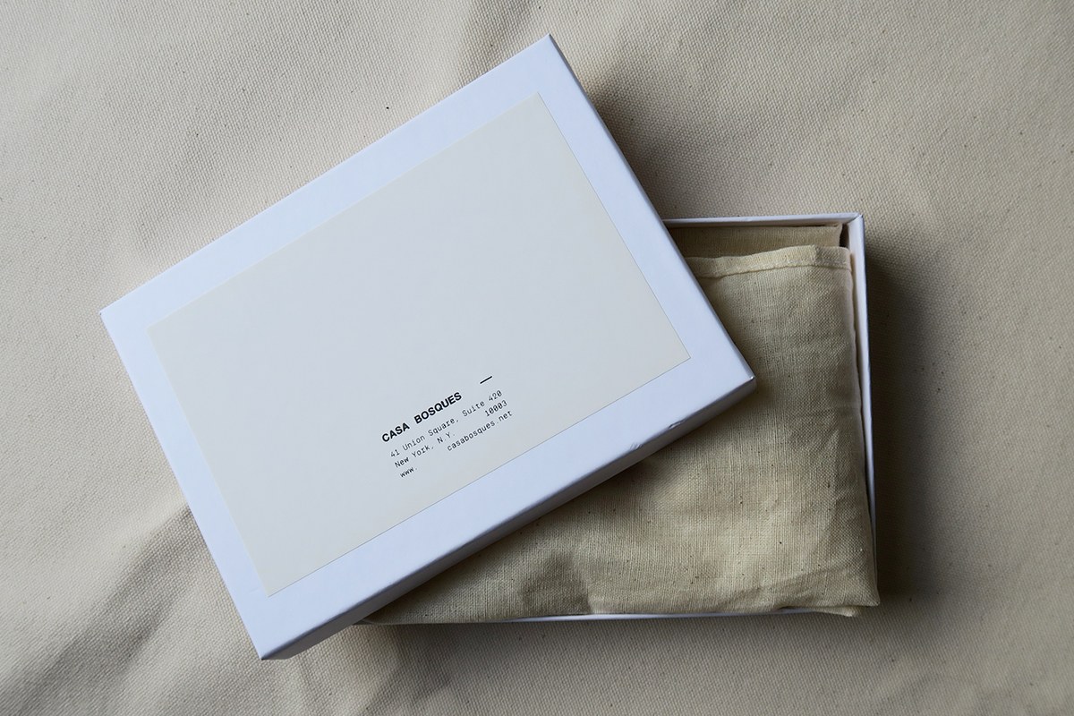
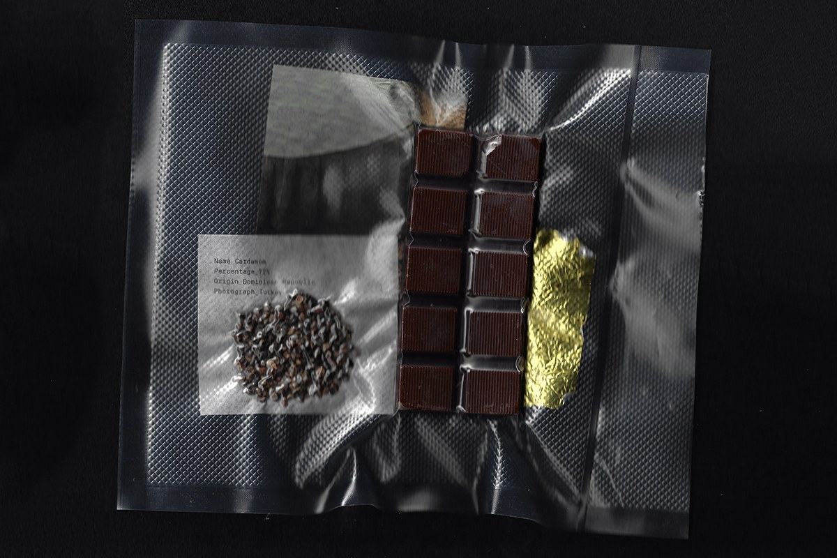
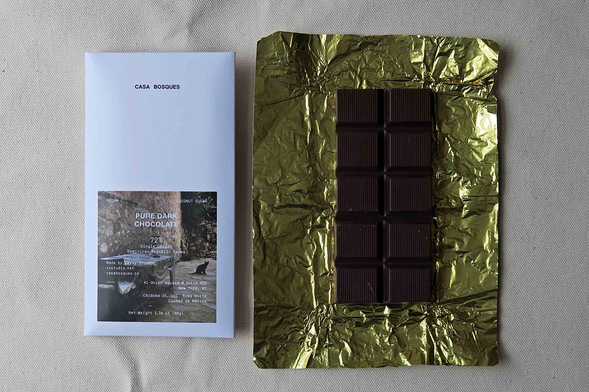
Fine paper craft shapes the touch of this release. Each dark chocolate bar rests inside bright gold foil wraps. Crisp white paper covers protect the treat inside. A custom vacuum pack holds dried cardamom seeds. Thin glassine wraps hold each chocolate block with care. Sturdy gift boxes hold soft cotton cloth bags. This layered packaging design creates a calm ritual. Every layer honors raw cacao from the farm. Tactile papers turn sweet tastes into an artful moment. Raw card textures pair with dark chocolate blocks. The physical craft feels honest and grounded. Unboxing the bar becomes a slow sensory experience.
See the full project by SAVVY STUDIO on Behance.