Digigoat Visual Identity Redesign and Branding
Digigoat is a minimalist visual identity and branding project by Paprika Design featuring high-contrast geometric typography.
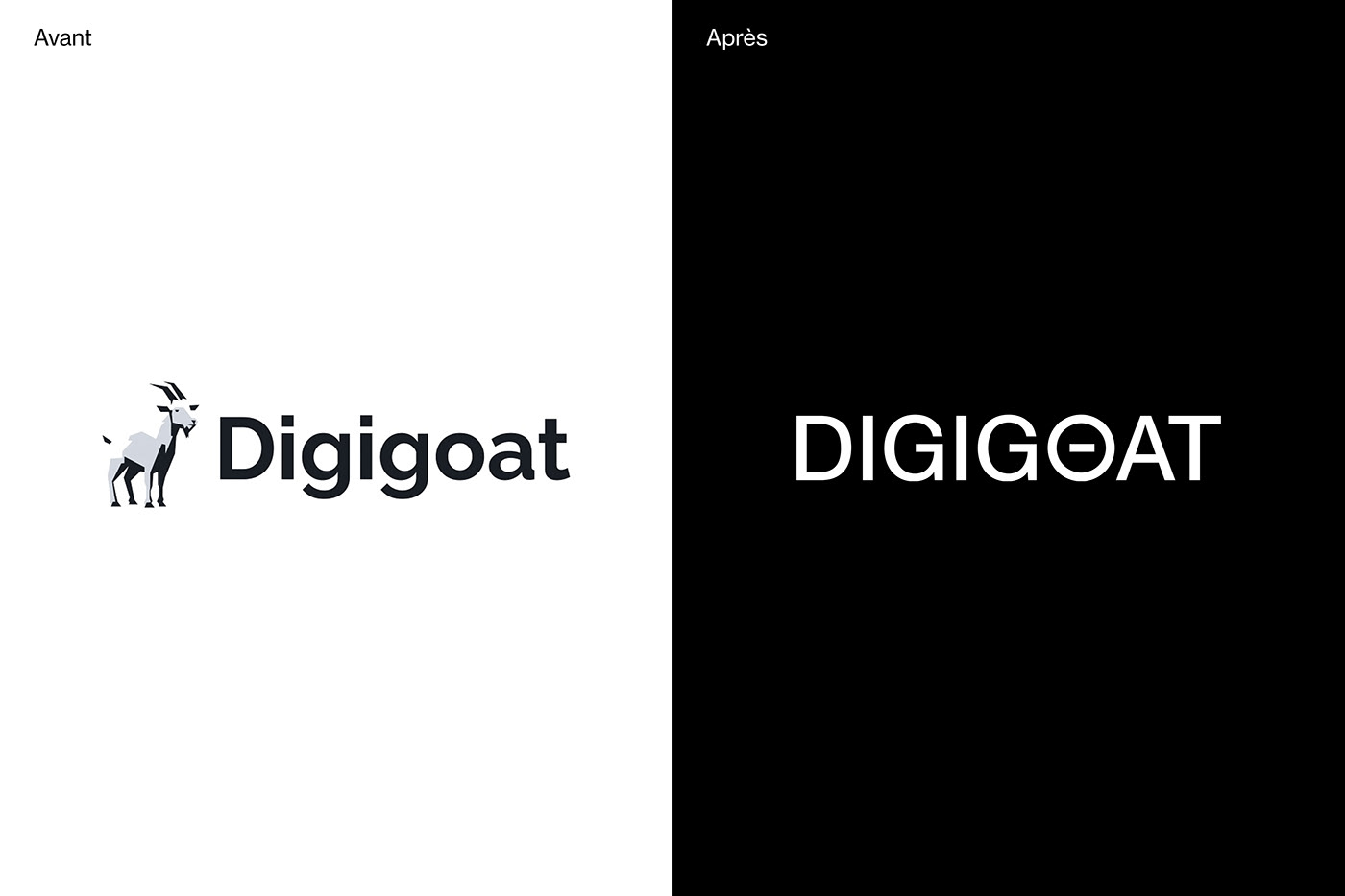
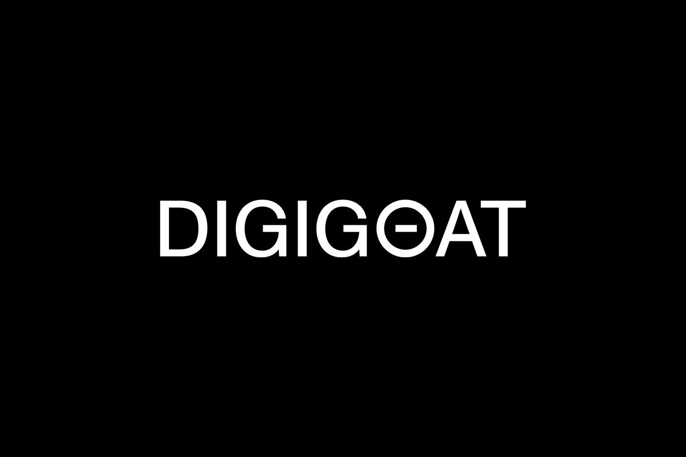
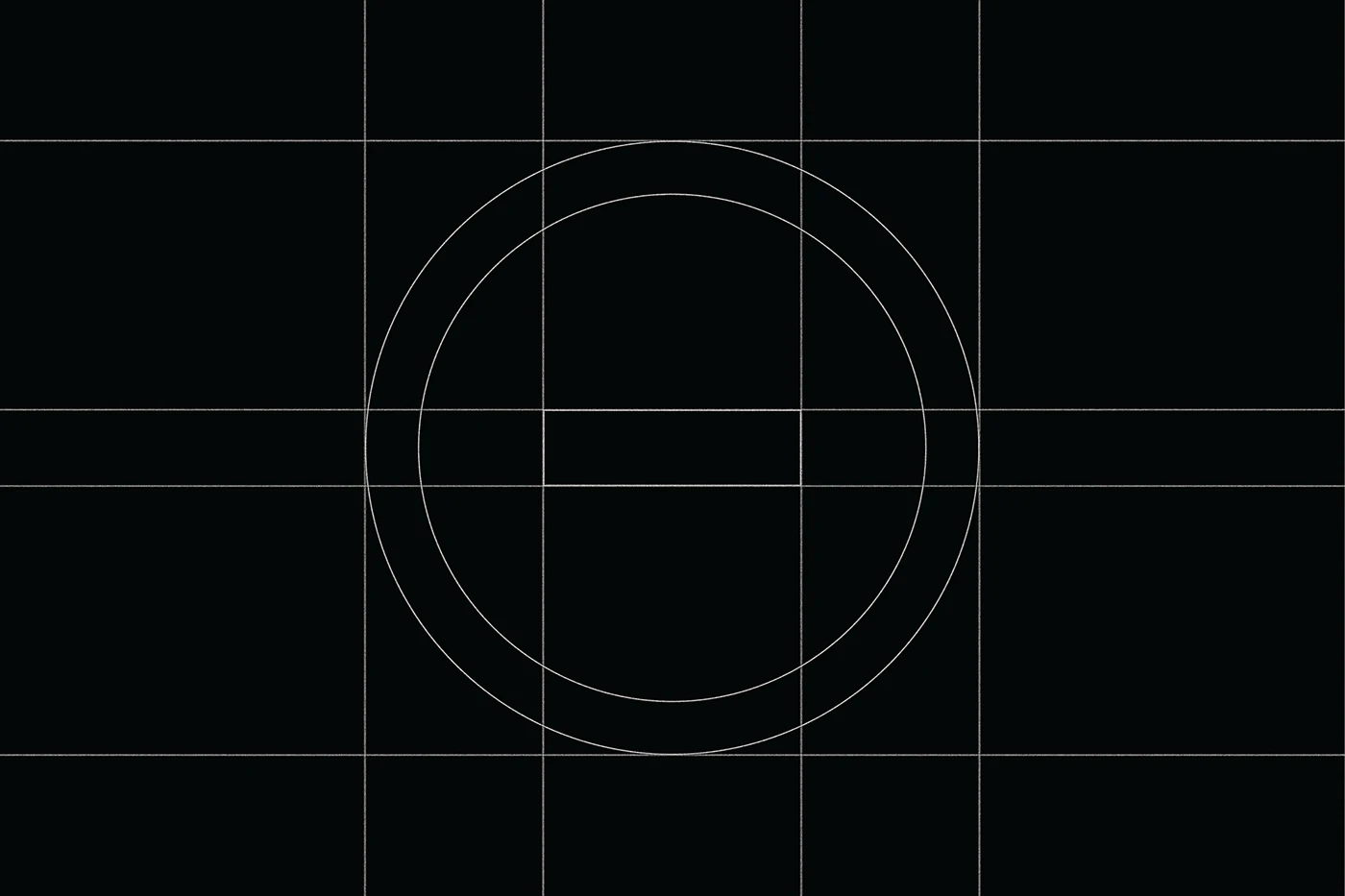
The redesign swaps a complex goat picture for a clean wordmark. At the core of the branding sits the name DIGIGOAT set in sharp block letters. Studio Paprika Design replaces the letter O center with a flat minus line that hints at a goat eye pupil. The mark uses bold black and white fields for clear visual contrast. Fine grid lines show how the round letter shapes match exact guidelines. The visual system cuts away extra decoration to focus on pure type forms. Every letter stays sharp on dark and light grounds. The full branding language feels strong and direct.
Minimalist Typography Grid and Corporate Branding
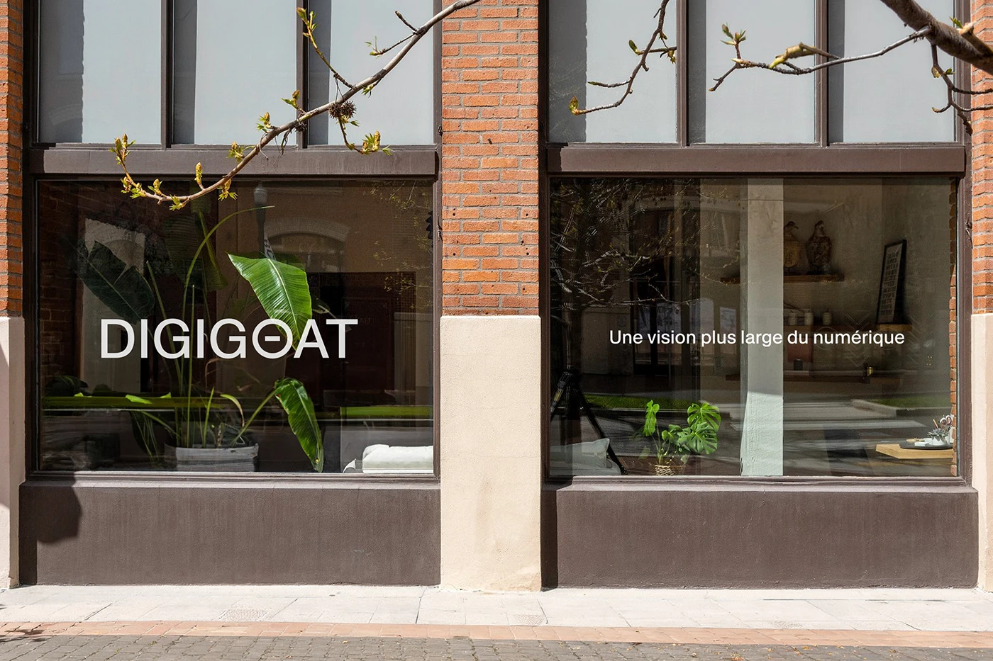
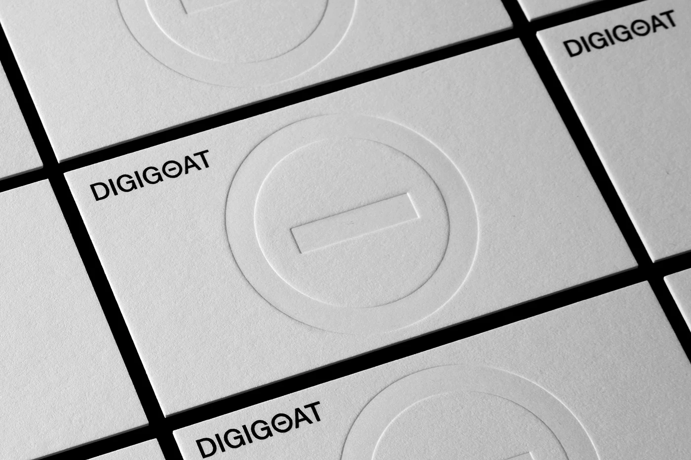
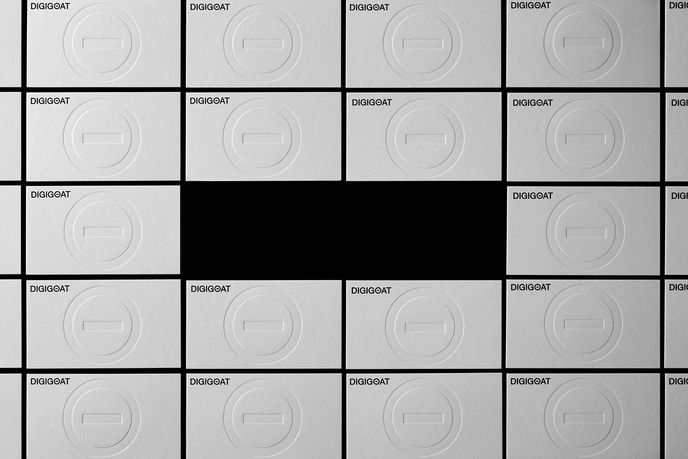
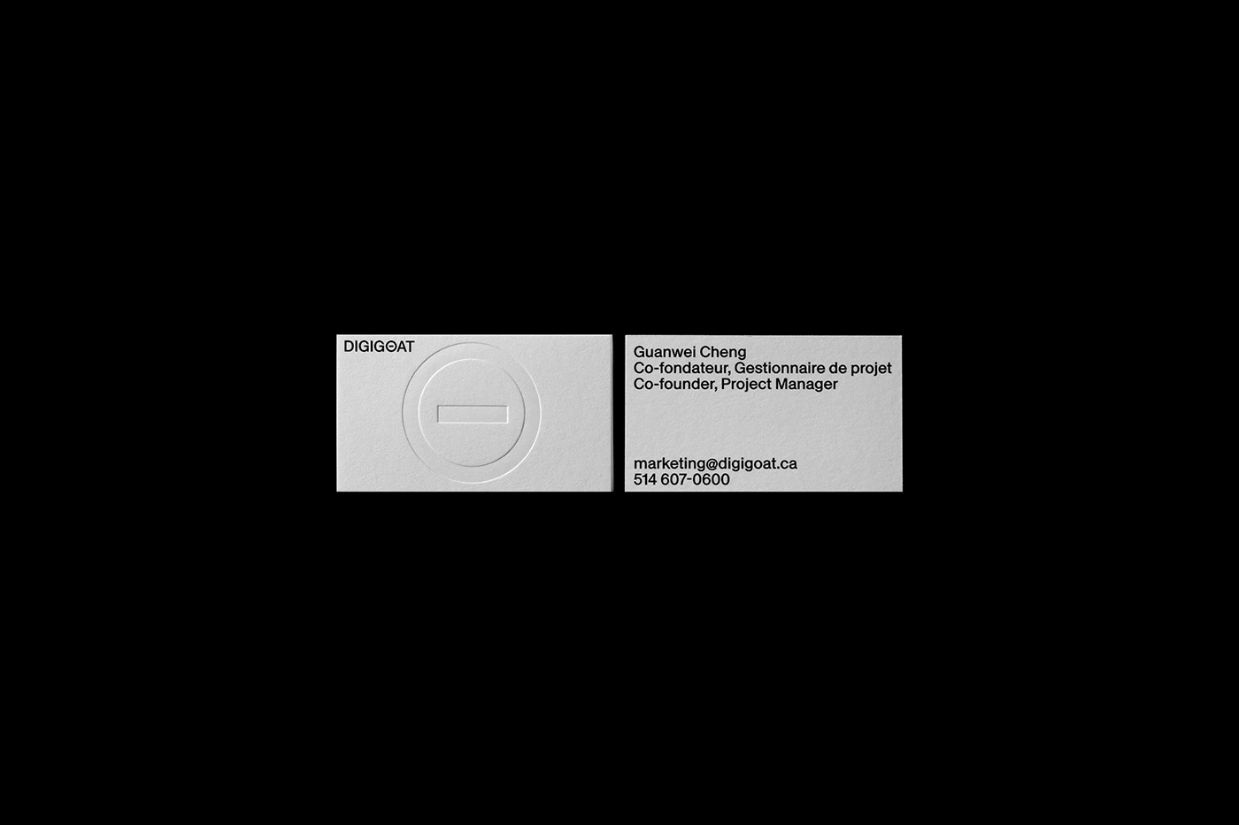
Physical collaterals move the branding onto heavy white card stock. A grid of business cards shows a center debossed mark with zero ink. Small contact text sits neatly in the top corner of each card. Studio window glass displays the white wordmark against dark interior rooms. The crisp contrast between black fields and white type gives the identity a strong look. Each piece relies on scale contrast and raw paper tooth. The plain print setup highlights real card texture and sharp edge cuts.
The project shows how simple type choices transform a tech brand. By moving from a literal animal drawing to a clean symbol, the branding presents a modern digital look. The full system relies on simple typography, clear grids, and plain paper cards. It offers a great reference for design teams working on brand updates. The clean visual strategy stays sharp on every substrate. Each item proves how minimal design details build clear identity value. Explore the complete brand identity case study on Behance by Paprika Design.